Launch Recite Me assistive technology
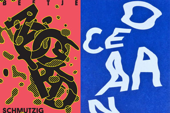
Two graphic posters side by side. The left is red with black and yellow distorted lettering that reads “BEETJE” at the top and “SCHMUTZIG” at the bottom. The right is blue with large, white, fluidly shaped letters that spell “OCEAN”.

Graphic Design: Update from designer Vincent Vrints' colourful portfolio

—
Date
18 July 2013

We last come across Belgian graphic designer Vincent Vrints last December when we were instantly sucked into his colourful world of prints and posters, and looking back over the most recent updates in his portfolio convinced us that he’s in this for the long haul. A look at his new work reveals the same trendy experimentation with form and type, but in a seemingly more grown-up fashion, playing with a more painterly technique and a pop-art half tone. What’s more, its still shows a rainbow spectrum of colour, which we’re not ashamed to admit sucks us in like moths to a halogen light bulb.
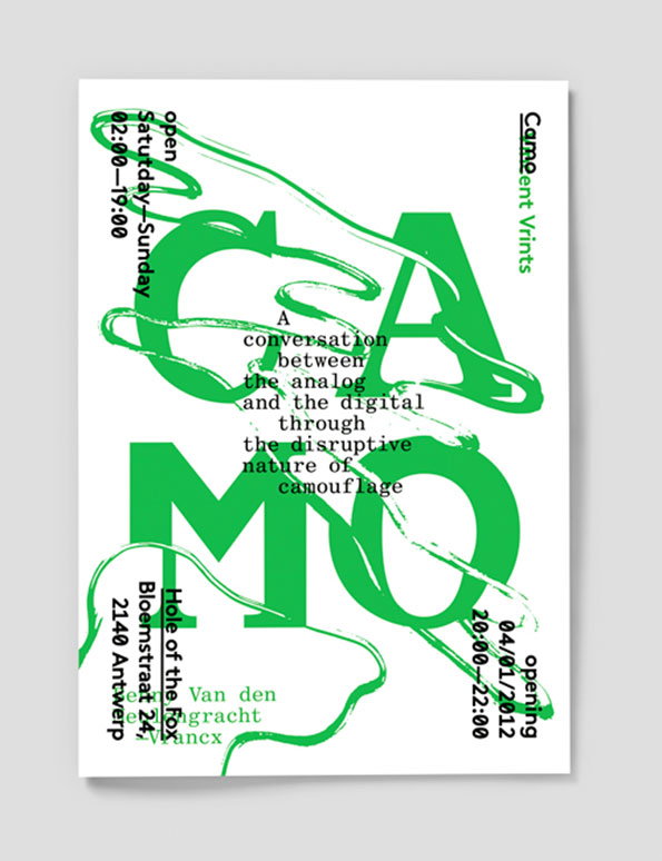
A typographic poster in green and white features the word “CAMO” in large, bold letters. A fluid, green line loops across the text, while a central block reads “A conversation between the analog and the digital through the disruptive nature of camouflage”.
Above

Vincent Vrints: Camo, H.O.T.Fox with Benny Van Den Meulengracht-Vrancx
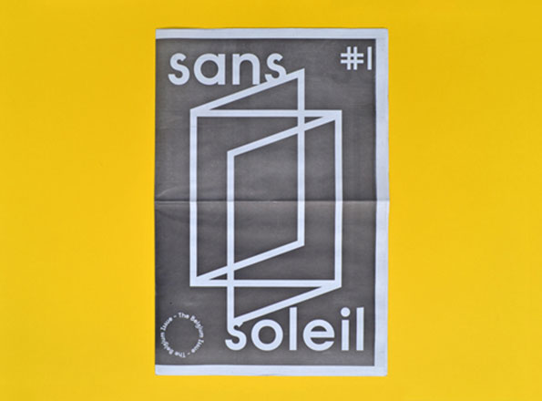
A grey poster on a bright yellow background features a white geometric line drawing of a cube. The words “sans” and “soleil” appear at the top and bottom, with “#1” in the top right corner.
Above

Vincent Vrints: Sans soleil, Newspaper published by Ward Zwart
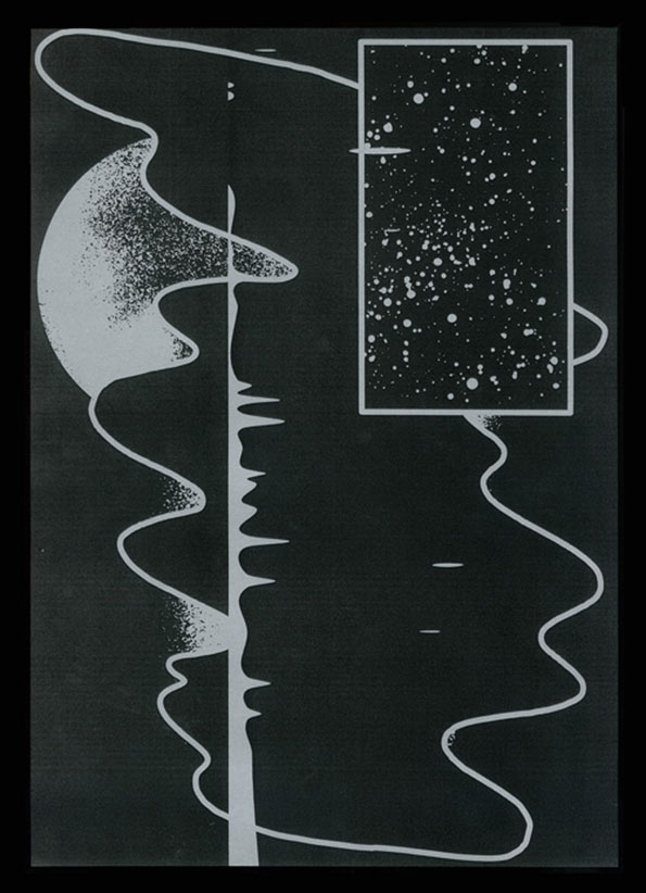
A black and white abstract illustration featuring a central vertical line and flowing, organic white outlines. A rectangular frame in the top right contains a dense field of white dots resembling a starry sky.
Above

Vincent Vrints: Firmament

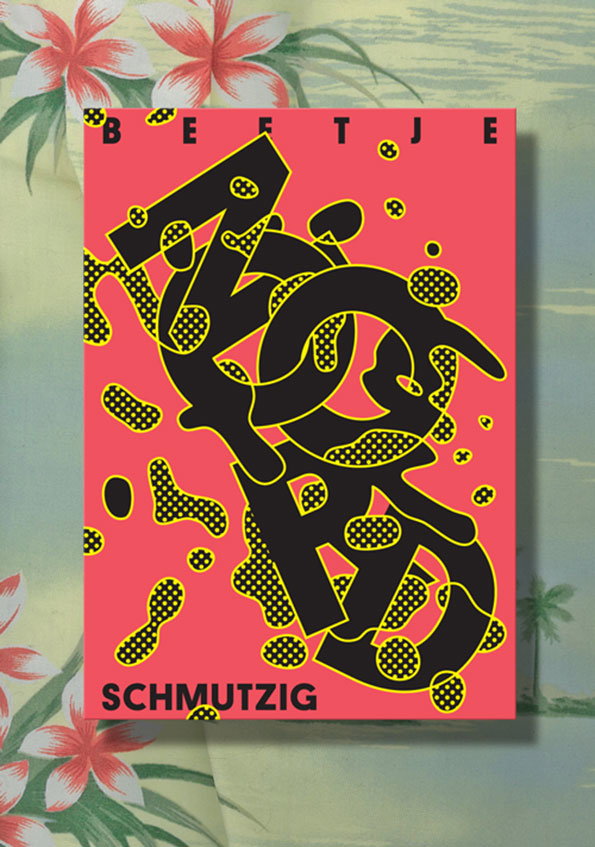
A graphic poster on a pink background features bold, black abstract lettering with yellow halftone patterns. The text “Beetje” appears at the top and “Schmutzig” at the bottom.
Above

Vincent Vrints: Flyer, Noord Feesjes

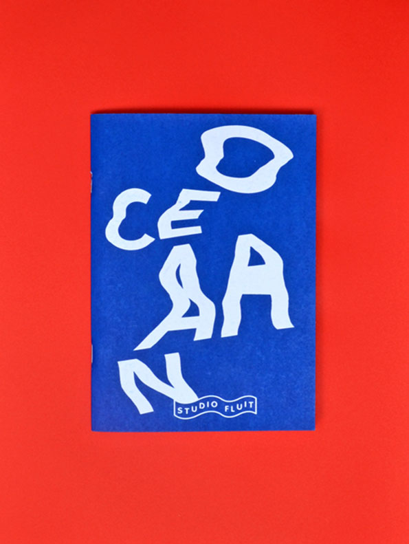
A blue booklet against a bright red background. White, stylised lettering reads “OCEAN”, with the word “STUDIO FLUIT” in a small banner at the bottom.
Above

Vincent Vrints: Studio Fluit

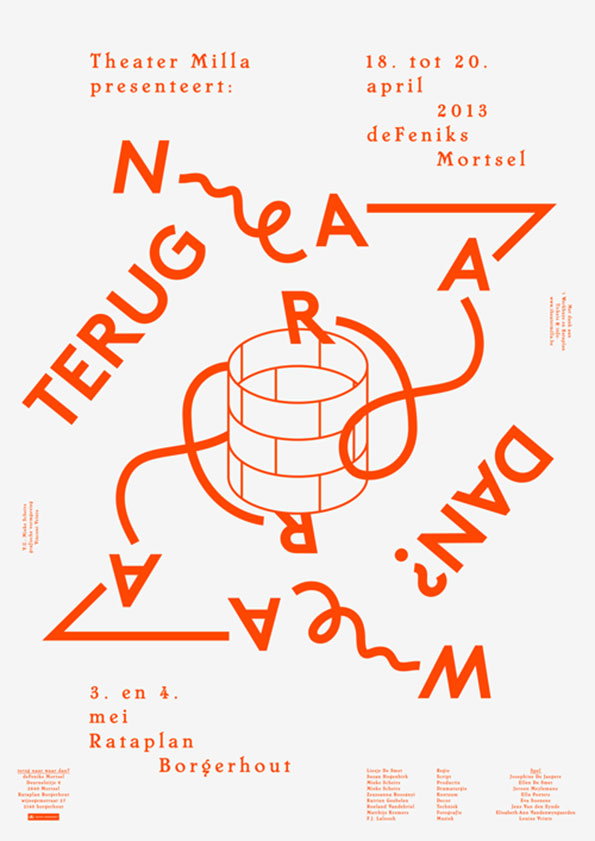
An orange and white poster for a production by Theater Milla. The central illustration shows a line of text wrapping around a 3D cylinder, reading “Terug naar waar dan?”. The top of the poster lists the dates “18. tot 20. april 2013” at deFeniks Mortsel. Further dates and the location “Rataplan Borgerhout” are listed at the bottom.
Above

Vincent Vrints: Poster for Theater Milla

Share Article

About the Author

Maisie Skidmore

—

Maisie joined It’s Nice That fresh out of university in the summer of 2013 as an intern before joining full time as an Assistant Editor. Maisie left It’s Nice That in July 2015.


It's Nice That Newsletters

Fancy a bit of It's Nice That in your inbox? Sign up to our newsletters and we'll keep you in the loop with everything good going on in the creative world.