




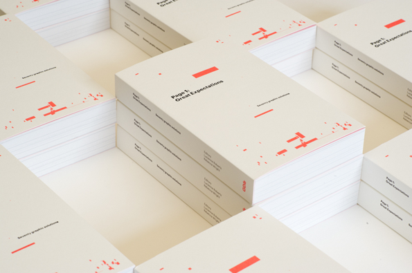
GraphicDesign& brilliantly reinterpret Charles Dickens' Great Expectations
If I really like a piece of writing I get an uneasy dip in stomach, not just because it’s moved me but out of annoyance because I didn’t think to write it first. It’s admiration more than anything, that’s what I tell myself anyway. With the classics I can’t really begrudge the ghost of an author, but I can clench my fists at their ability to get their writing to stand the test of time. Charles Dickens being one of them of course, who incidentally celebrates the bicentenary of his birth this year.
The people at GraphicDesign& are performing their own salutation to the author with their latest project Page 1: Great Expectations which brings together 70 leading designers and typographers and their interpretations of the first page of the Charles Dickens’ novel Great Expectations. It’s a wonderful idea and the results are even better being collated into book form. The relationship between layout, type and how we read books is all considered and it’s fascinating seeing the various interpretations creating new experiences for the reader of this well-known text.
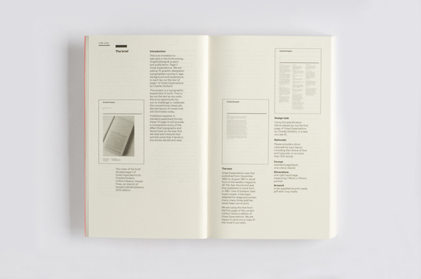
GraphicDesign&: Page 1: Great Expectations
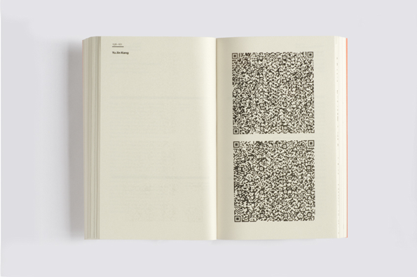
GraphicDesign&: Page 1: Great Expectations
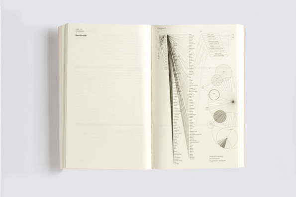
GraphicDesign&: Page 1: Great Expectations
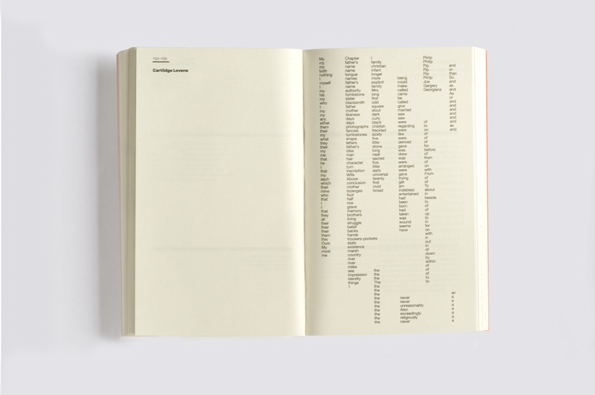
GraphicDesign&: Page 1: Great Expectations
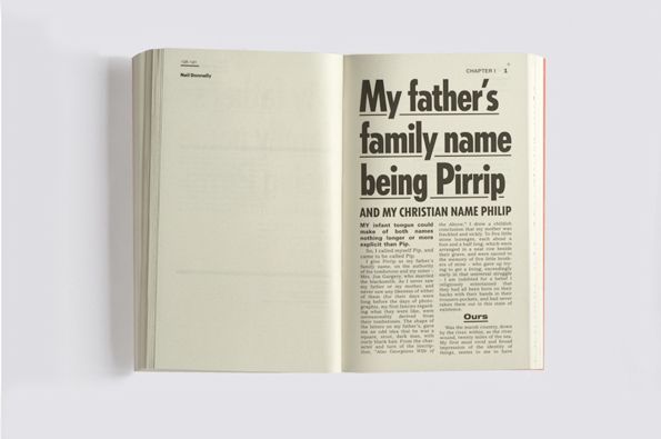
GraphicDesign&: Page 1: Great Expectations
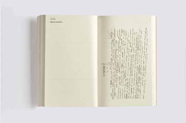
GraphicDesign&: Page 1: Great Expectations
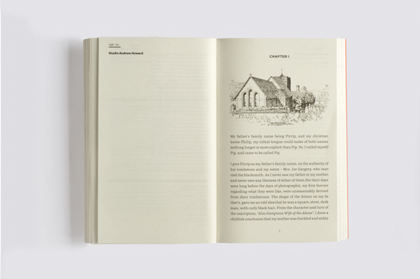
GraphicDesign&: Page 1: Great Expectations
Share Article
Further Info
About the Author
—
Rebecca Fulleylove is a freelance writer and editor specialising in art, design and culture. She is also senior writer at Creative Review, having previously worked at Elephant, Google Arts & Culture, and It’s Nice That.


