




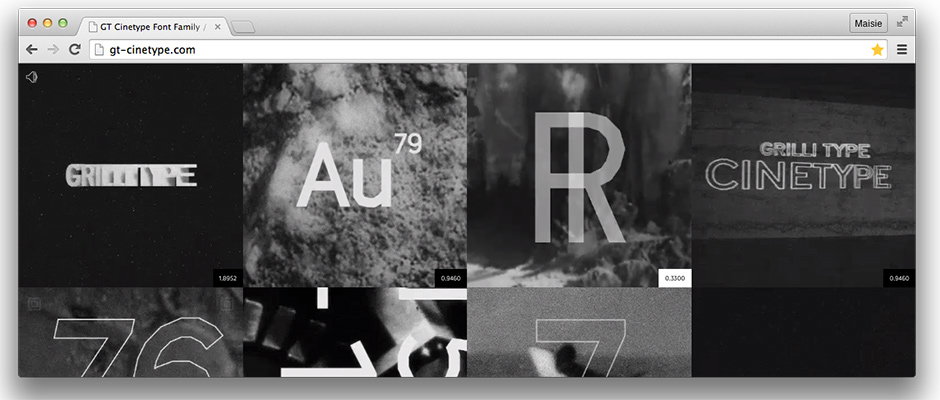
Grilli Type is back with a new cinema-inspired typeface. Live Long and Prosper!
It wasn’t long ago that we were singing the praises of Grilli Type, a foundry looking into new and innovative ways to show off the new typefaces that their designers produce, and coming up with fun and playful mini-sites in the process. Now we’re back to let you know that it has done it again for GT Cinetype, a font designed by Mauro Paolozzi and Rafael Koch, which was inspired by cinematic subtitles.
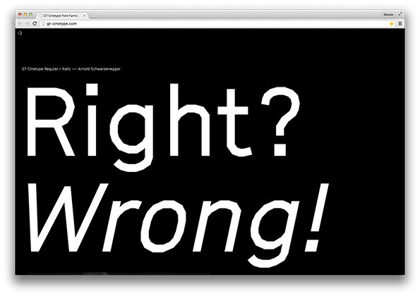
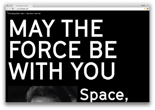
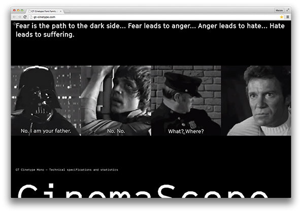
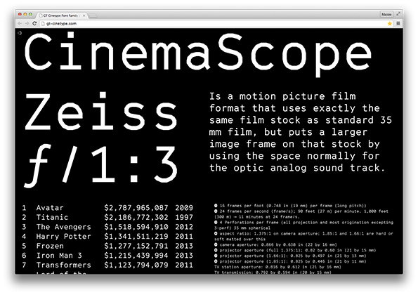
The corresponding site toys with iconic film scenes including moments from Star Wars and Pulp Fiction to present the various weights, and once again, it shows off each letterform to the very best of its abilities. We had a chat with Thierry Blancpain, co-founder of Grilli Type, to talk about GT Cinetype and the reasons behind creating a new mini-site for each new release.
What influenced the design of GT Cinetype?
GT Cinetype is inspired by an engineer’s font design for a subtitling machine by the now defunct Swiss company Cinetype AG. A laser set the type directly on the 35mm film by erasing the colour layer, and leaving behind a brilliant white layer of type. That laser could only move in straight lines. The typeface is our way of preserving that Swiss cinematic heritage in an age of digital Arial subtitles.
How does the typeface reflect this?
GT Cinetype is not a direct revival of that laser-based design, but is instead inspired by its process and many of its shapes. It was also designed to work better as a digital typeface. The typeface does not contain a single vector curve, and instead consists only of straight line segments. This leads to a mechanic look that is then softened with very human shapes like the lowercase a. The counters in a, e, g, and so on are kept very open to allow for the bold weight to work well despite the near mono-linear line-weight of the typeface.
"We find promotional texts for typefaces very boring – or plain wrong – most of the time, so we limit our writing about them to a level that we feel allows us to describe them clearly without becoming marketing bullshit."
Thierry Blancpain, Grilli Type
Are you big cinema fans?
We love movies, and are strongly influenced by them and pop culture in general. Our first studio featured huge posters of both Star Trek’s Spock and Arnold Schwarzenegger. On this note: Live Long and Prosper!
Will you continue to make a mini-site for each of the typefaces you design?
Yes, definitely. I love the challenge to show our typefaces in an interesting way on the web. We are generally invested in not simply releasing typefaces, but creating a visual world around them that reflects their concept and design. That way, the abstract black and white shapes become much more lively. Additionally, we find promotional texts for typefaces very boring – or plain wrong – most of the time, so we limit our writing about them to a level that we feel allows us to describe them clearly without becoming marketing bullshit. Everything else should be explained visually.
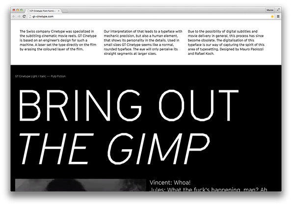
Grilli Type: GT Cinetype Mini-site
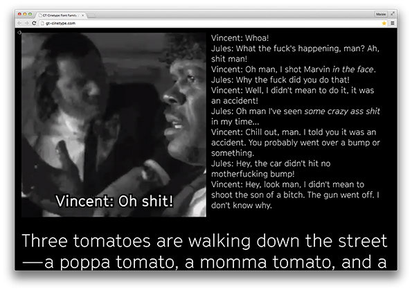
Grilli Type: GT Cinetype Mini-site
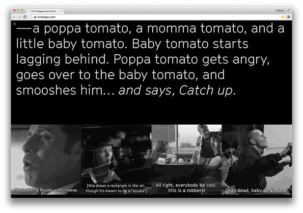
Grilli Type: GT Cinetype Mini-site
Grilli Type: GT Cinetype Mini-site

Grilli Type: GT Cinetype Mini-site
Grilli Type: GT Cinetype Mini-site
Grilli Type: GT Cinetype Mini-site
Grilli Type: GT Cinetype Mini-site
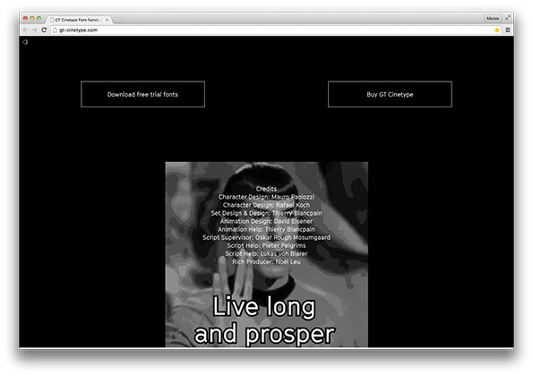
Grilli Type: GT Cinetype Mini-site
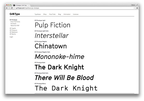
Grilli Type: GT Cinetype Mini-site
Share Article
Further Info
About the Author
—
Maisie joined It’s Nice That fresh out of university in the summer of 2013 as an intern before joining full time as an Assistant Editor. Maisie left It’s Nice That in July 2015.



