Launch Recite Me assistive technology
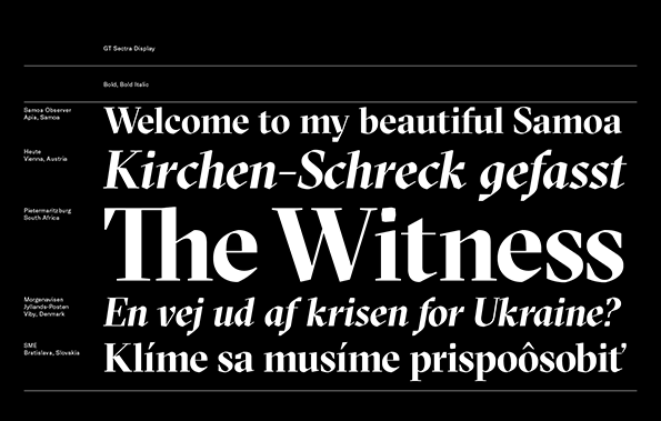
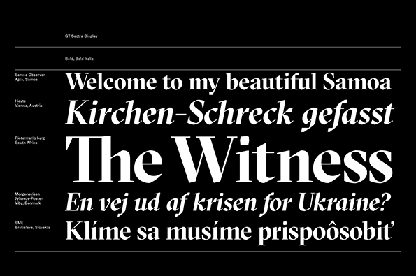
A typographic specimen for the font Gt Sectra Display, featuring white text on a black background. The layout showcases various weights and styles through headlines including “Welcome to my beautiful Samoa” and “The Witness”.

Graphic Design: Grilli Type produce a fantastically angular new typeface, GT Sectra

—
Date
23 April 2014

Swiss type foundry Grilli Type have just released GT Sectra, a bespoke typeface based on the calligraphic forms of a broad nib pen. Originally designed for Swiss news magazine Reportagen, GT Sectra was designed to be ornate in its construction, yet refined enough to be comfortably legible when used in long-form journalism. As a result the Grilli Type’s greatest efforts were spent refining and standardising the face beyond the remit of a traditional serif, paying particular attention to the proportions of the letterforms and the integration of capital letters. The resulting font families are beautifully angular – dispensing with curves almost completely – and distinctive for their obvious modernity despite being grounded in more traditional typographic practice.

GT Sectra is available exclusively through Grilli Type and can be downloaded as a trial version for free in advance of making a purchase.
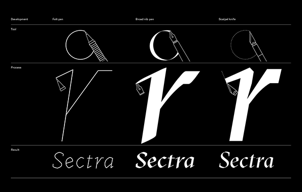
A diagram on a black background shows the development of the Sectra typeface. Three columns illustrate the tools used – a felt pen, broad nib pen and scalpel knife – alongside the resulting letterforms and the final “Sectra” wordmark.
Above

Grilli Type: GT Sectra

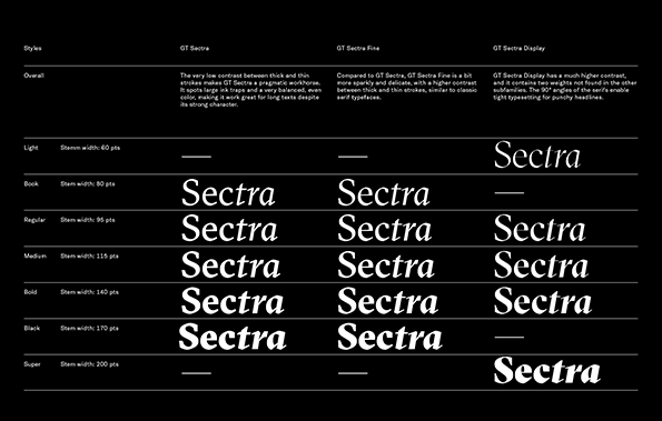
A typography specimen sheet for the GT Sectra typeface on a black background. The layout compares three versions – “GT Sectra”, “GT Sectra Fine” and “GT Sectra Display” – across various weights from “Light” to “Super”.
Above

Grilli Type: GT Sectra

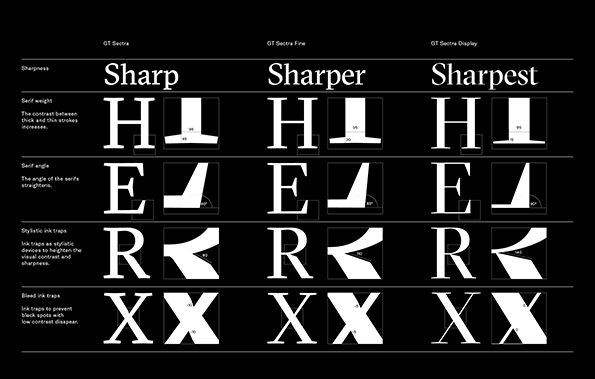
A typographic specimen chart on a black background compares three weights of the GT Sectra typeface. The columns are labelled “GT Sectra”, “GT Sectra Fine” and “GT Sectra Display”, with the corresponding headers “Sharp”, “Sharper” and “Sharpest”. Rows of letters demonstrate the evolution of serif weight, serif angle and ink traps. Each example includes a zoomed-in detail box with technical measurements to show the increasing contrast and sharpness.
Above

Grilli Type: GT Sectra

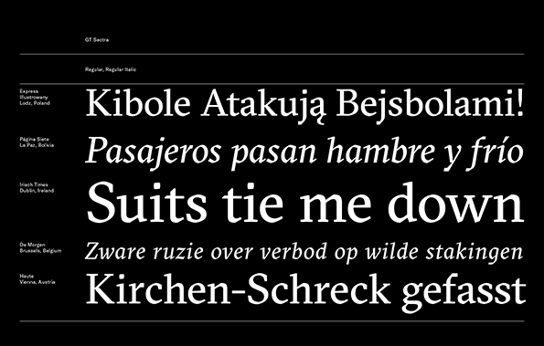
A typographic specimen for the GT Sectra typeface on a black background. Five headlines in different languages are displayed in white, including the English phrase “Suits tie me down”.
Above

Grilli Type: GT Sectra

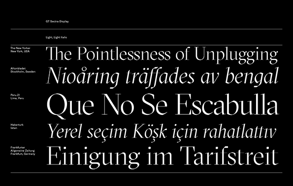
A typographic specimen for the GT Sectra Display typeface. Five lines of text in different languages are shown in light and light italic weights, including the English headline “The Pointlessness of Unplugging”.
Above

Grilli Type: GT Sectra

A typography specimen for the GT Sectra Display typeface. White text on a black background shows five headlines in different languages, including “Welcome to my beautiful Samoa” and “The Witness”.
Above

Grilli Type: GT Sectra

Share Article

Further Info

About the Author

James Cartwright

—

James started out as an intern in 2011 and came back in summer of 2012 to work online and latterly as Print Editor, before leaving in May 2015.


It's Nice That Newsletters

Fancy a bit of It's Nice That in your inbox? Sign up to our newsletters and we'll keep you in the loop with everything good going on in the creative world.