




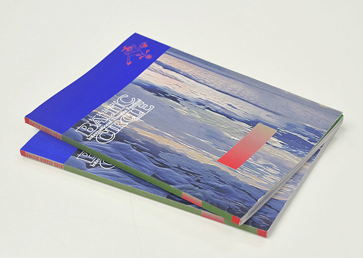
Finnish collective GRMMXI creates identity for Baltic Circle International Theatre Festival
GRMMXI is a group of 13 friends that eventually turned into a graphic design collective, based in Helsinki, Finland.
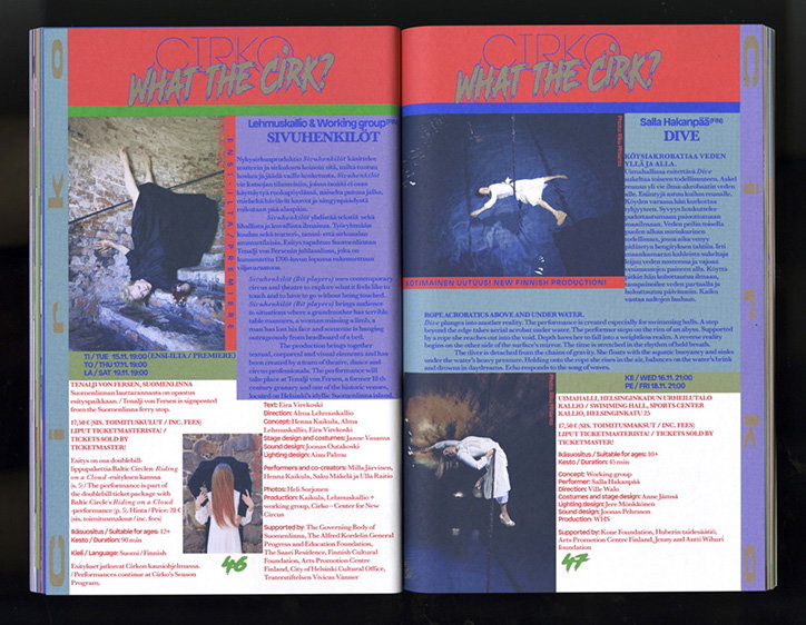
The studio were tasked with creating the visual identity for this year’s Baltic Circle International Theatre Festival after creating an award-winning identity for the previous year. “For the project, we set out to explore the boundaries of what constitutes a ‘visual identity’ by turning the design process upside down and inside out,” explains Samuli Saarinen, one of the members of GRMMXI. “We skipped the part where the designer would normally define a clear set of rules from which the outcomes would naturally emerge. This resulted in a visual mess of heterogeneous design artefacts that not only share the method behind them but becomes a sort of visual identity without the identity!”
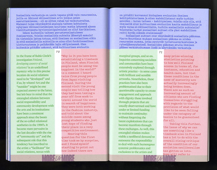
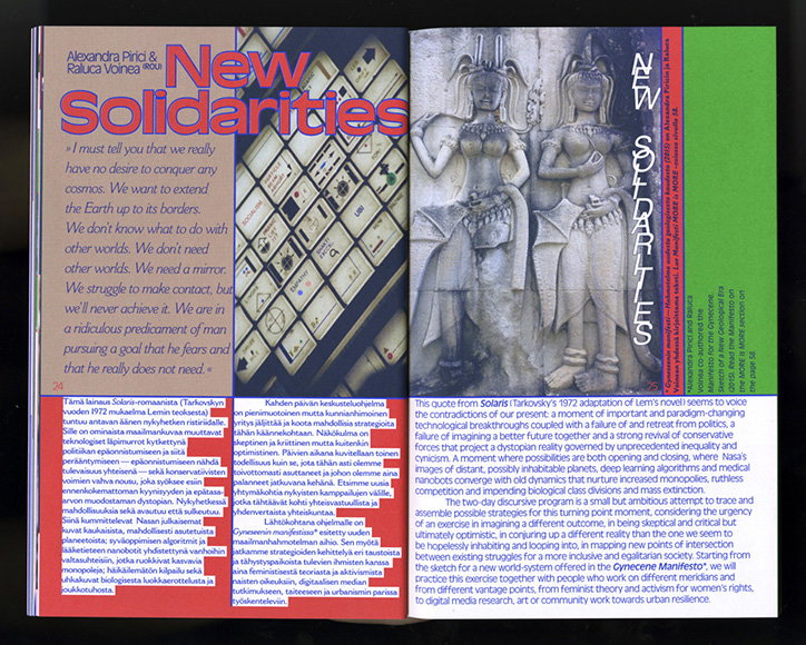
Creating posters, a catalogue and other festival materials, this collision of colour, ideas and styles could easily manifest itself into chaos. Yet the result is a vibrant, decade-blending and typography-merging identity that somehow comes together to create a cohesive idea. “When we pitched this to Baltic Circle we didn’t even present them with anything visual, just the idea for the design process and they were bold enough to embrace the uncertainty of the outcomes,” says Samuli.
The uncertainty was mildly controlled by having an open but clear approach. “On a very practical level, for example, the catalogue was designed by giving each designer a couple of spreads to do anything with – the outcome was a booklet where all the spreads looked very different. Simple as that,” the designer explains.
The uninhibited nature of the festival identity is similar to the studio’s ethos as a whole, where Samuli wouldn’t describe GRMMXI’s style as “visual” but rather a culmination of “anarchic and often conflicting design powers.” He explains: “I guess we try to resist the pull towards homogeneity, a tendency almost essential to design thinking as we know it.”
GRMMXI: Baltic Circle International Theatre Festival 2016
GRMMXI: Baltic Circle International Theatre Festival 2016
GRMMXI: Baltic Circle International Theatre Festival 2016
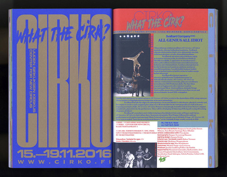
GRMMXI: Baltic Circle International Theatre Festival 2016
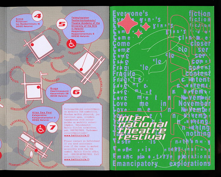
GRMMXI: Baltic Circle International Theatre Festival 2016
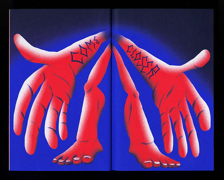
GRMMXI: Baltic Circle International Theatre Festival 2016
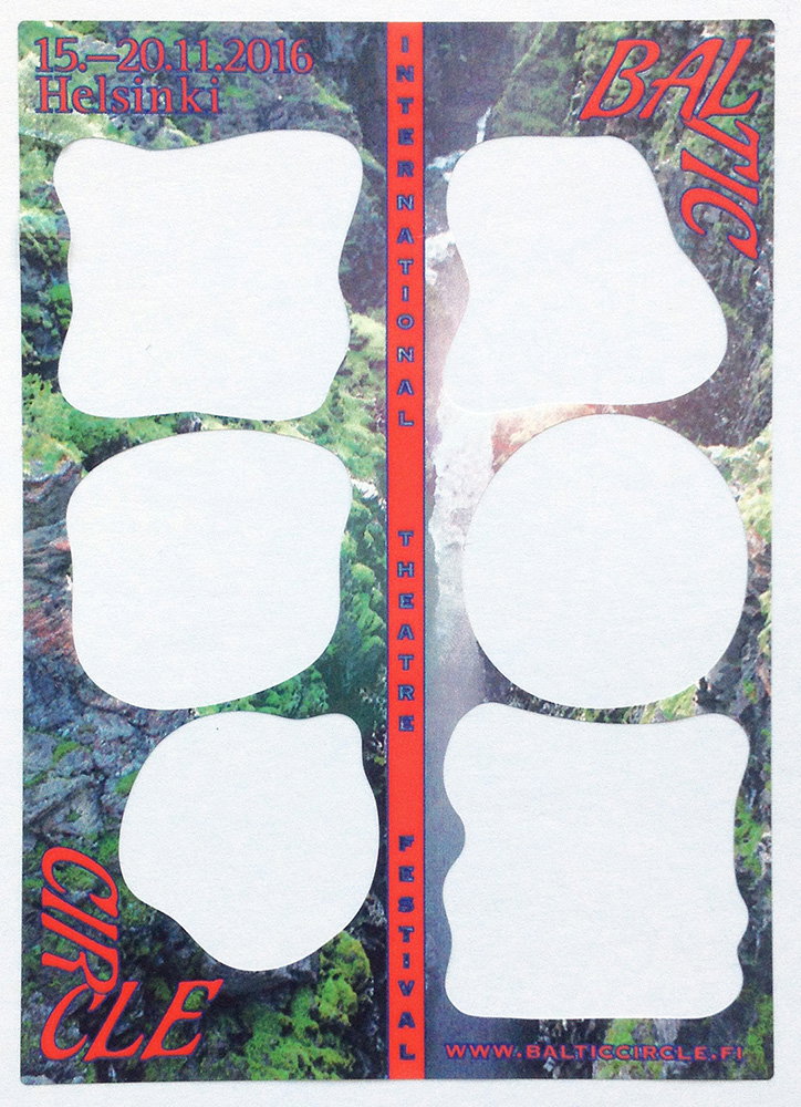
GRMMXI: Baltic Circle International Theatre Festival 2016
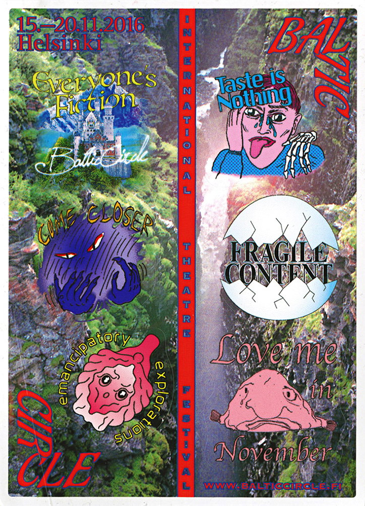
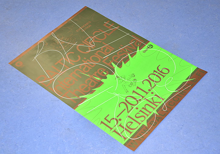
GRMMXI: Baltic Circle International Theatre Festival 2016
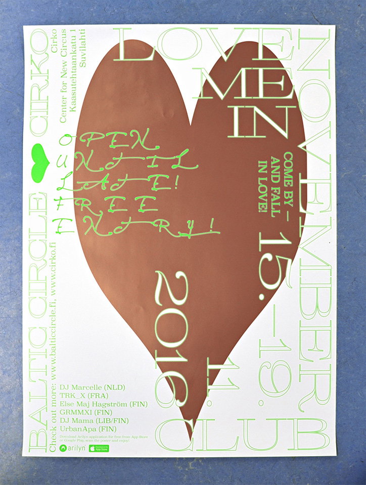
GRMMXI: Baltic Circle International Theatre Festival 2016
Share Article
Further Info
About the Author
—
Rebecca Fulleylove is a freelance writer and editor specialising in art, design and culture. She is also senior writer at Creative Review, having previously worked at Elephant, Google Arts & Culture, and It’s Nice That.



