




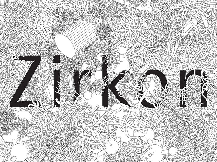
Grilli Type tells the story of GT Zirkon's gothic influences through animation
Independent Swiss type foundry, Grilli Type has become well-known for its retail and custom typefaces. But also, for the minisites which accompany them. Often utilising animation and a host of reference material, the sites break down the design process for each typeface, allowing the nuances of type design to be appreciated by type aficionados and novices alike.
“When we first started making these minisites, it came from a feeling that the presentation of typefaces lacked a sense of wonder, a sense of bringing the excitement of good type to a larger audience that might not care about the exact curvature on the lowercase “a” bowl, but that definitely can appreciate a joyous celebration of functional and beautiful shapes,” explains Grilli Type’s cofounder Thierry Blancpain. “If it’s teaching people a little bit more about type, and how they can use the typeface effectively, then that’s great as well.”
The foundry’s latest release, GT Zirkon is no different, featuring its own site which helps to explain how it came to be. Using animation as both an aesthetic and informative tool, the site details the san serif’s mix of historical and contemporary ideas, as created by Tobias Rechsteiner over a nine-year period.
“I was looking for a sans serif typeface that I could use for my own projects. It needed to have a good bit of personality but work across a wide range of uses, and I wanted it to be a little special – my own typeface, after all,” Tobias tells It’s Nice That. After creating an initial version of GT Zirkon, Tobias proceeded to utilise the typeface in various situations, adapting it as he saw fit. “When I needed another weight I would get started on that, when I needed italics, I would get started on them, and so on.”
Although not a direct replication of any specific typeface, GT Zirkon does include multiple ideas from 19th and 20th Century gothic typefaces. For example, its narrow character width, inward curls on letters like “C”, “G”, and “S”, and its higher than usual contrast.
An unusual feature of GT Zirkon is its family structure, with weights grouped into three sections. “GT Zirkon’s family structure and each style’s weight played an important role in the typeface’s development,” Tobias tells us, “The grouping in three parts is both functional and stylistic.” It’s in explaining this aspect that Grilli Type’s use of animation on its minisites is particularly evident. “Type design can be really complicated and also quite arduous,” Thierry adds, “Our animations try to strike a balance between that complexity of type and the very obvious end result: an ‘a’ is an ‘a’, after all. In short, we visually explain complicated processes in a relatively simple way.”
Across the site, animation is also used to visually underpin the concept behind GT Zirkon, with sprawling lines seeming to grow directly from the webpage itself. “GT Zirkon is named for the sparkling effect the high contrast between thin curve endings and the stems produce – like a crystal. Zirkon is named after the German name for zirconium, the fake diamonds,” Thierry outlines. Wanting to, therefore, create an organic, scientific visual world around the typeface, Grilli Type based the site’s animation off of a poster cofounder Noël Leu had created for the typeface. “We wondered how a website could look if you left it down there, under the mountain, and let it get overgrown a little bit.”
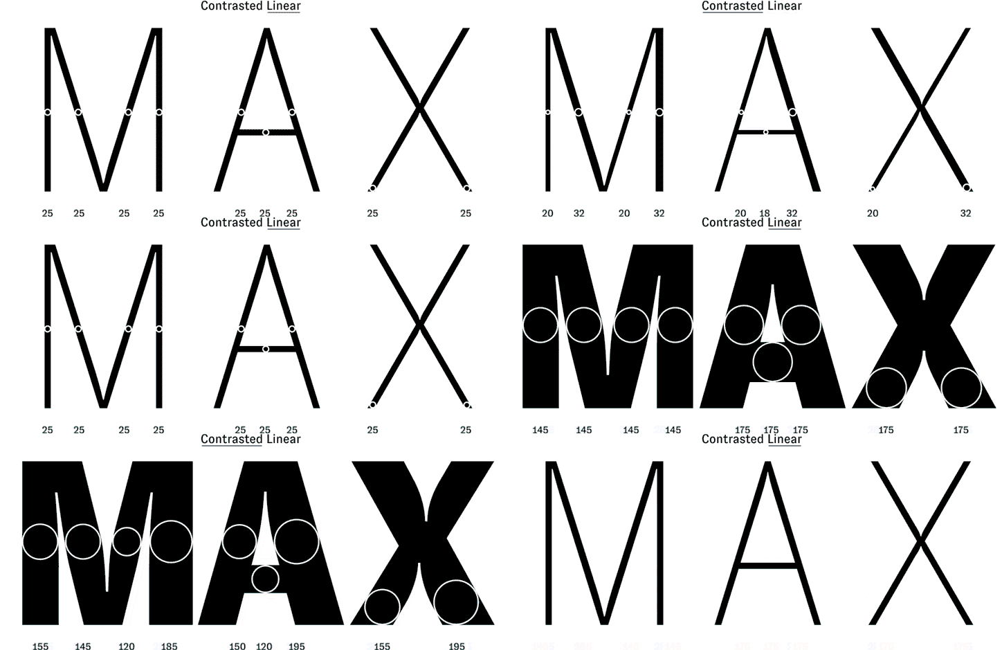
GT Zirkon: Tobias Rechsteiner and Grilli Type

GT Zirkon: Tobias Rechsteiner and Grilli Type
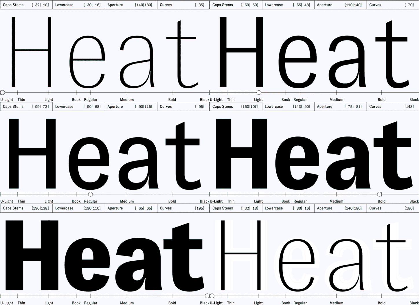
GT Zirkon: Tobias Rechsteiner and Grilli Type

Reference for GT Zirkon: Grotesque N. 10 – 1918 – Miller & Richard
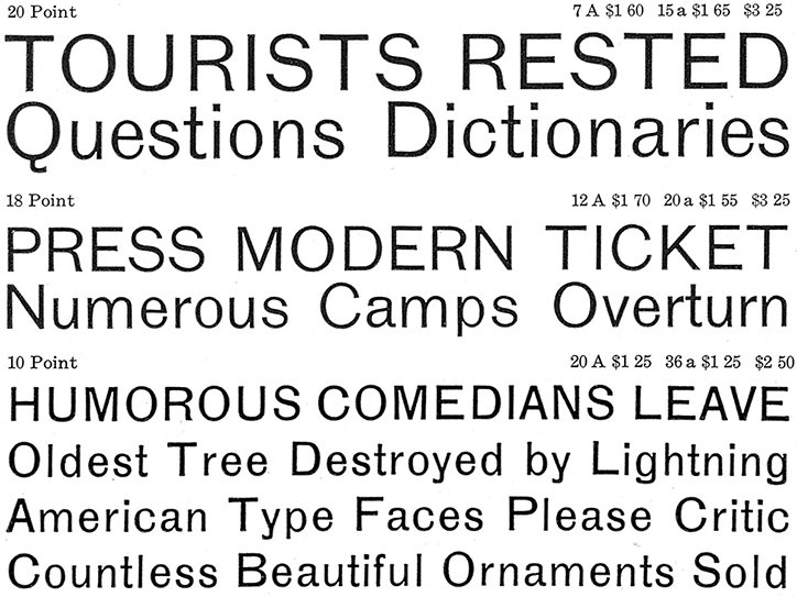
Reference for GT Zirkon: Inland Gothic No. 6 – 1898 – Inland Type Foundry
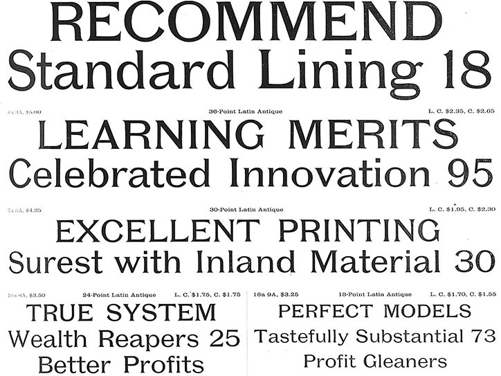
Reference for GT Zirkon: Poster Latin Antique – 1897 – Inland Type Foundry
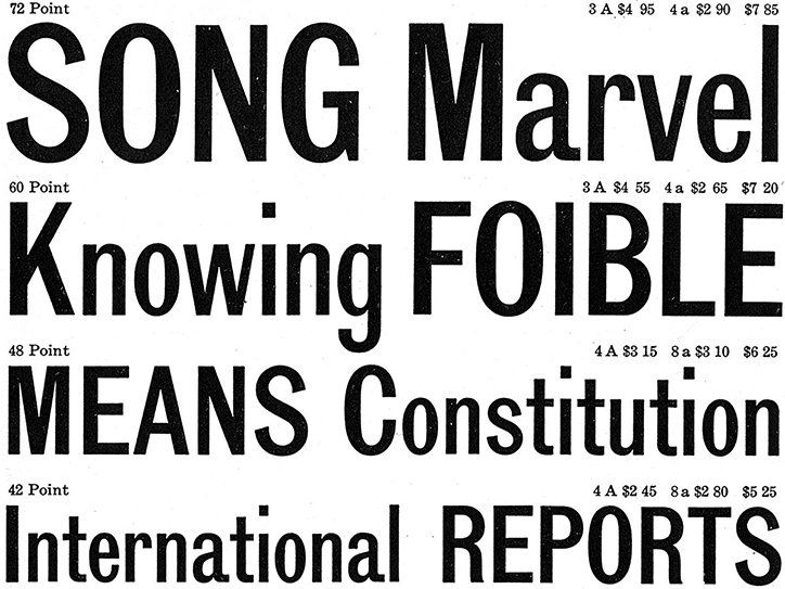
Reference for GT Zirkon: Lining Gothic Condensed – 1906 – American Type Founders
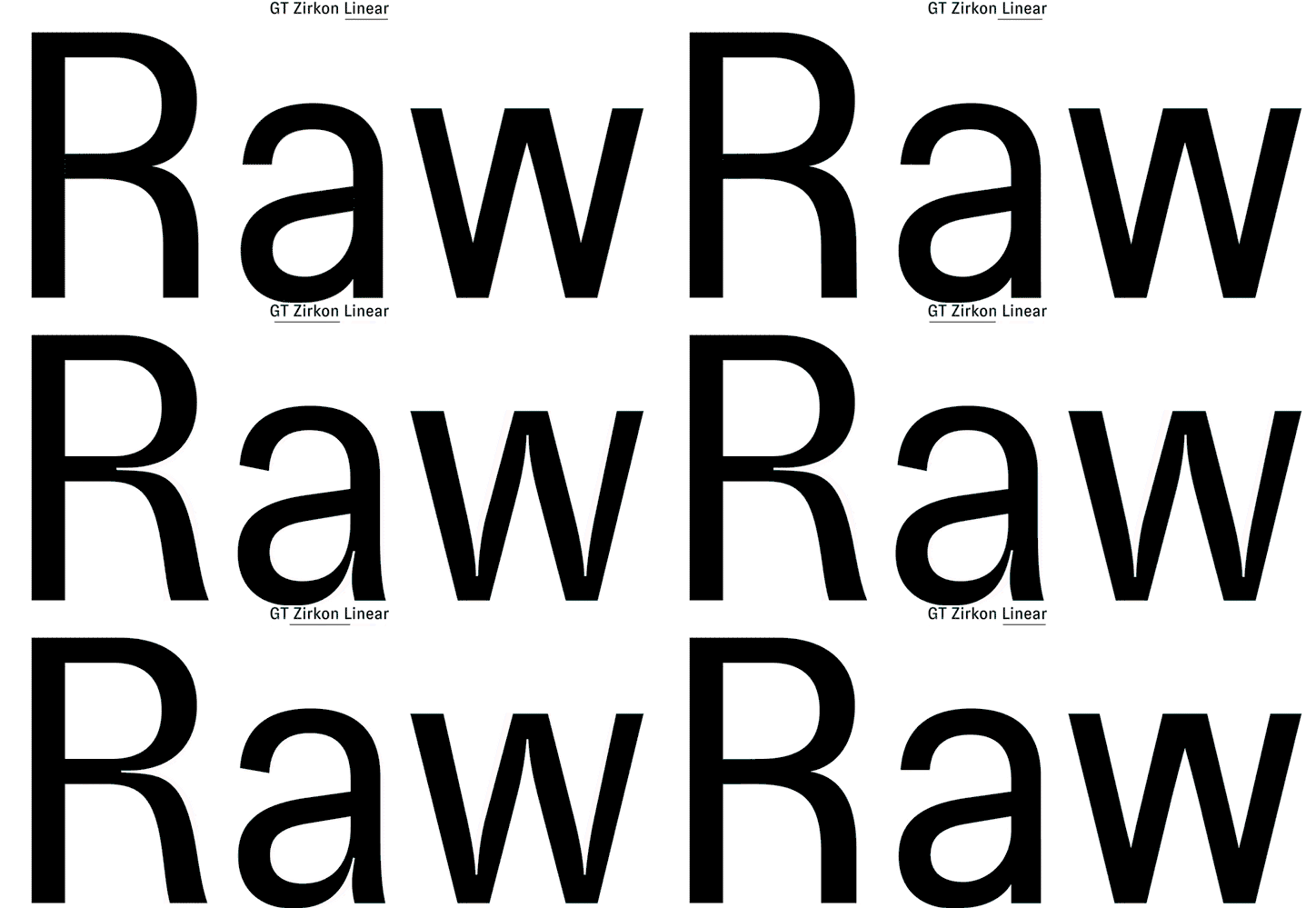
GT Zirkon: Tobias Rechsteiner and Grilli Type
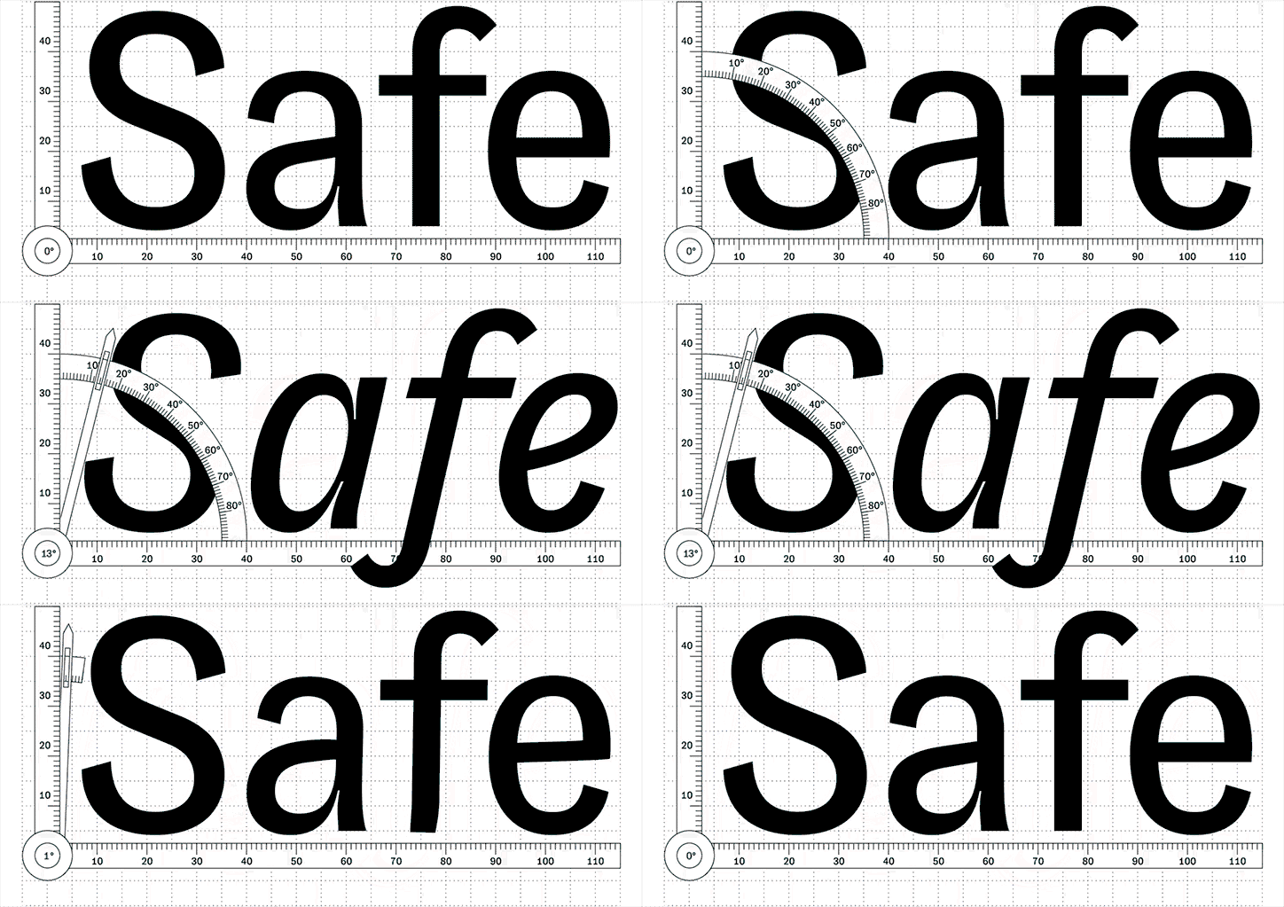
GT Zirkon: Tobias Rechsteiner and Grilli Type
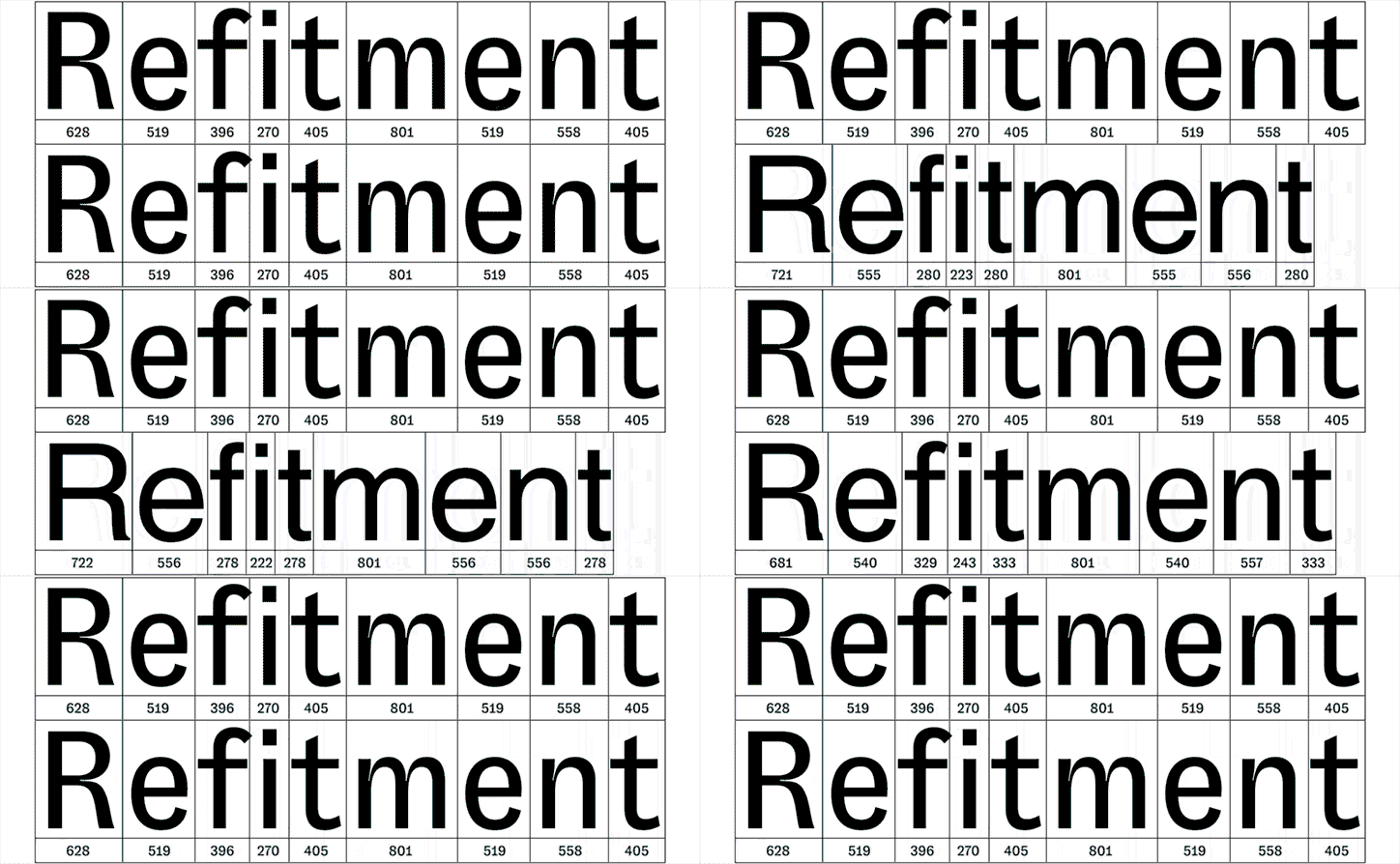
GT Zirkon: Tobias Rechsteiner and Grilli Type
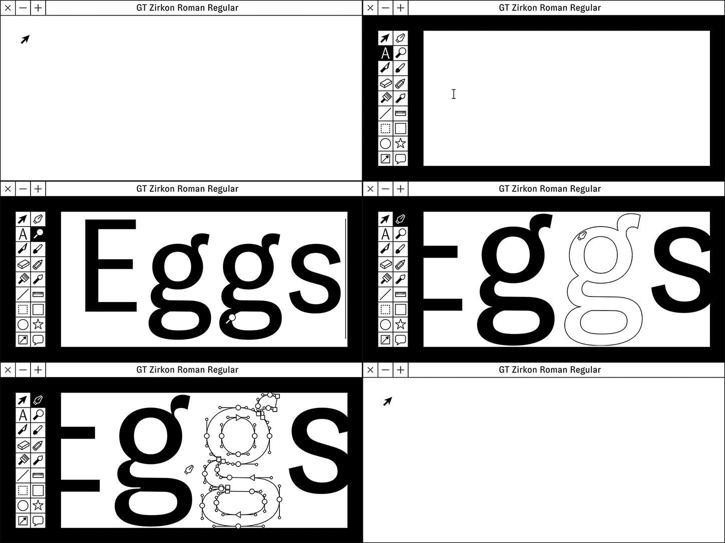
GT Zirkon: Tobias Rechsteiner and Grilli Type
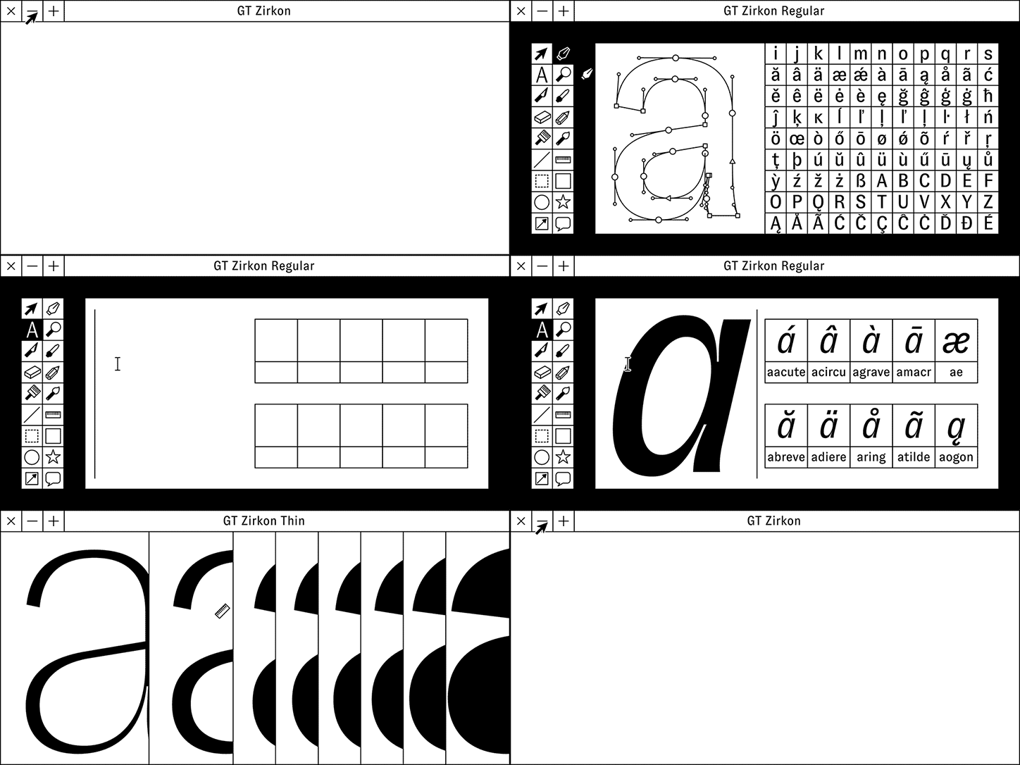
GT Zirkon: Tobias Rechsteiner and Grilli Type
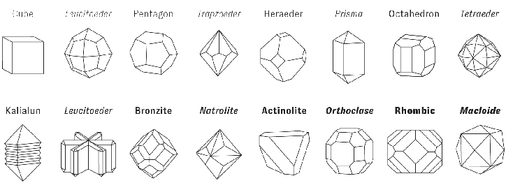
GT Zirkon: Tobias Rechsteiner and Grilli Type
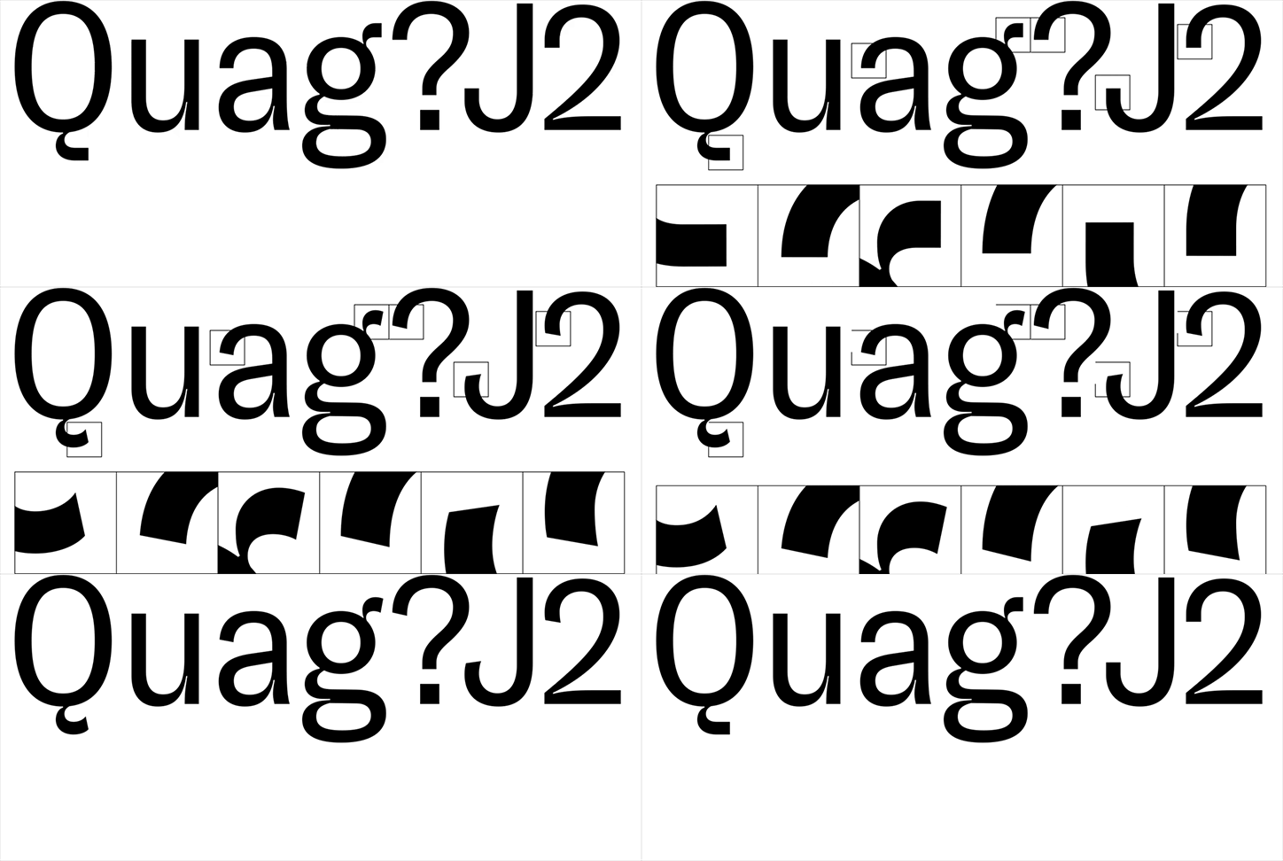
GT Zirkon: Tobias Rechsteiner and Grilli Type
Share Article
Further Info
About the Author
—
Ruby is Senior Creative at It's Nice That, overseeing our visual output across platforms and projects. Before that, she was associate editor on the editorial team, after joining in September 2017 following graduation from Central Saint Martins.

