Launch Recite Me assistive technology
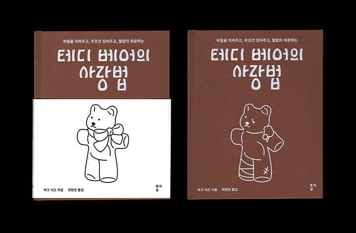
Two copies of a brown book featuring a white line drawing of a teddy bear. The cover includes Korean text, with the largest words reading “테디 베어의 사장법”.

Hezin O’s portfolio is a refreshing mix of considered and well-executed projects

—
Date
5 May 2017

Seoul-based graphic designer Hezin O has a portfolio chock full of different projects from identities and posters to publications and business cards. “It’s still difficult to explain my style,” says Hezin. “I try to make choices that fit with me as a designer but also try things I’ve not attempted before, however small.”

Her work has pleasing colour palettes and crisp illustrations and graphics that sit alongside an array of sans serif typography that’s set in both English and Korean. Stand-out projects include a series of Riso-printed pamphlets for exhibitions and galleries, an identity for a community arts centre and Hezin’s own business card which is scattered with emojis.

As well as personal work, the designer’s portfolio also has lots of commissioned projects, and Hezin enjoys the challenge of working with a client. “When I’m doing a commercial project, I’m interested in finding and visualising clues the client throws at me in the first meeting. I don’t feel comfortable when the client says: ‘do whatever you want’,” she says. “I love to know their ideas about the project, but I don’t take them all on board, I leave what I don’t need and then find the direction of the work. They know my work and like my style, so I just focus on how to conceptualise the project.”

Hezin’s work is considered and well-executed, and avoids over-designing her projects, simply focusing on strong composition instead. “Even if it is a small flyer, I try to always care about the small details, because such things gather to create the scenery of the project,” she explains. “I believe that it’s a good result if a work can convey that awareness of those finer attributes.”
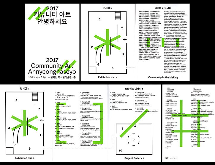
A layout of a gallery guide featuring floor plans and text. The cover reads “2017 Community Art Annyeonghaseyo” above the dates “2017.4.4–6.25”. The guide includes a map of “Exhibition Hall 1” and “Project Gallery 1”, with green arrows indicating the flow of the space. Accompanying text provides exhibition details and a list of participating artists.
Above

Hezin O

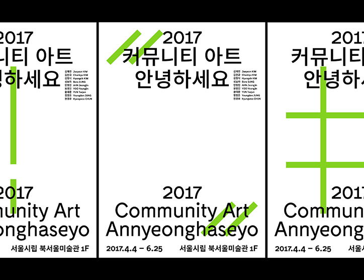
Three minimalist posters for an exhibition titled “2017 Community Art Annyeonghaseyo”. The layout features bold black typography on a white background, overlaid with bright green graphic lines.
Above

Hezin O

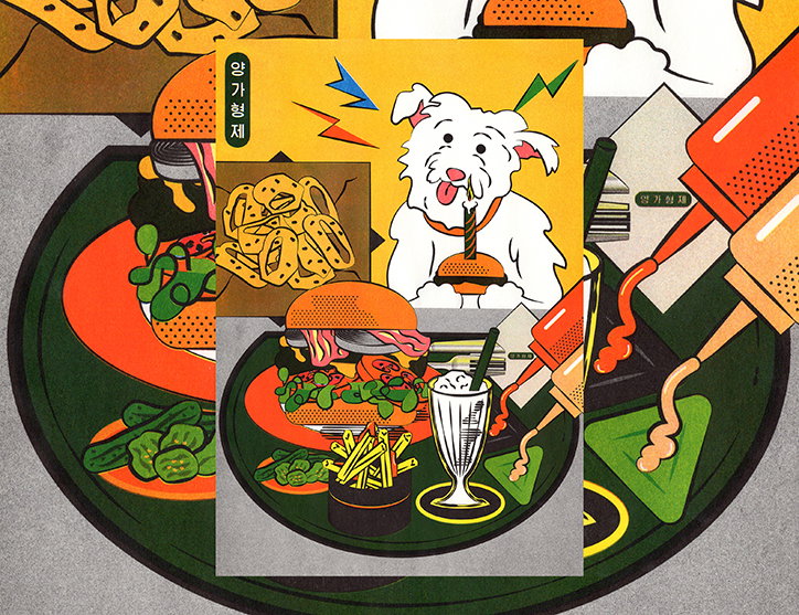
An illustration of a white dog with a candle in its mouth, sitting behind a burger. The image is a collage featuring a burger, fries and a milkshake on a dark green plate.
Above

Hezin O

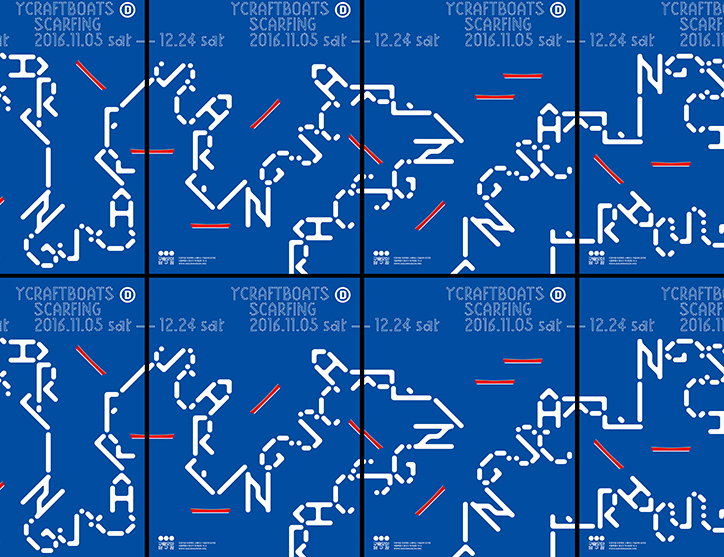
A grid of eight blue posters featuring white, abstract linear patterns and red accent lines. Each poster includes the text “Ycraftboats scarfing” and the dates “2016.11.05 sat – 12.24 sat”.
Above

Hezin O

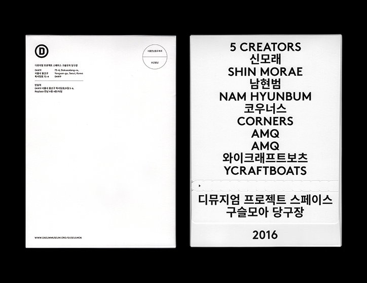
Two white cards set against a black background. The card on the right lists “5 CREATORS” followed by names including “SHIN MORAE”, “NAM HYUNBUM”, “CORNERS”, “AMQ” and “YCRAFTBOATS”, with the date “2016” at the bottom.
Above

Hezin O

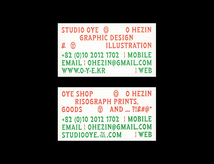
Two business cards with red and green text on a white background. The first reads “Studio Oye” and “O Hezin”, listing “Graphic Design & Illustration”. The second reads “Oye Shop” and “O Hezin”, listing “Risograph Prints, Goods & And... ?!&#@*”.
Above

Hezin O

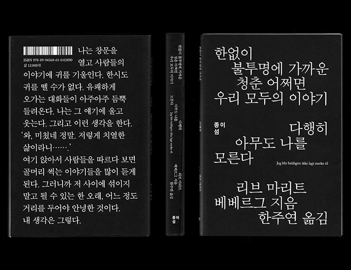
A black book cover and spine with white Korean text. The front cover features a bold title and the author’s name, “리브 마리트 베베르그”, with a small line of Danish text below.
Above

Hezin O

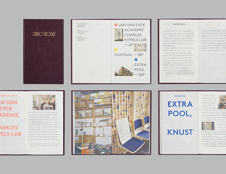
A series of open pages and a cover from a Risograph printed booklet titled “Riso Tour”. The layout features a mix of bold typography, Korean text, and photographs of interior spaces and architectural details.
Above

Hezin O

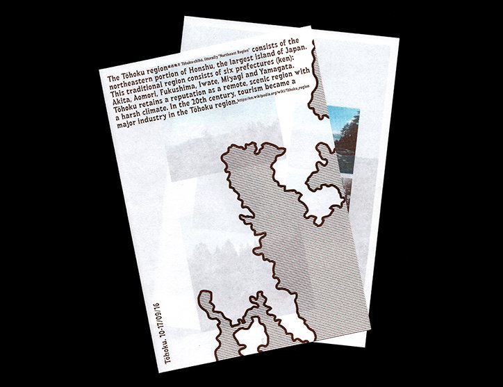
A printed page featuring a striped map of the Tohoku region of Japan. Text at the top describes the region’s geography and prefectures, while a vertical caption at the bottom reads “Tohoku. 10-17/09/16”.
Above

Hezin O

Share Article

Further Info

About the Author

Rebecca Fulleylove

—

Rebecca Fulleylove is a freelance writer and editor specialising in art, design and culture. She is also senior writer at Creative Review, having previously worked at Elephant, Google Arts & Culture, and It’s Nice That.


It's Nice That Newsletters

Fancy a bit of It's Nice That in your inbox? Sign up to our newsletters and we'll keep you in the loop with everything good going on in the creative world.