Meet the considerate and always collaborative work of studio HouseTMM
Already achieving a lot as a young agency, HouseTMM are a studio who remain future facing with an utmost respect and understanding of the past.
What do you get when you combine three inventive design graduates from the same 2018 class at the University of Utrecht? Well, you get the young but formidable design agency HouseTMM, based out of Amsterdam and Utrecht – formed of dream team Thomas van de Geest, Michaël Jovanović and Mischa Appel. Each with their own original perspective and individual expertise, the trio work supportingly of one another, responding to and respecting each of their practices and collective output. Quite the unique set up, HouseTMM is a design practice whose signature style is the way it works together, and not just the aesthetics it produces.
“We are all quite different, but we realised that we complimented each other when we collaborated,” the studio explain to It’s Nice That. Forming a strong friendship and working relationship since university, this existing chemistry meant it was only a matter of time before the group’s motivations turned towards wanting more creative control of projects. “We made the decision to start our own studio around the same time as the first coronavirus lockdown,” they recall. “We figured that this would be the best time to make a change,” as the group found independent working offered the chance to creatively grow, continue to learn and meet new people. This is why HouseTMM are often the authors of projects, flourishing in having total authority, and therefore a deeper involvement and connection to the design process. On top of this the studio also get to choose to work with the incredible and varying artists, designers and photographers that it wishes to – explaining “we really enjoy people that challenge our perspective.”
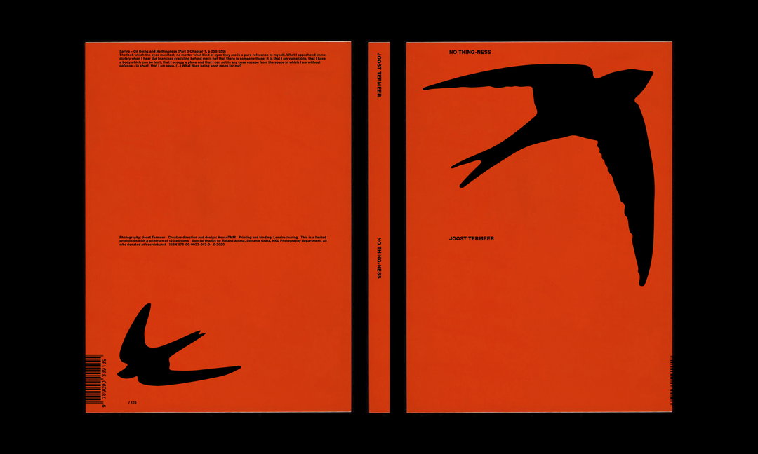
HouseTMM: No Thing-ness (Copyright © HouseTMM and Joost Termeer, 2020)
HouseTMM’s creative practice, complimentary to collaboration, is focused on curiosity and expectation. “We look at everything we do through the eyes of graphic designers,” the team explain, “and the things we love about design transcend specific media or output.” This results in work that finds its roots in traditional design theory and history, but is not directly referential. Instead, the joint practice is intent on remaining contemporary and original.
With this in mind, the trio tackle each project with the same understanding, enthusiasm and creative curiosity as the next, while the resulting work created is entirely individual to the brief. Similarly, HouseTMM thrive in tackling work that is privy to a strict, determined outcome, and the same for projects which grant total creative freedom.“We really appreciate the fluidity of our profession: shifting from big to small projects, or combining the cultural field with the commercial.”
This can range from identity design for the University of the Arts Utrecht’s digital graduation show – which represented the turbulence of this year’s graduates – to a collaborative photobook with photographer Joost Termeer, which saw the trio creating a delicate and intricate book split between photography and indexing.
Still a young studio, the team are currently trying to find their feet as an agency, but are fervently intent on expanding while maintaining the mix of commercial, artistic and collaborative projects. “It can be difficult being honest about your ambitions, doubts and current position in the field but we feel it is good to address these concerns as a young studio.” Admitting that it is a significant amount of hard work in the face of uncertainty, HouseTMM is learning to balance work, finances and passion projects, concluding that “in the end, we are really grateful that we have been able to start a studio in times like these.”
GalleryHouseTMM
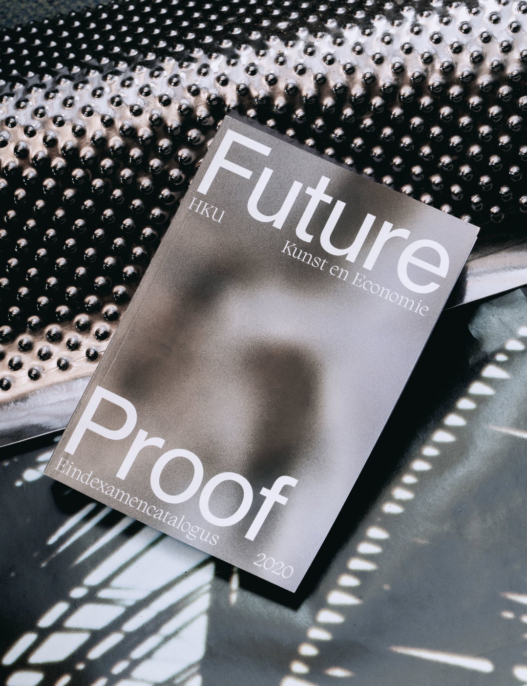
HouseTMM: HKU Future Proof Catalogue (Copyright © HouseTMM, 2020)
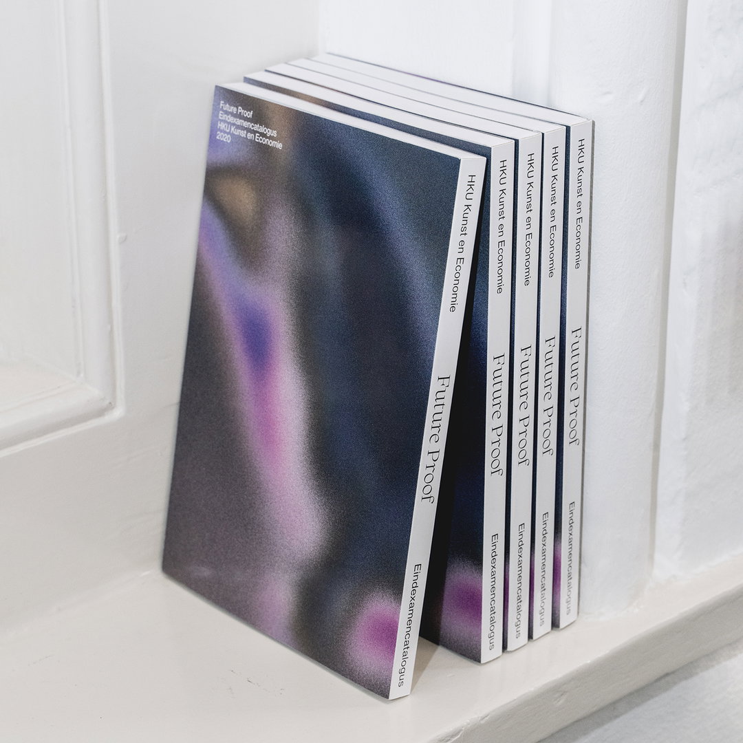
HouseTMM: HKU Future Proof Catalogue (Copyright © HouseTMM, 2020)
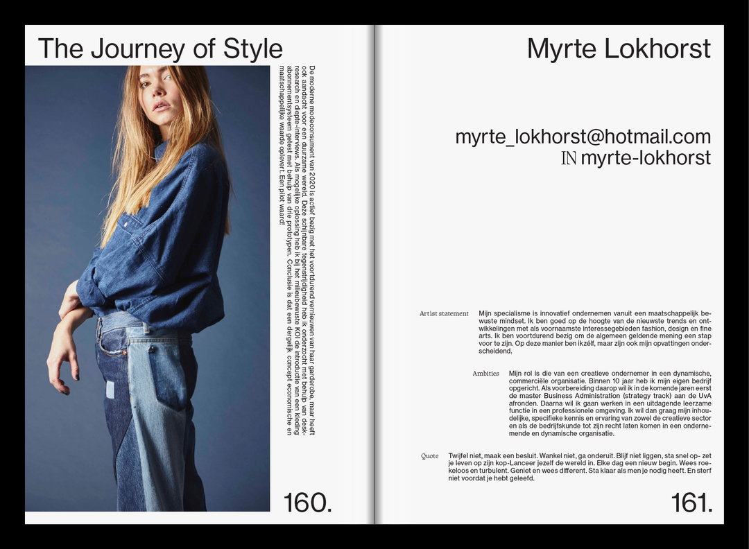
HouseTMM: HKU Future Proof Catalogue (Copyright © HouseTMM, 2020)
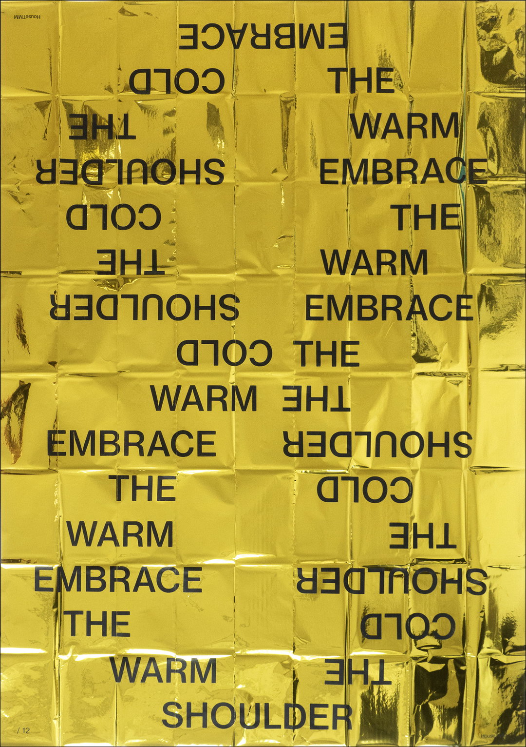
HouseTMM: The Cold Embrace (Copyright © HouseTMM & Clemency Newman, 2020)
HouseTMM: The Cold Embrace (Copyright © HouseTMM & Clemency Newman, 2020)
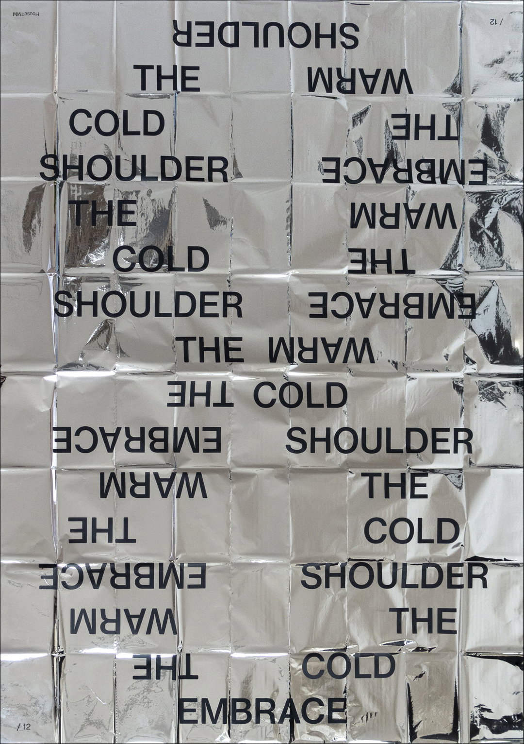
HouseTMM: The Cold Embrace (Copyright © HouseTMM & Clemency Newman, 2020)
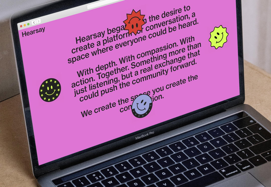
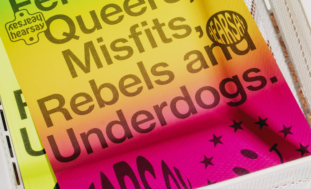
HouseTMM: Visual Identity and website for Hearsay (Copyright © HouseTMM, 2020)
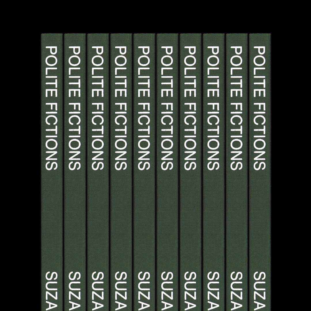
HouseTMM: Polite Fictions (Copyright © HouseTMM and Suzanne Schols, 2020)
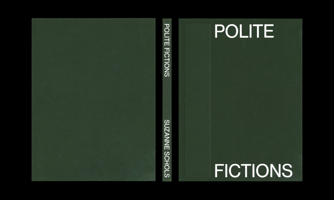
HouseTMM: Polite Fictions (Copyright © HouseTMM and Suzanne Schols, 2020)
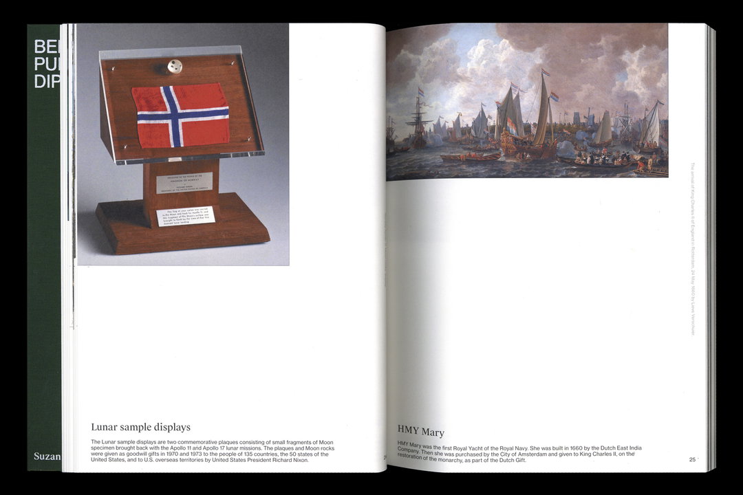
HouseTMM: Polite Fictions (Copyright © HouseTMM and Suzanne Schols, 2020)
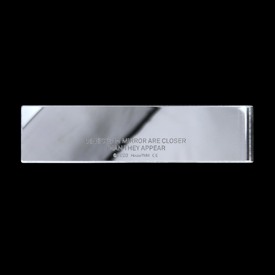
HouseTMM: Objects in Mirror (Copyright © HouseTMM, 2020)
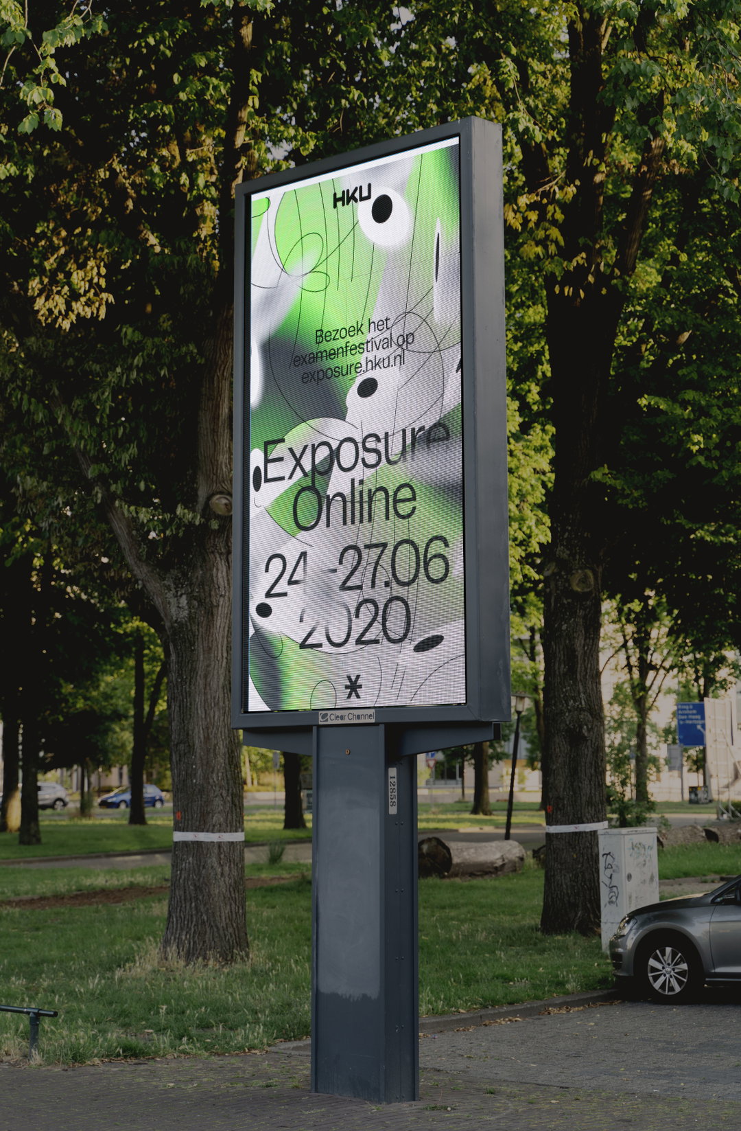
HouseTMM: Graduation show identity for The University of the Arts Utrecht (Copyright © HouseTMM, 2020)
Hero Header
HouseTMM: Visual Identity and website for Hearsay (Copyright © HouseTMM, 2020)
Share Article
Further Info
About the Author
—
Hailing from the West Midlands, and having originally joined It’s Nice That as an editorial assistant in March 2020, Harry is a freelance writer and designer – running his own independent practice, as well as being one-half of the Studio Ground Floor.