Launch Recite Me assistive technology
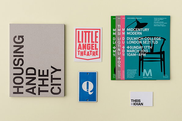
A collection of graphic design work laid out on a pale yellow background. A grey book cover reads “HOUSING AND THE CITY”, alongside a pink “LITTLE ANGEL THEATRE” logo and a blue sign featuring a white “Q”. To the right, a stack of teal posters reads “MIDCENTURY MODERN” and lists an event at Dulwich College.

Hyperkit's big, bold new website largely lets the work speak for itself

—
Date
5 March 2013

We were lucky enough to work with the talented folk at Hyperkit on our recent hunt for the Ideal Studio and so it was a pleasure to see they’ve just redesigned their own website. With big, bold, full-screen images of recent projects, a pleasingly straightforward swipe system and a journal where they can go into a bit more detail on their newest work, it’s a site befitting of a studio with such a big reputation.Content to let the visual quality of their work do most of the talking, it’s a refreshing change from the over-explained design statements we sometimes come across.
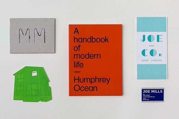
A collection of design objects on a white background. A bright orange book reads “A handbook of modern life – Humphrey Ocean”, flanked by a grey concrete block embossed with “MM” and a small green architectural model. To the right, a blue and white striped brochure reads “Joe and Co. Soho London” above a small navy business card for Joe Mills.
Above

Hyperkit: New website

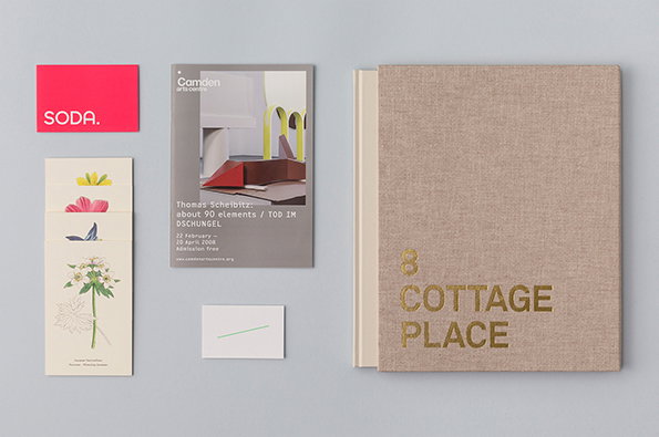
A collection of stationery and a linen-bound book laid out on a grey surface. The book features the gold-foiled text “8 COTTAGE PLACE”, alongside a pink card reading “SODA.” and a grey exhibition flyer for Thomas Scheibitz.
Above

Hyperkit: New website

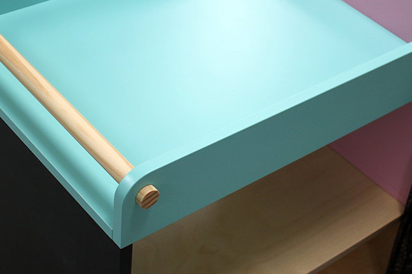
A close-up of a light blue shelf with a rounded edge. A thin wooden dowel runs along the front, held in place by a small circular wooden peg.
Above

Hyperkit: New website

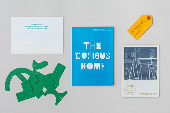
A collection of design materials laid out on a grey surface. These include a blue book titled “The Curious Home”, a white card reading “House of Propellers”, a yellow tag with the words “Cupboard Love” and a black and white photograph. A pile of green, abstractly shaped paper cut-outs sits to the left.
Above

Hyperkit: New website

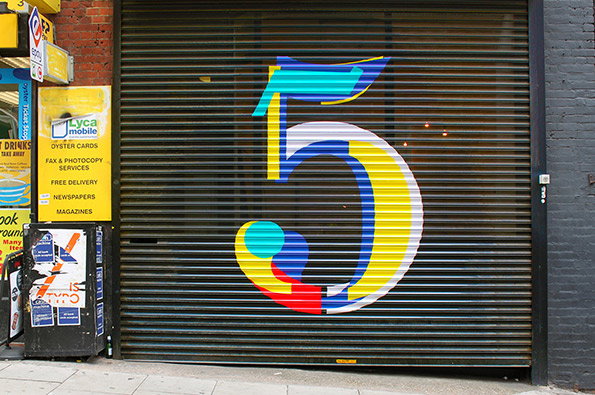
A large, colourful number “5” is painted across a grey metal security shutter. To the left, a yellow sign for Lyca Mobile lists services including “Oyster Cards” and “Fax & Photocopy Services”.
Above

Hyperkit: New website

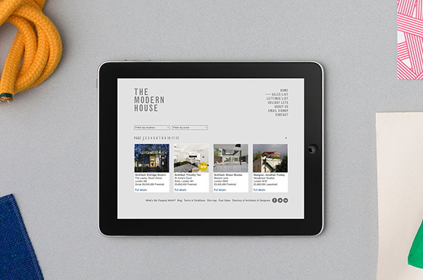
A tablet displays the website for “The Modern House”, showing a grid of architectural properties. The clean, white interface features a minimalist menu and a series of property listings with photos and descriptions.
Above

Hyperkit: New website

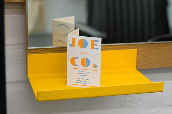
A white brochure with bold, colourful typography reads “JOE AND CO.”. It stands on a bright yellow shelf in front of a mirror.
Above

Hyperkit: New website

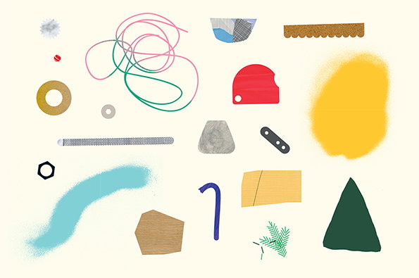
A collage of abstract shapes, lines and textures arranged on a pale cream background. The elements include a pink and green scribble, a yellow spray-painted blob and various geometric forms in red, blue and green.
Above

Hyperkit: Invented Objects print

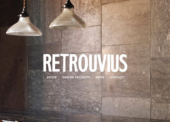
Two ribbed glass pendant lamps hang in front of a textured stone wall. Bold white text in the centre reads “RETROUVIUS”, with smaller links below for “STOCK”, “DESIGN PROJECTS”, “NEWS” and “CONTACT”.
Above

Hyperkit: Retrouvius website

Share Article

Further Info

About the Author

Rob Alderson

—

Rob Alderson is a freelance writer, editor and strategist. He was previously editor-in-chief of It’s Nice That and WePresent, and editor of Design Week. He publishes the newsletter Undo, which tries to make sense of how AI is changing design work, the design process and the design industry.


It's Nice That Newsletters

Fancy a bit of It's Nice That in your inbox? Sign up to our newsletters and we'll keep you in the loop with everything good going on in the creative world.