From hotel menus to event posters, Ian Miller knows how to create “stealable” graphics
The California-based graphic designer’s posters and menus for boutique hotels draw on gig posters and book covers from the 1960s and 70s.
When you stumble across Ian Miller’s portfolio on Instagram, you’d be forgiven for thinking that you’d discovered a rather well-curated archive of vintage poster designs. In reality, the majority of these posters are commissions. Alongside a few personal projects, Ian regularly creates flyers, posters, menus and merchandise for a range of boutique hotels and their affiliated bars and restaurants.
For the elegance and sophistication required by boutique hotel clients, Ian doesn’t go to the usual places for inspiration. Instead he prefers to delve through “old book and magazine covers, art exhibition posters, and gig flyers”, and often looks to the disciplines of paintings, sculpture and film to create his compositions. His menu for the Cafe Integral draws from 60s and 70s posters and book covers. The “clean and legible layout” is composed of geometric shapes and bold colours to distinguish the cafe’s range of “cold stuff”, “hot stuff” and “tea stuff.” For this project he was tasked with merging the aesthetics of two enterprises, the Cafe and the Freehand Hotel Chicago in which it is situated – “ultimately a blend of contemporary, minimal, eclectic and retro influences”.
Intrigued by the sheer abundance of graphic references which assemble in Ian’s portfolio, we wanted to know where Ian was sourcing his visuals. But rather than archival material, Ian usually crafts his own imagery from scratch or by deftly manipulating photographs he’s taken himself. This is an important aspect of his creative process as “it brings an extra layer of personality and specificity to a design”. Depending on the needs of a brief, Ian sometimes has to turn to imagery in the public domain. But in these cases, he never uses images without giving them a thorough “remix”, manipulating them heavily and making them his own.
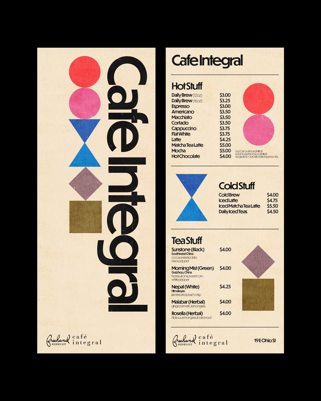
itm.graphics: Cafe Integral (Copyright © itm.graphics, 2020)
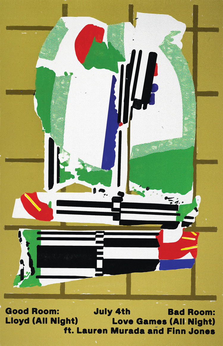
Alongside his work for hotels, Ian’s eclectic style has attracted a roster of clients in the music industry. For his “Punch House x Eccentric Disco” project he was asked to create a poster that would encapsulate the mood of the music event but also something that would be “stealable” – “essentially something especially eye-catching that you’d want to pull off of the wall of the venue so that you could hang it up in your home.” Rather than creating imagery for the poster, Ian designed some custom type for the word “Disco”, giving it an eccentric, 60s-style twist and a “vibrant, repetitive” colour scheme to evoke the “energy of the night and really emphasise the theme”.
His skill for capturing musical “energy” through type and visuals has recently led Ian to collaborate with Beloved, a Chicago-based micro record label started by some of his friends. Along with the label’s logo, Ian designed obi strips to accompany Beloved’s weekly playlist, curated by a different musician or artist each week. The collaboration has been one of his favourite projects to date: “I was given a ton of creative freedom and the flow / exchange of ideas felt very natural and reciprocal. Ultimately it was a project where many of my interests converged and it felt like everything just fell into place.”
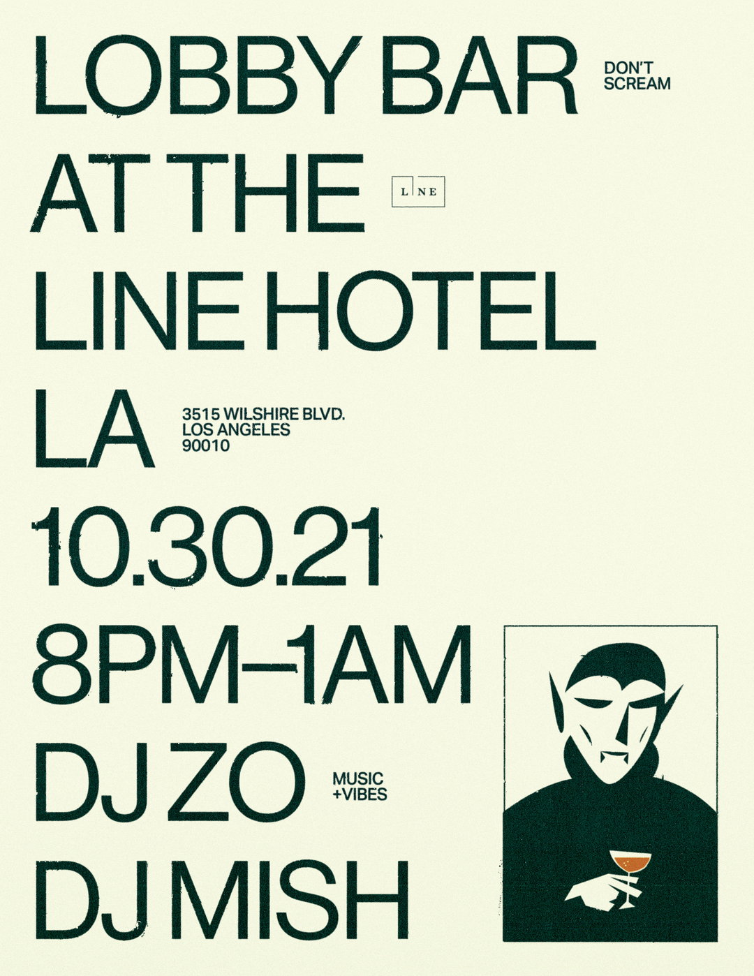
itm.graphics: Lobby Bar at LINE Hotel (Copyright © itm.graphics, 2021)
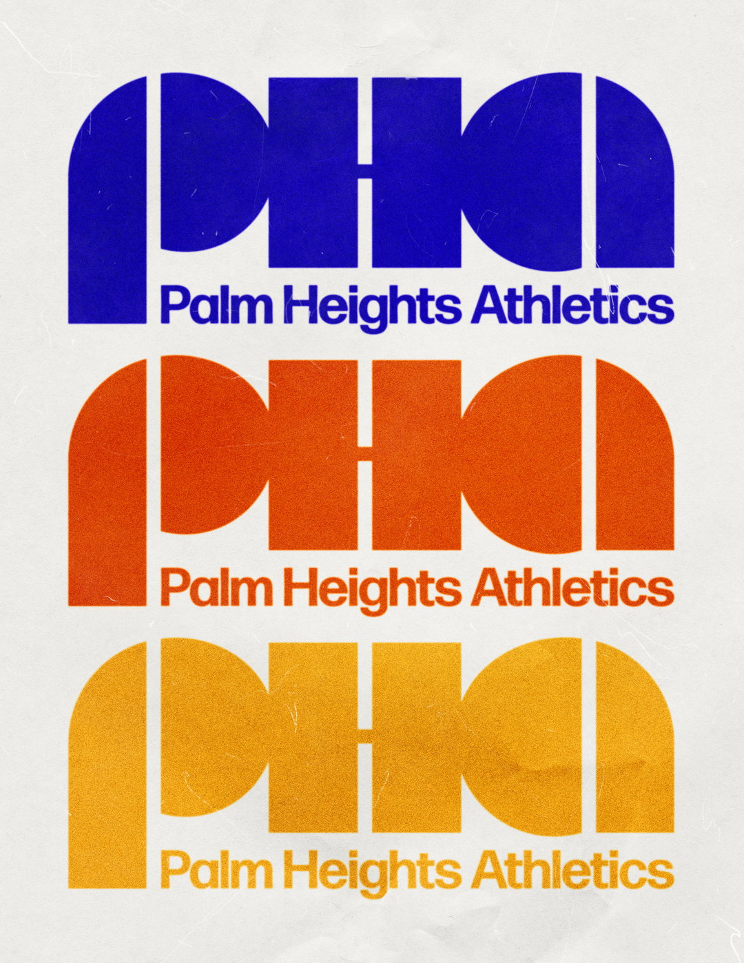
itm.graphics: Palm Heights Athletics (Copyright © itm.graphics, 2021)
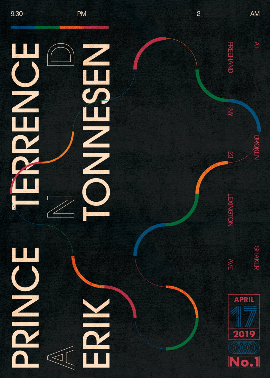
itm.graphics: Broken Shaker (Copyright © itm.graphics, 2019)
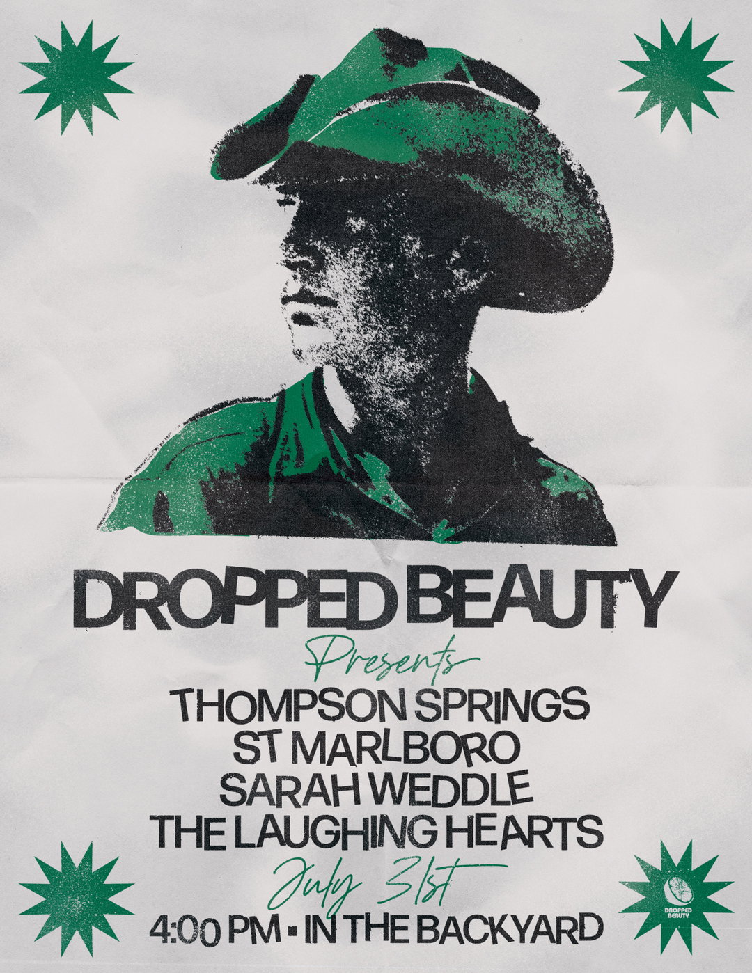
itm.graphics: Dropped Beauty (Copyright © itm.graphics, 2021)
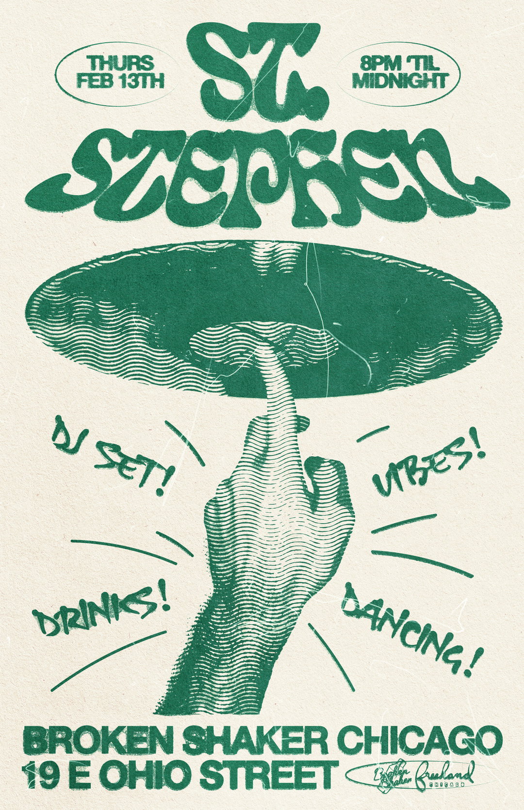
itm.graphics: Broken Shaker x St. Stephen (Copyright © itm.graphics, 2020)
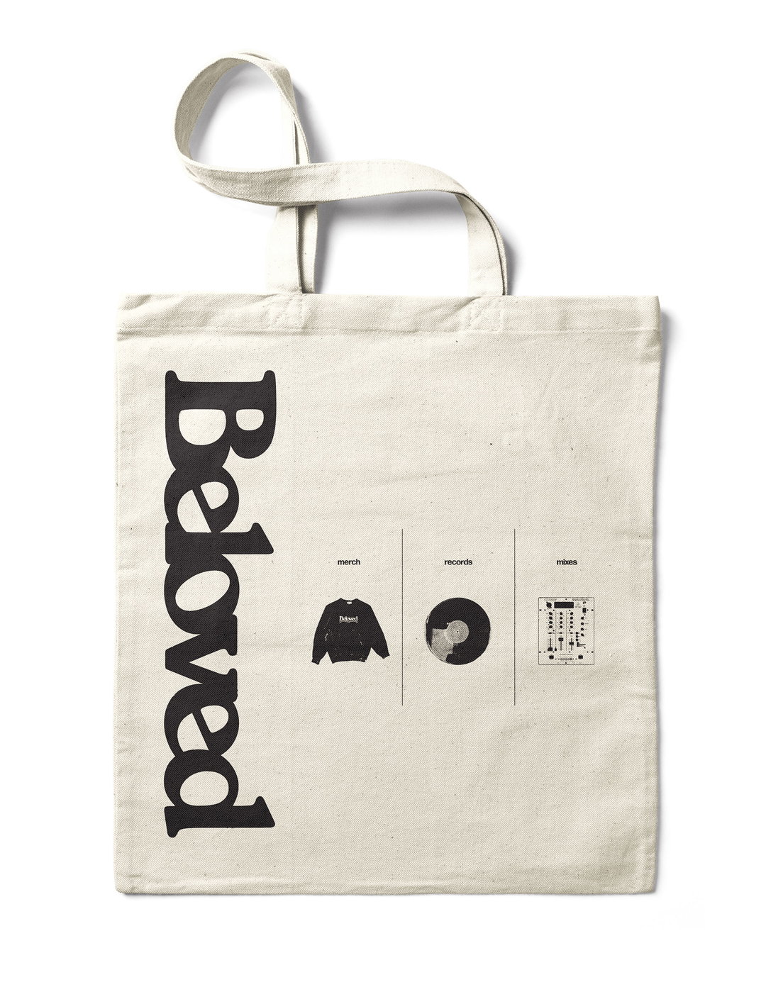
itm.graphics: Beloved Tote (Copyright © itm.graphics, 2021)
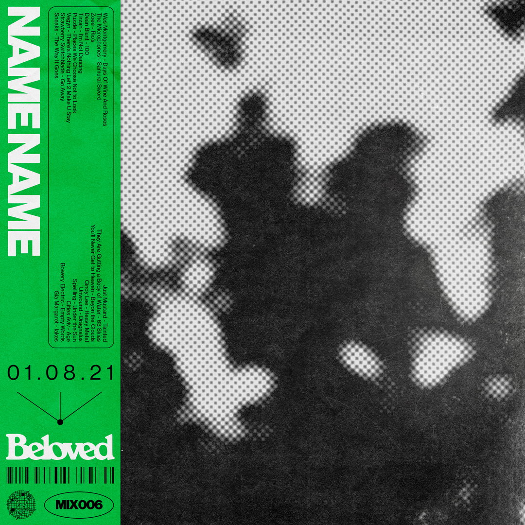
itm.graphics: Beloved Obi Strip (Copyright © itm.graphics, 2021)
Hero Header
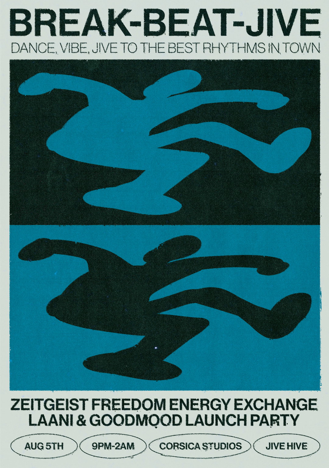
itm graphics: Break Beat Jive (Copyright © itm.graphics, 2021)
Share Article
Further Info
About the Author
—
Elfie joined It’s Nice That as an editorial assistant in November 2021 after finishing an art history degree at Sussex University. She is particularly interested in creative projects which shed light on histories that have been traditionally overlooked or misrepresented.