The experimental graphic design work of Ward Goes sits at the intersection of type and materiality
Giving branding a break and pursuing personal projects presented the Amsterdam-based creative with the chance to reconnect with graphic design as an explorative practice.
A graphic designer that isn’t limited to working in 2D, Ward Goes has been working in aluminium of late. His recent solo show in Rotterdam, Literally Anything, was full of things that moved beyond the screen or printed page, including some wonderful metal signage and archival storage. The exhibition at Alley Space was the result of the designer’s decision to pursue more tactical investigations alongside his commissioned work at the start of 2025. The show sought to respond to graphic design’s increasing categorisation as “a digital service, moving messages between audiences, often driven by strategy or commercial goals”, Ward says.
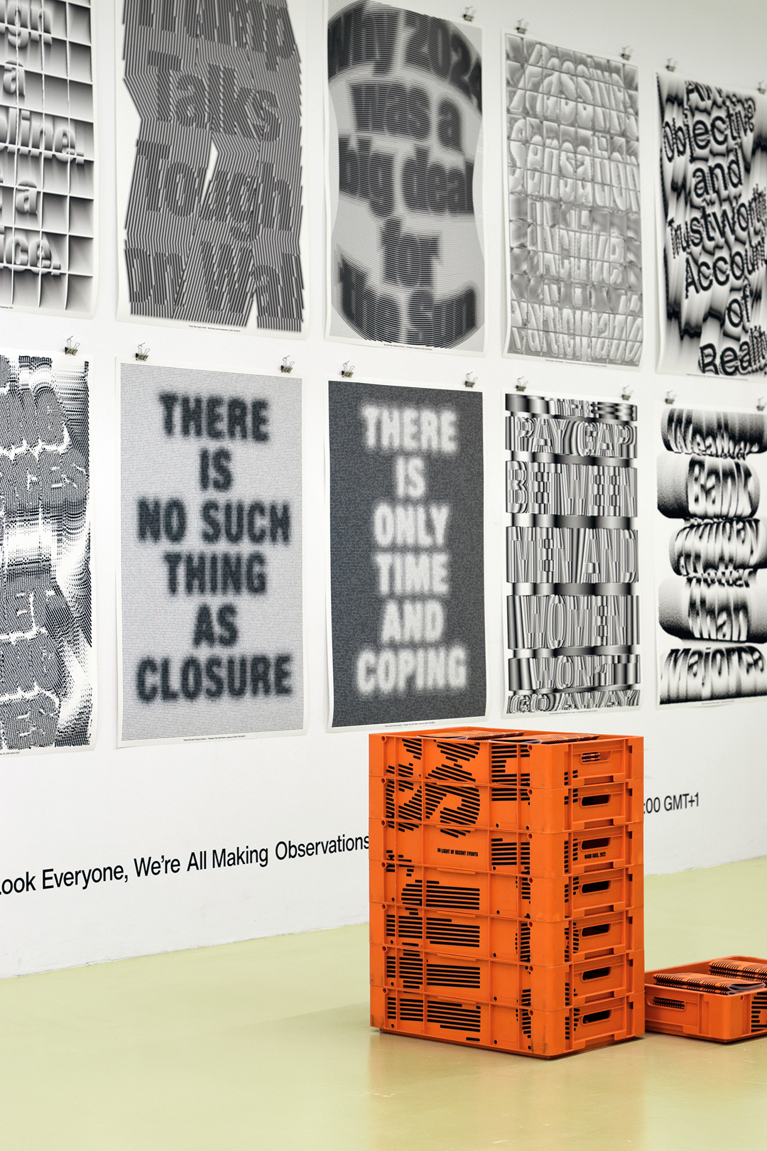
This display of the designers work also explored how the discipline, and typography in particular, interacts with the aesthetics of news media and public debate. It’s a topic that Ward’s 2021 series of silkscreens Truth’s Triptych and his 2022 self-published book, In Light of Recent Events also dealt with, through careful explorations of how things like type, image, layout and colour shape our understanding of media. These tactile investigations into the ways that images and headlines communicate urgency and immediacy bring type and materiality into play for the designer, drawing inspiration from “from everyday visual culture, such as shopfront typography and media aesthetics”, Ward says.
Whilst digital and commercial work is an inevitable part of the discipline, Ward has learnt to keep up the momentum of these personal projects and push them into exciting object-based outcomes alongside his commissions. While his branding visual identity work, publications and campaigns for clients like Issey Miyake and Onomatopee have perfected his detailed, colourful design style, these critically engaged independent projects draw on his background in cultural anthropology and present an opportunity for his work to be both “a carrier of information and an interesting design object at the same time, where visual form itself carries authorship and meaning, revealing how design can shape the way we see, interpret, and remember things,” Ward says.
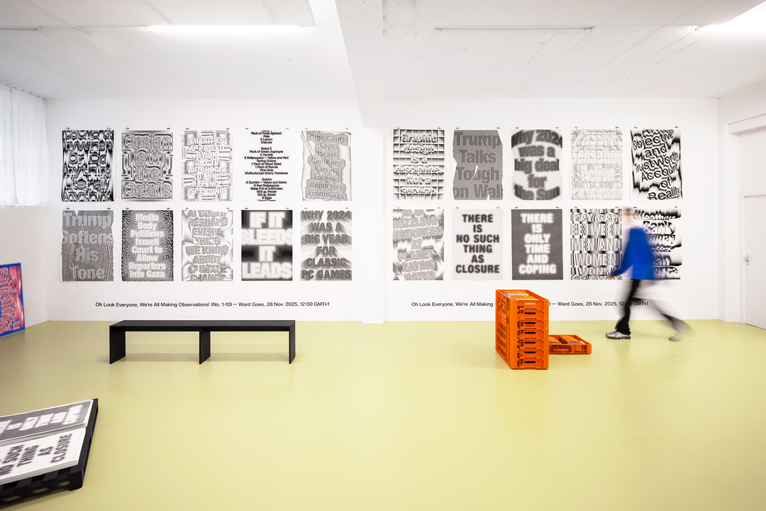
Ward Goes: Literally Anything (Copyright © Studio Ward Goes, 2025)
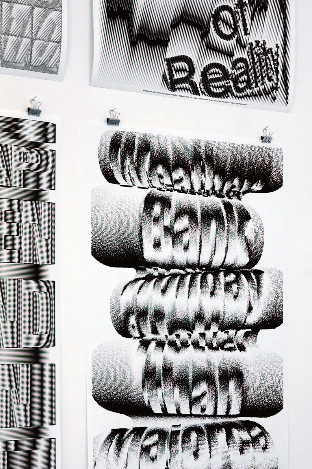
Ward Goes: Oh Look Everyone, We’re All Making Observations! (Copyright © Studio Ward Goes, 2025)
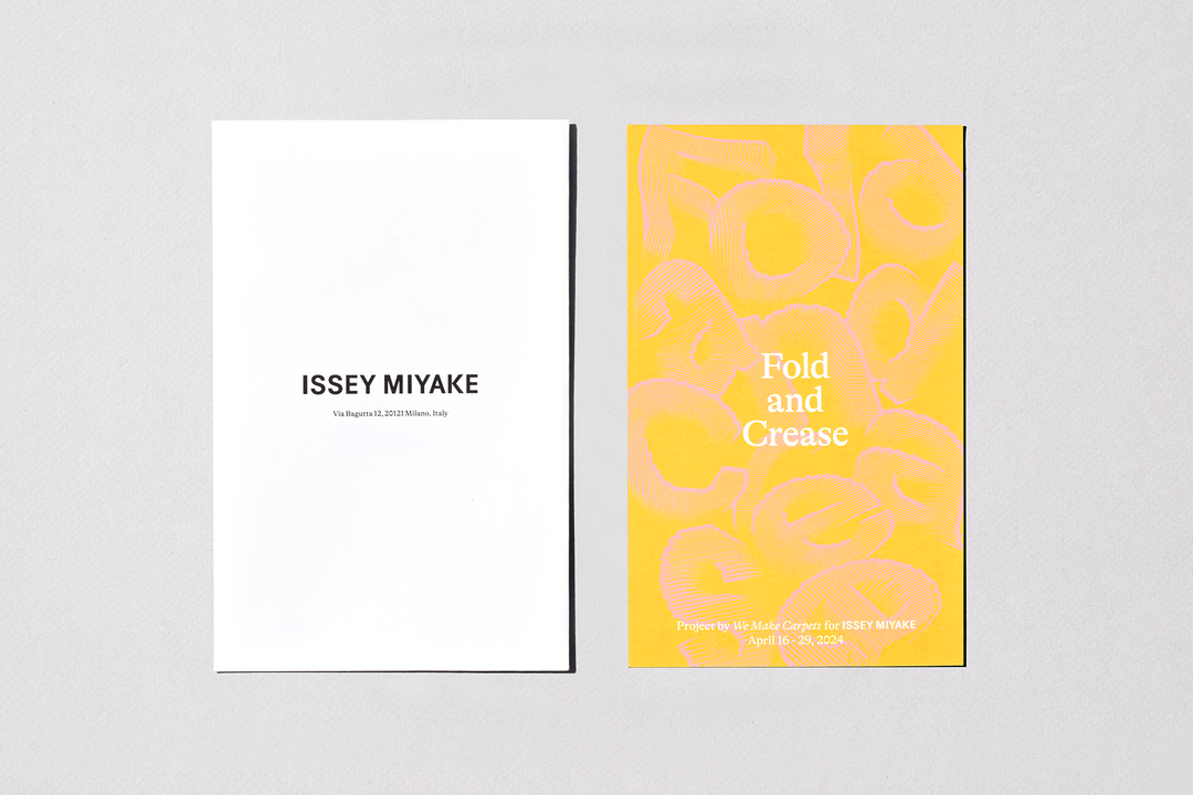
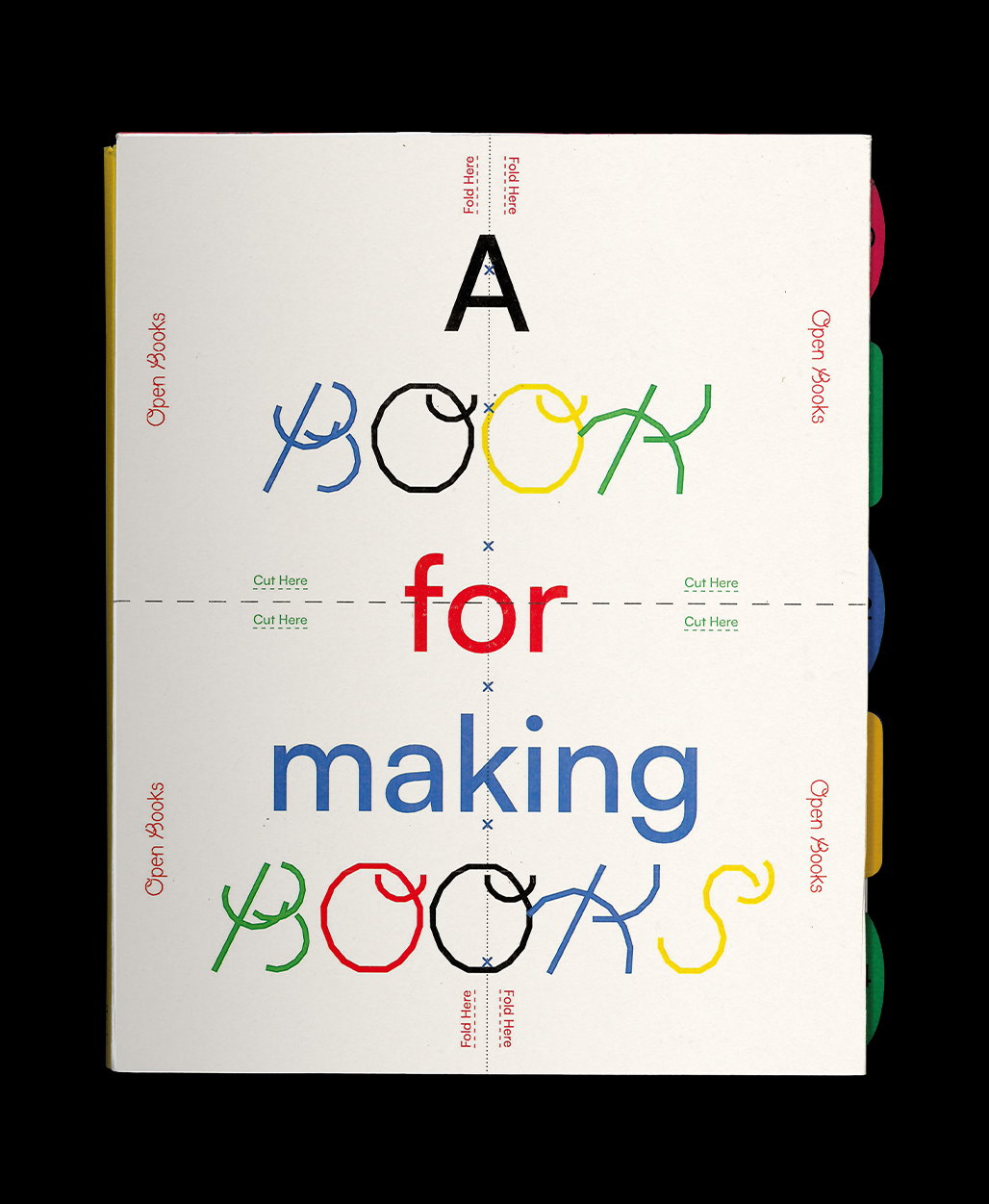
Ward Goes: Fold and Crease (Copyright © Studio Ward Goes, 2024)
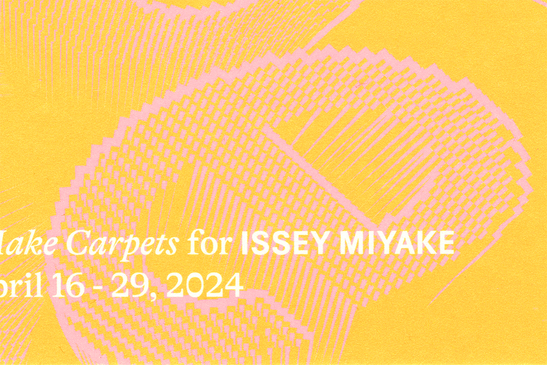
Ward Goes: Fold and Crease (Copyright © Studio Ward Goes, 2024)
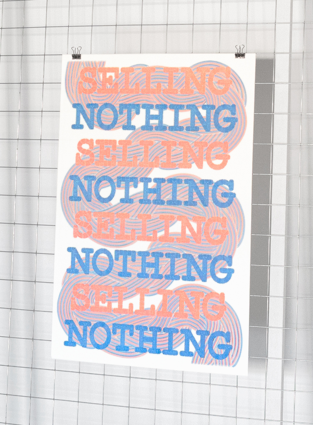
Ward Goes: Selling Nothing (Copyright © Studio Ward Goes, 2020)
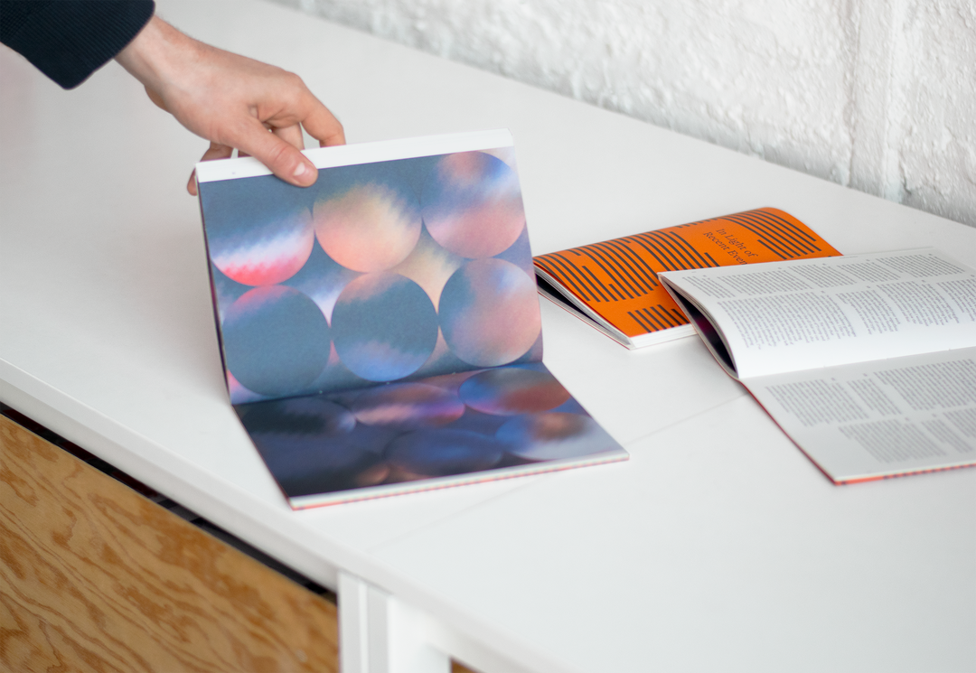
Ward Goes: In Light of Recent Events (Copyright © Studio Ward Goes, 2022)

Ward Goes: Ruth’s Triptych (Copyright © Studio Ward Goes, 2021)
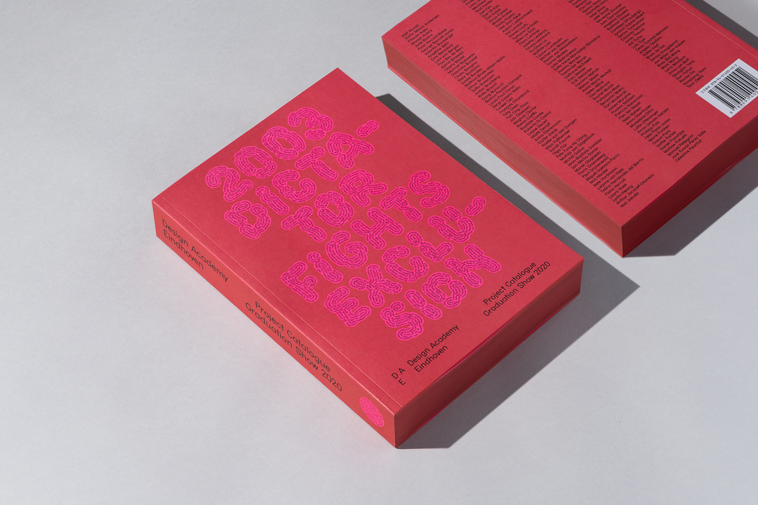
Ward Goes: Design Academy Grad. Catalogue (Copyright © Studio Ward Goes, 2020)
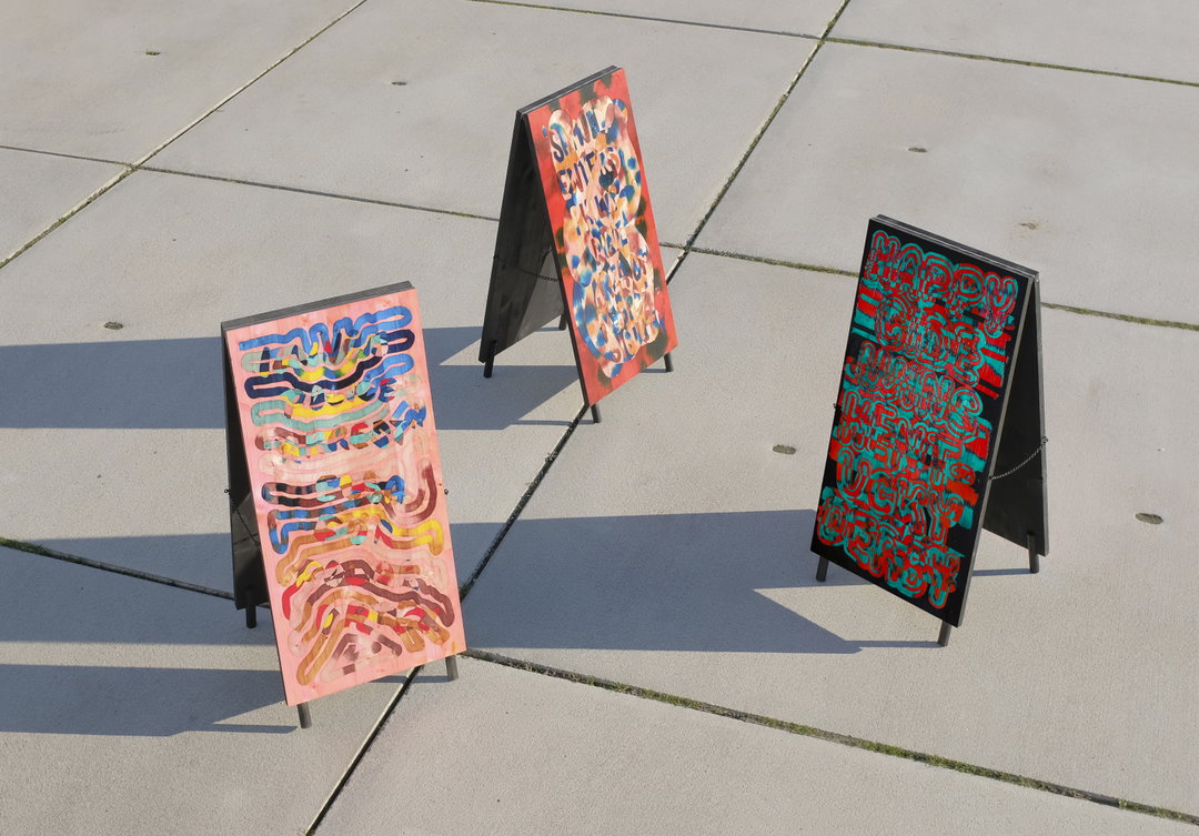
Ward Goes and Laurids Gallée: Selected Headlines (Copyright © Studio Ward Goes and Studio
Laurids Gallée, 2019)
Hero Header
Ward Goes: Oh Look Everyone, We’re All Making Observations! (Copyright © Studio Ward Goes, 2025)
Share Article
Further Info
About the Author
—
Ellis Tree (she/her) is a staff writer at It’s Nice That. She joined as a junior writer in April 2024 after graduating from Kingston School of Art with a degree in Graphic Design. Across her research, writing and visual work she has a particular interest in printmaking, self-publishing and expanded approaches to photography. ert@itsnicethat.com
To submit your work to be featured on the site, see our Submissions Guide.