




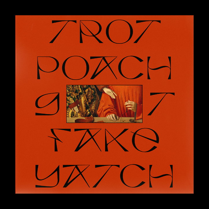
Jacob Wise’s visually led, historically inspired designs are “visual nonsense”
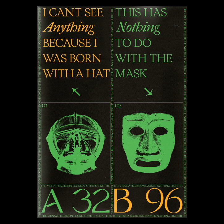
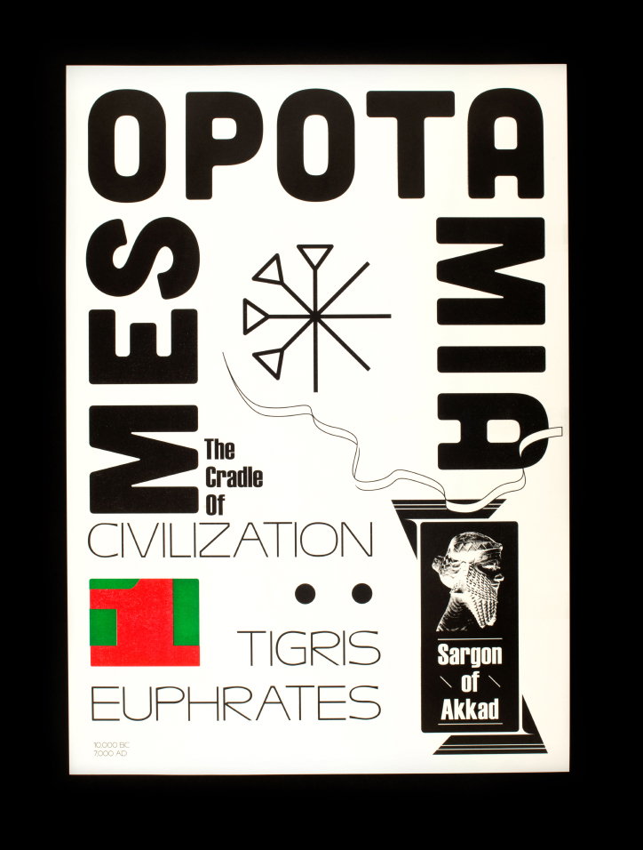
“I’ve always been fascinated by history and often think it filters down into starting points for a lot of the visual work I produce,” explains London-born graphic designer, Jacob Wise. Currently based in Munich where he is undertaking an internship at Bureau Borsche, Jacob’s unique typographic designs are often inspired by the things he reads or the documentaries he watches and, as a result, he’s developed an eclectic style that varies from design to design.
With parents who are both designers, Jacob spent his childhood visiting his dad’s small graphic design studio in Clerkenwell. His brother and him would “always go absolutely nuts there but I’d like to think that amidst the chaos it’s still something that has been a big contributing influence on me.” I wasn’t until the age of 14, however, that he acquired a spare copy of inDesign and became “obsessed with designing film posters,” marking his first step towards communicating with more of a purpose.
Jacob graduated from Kingston University earlier this year – where he was part of the team who designed the identity for the 2017 degree show – a school famed for its concept-first approach to graphic design. “I’m indebted to this way of thinking, however I often found myself bursting to create without reason,” he explains.
During Jacob’s time studying, the term “multidisciplinary creative” became extremely popular, however he always felt adverse to the phrase, feeling that graphic design in the formal sense was becoming somewhat suppressed. “I’m a bit sceptical about the future of design if my generation is so set on doing a bit of everything rather than investing time into a particular field,” he tells It’s Nice That. As a result he took the decision to focus his strengths on traditional graphic design and typography in his final year.
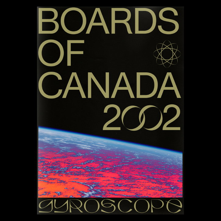
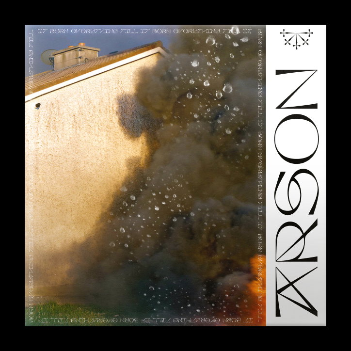
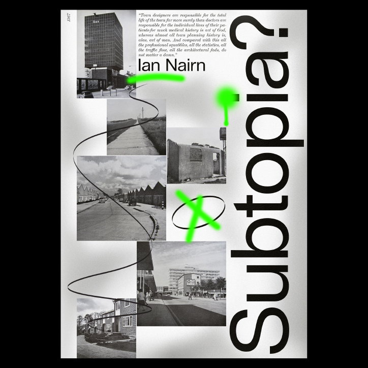
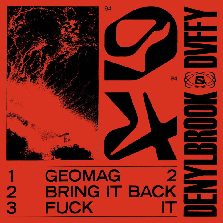
Upon leaving university, Jacob found himself able to work without the burden of concept: “I had got so caught up in designing with a purpose that I hadn’t allowed myself to really experiment visually. Some of the work I’m most proud of has been relatively meaningless in concept – I guess you could call it visual nonsense.” This approach has enabled Jacob to take himself less seriously and create work with an “underlying element of dull humour,” playing around with “stupid phrases” until he finds something he likes.
Although understanding that it’s counter intuitive to solely rely on regurgitating old styles, Jacob believes that gaining an understanding of what has already been done helps give him a wider perspective. He therefore aims to discover the untapped potential in various areas of design that may have been forgotten about today.
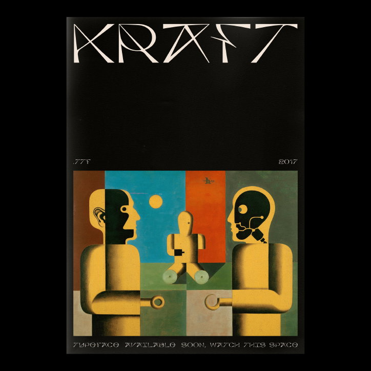
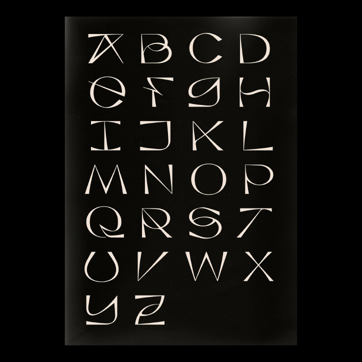
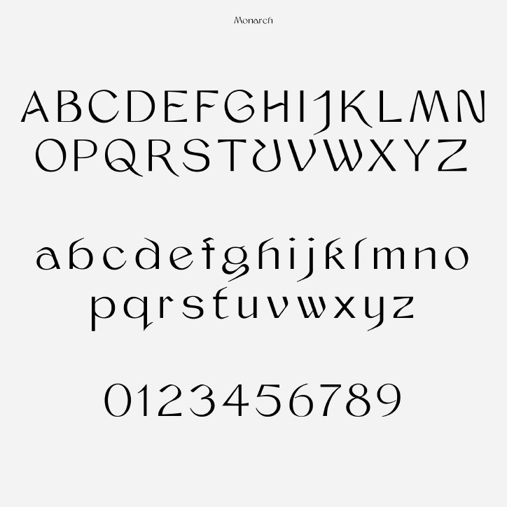
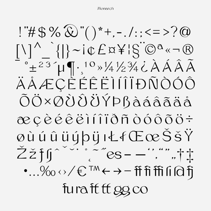
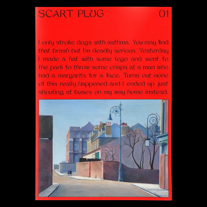
This is evident in the two of his typefaces: Monarch and Kraft. Sitting somewhere between a serif and sans-serif, Monarch is a figurative and elegant typeface that represents the meeting of the old and new. “I was going through a bit of an intense medieval phase during the time (I still am), which definitely shows in the particular characteristics of the font.” Instead of directly referencing any classic typefaces, he tried to capture the atmosphere of the era and provide his own interpretation. Kraft is a more novelty typeface but was the result of a very similar process, attempting to represent the Dark Ages in a typeface.
Jacob Wise
Jacob Wise
Jacob Wise
Jacob Wise
Jacob Wise
Jacob Wise
Jacob Wise
Jacob Wise
Jacob Wise
Jacob Wise
Jacob Wise
Jacob Wise
Jacob Wise
Jacob Wise
Share Article
Further Info
About the Author
—
Ruby is Senior Creative at It's Nice That, overseeing our visual output across platforms and projects. Before that, she was associate editor on the editorial team, after joining in September 2017 following graduation from Central Saint Martins.
