Launch Recite Me assistive technology
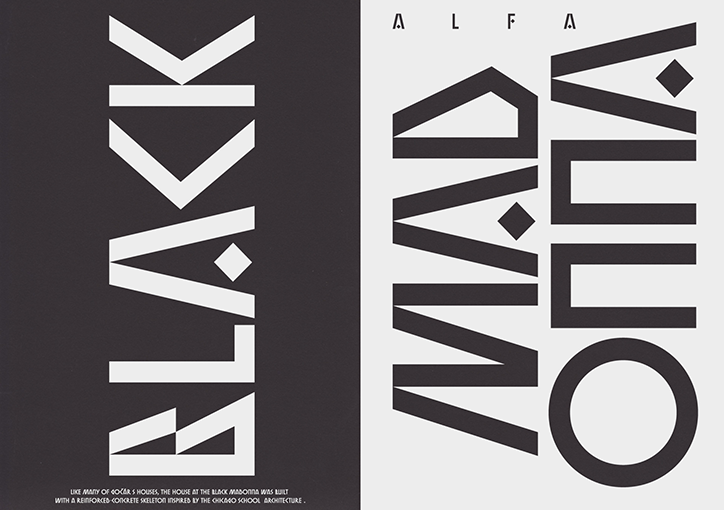
A graphic design piece split into two vertical panels. The left panel is black with the word “BLACK” written vertically in bold white lettering, while the right panel is white with the words “ALFA MADONNA” in black.

Jan Novák’s conceptual typefaces and identities are both functional and clear

—
Date
29 June 2017

Prague-based designer Jan Novák describes his childhood self as “a typical drawing kid”. “I drew everywhere all the time whenever paper and a pen were at hand – this stayed with me for quite a long time, and in the last couple of years I’ve managed to fulfil this obsession by drawing typefaces and doing graphic design,” says Jan. “I like creating things and caring about them during the whole process, which is quite possible with both type and graphic design. But I can easily imagine that I could be doing something completely different in five years time.”

Functionality and clarity is at the heart of everything Jan designs. “But it also has to be exciting for people who are willing to reveal deeper layers of design,” he says. “In my type design practice I try to work in a conceptual way, always exploring and including shapes and forms outside of the common type-design universe.”

Jan enjoys working on projects with startup brands, which allows him freedom to help with graphic design but also overall brand direction. “It can be hard and it is a lot about communication and finding the right fit for me and the client,” he explains. The designer has recently worked on a rebrand for a small chain of Prague-based restaurants, which combines a mix of sophisticated typefaces. Other stand-out projects include Pater, Jan’s science fiction novel illustrated with the designer’s renders and visual experiments, and a handful of sleek typefaces including Youth which he’s still working on.
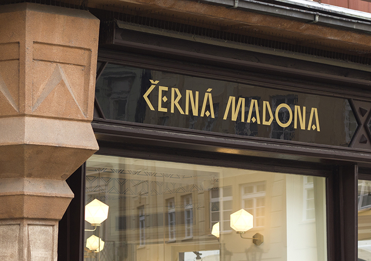
A dark storefront sign features the words “Černá Madona” in gold serif lettering. Below the sign, a glass window reflects a pale yellow building and glowing outdoor lamps.
Above

Jan Novák: Black Madonna typeface

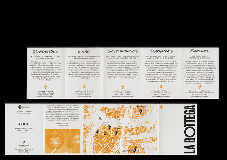
Five white informational cards are laid out side by side, each featuring a different restaurant name: “Di Finestra”, “Linka”, “Gastronomica”, “Bistroteka” and “Tusarova”. Below the text, a wide orange map of Prague spans across the cards.
Above

Jan Novák: La Bottega

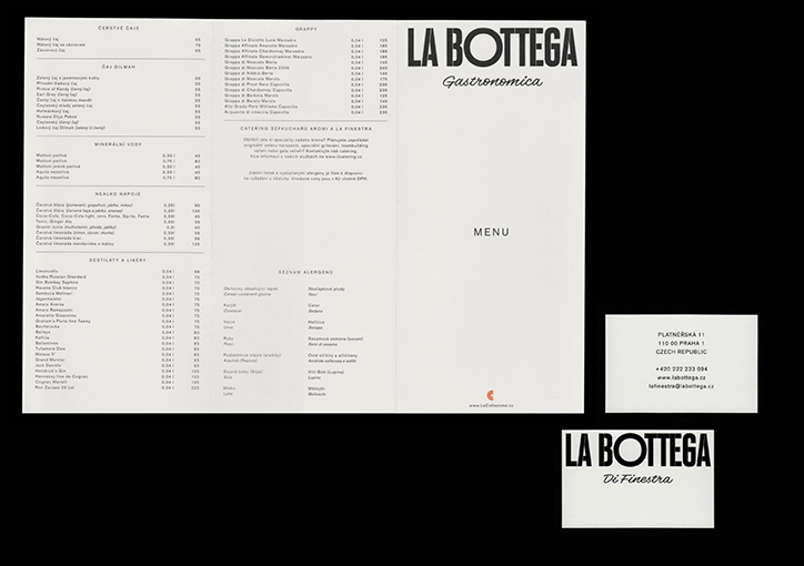
A minimalist black and white menu for “La Bottega Gastronomica”. The open booklet displays lists of drinks and allergens in a clean, sans-serif typeface. Beside it sit a business card and a small card featuring the “La Bottega Di Finestra” logo.
Above

Jan Novák: La Bottega

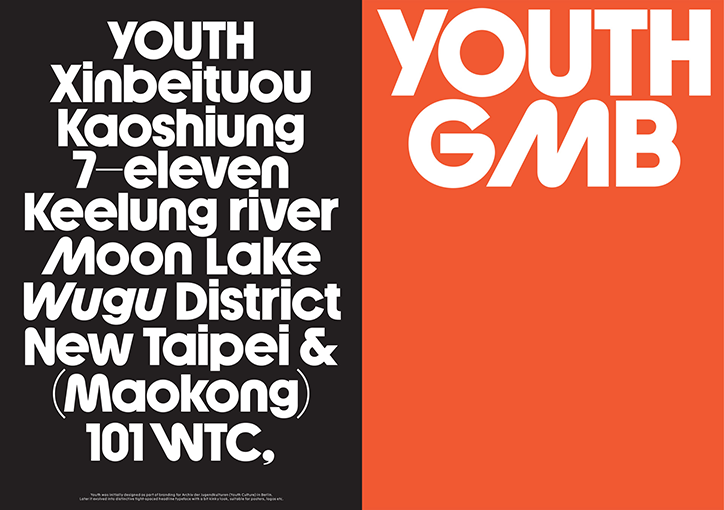
A graphic design piece split vertically between a black and an orange background. The orange side features bold white text that reads “YOUTH GMB”, while the black side lists various Taiwanese locations and brands, including “Kaoshiung”, “7–eleven” and “New Taipei &”.
Above

Jan Novák: Youth typeface

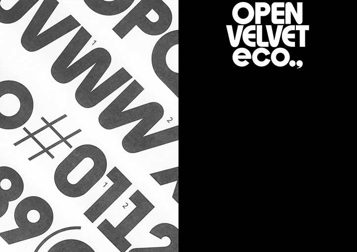
A split image featuring bold, black typography on a white background on the left and white text on a black background on the right. The right side reads “Open Velvet eco..”.
Above

Jan Novák: Youth typeface

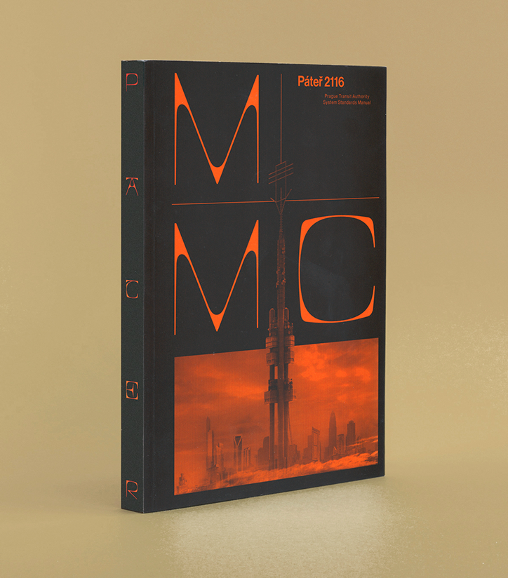
A black book cover features bold orange typography and a futuristic image. The text reads “Páteř 2116” and “Prague Transit Authority System Standards Manual”.
Above
Left

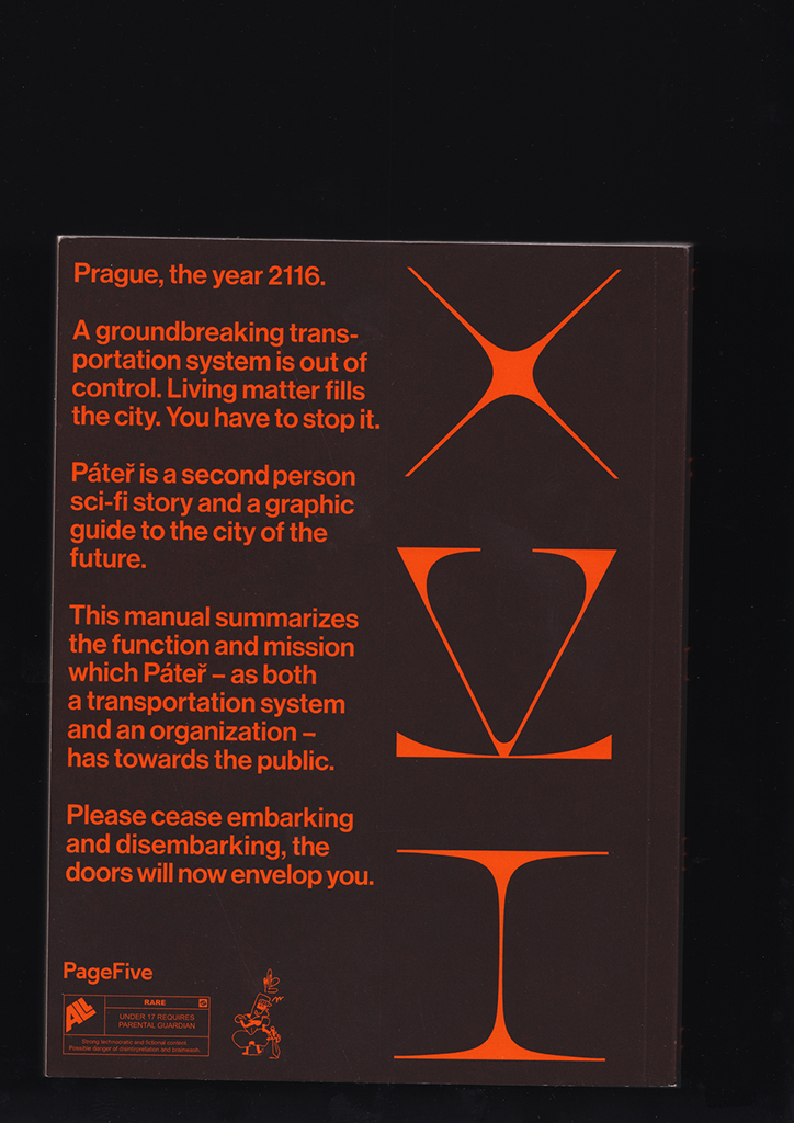
Jan Novák: Pater

The back cover of a book with orange text and graphics on a dark brown background. The text describes a sci-fi story set in Prague in 2116 called “Páteř”, which serves as a graphic guide to a future city. Three abstract, symmetrical orange shapes are stacked vertically on the right.
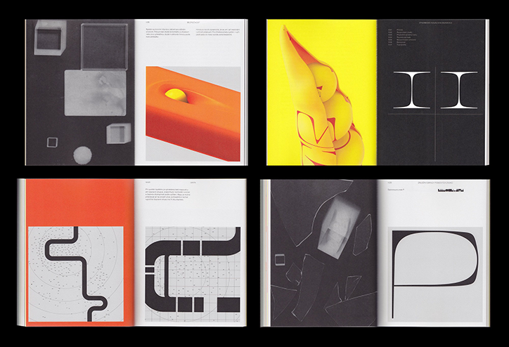
Four open spreads from a graphic design book. The pages feature a mix of bold orange and yellow colours, abstract 3D shapes, and minimalist black and white typography.
Above

Jan Novák: Pater

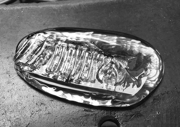
A black and white close-up of a clear, oval glass object with a rippled surface. Inside the glass, a distorted, textured form is visible, resting on a dark, grainy surface.
Above

Jan Novák: FRG Stamps with Lukás Novák
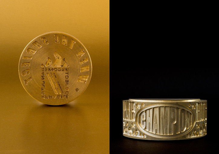
Two views of a gold-coloured metal ring. One shows the top face with an embossed design and text, while the other shows the side featuring the word “CHAMPION” in a bold, curved font.
Above

Jan Novák: FRG Stamps with Lukás Novák

Share Article

Further Info

About the Author

Rebecca Fulleylove

—

Rebecca Fulleylove is a freelance writer and editor specialising in art, design and culture. She is also senior writer at Creative Review, having previously worked at Elephant, Google Arts & Culture, and It’s Nice That.


It's Nice That Newsletters

Fancy a bit of It's Nice That in your inbox? Sign up to our newsletters and we'll keep you in the loop with everything good going on in the creative world.