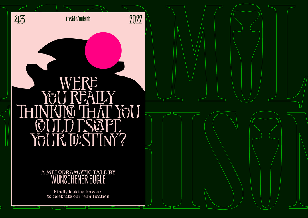
Jérémy Landes questions notions of success with his new typeface
Should success come at the expense of others? Jérémy doesn’t think so…
Since we last spoke with Jérémy Landes of Studio Triple in 2017, much has changed. Namely, he has relocated from Paris to Berlin, but he has also begun releasing retail typefaces once again, following a period of client-heavy work. This renewed focus has most recently resulted in NaN Success, a retail typeface that he created in collaboration with Luke Prowse of NaN, a local boutique foundry.
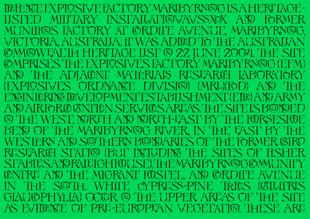
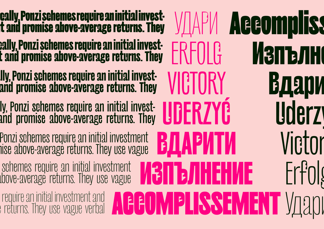
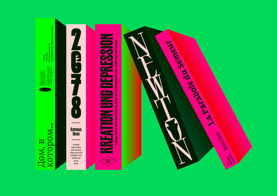
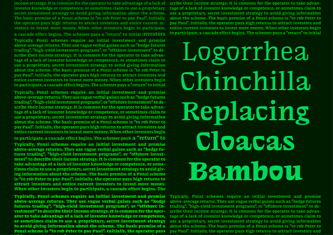
“I met Luke during the first lockdown in Berlin,” recalls Jérémy. “We spent hours walking in our neighbourhood while everything was closed and we quickly became friends and developed a working relationship.” Together, the pair came up with NaN Success, which “encapsulates Jérémy’s distinctive wiggily organic touch in a family of 18 eclectic typographic styles.” There are three versions of the typeface – Sans, Titling, Text – and each boasts its own personality.
Speaking on the inspiration behind NaN Success, which was initially a working title that eventually stuck, Jérémy says: “The idea of questioning our ability, as authors, to have agency towards the success we encounter became central during my design process. I then decided that, instead of keeping those interrogations private, why not make it the core of this typeface and share those doubts publicly? Somehow I’m trying to be very genuine here. Genuine with drawing something I like, and genuine with being public about the (economical) doubts and questions linked with the release of a new typeface.”
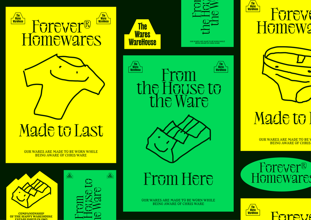
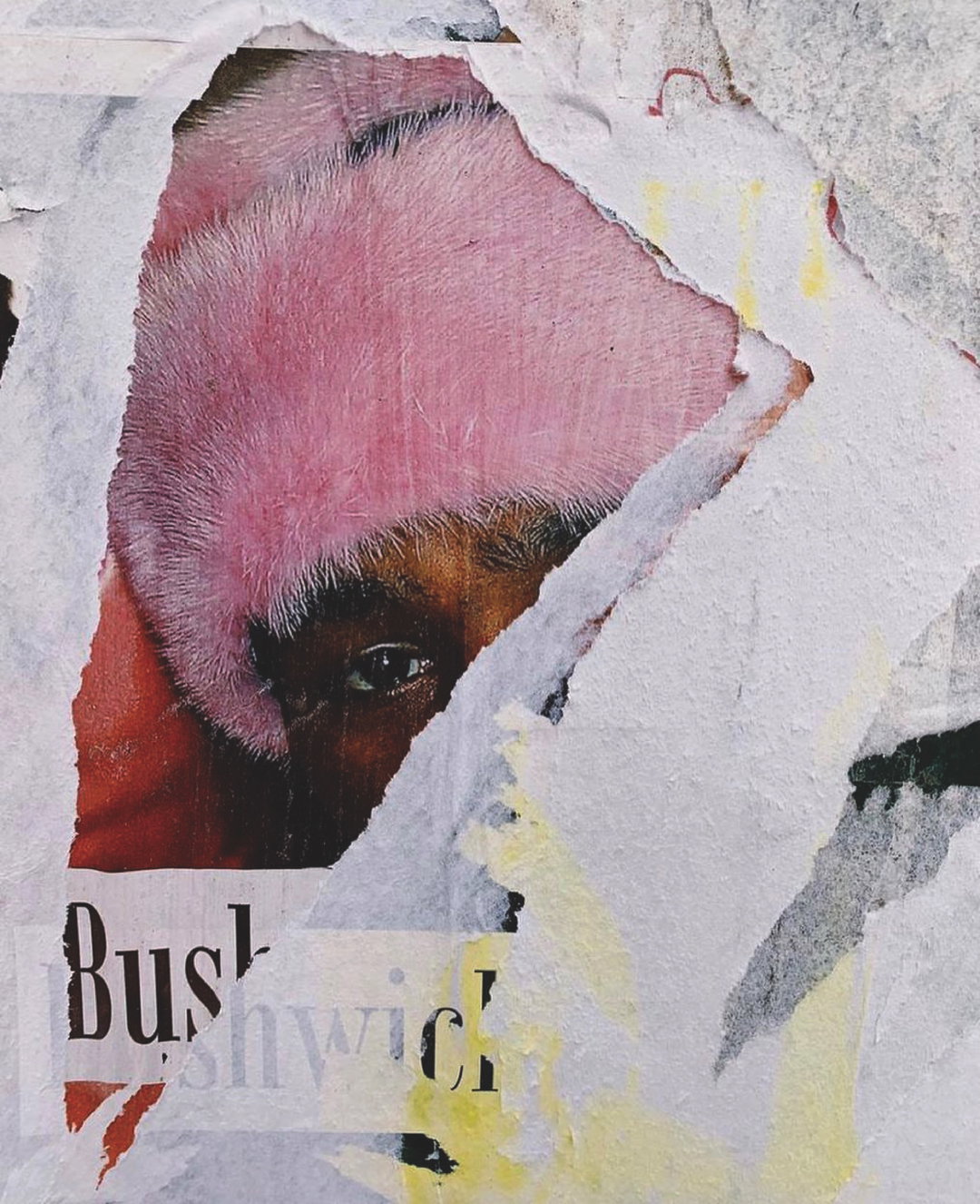
Jérémy Landes: NaN Success (Copyright © Jérémy Landes, 2022)
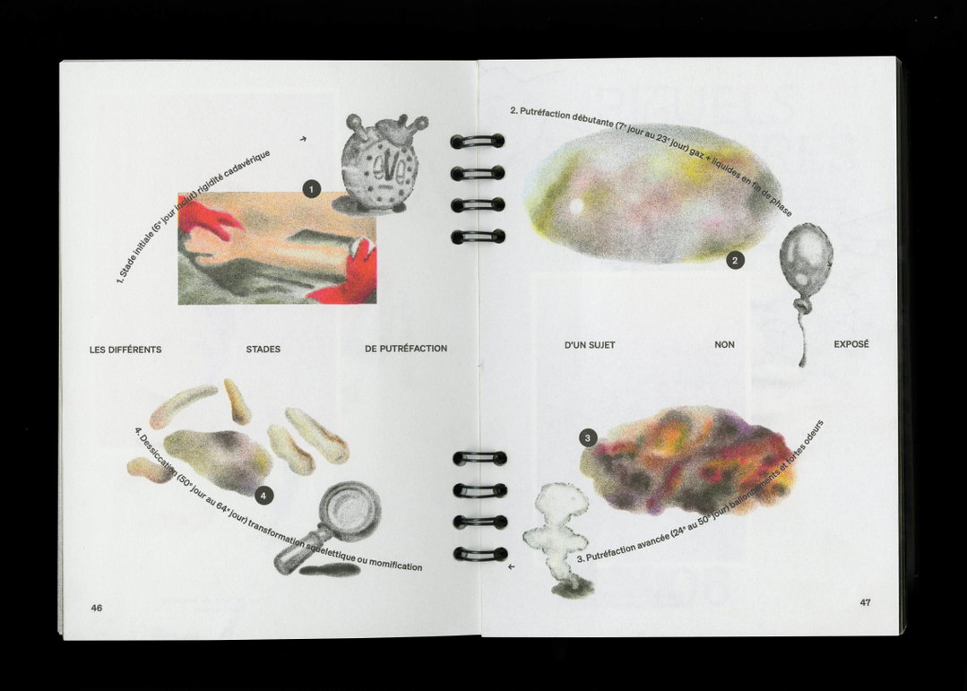
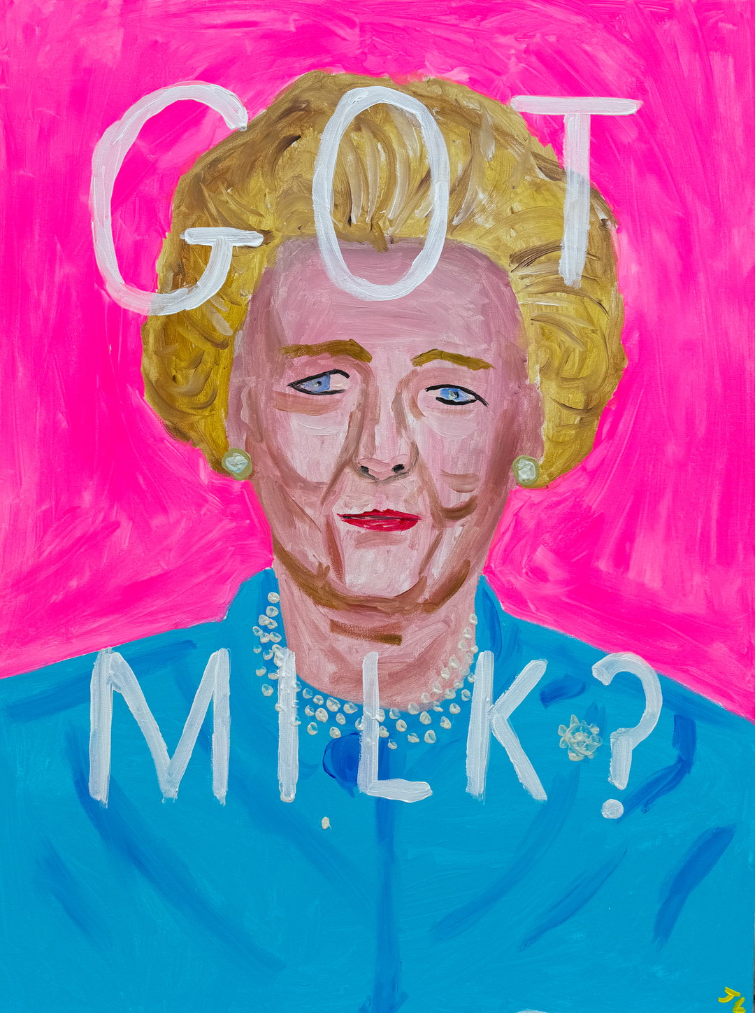
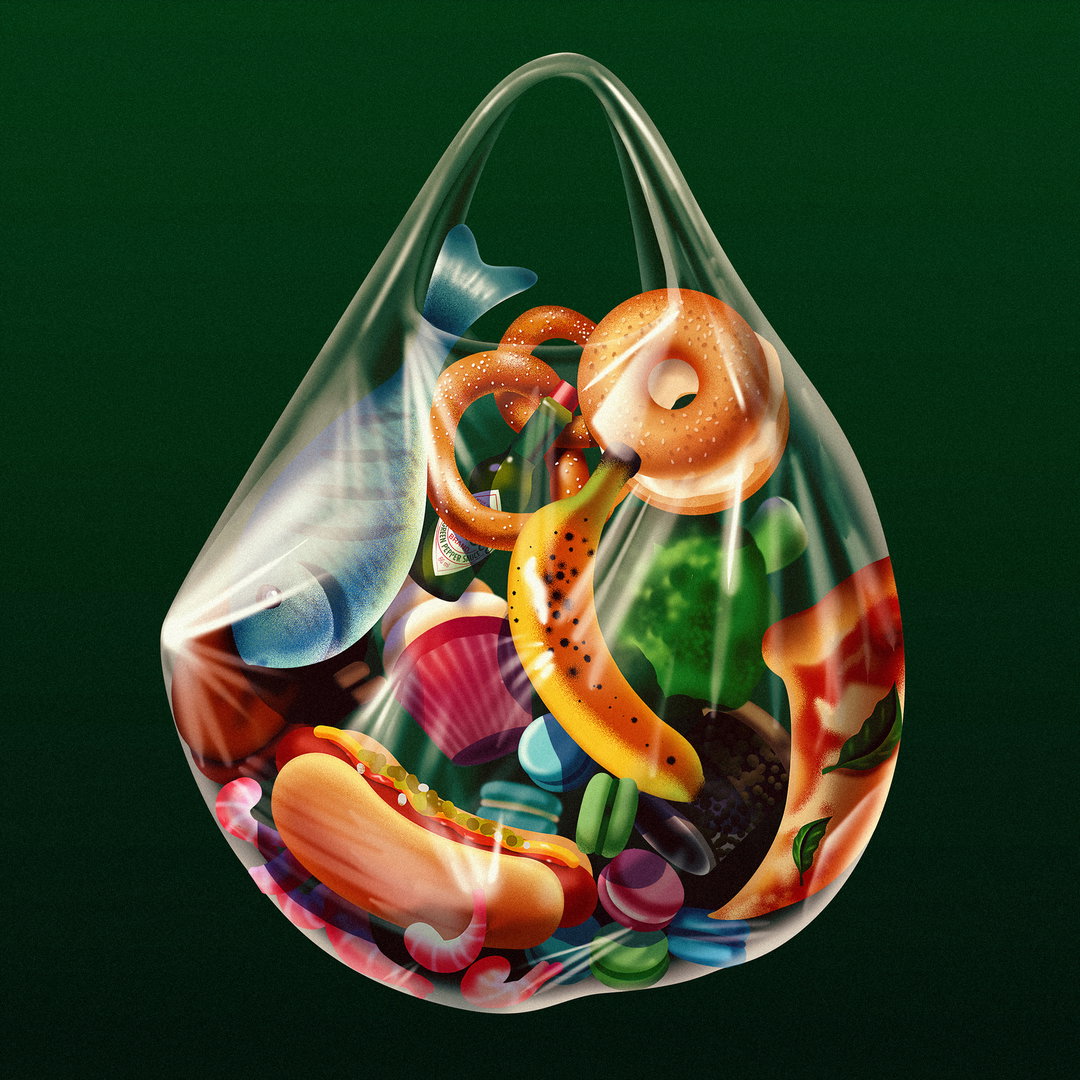
To turn these interrogations into letters, Jérémy drew something that he thought he was good at: a quintessential display typeface “packed with weirder organic shapes”. Though he was initially sceptical of this style, concerned that its appeal would be transient, he pushed through, realising “that there was no reason for me to prevent myself from drawing in a style that I like as long as I keep it original.” And original it certainly is. In line with his previous typefaces Pilowlava and Digestive, the NaN Success family showcases some beautiful organic linework, with “very gooey curves” that show, despite the typeface’s seemingly boastful name, it actually doesn’t take itself very seriously at all.
Naturally, Jérémy’s approach to the work is humble and refreshing, explaining that the naming of NaN Success is “more of a question than an affirmation.” It questions whether success should be thought of as a condition which requires others to fail – “but that's not what I want to build or believe in,” he says. On the contrary, Jérémy has ensured that the success of this typeface will provide support to worthy causes and, as such, has recently partnered with ClientEarth to donate 15 per cent of the profits to fighting climate change, and has offered a 100 per cent discount to any brand related to nature conservation, sustainability and environmental justice. He concludes: “I hope to see NaN Success used for good, even if that sounds very naive – but hey, better that than being bitter.”
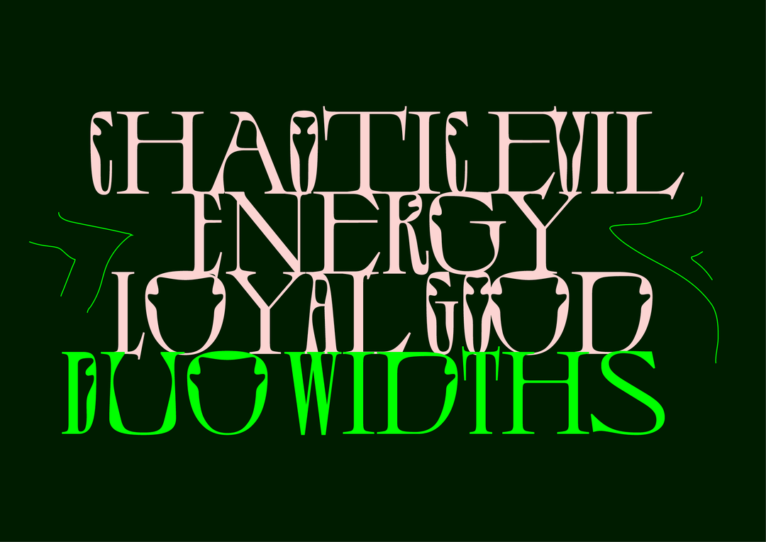
Jérémy Landes: NaN Success (Copyright © Jérémy Landes, 2022)
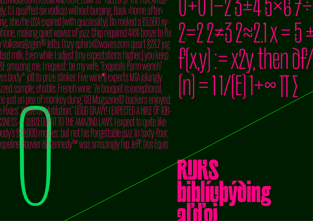
Jérémy Landes: NaN Success (Copyright © Jérémy Landes, 2022)
Jérémy Landes: NaN Success (Copyright © Jérémy Landes, 2022)
Jérémy Landes: NaN Success (Copyright © Jérémy Landes, 2022)

Jérémy Landes: NaN Success (Copyright © Jérémy Landes, 2022)
Jérémy Landes: NaN Success (Copyright © Jérémy Landes, 2022)
Jérémy Landes: NaN Success (Copyright © Jérémy Landes, 2022)
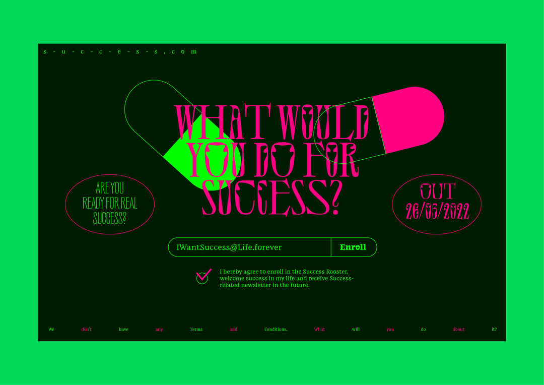
Jérémy Landes: NaN Success (Copyright © Jérémy Landes, 2022)
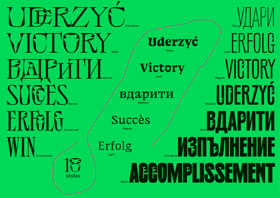
Jérémy Landes: NaN Success (Copyright © Jérémy Landes, 2022)
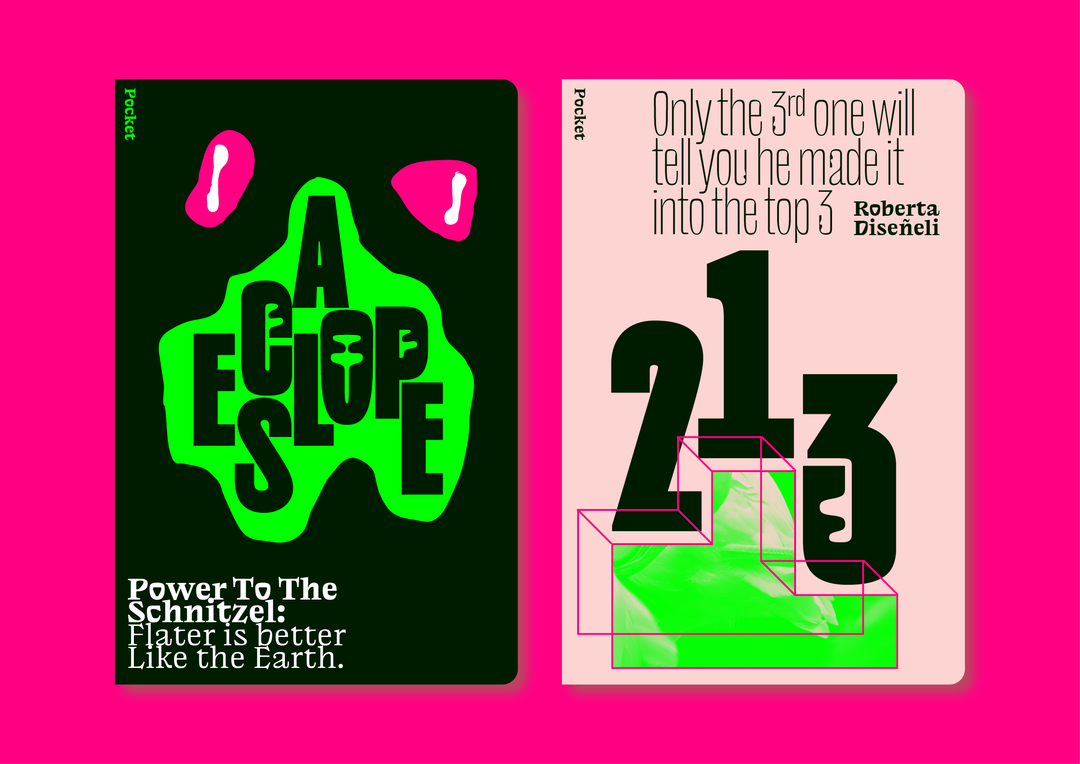
Jérémy Landes: NaN Success (Copyright © Jérémy Landes, 2022)
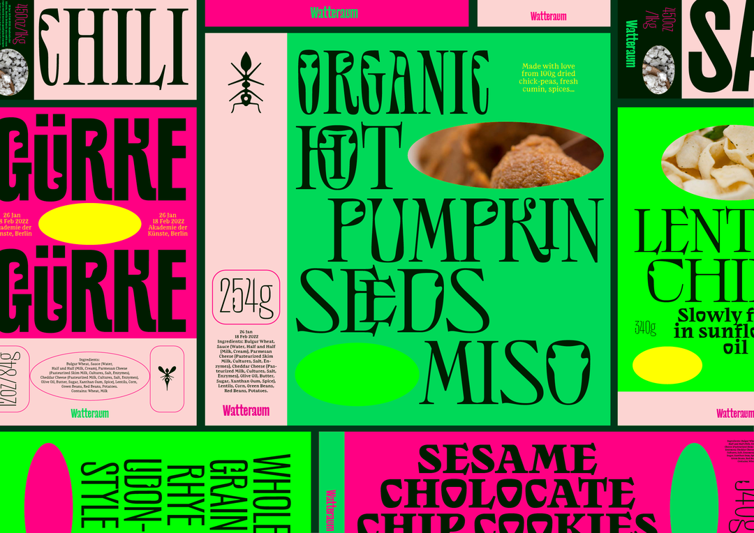
Jérémy Landes: NaN Success (Copyright © Jérémy Landes, 2022)
Hero Header
Jérémy Landes: NaN Success (Copyright © Jérémy Landes, 2022)
Share Article
Further Info
About the Author
—
Daniel joined It’s Nice That as an editorial assistant in February 2019 and continues to work with us on a freelance basis. He graduated from Kingston University with a degree in Journalism in 2015. He is also co-founder and editor of SWIM, an annual art and photography publication.