



Launch Recite Me assistive technology
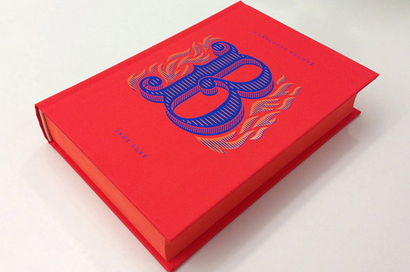
A bright red hardback book features a large, ornate blue letter “B” on the cover. The letter is surrounded by orange flame-like flourishes, with the names “Jane Eyre” and “Charlotte Brontë” printed in small white text.

Graphic Design: Jessica Hische and Penguin's gorgeous book series

—
Date
25 June 2013

When it comes to making us drool, really good book cover design still has the power to get our creative juices flowing. This latest collaboration between the incomparable Jessica Hische and Penguin art director Paul Buckley is called Drop Caps, a series of classic novels boasting the gorgeously illustrated first letter of the author’s surname on the front. It takes something pretty special to stop the It’s Nice That studio in its tracks, but there were audible gasps when these arrived this week. Many believe that print’s salvation may lie in playing up to its inherent collectibility – if many are right then this series should be very successful.
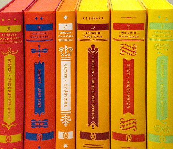
A row of six colourful Penguin Drop Caps hardcover books stand side by side. The spines feature bold colours and decorative typography, including titles such as “Pride and Prejudice” and “Great Expectations”.
Above

Jessica Hische/Penguin USA: Drop Caps
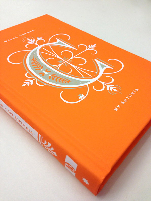
An orange book cover featuring a large, decorative white and pale green letter “C” entwined with floral flourishes. Text on the cover reads “Willa Cather” and “My Ántonia”.
Above

Jessica Hische/Penguin USA: Drop Caps
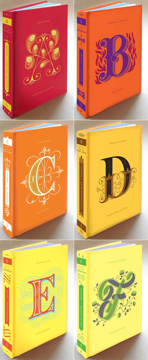
Six hardcover books are arranged in a grid of two columns and three rows. Each book features a large, ornate capital letter on the cover that corresponds to the author’s name.
Above

Jessica Hische/Penguin USA: Drop Caps
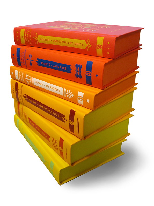
A stack of six hardcover books in a gradient of red, orange and yellow. The spines feature gold detailing and titles including “Pride and Prejudice”, “Jane Eyre”, “My Antonia” and “Great Expectations”.
Above

Jessica Hische/Penguin USA: Drop Caps
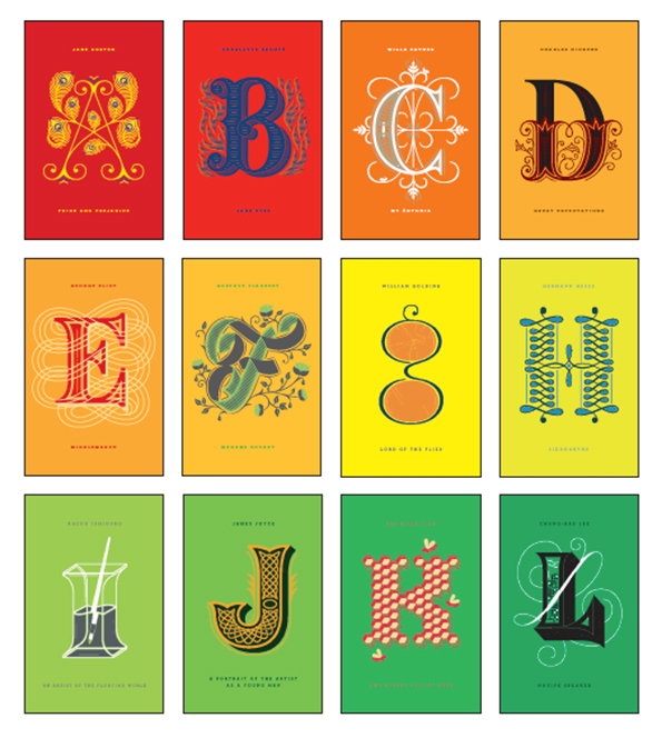
A grid of 12 colourful book covers, each featuring a large, stylised capital letter from “A” to “L”. Every cover includes the author’s name at the top and the book title at the bottom.
Above

Jessica Hische/Penguin USA: Drop Caps

Share Article

About the Author

Rob Alderson

—

Rob Alderson is a freelance writer, editor and strategist. He was previously editor-in-chief of It’s Nice That and WePresent, and editor of Design Week. He publishes the newsletter Undo, which tries to make sense of how AI is changing design work, the design process and the design industry.


It's Nice That Newsletters

Fancy a bit of It's Nice That in your inbox? Sign up to our newsletters and we'll keep you in the loop with everything good going on in the creative world.