



Launch Recite Me assistive technology
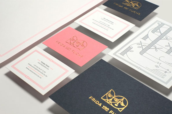
A collection of stationery and business cards in pink, white and dark blue. The cards feature a gold line drawing of a face and the text “Frida von Fuchs”.

Graphic Design: Jonathan Garrett's dreamy identity for design studio Frida von Fuchs

—
Date
28 February 2014

I always think that one of the hardest things for a studio to design must be their own identity; trying to encapsulate every element of your practice in a series of visuals that’s both clear and informative and yet still aesthetically pleasing. Fortunately for Berlin-based illustration and design studio Frida von Fuchs, they had the talented hand of Jonathan Garrett to turn to instead! And my, did he do a good job.

From the series of illustrations which are subtle, intricate and nonetheless impressive, to the pairing of soft powder pink with navy; every aspect of the stationery reflects the philosophy of careful craft that underlines what Frida von Fuchs does. What a dreamy design pairing.
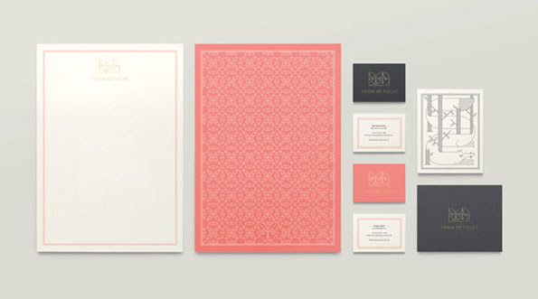
A stationery set featuring a white letterhead, a coral-coloured patterned page, and several business cards. The items are arranged on a grey background and feature a minimalist logo with the text “Frida Del Fuchs”.
Above

Jonathan Garrett: Frida von Fuchs Identity
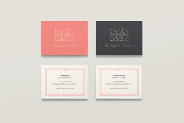
A set of business cards for “Frida von Fuchs”. Two cards feature a gold line drawing of a face on red and black backgrounds, while two white cards display contact details in red text.
Above

Jonathan Garrett: Frida von Fuchs Identity

An open white envelope reveals a dark grey interior. The lining features a line illustration of a fox curled above a vintage postbox labelled “POSTBRIEFKASTEN”.
Above

Jonathan Garrett: Frida von Fuchs Identity
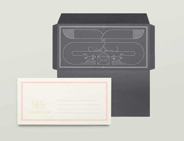
A dark grey envelope features a white line illustration of a stylised bird and geometric shapes. Beside it lies a white card with a pale pink border and the name “Frida Fuchs” in small gold lettering.
Above

Jonathan Garrett: Frida von Fuchs Identity
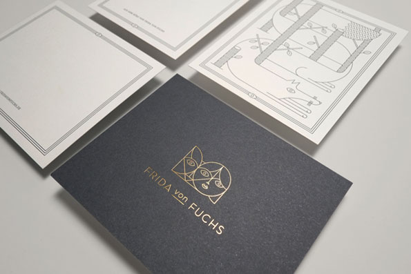
A dark grey business card features a gold foil logo of a stylised face and the name “Frida von Fuchs”. It is surrounded by white stationery, including a card with a linear illustration of a animal.
Above

Jonathan Garrett: Frida von Fuchs Identity
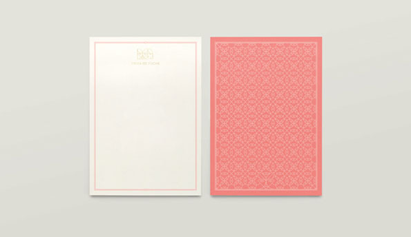
Two rectangular cards side by side against a grey background. One is white with a thin pink border and a small gold logo at the top, while the other is pink with a white geometric pattern.
Above

Jonathan Garrett: Frida von Fuchs Identity
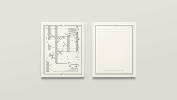
Two white cards side by side. The left card features a line illustration of a creature weaving through a forest of striped trees. The right card is blank with a thin border and a line of small text at the bottom.
Above

Jonathan Garrett: Frida von Fuchs Identity
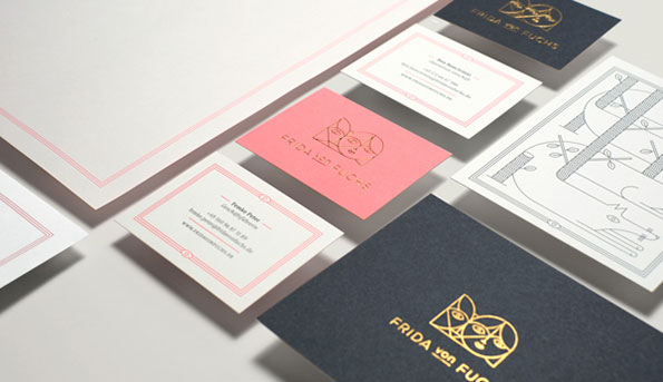
A collection of stationery and business cards in pink, white and dark blue. The branding features a gold line drawing of a face and the text “Frida von Fuchs”.
Above

Jonathan Garrett: Frida von Fuchs Identity

Share Article

About the Author

Maisie Skidmore

—

Maisie joined It’s Nice That fresh out of university in the summer of 2013 as an intern before joining full time as an Assistant Editor. Maisie left It’s Nice That in July 2015.


It's Nice That Newsletters

Fancy a bit of It's Nice That in your inbox? Sign up to our newsletters and we'll keep you in the loop with everything good going on in the creative world.