Launch Recite Me assistive technology
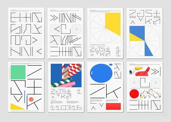
Eight graphic posters arranged in two rows of four. They feature a mix of abstract geometric shapes, bold primary colours and experimental typographic symbols.

Typographic tests and visual experiments from designer Jozef Ondrik

—
Date
17 March 2016

Based in Manchester, Slovakia-born designer Jozef Ondirk has been doing work with Deep Throat Studio, an independent design practice he co-founded with Zdenek Kvasnica, which aims to be a space for collaboration and discussion. As well as creating various printed materials, the studio also runs workshops and presentations on creating better design-based solutions. In a recent update on Jozef’s site the designer showcases various promo posters and pamphlets for the studio’s activities that display his geometric style.

When we featured Jozef’s work last year there’s was a multitude of web-based projects but it seems the designer’s focus has shifted to printed matter and type specimens. As well as posters for exhibitions and cafes, various typographic tests and visual experiments litter his site giving us an insight into the designer’s process. Sticking largely to a colour palette of black and white with splashes of primary hues, Jozef’s approach continues to be fresh and well-balanced. 
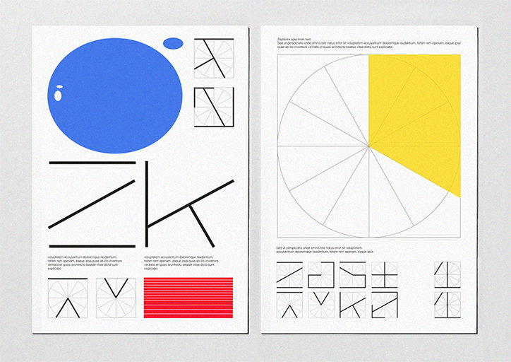
Two pages of a graphic design specimen. The first page features a large blue circle and bold, abstract black lines, while the second shows a large circle divided into segments with one half filled in yellow. Both pages include blocks of placeholder text and grids of geometric shapes.
Above

Jozef Ondrik: Zastavka, visual conception
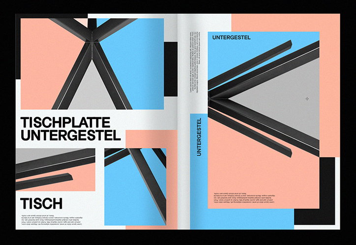
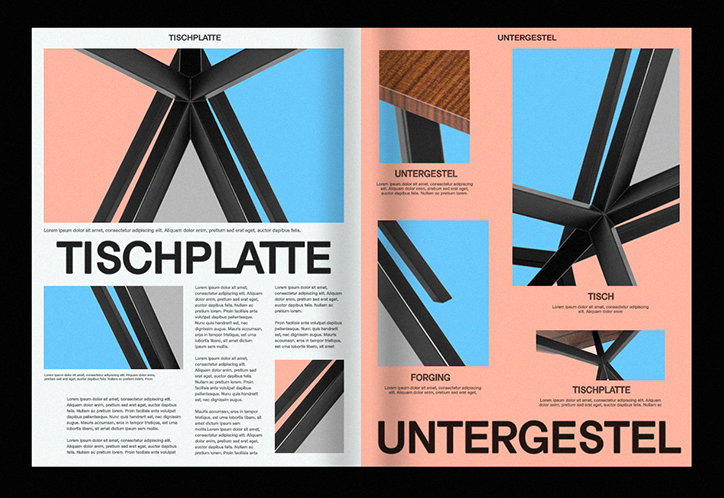
An open book featuring a graphic layout with architectural photography and bold typography. The pages use a palette of pale pink, light blue and grey, with large sans-serif text reading “Tischplatte Untergestel” and “Tisch”.
Above

Jozef Ondrik:Print promo for kt11

A double-page spread from a design catalogue featuring a black geometric table. The pages combine close-up photographs of the furniture with bold typography reading “Tischplatte” and “Untergestel”.
Above

Jozef Ondrik:Print promo for kt11

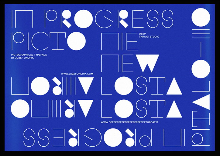
A typographic poster on a blue background featuring a white, geometric typeface. The layout includes the phrases “In Progress”, “Picto”, “New” and “Losta” repeated and mirrored across the page.
Above

Jozef Ondrik:

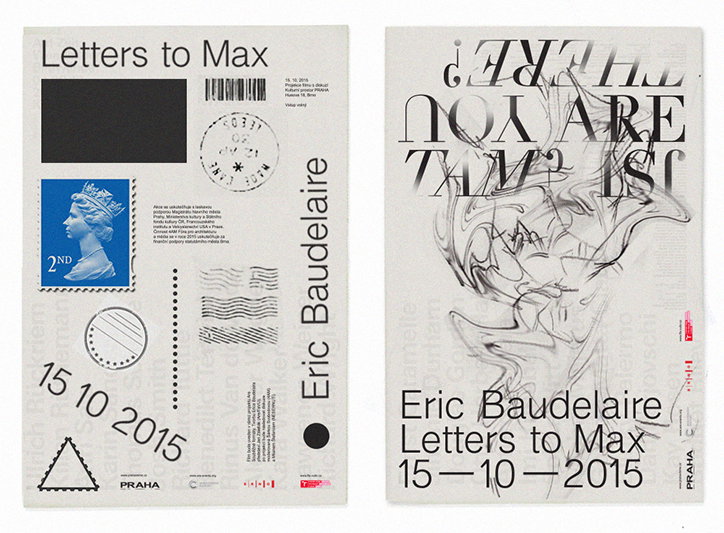
Two posters for a project by Eric Baudelaire titled “Letters to Max”. The first is designed like a postcard with a stamp of Queen Elizabeth II, a barcode and the date “15 10 2015”. The second features a swirling, abstract ink drawing and the phrase “IS YOU ARE THERE?” printed in reverse.
Above

Jozef Ondrik: Letters to Eric

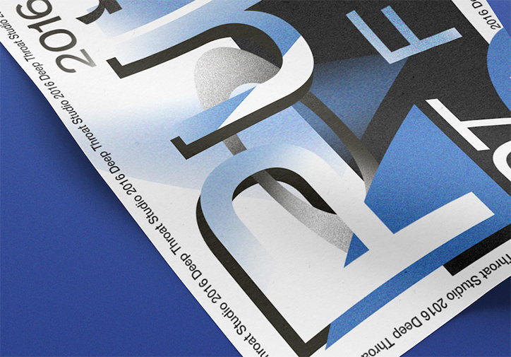
A close-up of a printed page featuring bold, distorted typography in blue, black and white. The edge of the paper repeats the text “Deep Throat Studio 2016” in a small, clean font.
Above

Jozef Ondrik: DTPF16

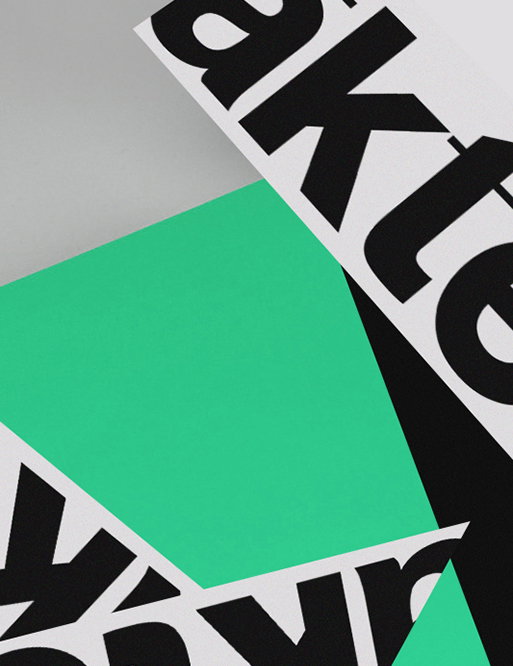
A close-up of overlapping paper cut-outs in green, black and white. Bold black typography is visible on the white strips, showing fragments of words.
Above
Left

Jozef Ondrik: akte

Right

Jozef Ondrik: DT Grotesk

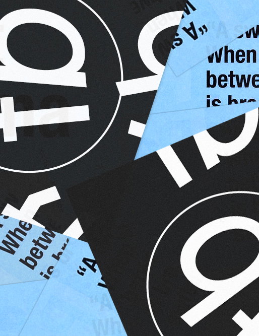
A collage of fragmented black and light blue paper scraps. Bold white typographic elements and snippets of text including “when between is br” are scattered across the composition.
Above

Jozef Ondrik: DT Grotesk

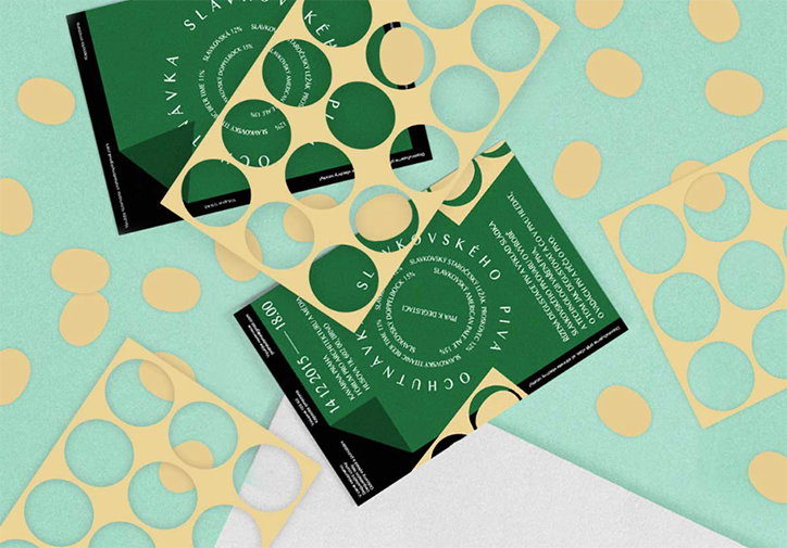
Two green and black printed brochures lie on a pale mint background with yellow polka dots. They are partially covered by yellow paper cut-outs with circular holes.
Above

Studio Deep Throat: Flyer for Praha v Brne
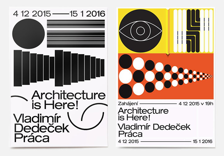
Two graphic posters for an exhibition titled “Architecture is Here!”. The first is black and white with bold geometric shapes and the name “Vladimír Dedeček Práca”. The second uses a yellow and orange colour palette, featuring a stylised eye and a tapering grid of circles.
Above

Jozef Ondrik: Architecure is Here! Posters for PRAHA
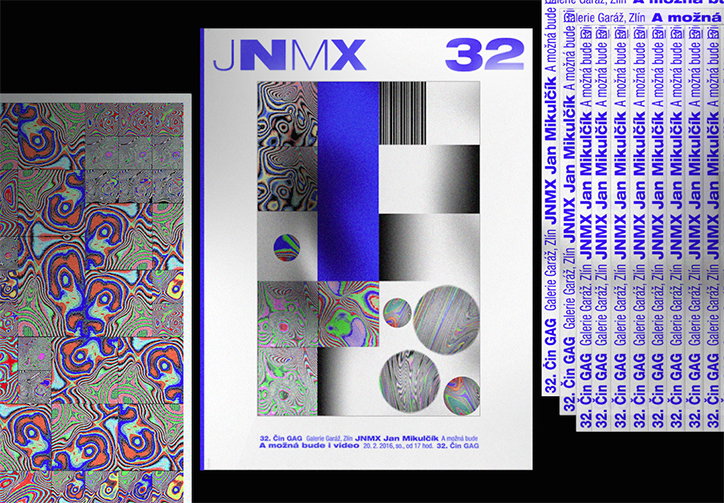
A series of graphic prints featuring abstract, psychedelic patterns in blue, red and green. The central print is a magazine cover with the text “JNMX 32” and a grid of distorted, iridescent imagery.
Above

Jozef Ondrik:GAG JNMX 32

Share Article

About the Author

Rebecca Fulleylove

—

Rebecca Fulleylove is a freelance writer and editor specialising in art, design and culture. She is also senior writer at Creative Review, having previously worked at Elephant, Google Arts & Culture, and It’s Nice That.


It's Nice That Newsletters

Fancy a bit of It's Nice That in your inbox? Sign up to our newsletters and we'll keep you in the loop with everything good going on in the creative world.