Launch Recite Me assistive technology
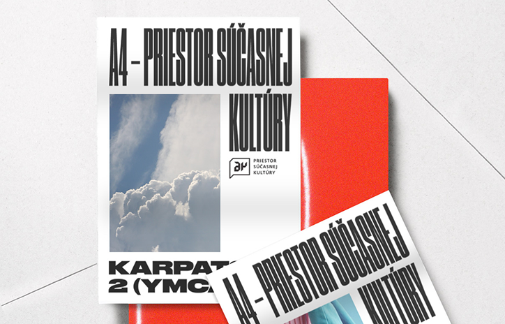
A white publication cover features a photograph of white clouds against a blue sky. Bold black text reads “A4 – PRIESTOR SÚČASNEJ KULTÚRY” and “KARPATY 2 (YMCA)”.

Designer Jozef Ondrik adapts old fonts to create sleek and refreshed typographic systems

—
Date
12 October 2016

Slovakian designer Jozef Ondrik aims to change his style and give it a different shape with each project. “First comes the idea, the concept, context and then style. I don’t have one particular style or permanent ideology,” he explains. “However, one thing that links all my projects is a component of typography. Whether it’s in the background or it’s a main part, it is always there.”

We’ve featured Jozef’s work multiple times before for his experimental approach to typography, where he often mixes different typefaces together with geometric graphics. In one of his most recent projects, he’s created a cover for quarterly magazine, Smart Cities, which is designed for officials and politicians in Czech and Slovak cities. “The magazine provides information on technologies and concepts for efficient urban management,” explains Jozef. “Smart Cities is run by my good friend Ondrej Doležal and he gave me a chance to design a cover on the subject of public procurement. The result was a gravestone with the text ‘Rest in Peace’.”
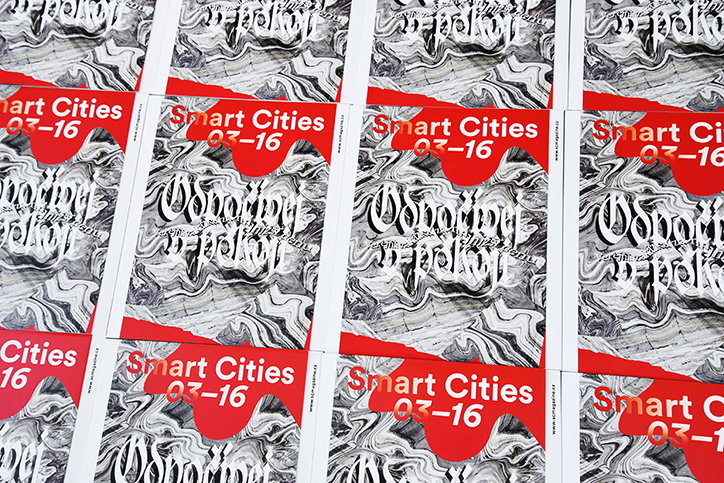
A grid of identical publications featuring a black and white marbled pattern. A red banner across the top reads “Smart Cities 03–16”.
Above

Jozef Ondrik

The seemingly dry subject matter of the magazine is lifted by Jozef’s bold approach and as well as the final cover, Jozef has included roughs on his website, offering an insight into his process, which he tries to keep adaptable. “My approach to a project changes. For example, sometimes we work on really complex structured websites in a team of four or five people, which requires a lot of communication and consultation with other people on the team,” says Jozef. “Other times, a project is much more about the story and we try to identify a theme for the story, which supports and represents the project.”

Jozef still works with Zdenek Kvasnica as Deep Throat Studio, and the pair have worked on several type-based projects including Oval, Lyra, DT Grotesk and others. For his posters, programmes and covers, Jozef often creates typographic systems from scratch or adapts old typefaces and it can be a complicated process. “Sometimes I revive the font by transforming old fonts that attract me visually or through some personal experiences,” he explains. “I also create and modify fonts for a particular commission we’re working on in the studio, so the morphed characters respond to the brief.”

In the future Jozef would like to run a small type foundry with Matej Vojtuš, which would suit his typographic sensibilities perfectly. “I enjoy finding and creating strange typefaces and characters. But it’s always rewarding to come up with a character set that fits the client’s concept exactly.”
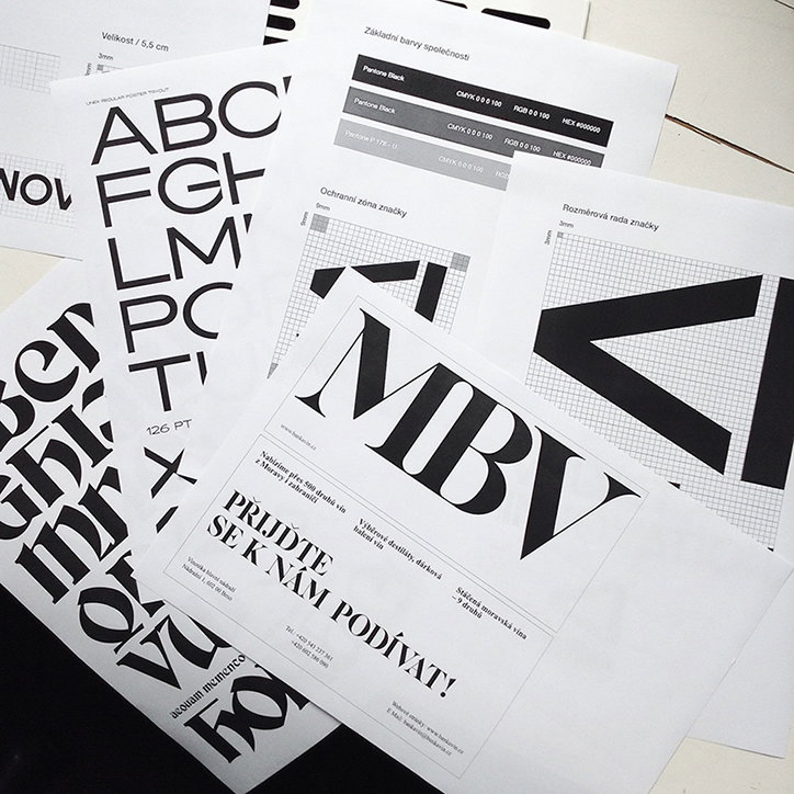
A collection of brand identity guidelines and printed materials in black and white. A central flyer features the bold letters “MBV” above the text “PRIJĎTE SE K NÁM PODÍVAT!”.
Above

Jozef Ondrik

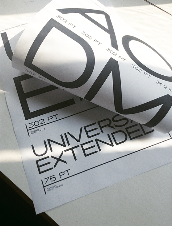
A close-up of printed typography sheets on a white surface. Large, bold black letters are accompanied by technical labels such as “302 PT” and “75 PT”, with the words “UNIVERSAL EXTENDED” visible below.
Above
Left

Jozef Ondrik

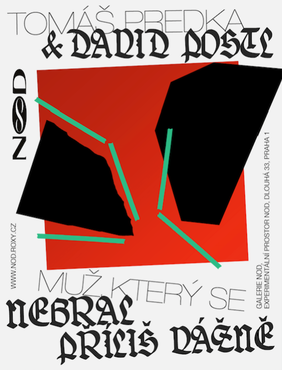
A graphic poster featuring a red square containing two jagged black shapes and thin green lines. Text at the top reads “Tomáš Predka & David Postl”, while the bottom reads “Muž který se nebral příliš vážně”.
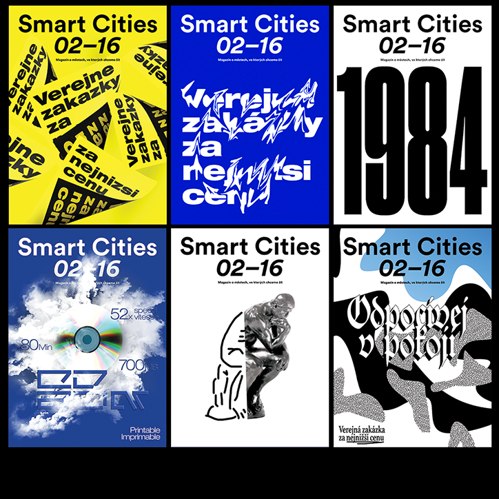
Six magazine covers for “Smart Cities 02–16” featuring different graphic styles. The designs include bold typography on yellow and blue backgrounds, a large “1984” headline, and surreal imagery of clouds and sculptures.
Above

Jozef Ondrik

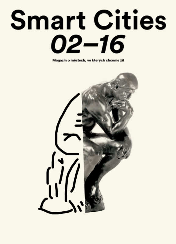
A magazine cover featuring the bold headline “Smart Cities” above the numbers “02–16”. Below this, a smaller line of text reads “Magazín o městech, ve kterých chceme žít”. The central image is a split composition. The right side shows a photograph of Rodin’s The Thinker sculpture, while the left side is a simple line drawing of a figure in the same pose.
Above
Left

Jozef Ondrik

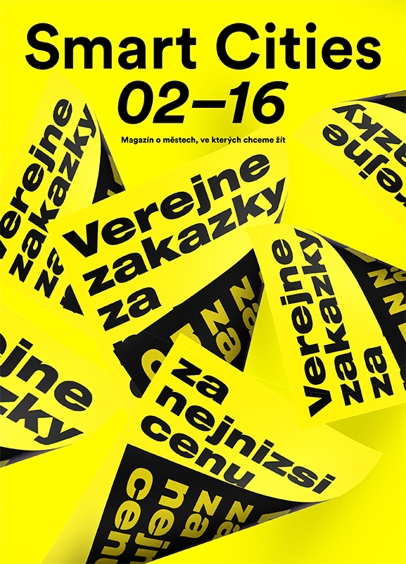
A yellow magazine cover reads “Smart Cities 02–16”. Below the title, smaller text reads “Magazín o městech, ve kterých chceme žít”. The background is filled with overlapping yellow slips of paper featuring the bold black text “Verejne zakazky za nejnizsi cenu”.
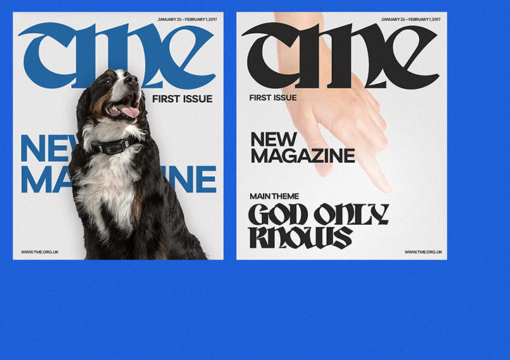
Two magazine covers for “Tme” are set against a bright blue background. The first features a Bernese Mountain Dog in front of the blue masthead, with the words “New Magazine” and “First Issue”. The second shows a hand pointing downwards beneath a black masthead, with the headline “God Only Knows”.
Above

Jozef Ondrik

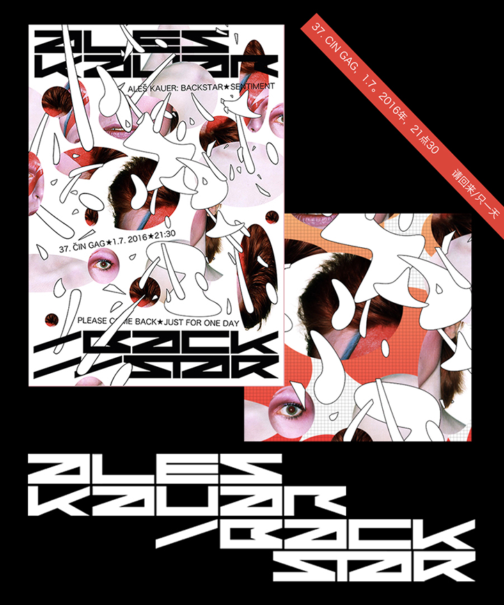
A graphic poster for “Ales Kauer: Backstar Sentiment” featuring fragmented, distorted portraits of people. The composition uses a white background with bold, abstract white shapes and black typographic elements. A red banner in the top right reads “37. CIN GAG, 1.7. 2016年, 21点30” and “请回来/只一天”. Below the poster, the name “Ales Kauer” and the word “Backstar” appear in a heavy, geometric white typeface.
Above

Jozef Ondrik

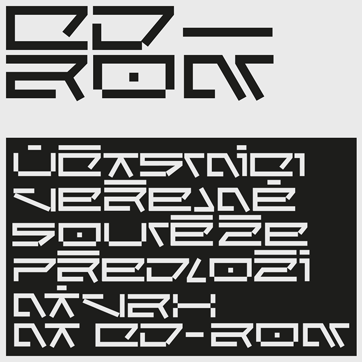
A graphic design featuring a highly stylised, geometric typeface in black and white. The top section reads “CD-ROM” in large, blocky letters, while the bottom section contains several lines of similar text on a black background.
Above

Jozef Ondrik

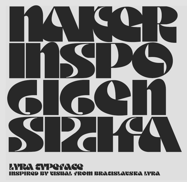
A bold typographic poster featuring heavy, black abstract lettering on a grey background. The text at the bottom reads “Lyra typeface” and “inspired by visual from Bracislawska Lyra”.
Above

Jozef Ondrik

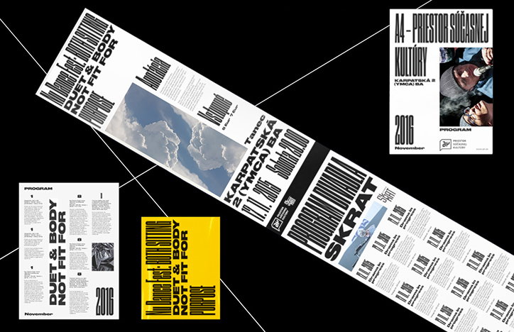
A collection of graphic design layouts for a programme, featuring bold black typography on white and yellow backgrounds. The text includes the phrase “DUET & BODY NOT FIT FOR” and the date “2016 November”.
Above

Jozef Ondrik

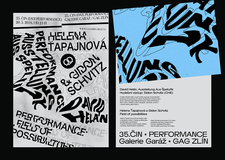
Two black and white posters with bold, distorted typography. One features the names “Helena Tapajnová” and “Gidon Schvitz” alongside the text “Performance Field of Possibilities”. The second poster includes a blue graphic element and a block of text detailing an exhibition by David Helán.
Above

Jozef Ondrik

Share Article

About the Author

Rebecca Fulleylove

—

Rebecca Fulleylove is a freelance writer and editor specialising in art, design and culture. She is also senior writer at Creative Review, having previously worked at Elephant, Google Arts & Culture, and It’s Nice That.


It's Nice That Newsletters

Fancy a bit of It's Nice That in your inbox? Sign up to our newsletters and we'll keep you in the loop with everything good going on in the creative world.