Launch Recite Me assistive technology
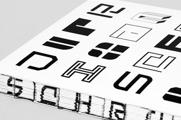
A close-up of a book cover featuring a grid of bold, black abstract glyphs on a white background. The side of the book shows the word “SCHRIFT” printed across the edges of the pages.

Unit Editions' latest explores the beautiful letterforms of Jurriaan Schrofer

—
Date
4 February 2013

London publishers Unit Editions have gathered and maintained a relentless momentum with their output over the past few months. Following the huge success of their mammoth volume dedicated to design legend Herb Lubalin, they quickly followed up with a retrospective of British hero Ken Garland and now they’re at it again. Their latest project focusses on the experimental typography of Dutch designer Jurriaan Schrofer, a man renowned for his adventures into perspective and perception within the framework of type design.

Schrofer’s creations might appear dated in today’s visual landscape, but his progressive development of letterforms from the 1950s to 1980s shaped the way we approach type today, particularly in his prescient use of square grid systems and dot matrices that became the backbone of typographic styling in the early years of personal computing.
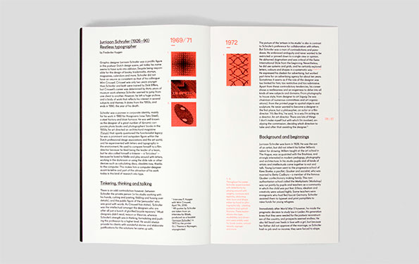
An open book showing a spread about the designer Jurriaan Schrofer. The left page features a profile titled “Restless typographer” alongside a red abstract graphic.
Above

Unit Editiions: Jurriaan Schrofer

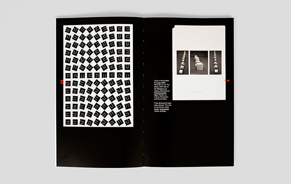
An open book with black pages. The left page features a grid of repeating, abstract black and white geometric shapes, while the right page shows three small photographs of white 3D blocks and a block of descriptive text.
Above

Unit Editiions: Jurriaan Schrofer

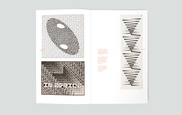
An open book showing black and white graphic studies. The left page features a distorted, oval-shaped pattern of text and a block of typographic art that reads “Change Continuity in Africa”.
Above

Unit Editiions: Jurriaan Schrofer

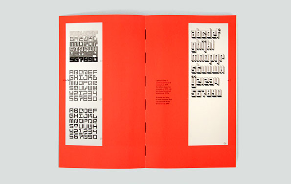
An open book with bright red pages displays various typeface specimens. The left page shows three different blocky, geometric alphabets, while the right page features a rounded, 3D-style font.
Above

Unit Editiions: Jurriaan Schrofer

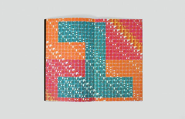
An open book features a bold, typographic design across two pages. Repeating words in teal, orange and pink form the shapes of the numbers “5” and “1”.
Above

Unit Editiions: Jurriaan Schrofer

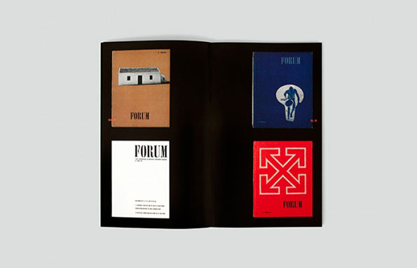
An open book displays four different cover designs for a publication titled “Forum”. The layouts feature a mix of photography and bold graphics in brown, blue, white and red.
Above

Unit Editiions: Jurriaan Schrofer

Share Article

About the Author

James Cartwright

—

James started out as an intern in 2011 and came back in summer of 2012 to work online and latterly as Print Editor, before leaving in May 2015.
It's Nice That Newsletters

Fancy a bit of It's Nice That in your inbox? Sign up to our newsletters and we'll keep you in the loop with everything good going on in the creative world.