Launch Recite Me assistive technology
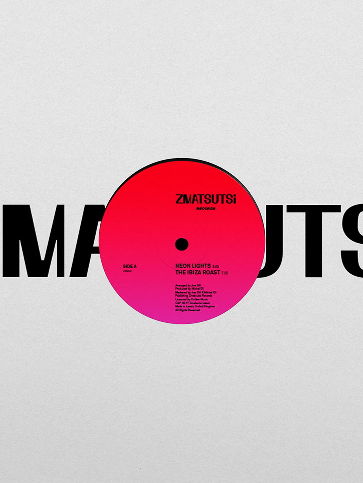
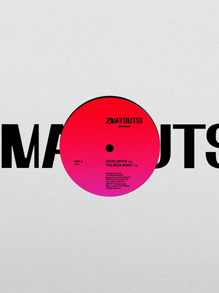
A red vinyl record with a pink centre label sits against a pale grey background. The label reads “Zmatsutsi Records” and lists the tracks “Neon Lights” and “The Ibiza Roast”. Large, black typographic letters are partially obscured behind the record.

Designer Kara Zichittella talks about her typographically-led projects

—
Date
24 March 2017

Designer Kara Zichittella started her studio Zeitype in 2015 while she was studying for her master’s at Leeds College of Art. “It was set up as a platform to showcase my personal projects and new commissions,” Kara explains. “I mostly work independently, but sometimes collaborate with friends on self-initiated projects and incentives.”

Kara grew up in Hawaii, which “doesn’t have much of a design culture to refer to”, but she’s always been interested in drawing and painting. “My dad pushed me to apply for the Visual Communication Design programme at Arizona State University’s Design School, Here, traditional Swiss principles of design were encouraged and my passion for design grew from there,” she says.

Kara’s portfolio is full of projects that aim to “generate conceptual solutions with a strong typographic approach” and creating typefaces is something the designer really enjoys. “I like the utilitarian nature of making typefaces or visual systems which can work to give a project a unique sense of identity,” explains Kara. “[In my work] I apply a conceptual and pragmatic logic to the design process. I’m very interested in the way complex ideas can produce simple and effective work.”

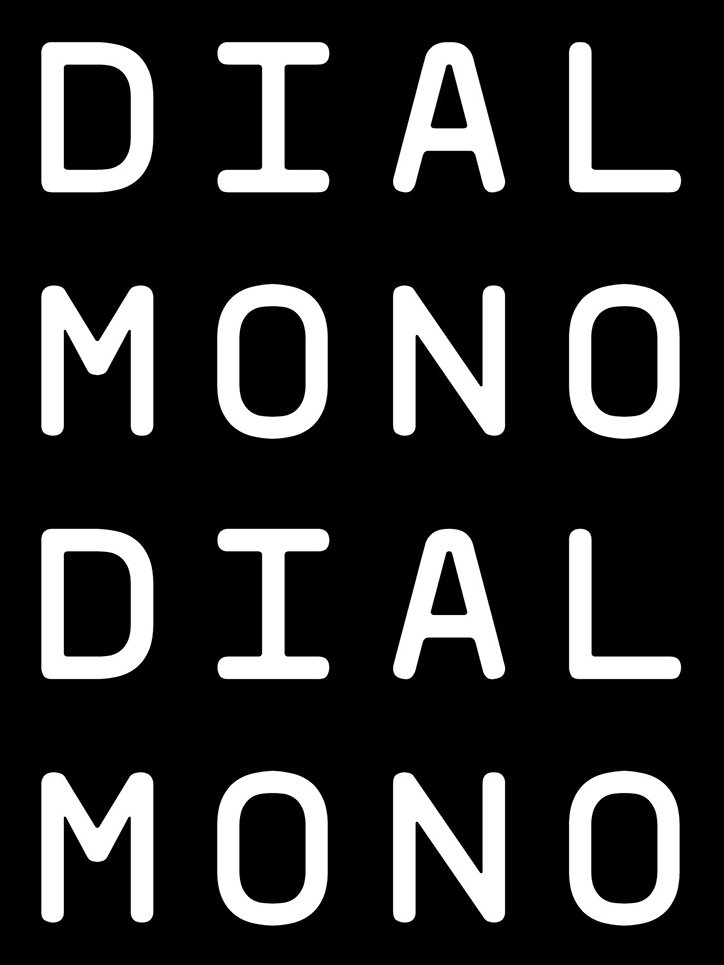
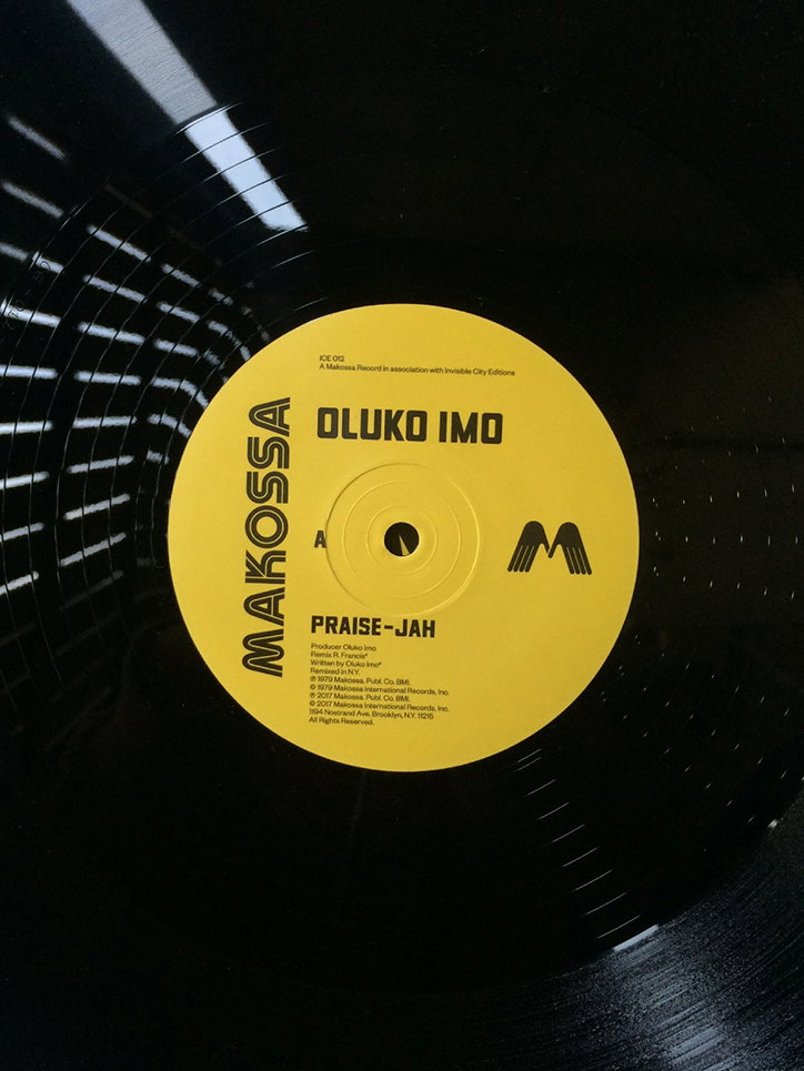
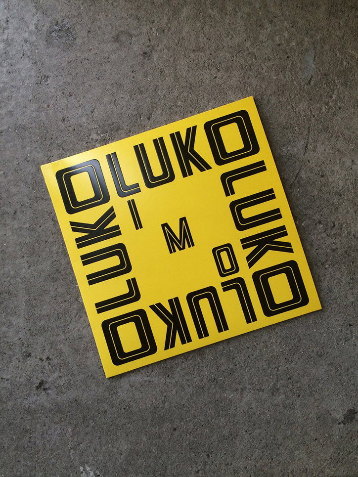
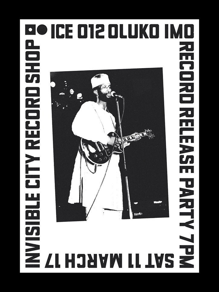
Most recently Kara has been working with Invisible City Editions, a record label from Toronto, designing album artwork for some vinyl reissues. “I’m also developing new weights for Dial Mono, a monospace typeface collaboration with friend and designer, Josh Baker.” Her use of type and colour is thoughtful and the designer uses imagery sparingly giving her work a graphic aesthetic. “My aim with Zeitype is to make engaging work which communicates an experience or mood through typography,” says Kara.
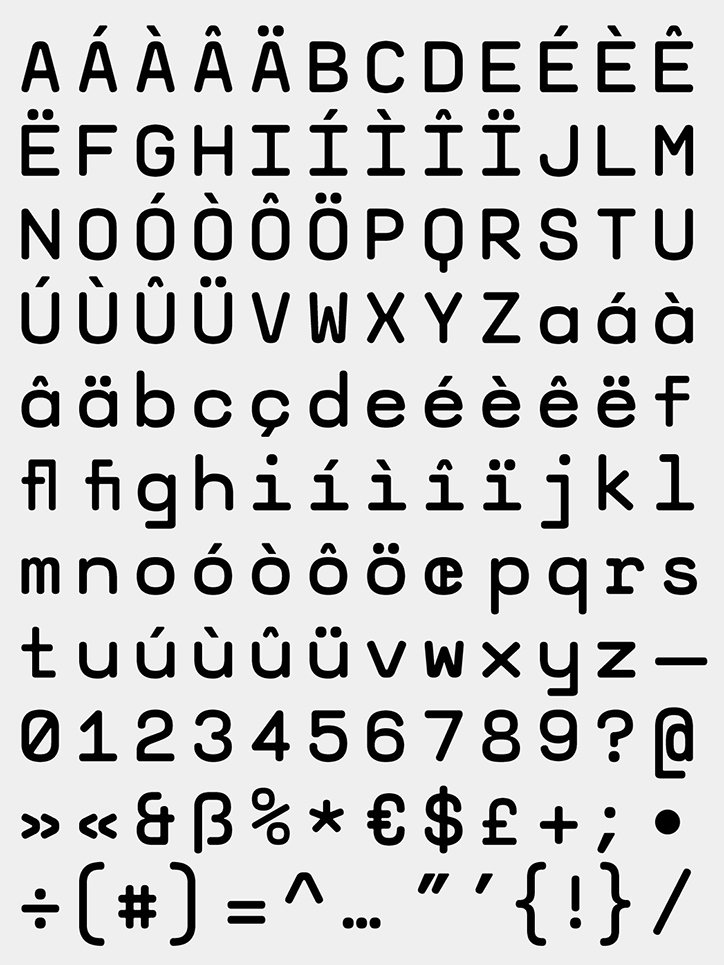
A specimen of a clean, sans-serif typeface in black on a light grey background. The image shows a full character set including uppercase and lowercase letters, accented characters, numbers and symbols.
Above
Left

Zeitype and Josh Baker

A typographic image with white text on a black background. The words “DIAL MONO” are repeated twice in a bold, rounded sans-serif typeface.
A close-up of a black vinyl record with a bright yellow centre label. The label features the text “MAKOSSA”, “OLUKO IMO” and “PRAISE-JAH”.
Above
Left

Zeitype

A yellow square card lies on a grey concrete floor. Bold black typography reads “OLUKO” around the edges, with a central “M” flanked by an “I” and an “O”.
A black and white poster for a “Record Release Party 7pm” on “Sat 11 March 17”. A central photograph shows a person playing an electric guitar and singing into a microphone. The border reads “Ice 012 Oluko Imo” and “Invisible City Record Shop”.
Above
Left

Zeitype

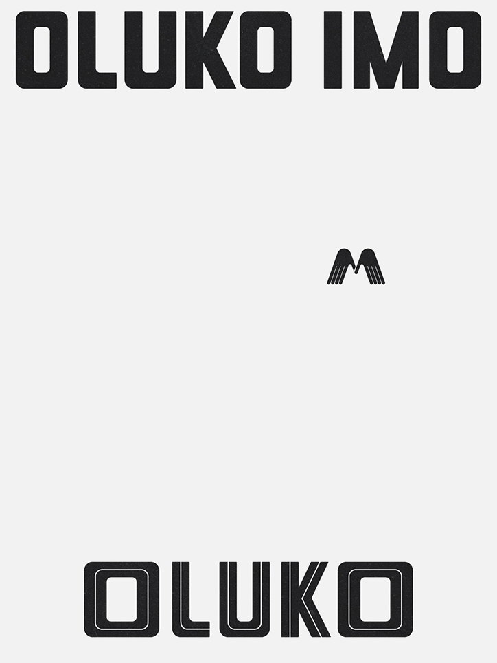
A minimalist graphic design on a light grey background. Bold black text at the top reads “OLUKO IMO”, with a small black wing icon in the centre and the word “OLUKO” in a outlined font at the bottom.
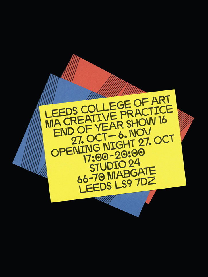
A yellow flyer sits atop blue and red sheets of paper against a black background. The text reads “Leeds College of Art MA Creative Practice End of Year Show 16”, listing dates from “27. Oct – 6. Nov” at “Studio 24”.
Above
Left

Zeitype

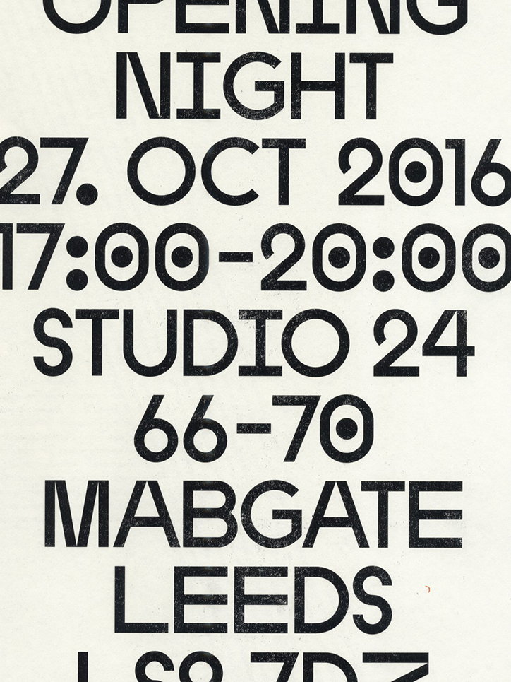
A typographic poster reads “OPENING NIGHT” followed by the date “27. OCT 2016” and the time “17:00–20:00”. Below this, the location is listed as “STUDIO 24”, “66–70 MABGATE”, “LEEDS”.
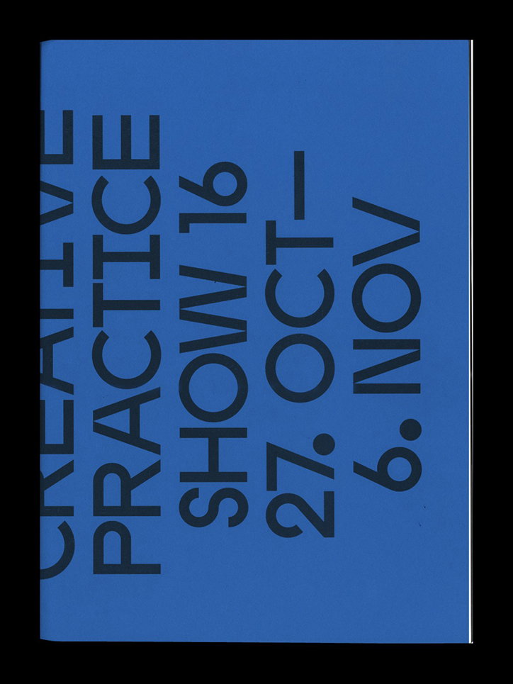
A blue poster with bold, dark blue vertical text that reads “CREATIVE PRACTICE SHOW 16”. Below this, the dates “27. OCT – 6. NOV” are listed.
Above
Left

Zeitype

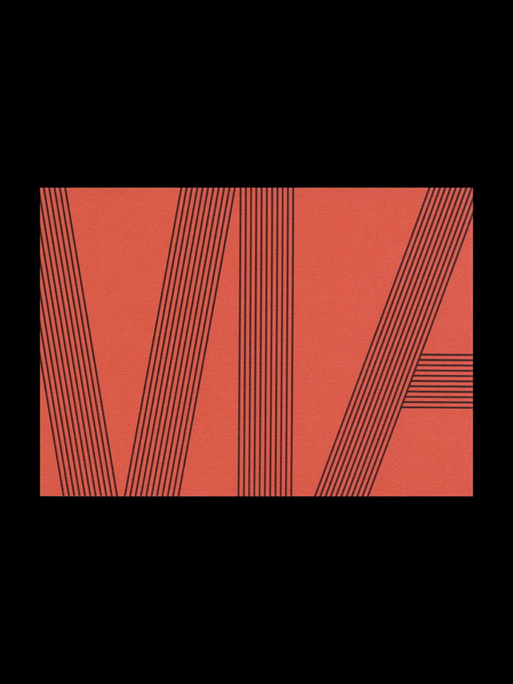
A graphic illustration of the word “VIA” in a bold, linear style. The letters are formed by thin black parallel lines against a textured coral background.
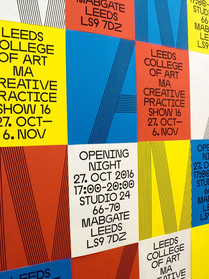
A grid of colourful posters in red, yellow and blue. The text reads “Leeds College of Art MA Creative Practice Show 16” and “Opening Night 27 Oct 2016”.
Above

Zeitype

Share Article

Further Info

About the Author

Rebecca Fulleylove

—

Rebecca Fulleylove is a freelance writer and editor specialising in art, design and culture. She is also senior writer at Creative Review, having previously worked at Elephant, Google Arts & Culture, and It’s Nice That.


It's Nice That Newsletters

Fancy a bit of It's Nice That in your inbox? Sign up to our newsletters and we'll keep you in the loop with everything good going on in the creative world.