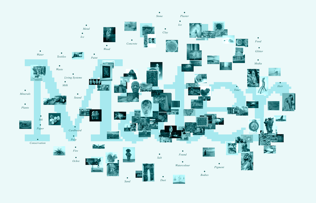
Kartik Tuli is dismantling graphic design perfection, one project at a time
Sculpture, web design, typography – whatever Kartik turns his hand to, there is an urge to let real world influences mess with standardisation.
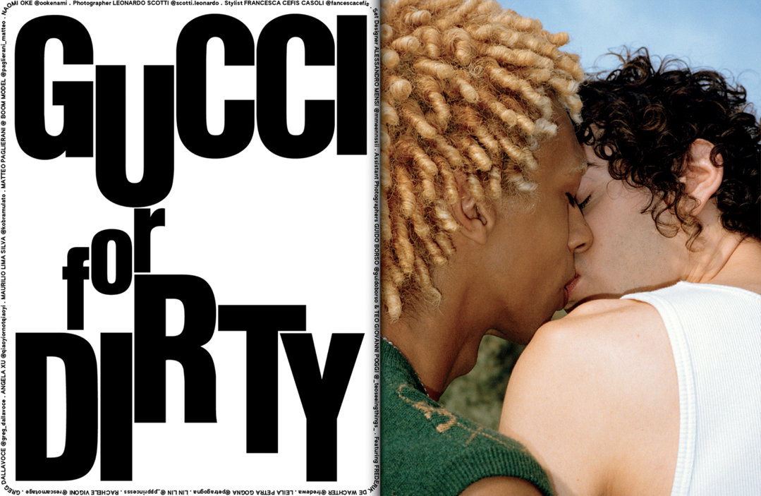
When Kartik Tuli is designing websites, he likes to think about how we navigate the world in real life. That’s how Katkoot Italia, a winemaker, received a website that opens like a filing cabinet, and why the fashion brand Karu Research will soon launch a website that works a bit like a light switch. Actually, Kartik likes to embed handmade quirks and diversions into the fabric of everything he produces – sometimes to his detriment. For the first issue of Indian print title The Dirty Magazine, Kartik designed bespoke typesetting for each and every story and no two copies were the same.
‘Imperfection’, generally, is a much-discussed concept in graphic design today; Kartik’s own specific relationship with this approach emerged in his youth. “Growing up in Delhi I spent a lot of time at local markets, where I found a culture of knockoff branded clothing and accessories. Misspelt brand names, askew logos, Indian flairs and embellishments excited me because they represented a parallel reality that directly referenced the surroundings,” he says. Kartik became interested in how visual communication can not only adapt depending on its cultural surroundings, but distil them, “as a form of expression”.
Then, when Kartik studied at RISD, another evolution occurred in his practice. “My mind was blown by the resources available to us at the school. There was no limit to what you could do and it made me want to extend my graphic design work beyond 2D.” Alongside his ‘flat’ work, he began making surfaces that could be turned into a spatially complex 3D object.
Now working as a full-time designer in Brooklyn at 2x4, Inc, his personal practice continues this spirit of exploration. Stand out projects include PoMo, a collection of essays which, dependent of their content, are split between ‘modernist’ and ‘postmodernist’ typesetting, and Trash/Treasure, a book (of sorts) made from bags of scraps and scans collected from a commercial printing shop in Delhi.
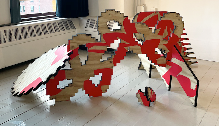
Kartik Tuli: Where Do We Go from Here, solo exhibition at Rhode Island School of Design (Copyright © Kartik Tuli)
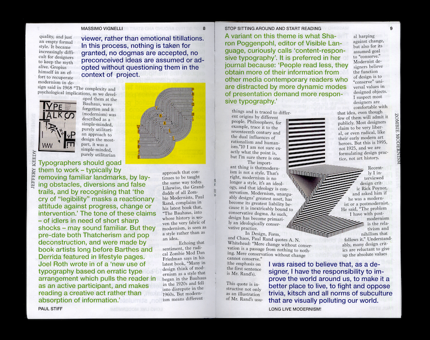
Kartik Tuli: PoMo (Copyright © Kartik Tuli)
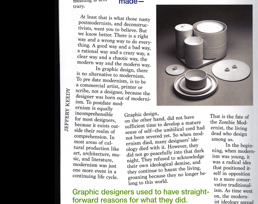
Kartik Tuli: PoMo (Copyright © Kartik Tuli)
Kartik Tuli: PoMo (Copyright © Kartik Tuli)
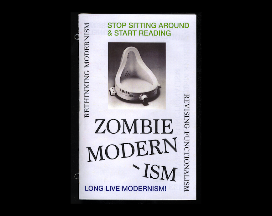
Kartik Tuli: PoMo (Copyright © Kartik Tuli)
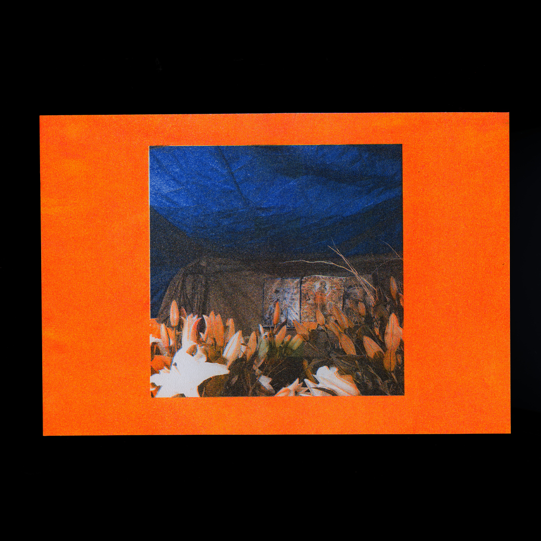
Copyright © Kartik Tuli
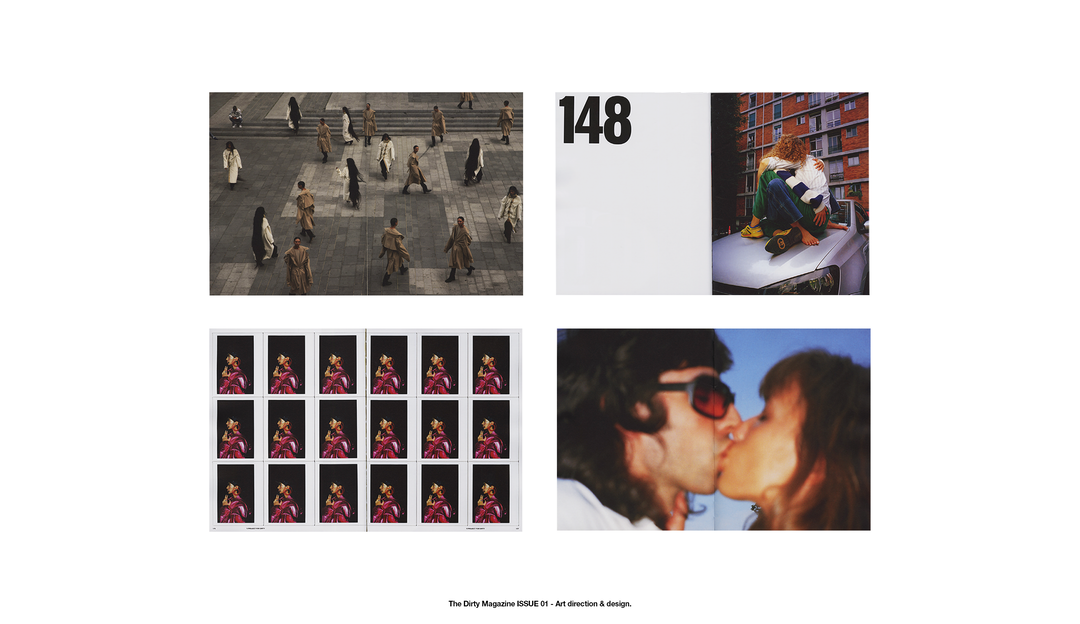
Kartik Tuli: The Dirty Magazine (Copyright © The Dirty Magazine)
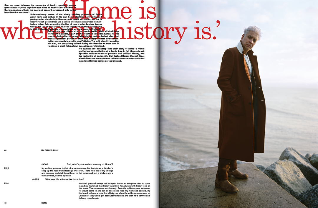
Kartik Tuli: The Dirty Magazine (Copyright © The Dirty Magazine)
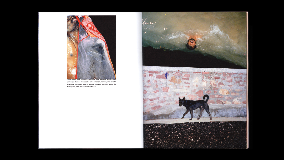
Kartik Tuli: The Dirty Magazine (Copyright © The Dirty Magazine)
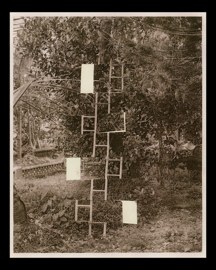
Kartik Tuli: The Sapper by Bharat Sikka (Copyright © Bharat Sikka)
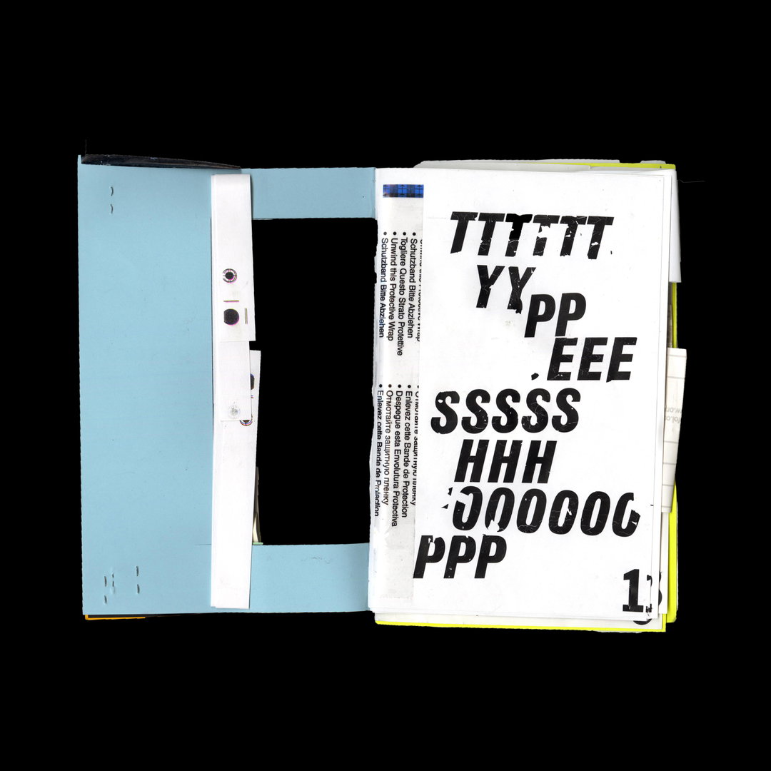
Kartik Tuli: Trash/ Treasure (Copyright © Kartik Tuli)
Kartik Tuli: Trash/ Treasure (Copyright © Kartik Tuli)
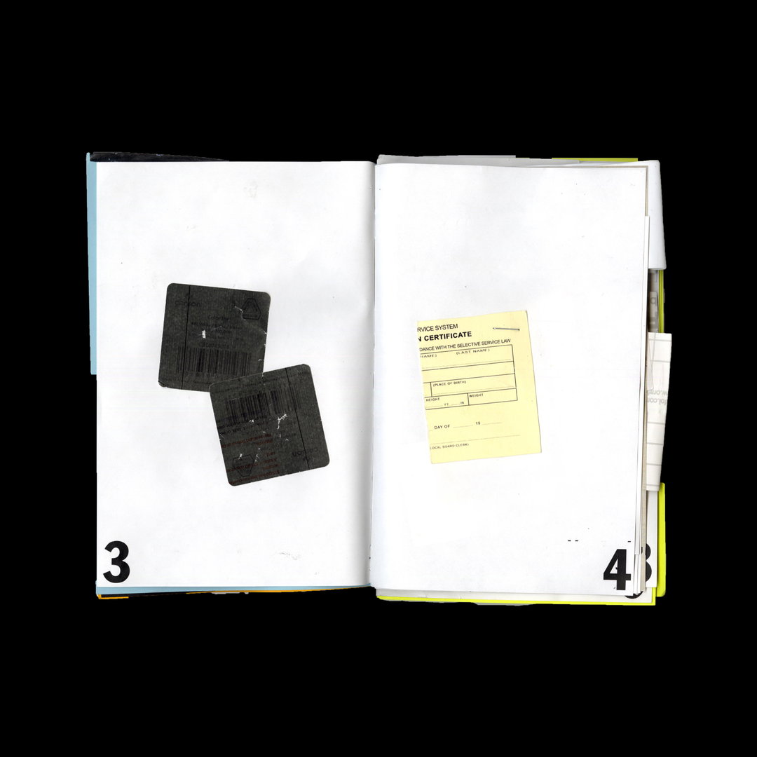
Kartik Tuli: Trash/ Treasure (Copyright © Kartik Tuli)
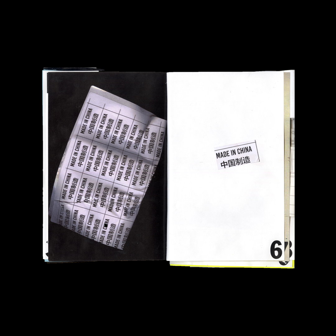
Kartik Tuli: Trash/ Treasure (Copyright © Kartik Tuli)
Hero Header
Kartik Tuli: The Dirty Magazine (Copyright © The Dirty Magazine)
Share Article
Further Info
About the Author
—
Liz (she/they) is the senior editor at Insights, a research-driven department within It’s Nice That. They previously ran the news section of the website. Get in contact with them for potential Insights collaborations or to discuss Insights’ public-facing reports.