Wim bakery’s branding takes tips from floury work benches and croissant folds
Designer Kevin Högger’s visual system for the Zurich-based business draws on the bakery’s industrial interiors and sourdough sweet treats to tie the brands signature to its physical space.
When the Zurich-based graphic designer Kevin Högger embarks on a new visual identity for a brand he pays close attention to the physical space it inhabits – a process likely learnt from his background in industrial design and architecture. Much like his identity for Zurich-based eatery Belmondo, where the designer drew from the restaurant’s old neon signage for a logo mark that hinted at 70s nightlife, a new project for local independent bakery Wim saw Kevin once again turn to interior.
The brief came to the designers desk when a few mutual friends were looking for a brand identity for their new sourdough bakery on quite a short timeline. “They were eager to open as soon as possible”, Kevin says, “and they mentioned that they were taking over an existing space that had only been built two years prior, with a well-designed interior.”
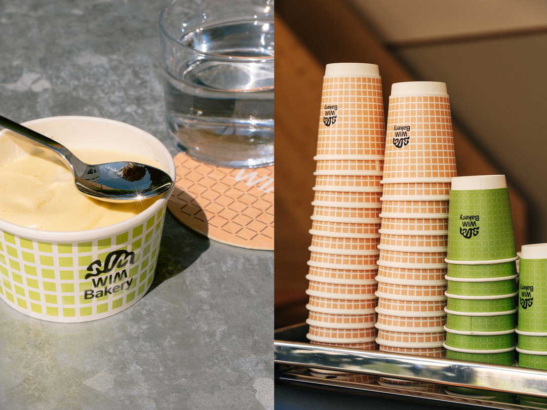
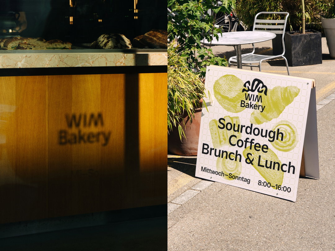
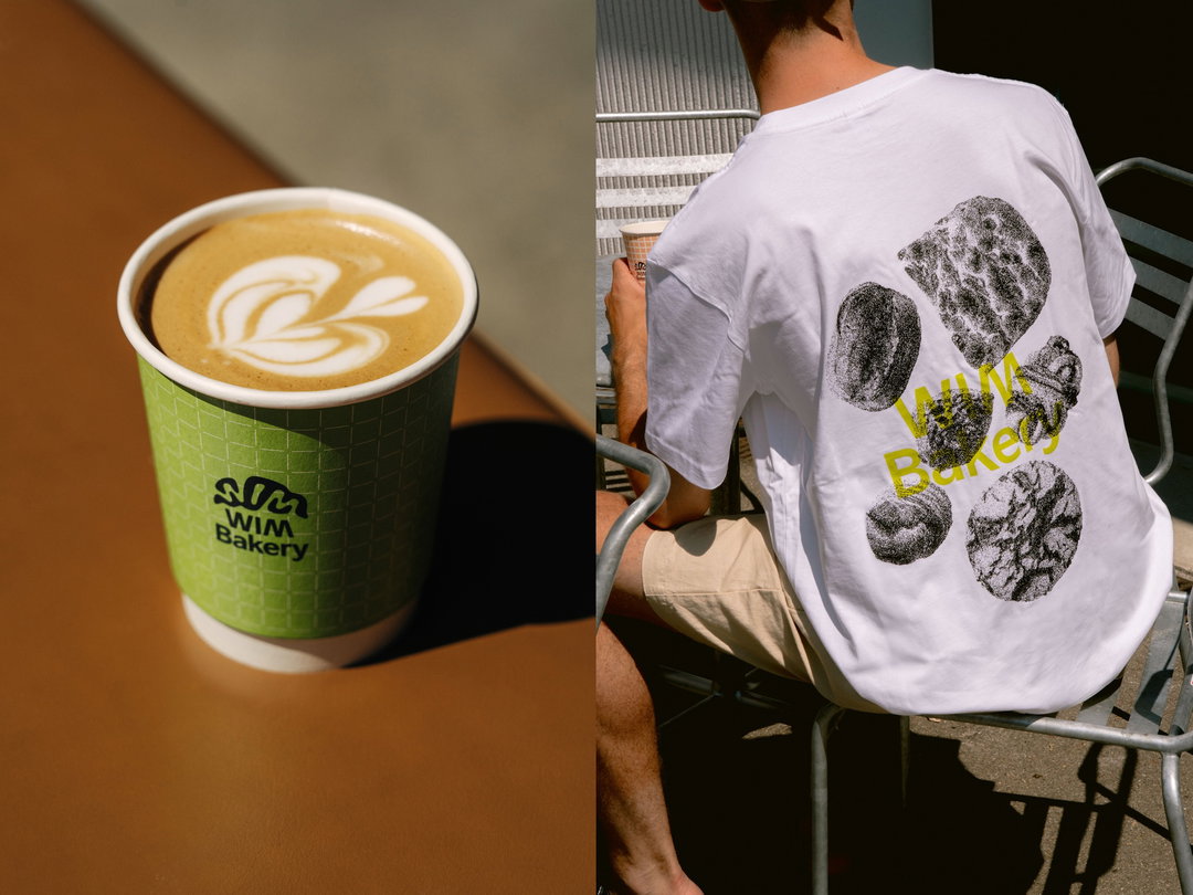
Following an initial look around the bakeries industrial site, the designer got to work on crafting a visual system that took influence from the building’s structural components. “For this project, I didn’t rely heavily on external visual references, as the existing interior already offered a wealth of inspiration,” Kevin shares. The bakeries’ green tiled walls spurred on a system of grid-based patterns that the designer used to maintain a “consistent and cohesive visual language throughout the brand identity, whether on print, packaging, or merchandise”, he says. This visual trend across assets became the strong core principle that Kevin always looks to establish from the get go with every branding project.
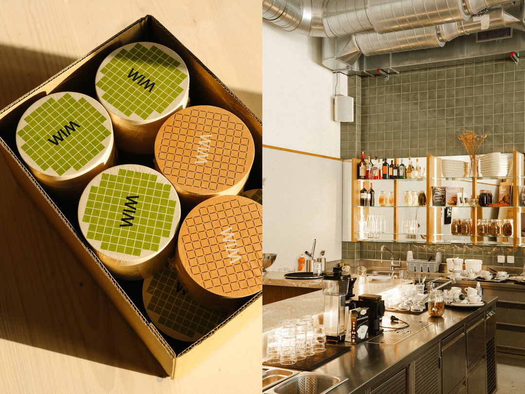
Kevin Högger: WIM Bakery (Copyright © Kevin Högger, 2025)
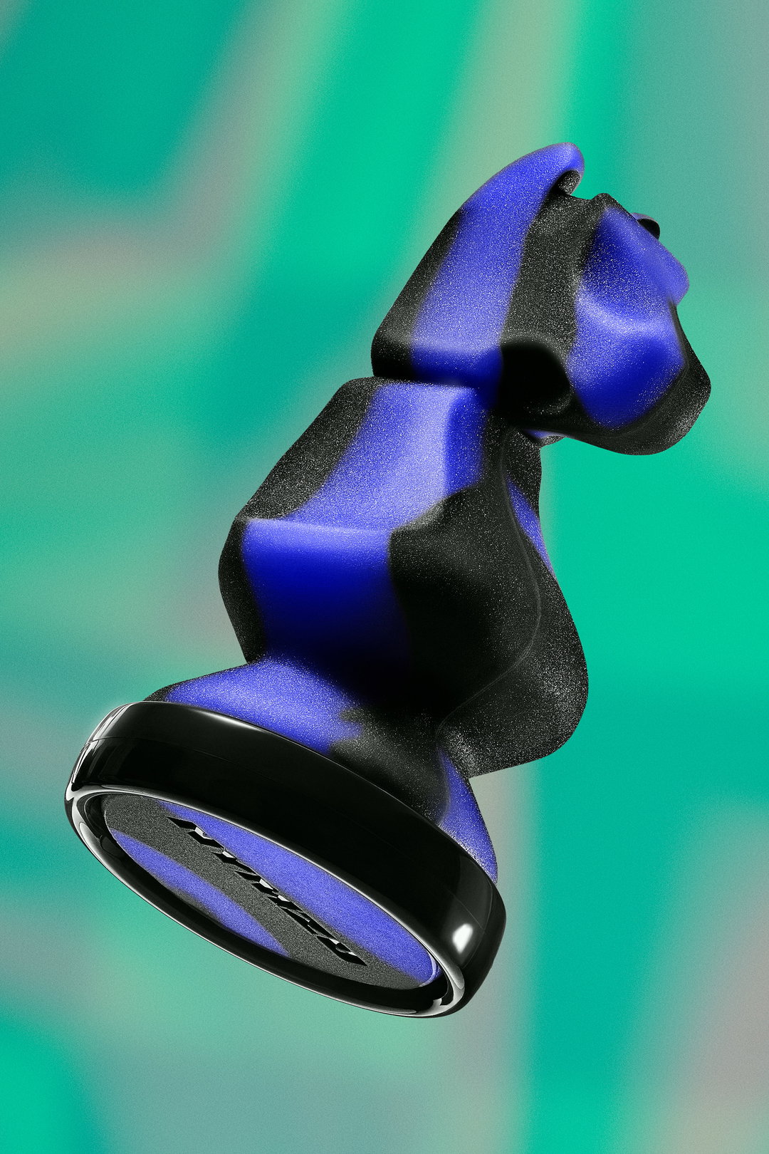
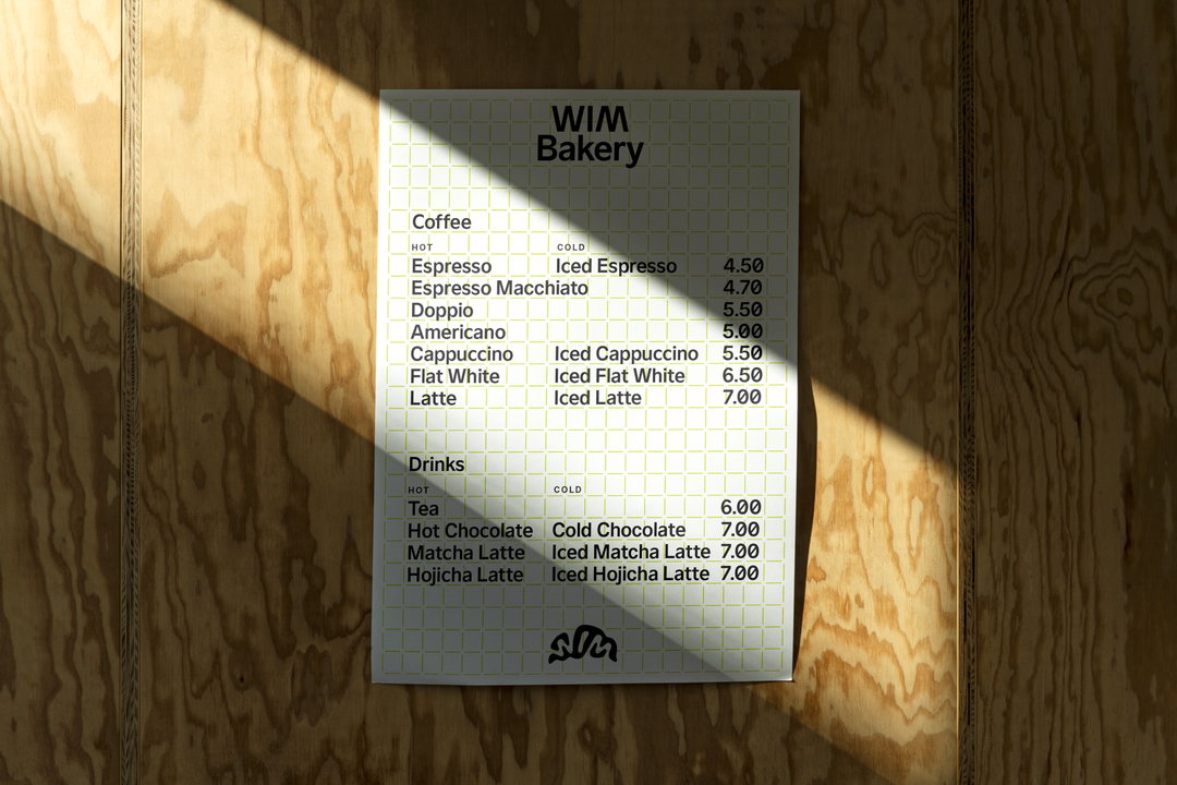
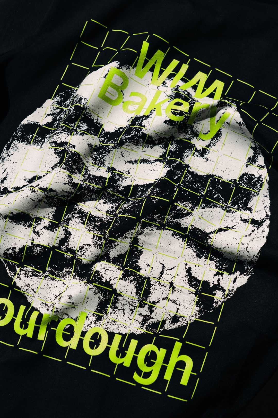
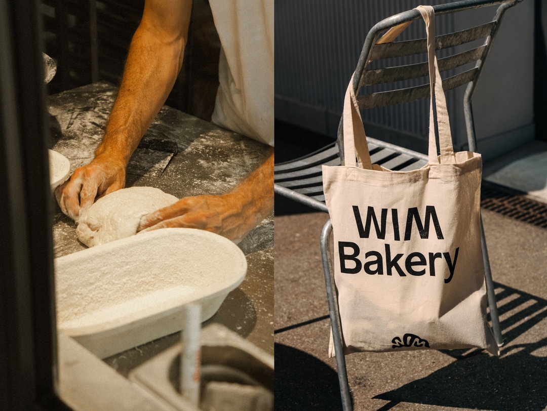
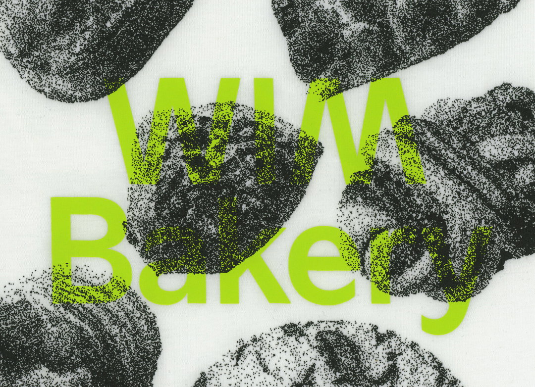
Once the tile-like grid systems were set up, Kevin introduced printed elements to the identity, taking influence from the flour on bakers benches that stop dough sticking to surfaces. Creating a halftone image treatment for assets, the designer transformed Wims tasty images of baked goods into a set of “grainy textures that evoke the look of flour scattered on a surface”, he says. For the typographic elements that overlay these images on bakery signs, menus, coasters and posters, Kevin used a custom typeface MM Sign, developed in collaboration with Daniel Wenzel at Mockup.Maison. “Its clean, neutral letterforms provided a strong foundation for adding more expressive graphic elements”, Kevin adds.
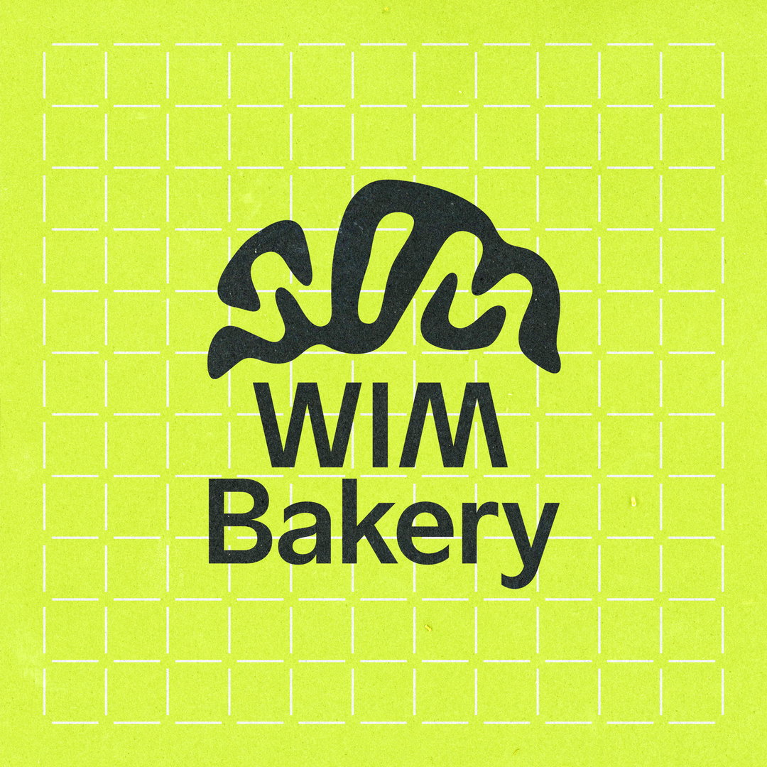
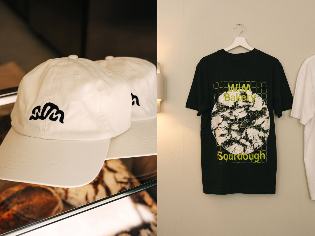
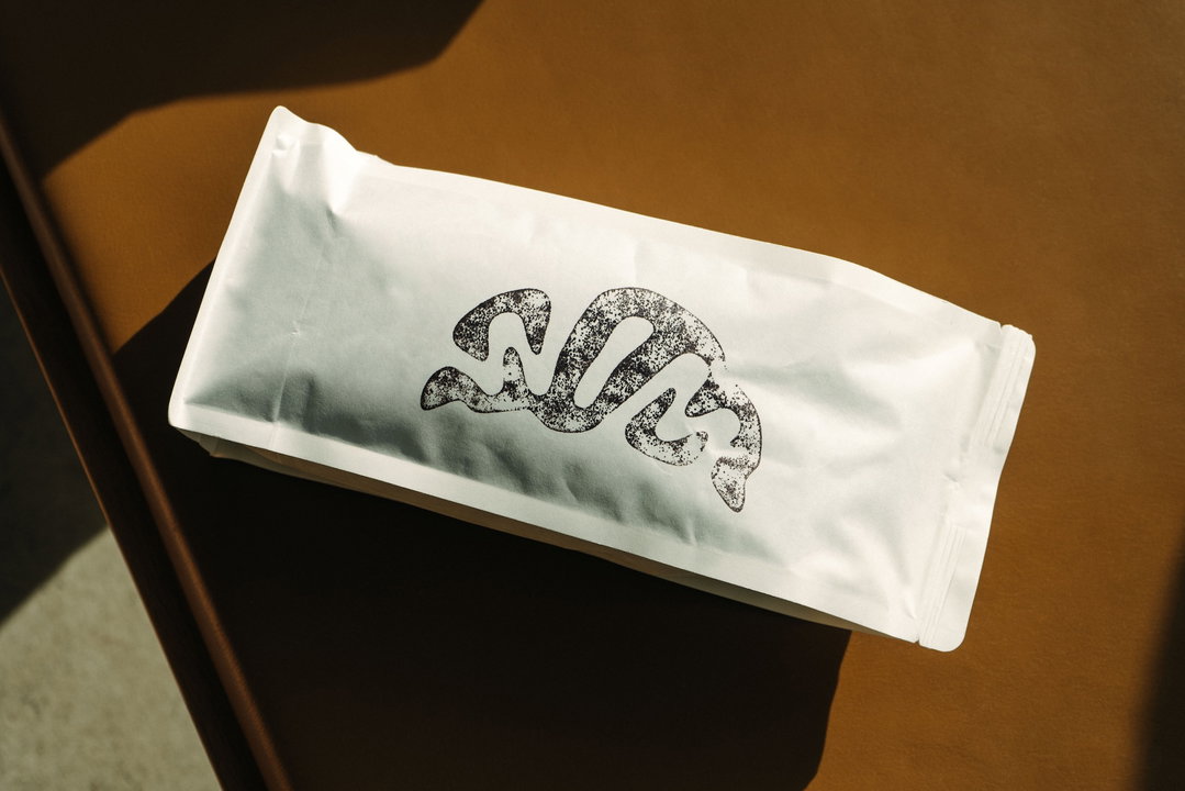
The imagery wasn’t the only thing that has ties to the kitchen; the brand’s new logo neatly fits into the curved shape of a croissant. “People really seem to enjoy the croissant logo”, Kevin says, but he assures us, although it looks “straightforward”, this typographic solution actually took dozens of explorations and sketches to get right. From the very beginning of the project the designer was intrigued by “the symmetry in the word Wim”, and knew he wanted to do something with this visual trick. Although he wasn’t initially expecting an arrangement of letters that naturally formed a croissant, it’s now become a playful visual reference that’s become closely associated with the brand.
Now the ovens are up and running at Wim, the bakery has opened to much local fanfare and the designer often sees people around Zurich sporting the brand’s merchandise, shirts and tote bags that he designed for customers to get their hands on alongside baked goods. “It’s always fulfilling to see people wear your designs in everyday life”, he ends. “It shows that the merchandise is more than just a logo on a shirt; it's a thoughtfully integrated part of the brand identity.”
GalleryKevin Högger: WIM Bakery (Copyright © Kevin Högger, 2025)
Hero Header
Kevin Högger: WIM Bakery (Copyright © Kevin Högger, 2025)
Share Article
Further Info
About the Author
—
Ellis Tree (she/her) is a staff writer at It’s Nice That. She joined as a junior writer in April 2024 after graduating from Kingston School of Art with a degree in Graphic Design. Across her research, writing and visual work she has a particular interest in printmaking, self-publishing and expanded approaches to photography. [email protected]
To submit your work to be featured on the site, see our Submissions Guide.