Kris Andrew Small on pushing his style forward without distancing it from his existing work
The Australian illustrator and designer has been working with a plethora of exciting clients while also developing his personal style – and it’s seen his confidence grow immensely.
Sometimes, from afar, it may appear that a creative’s portfolio is continuing to grow as it should, building upon a style or a pattern of concepts – but there is a lot more going on than meets the eye. This is certainly the case with Kris Andrew Small, an illustrator and designer based in Paddington, Australia. It’s been a little over a year since we last wrote about Kris’ work and he’s continued to go from strength-to-strength, producing more of his distinctive work for a range of amazing clients, but the biggest change has been in his mindset.
“I definitely have a lot more confidence in my work, that takes time and a lot of testing and failing,” he tells us. “What I’ve noticed is that every time I overthink something about how the work will be received, it just doesn’t work. If I do what comes naturally and trust myself, A. the work is better and B. people respond to it a lot more, they can see the honesty in the work I think.” Clearly, it’s an approach which is working as in the last year, Kris has worked on commissions for Nike, Reebok Classics, Wonderland Magazine, Crack Magazine, Adobe and more. He held a solo show in London last year and has been working with an agent, Grand Matter, in the UK.
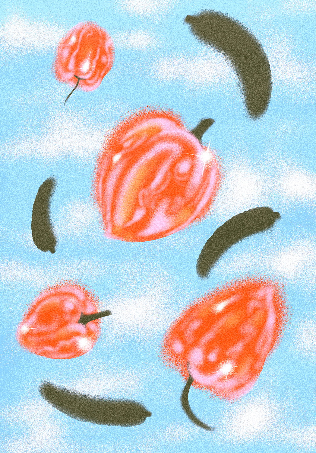
Kris’ work is unique in its blending of styles, sitting somewhere between graphic design and illustration. And the way in which he blends these media has been a real focus for Kris recently. Whereas he used to view different works as part of different media – “I made type work, crazy textural pieces and photo collages” – lately, he’s been trying to seamlessly mix them together to make “one cohesive ‘super style’.”

Kris Andrew Small: Street posters
Another major development for Kris has been the introduction of animation into his practice – yet another medium the creative now has under his belt. Looking at Kris’ previous work, which is always full of dynamic energy and basically begging to be animated, it’s a fitting step up and something he calls “a natural progression”. “Sometimes I made work that somehow just didn’t feel finished or that it needed something else,” he says, “and when I started to animate, it gave it that extra bit of energy that it needed.” This is part of Kris’ overall goal to push his style every time he makes a new work to ensure its constantly evolving. “If it’s a type work for example, I make something I would have before and then I think, ‘OK, what can I change to push it forward without distancing it from my existing work’,” he adds.
Looking back over the past year, a real highlight for Kris was his project with Reebok Classics. He was brought on board to work on a visual commission alongside the launch of a new trainer and ended up heading to The States to do a large installation piece in Times Square. “That was pretty crazy, to be honest,” Kris reflects. “It was a bit of a dream come true really. It was interesting because it went from a very digital brief to, all of a sudden, a giant physical work. So it was cool to see the whole process evolve.”
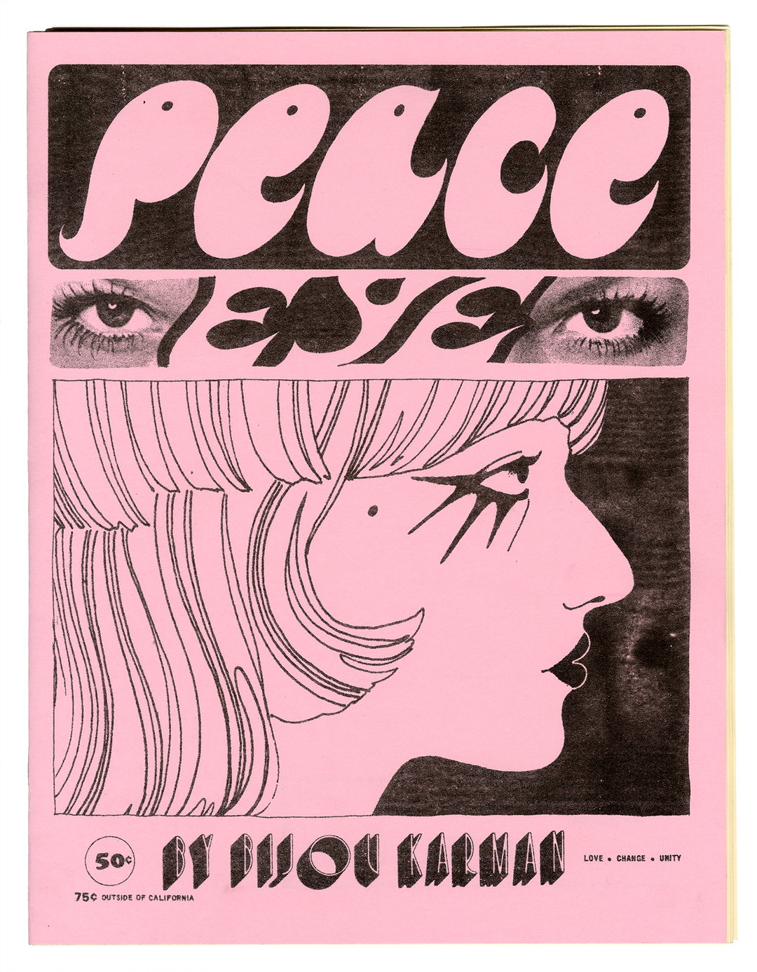
On a much smaller scale, Kris is also fond of a poster he recently created titled Human. While it’s a single standalone work, it’s one of the pieces which has really contributed to his shift in perspective. It was made quickly and intuitively, and Kris kept working on over a three-month period. “I kept changing it and doing so many colour ways and new versions, literally this went on for three months. Then I forgot about it for a month or so,” he says. When he rediscovered the work, he went back to the very first version he made. “It’s funny sometimes you have to go through so many options to realise the first raw version of the work was actually the best. That taught me a lot about trusting myself and not overworking an idea and it’s best to go with my instinct.”
With several commercial projects on the go and some exhibitions in the pipeline later this year (all going well), Kris’ big plan is to use a residency he has coming up to make his work a little less computer-based – “maybe even finally pick up a paint brush, who knows?” Thematically, however, he will continue to explore how he can intertwine strong messages within his graphic and illustration work. “It’s really nice to see so much more activism in peoples’ work,” he concludes. “The world is a weird place these days and people are a bit fed up and a lot of artists have these platforms that they didn’t have before. I think people find artists they like now, based on their work, but also based on the message they put out and what they stand for. I think it’s also bringing back a rebellious side to design that has maybe been missing for the last few years.”
GalleryKris Andrew Small

Reebok Classics

Human

How Make Sense

Fresh Fruit Jam

Wild Night


What Do U Fear

Made in Colombo
Hero Header
Kris Andrew Small: Fluid Lush
Share Article
Further Info
About the Author
—
Ruby is Senior Creative at It's Nice That, overseeing our visual output across platforms and projects. Before that, she was associate editor on the editorial team, after joining in September 2017 following graduation from Central Saint Martins.