Laura Csocsán on the artistry of type design and some advice for this year’s graduates
Without the time for large scale projects, Laura has been focussing on posters and custom typography.
Share
A lot has changed for Budapest-based designer and former It’s Nice That Graduate Laura Csocsán since graduating last summer. Currently, she’s working full-time but remotely from Budapest for &Walsh, after initially working part-time with friends in a smaller studio, whilst continuing freelance projects on the side. “Generally speaking, these freelance projects involve custom typography and poster and logo design for different occasions and purposes,” Laura explains, “all of them devoid of the regular client-designer hierarchy, it felt liberating working on these.” The nature of bigger studio work, however, has meant Laura focuses almost all of her time dealing “specifically with type design and projects that involve custom typography” as well as branding projects. Recently for Laura, things have been somewhat “tumultuous” she says, “and it is harder for me to manage freelance projects now, so I have to be very careful with time-management and my priorities,” Laura tells us, expanding that she has learned a lot “about how to prioritise during a process, how to stay in focus and last but not least, how to work from home.”
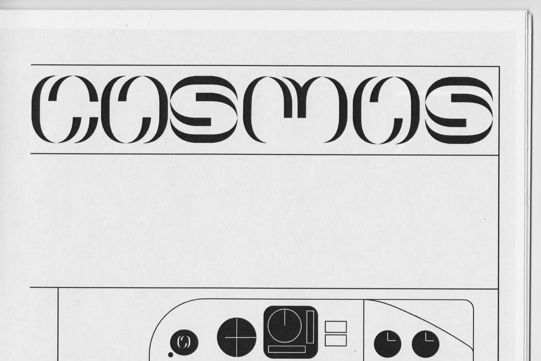
Since graduating, Laura’s interests have shifted even more towards type design, a medium, she explains, will allow her to explore new grounds: “[it] holds many concrete things to learn without lacking the need for the training of the imagination.” In doing so, she celebrates and thrives on the difference between art and design, finding type design “more fulfilling in itself artistically than solely graphic design,” despite the introspection that the typographic field is typically “considered something far from artistic expression and more a tool with a purpose.” Not rejecting either side, Laura remains motivated by “the synchronicity of these two fields,” noting that awareness for quality type design has increased due to custom typography becoming something easier to achieve through contemporary software.
“My recent works are very fragmented since I haven’t had the opportunity to work on complex projects,” Laura tells us. However, despite this, she has continued to approach her smaller-scale projects with the same conceptual, considerate creative practice, not perturbed by the size of the project. An example of this would be the poster she created for the Entkunstung III launch, a poster about the turbulent history of computers. What Laura created was a “seemingly clustered” and chaotic image where “abstract forms in a random composition” were determined by “an invisible base structure – just as the geometric forms displaying numbers or data in this insoluble visual manner.” An image of the 1990s iCray Y190A supercomputer is found in the upper left corner, “just as temporary and transcended as every other technological development throughout the decades.” It is this ardent attention to detail partnered with a total contextual understanding and artistry that makes Laura’s work so compelling. We can see the level of commitment and passion laboured into each image she makes through the effortless nature of her work, come not from chance but diligence and skill.
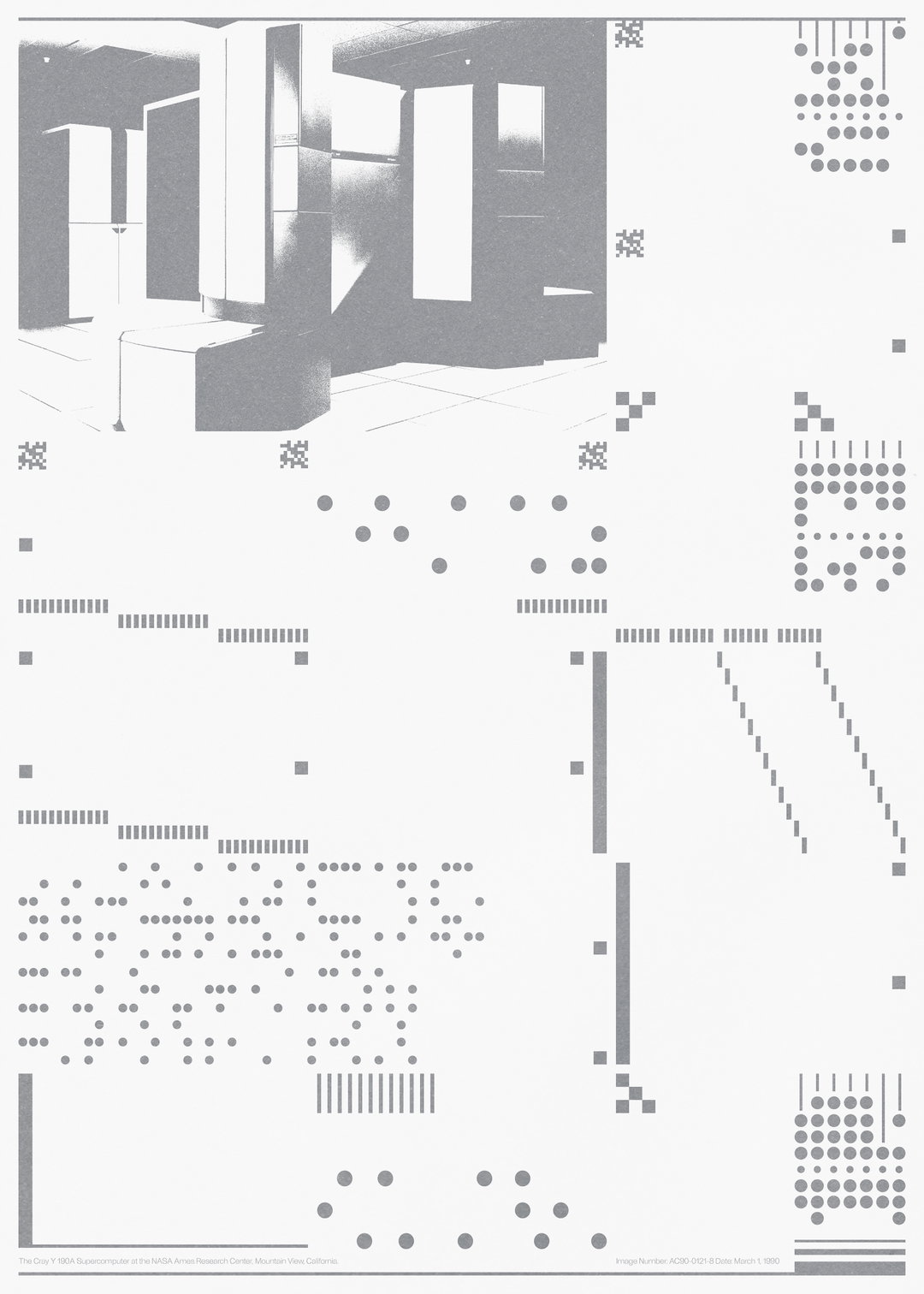
Laura Csocsán: Entkunstung Poster
As poster design was a new medium for Laura, she found herself excited and exercising trepidation due to “the limitations of the medium,” adding “it was nice to be able to take up this challenge finally.” The limitless tone of voice conveyed through “different lettering or custom types” alongside the lacking concern for legibility due to it being “easier to be free with forms” has seen Laura thrive. Another recent collaboration was with Aron Lodi for issue five of Utca&Karrier, where Laura crafted Final Fantasy artwork aligned “to a rule where stems can only be slanted in one direction or be vertical, which provided a certain frame to adapt to.” The resulting typographic mood “draws from a dystopian vision” that is found in the content of the publication.
Giving advice to this year's graduates, Laura says that “there is one particular thing in my opinion that is extremely important and helpful, especially now – that is to be patient.” She stresses that despite the time it takes to hone one’s craft, it’s crucial you stay motivated. “It is hard to stay motivated, even harder to stay productive now,” she tells us, emphasising “it is important to remember that no one is going on the same path and finding [yours] also takes time.” She continues: “Taking steps towards goals that may not be clear is hard, and waiting to see the results of our efforts need patience because nothing is immediate.”
Depending on where the world finds itself in the coming year, Laura intends to start work somewhere new, potentially abroad – whilst at the same time she’s also “considering working full-time as a freelancer..” With an avidly determined mindset, we know Laura will continue to produce amazing work which we are excited to see, wherever she ends up. When asked where she considers her work to be heading, Laura tells us that “I have set my mind to release more typefaces, and extend and update the existing” adding that “it’s always an ongoing process and I would like to devote more time to it in the future, making it my primary focus compared to graphic design.” Laura released Ambiant Sans, in September last year and continues to work on Ambient Serif to accompany it. Importantly for Laura, she intends to continue her study of type design, excited to discover where to next push the typographic discipline in the fresh, speculative and considerate mindset she brings to the field.
GalleryLaura Csocsán
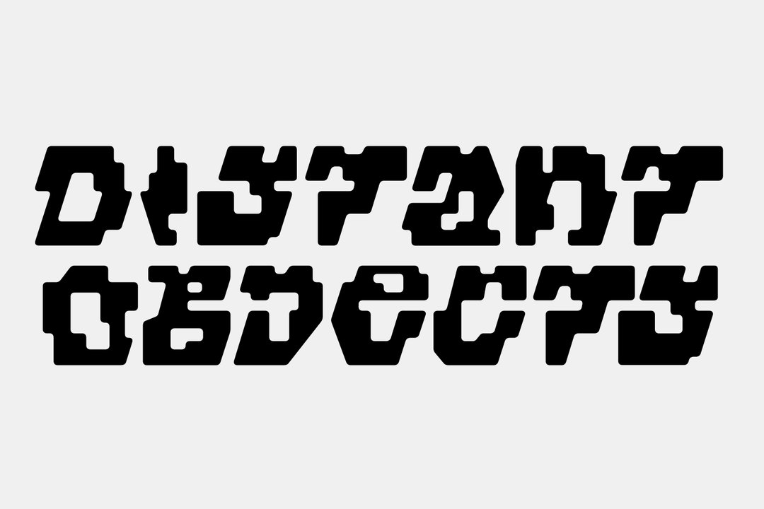
Distant Objects Lettering
70 Lettering
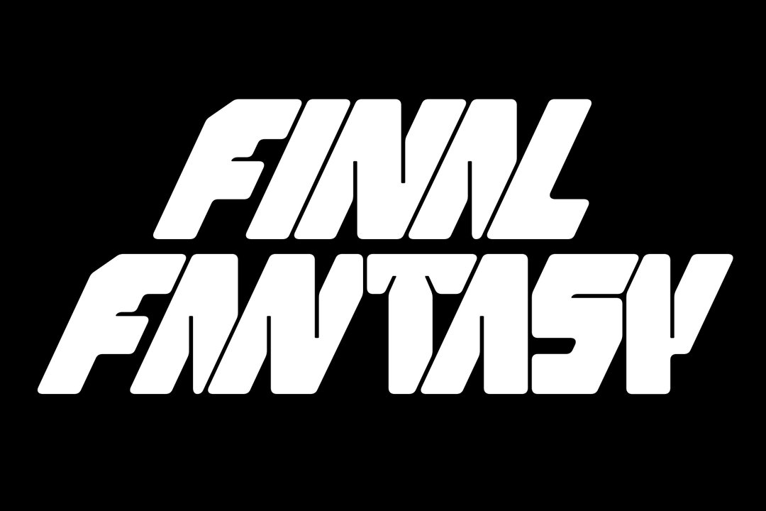
Laura Csocsán and Aron Lodi: Final Fantasy Lettering
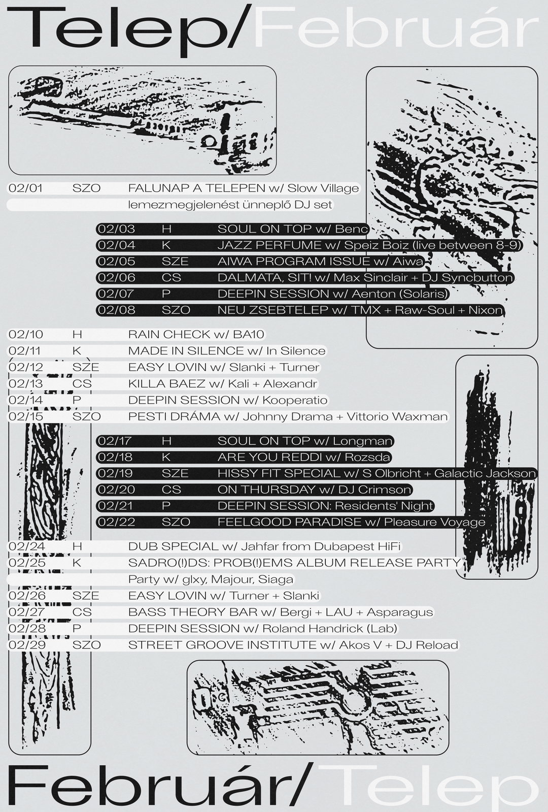
Telep Poster
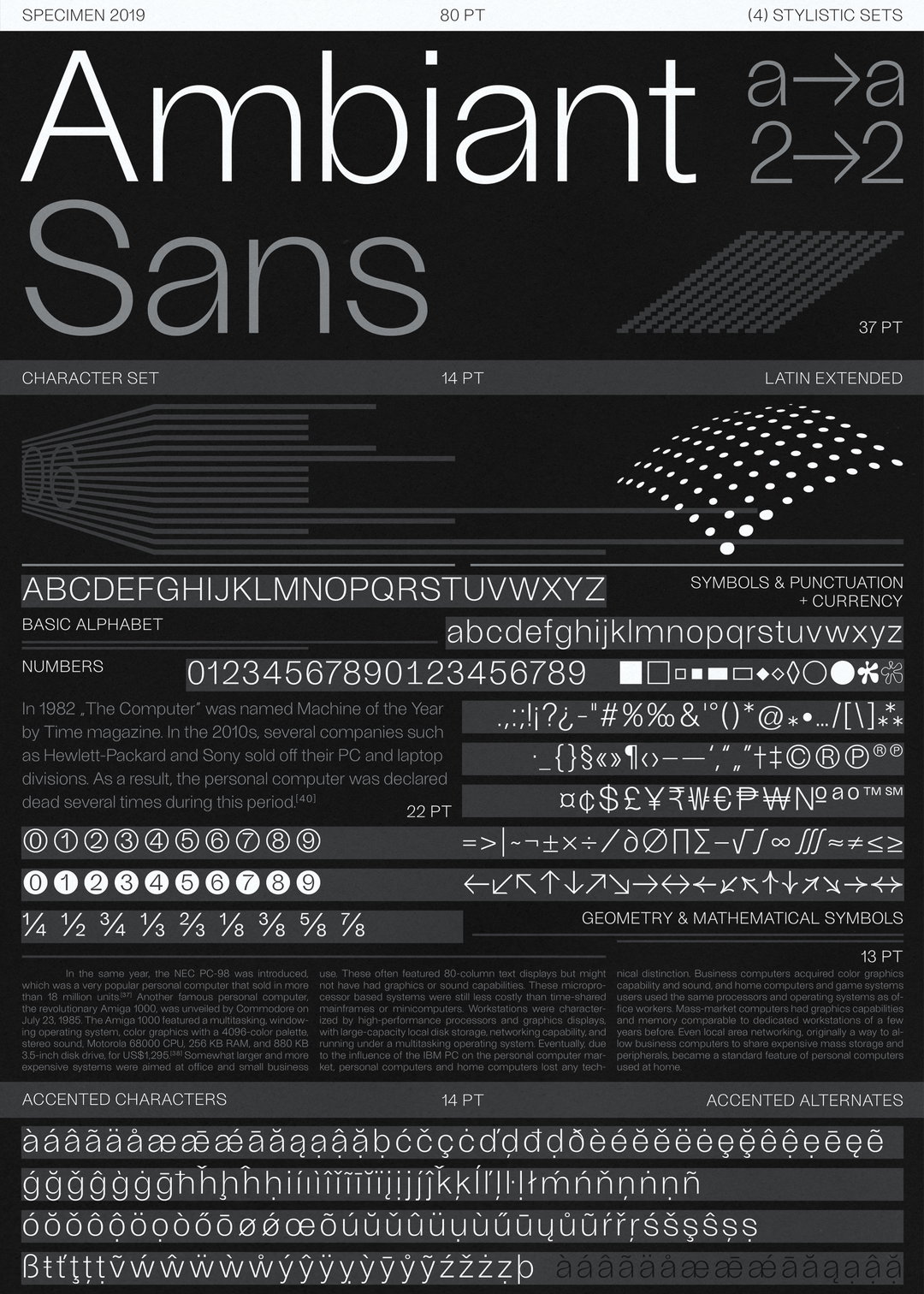
Ambiant used for Femme Type Poster series
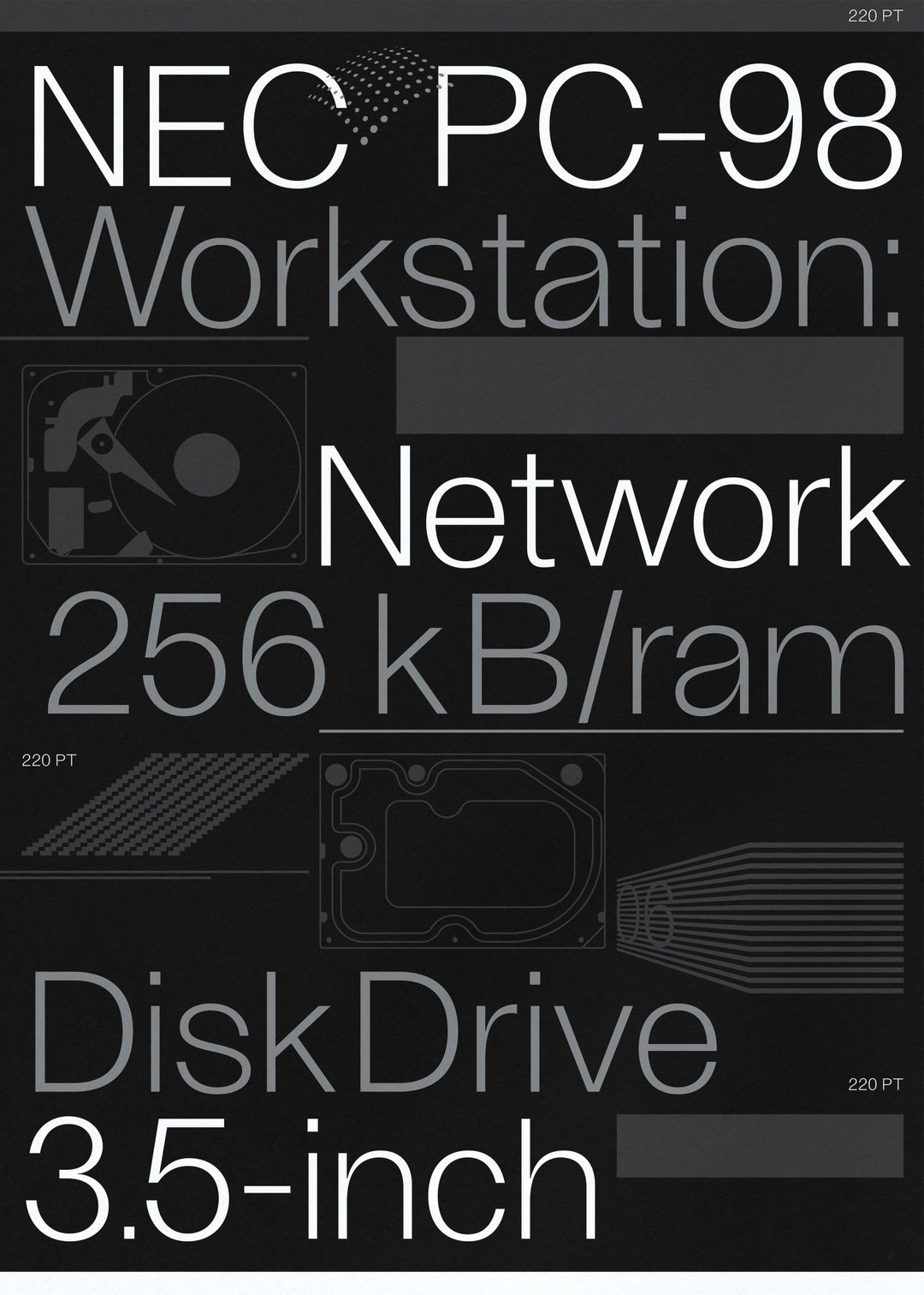
Ambiant used for Femme Type Poster series
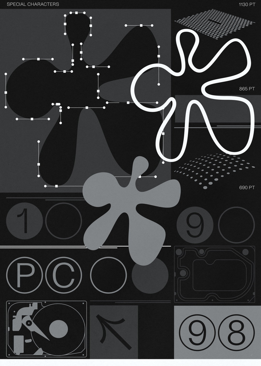
Ambiant used for Femme Type Poster series
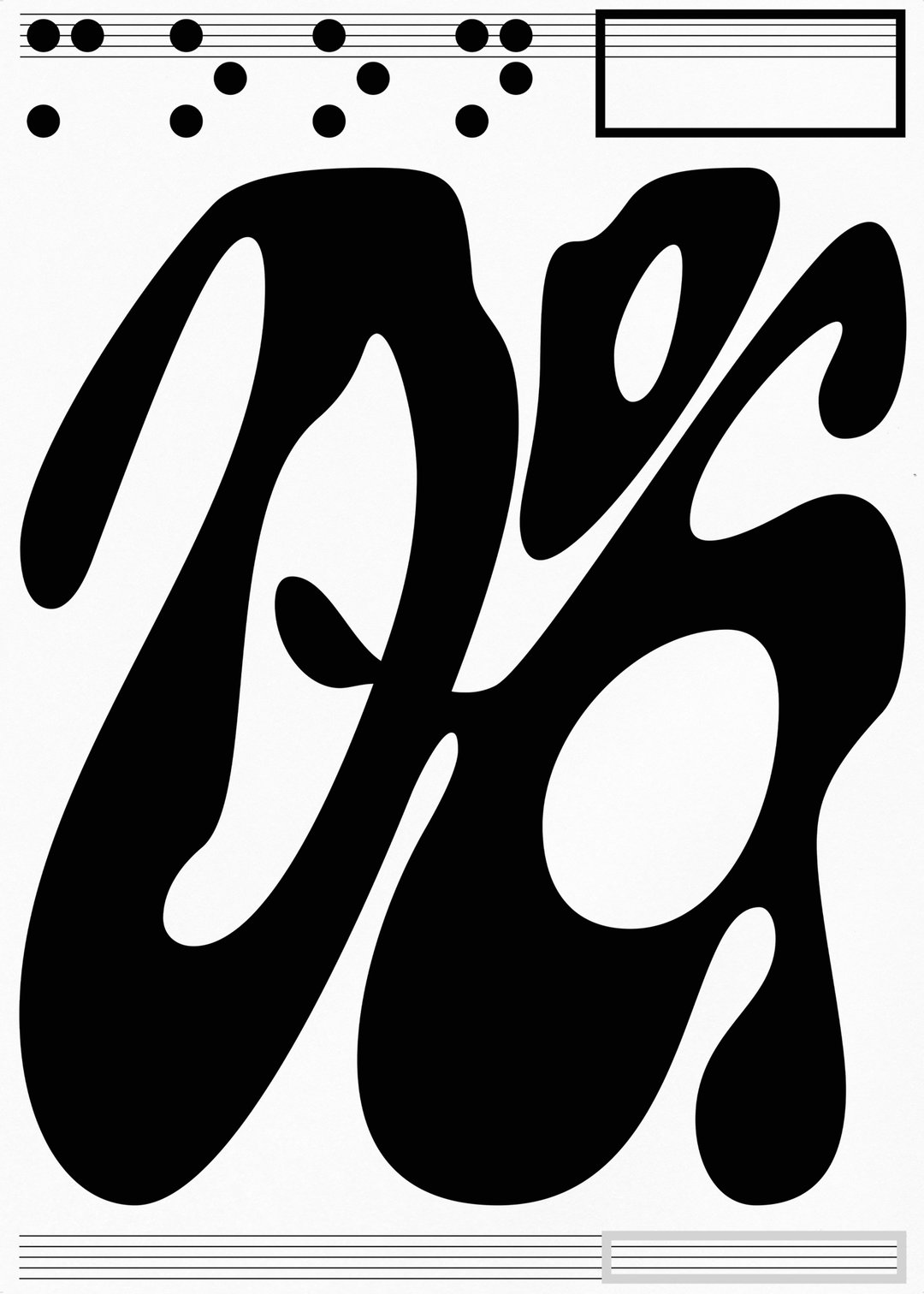
PHORM Exhibition Moondog Poster
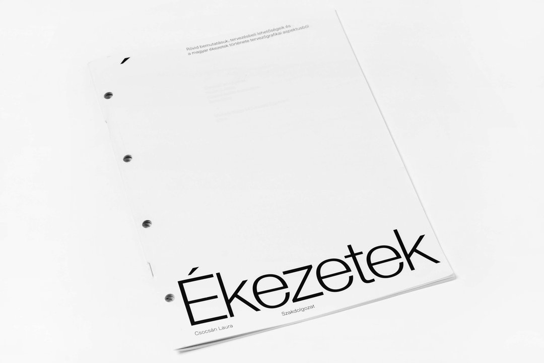
Diacritics Thesis
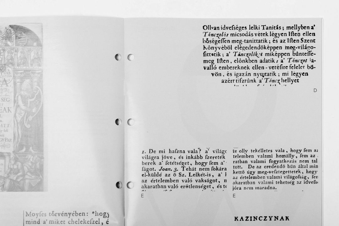
Diacritics Thesis
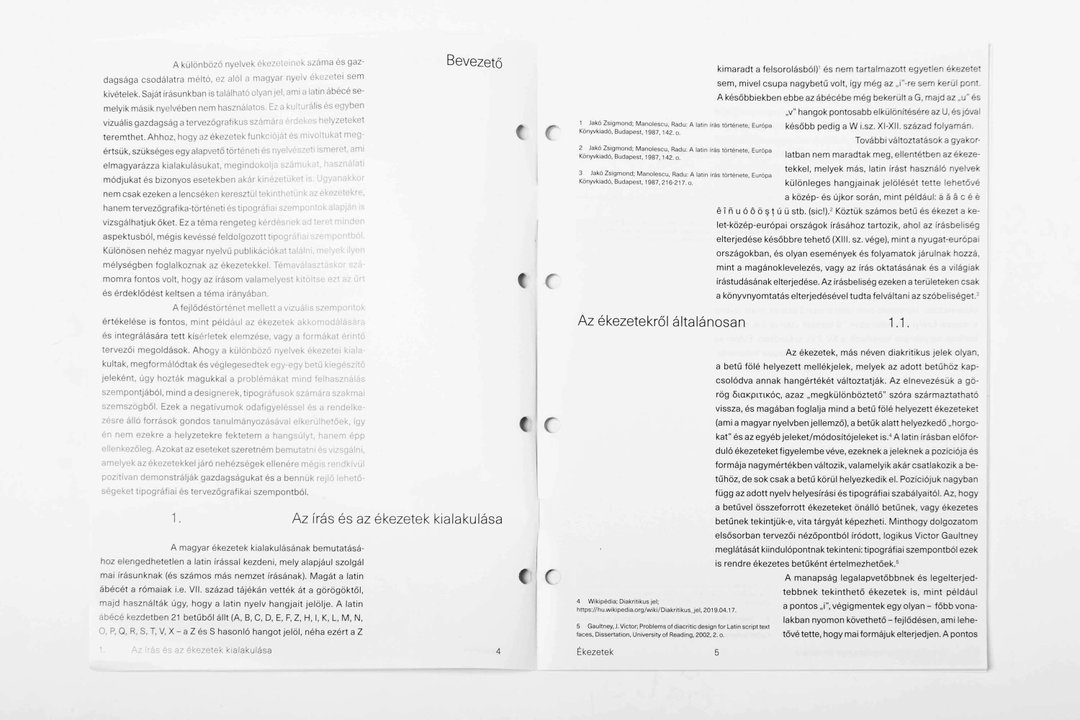
Diacritics Thesis
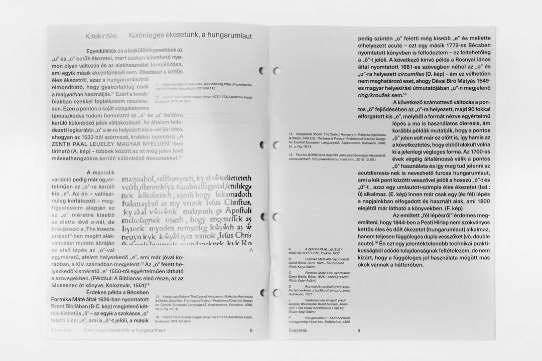
Diacritics Thesis
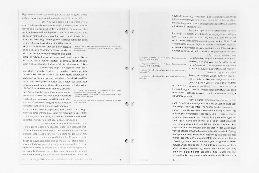
Diacritics Thesis
Share Article
Further Info
About the Author
—
Hailing from the West Midlands, and having originally joined It’s Nice That as an editorial assistant in March 2020, Harry is a freelance writer and designer – running his own independent practice, as well as being one-half of the Studio Ground Floor.