



Launch Recite Me assistive technology
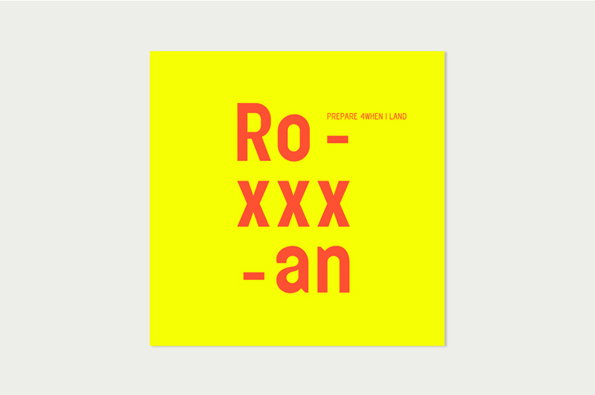
A bright yellow square featuring bold, orange typographic text. The central text reads “Ro – xxx – an”, with smaller text to the right that reads “PREPARE 4WHEN I LAND”.

High quality graphic design and art direction on show on new LBN website

—
Date
9 May 2012

You know what people don’t use enough? Initials. Americans have the right idea, liberally sprinkling their names with single letters (i.e. Hunter S Thompson, F Scott Fitzgerald) but us Brits have never quite got the hang of it. There’s a reductive confidence to stripping away all but the first letters of your names, discarding the supplementary vowels and consonants and saying, this is me, unaffected, bold and uncompromising. Of course some letters are undeniably weaker than others (you know who you are F) but when Luciana Britton Newell came to naming her art direction and graphic design studio, she knew she was onto a winer with LBN.

The Central St Martins grad who previously held senior design positions at Burberry, Aquascutum and Vivian Cipolla has just launched her new website, and as well being a thing of simple beauty in and of itself, it’s full to bursting with a host of eye-catching projects across print, web and identity design.

LBN is not about faddish bells and whistles, but clean, crisp, communicative design, where composition takes on a choreographic quality.
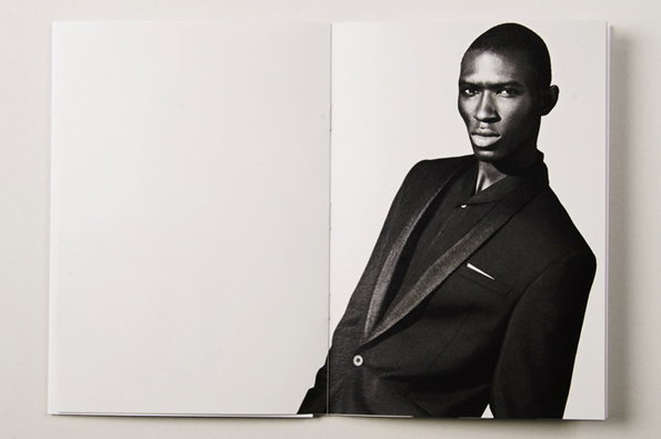
An open book shows a black and white portrait of a person wearing a dark blazer. They look directly at the camera against a plain white background.
Above

LBN: Art Direction for the Aquascutum LTD collection
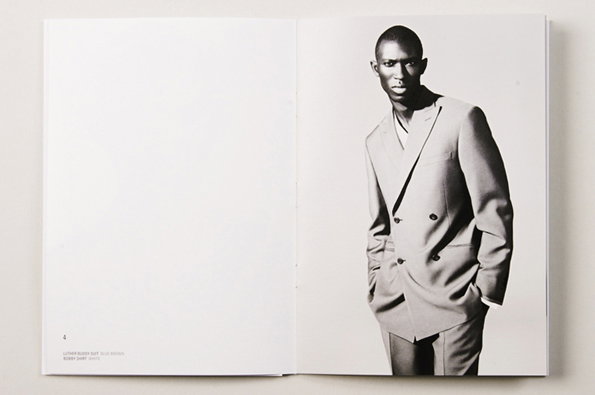
An open magazine shows a black and white portrait of a person wearing a double-breasted suit. Small text in the bottom left corner reads “LUTHER BLUFF SUIT BLUE WOOL” and “ROBERT SHIRT WHITE”.
Above

LBN: Art Direction for the Aquascutum LTD collection
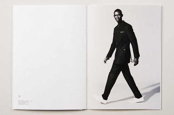
An open lookbook shows a black and white photograph of a person walking across a plain white background. They wear a dark, structured jacket and matching trousers with white shoes. Small text on the opposite page lists the garments, including a “travel jacket”.
Above

LBN: Art Direction for the Aquascutum LTD collection,
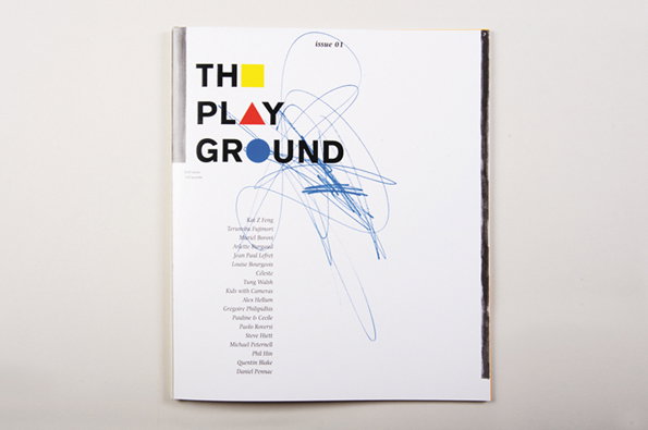
The cover of a magazine titled “The Playground” in bold black type. A blue scribble is drawn over the text, and a list of names is printed below.
Above

LBN: Art direction/design for The Play Ground Issue 1
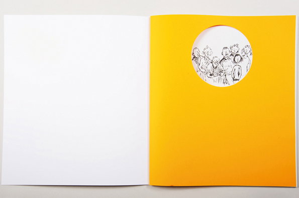
An open greeting card with a bright yellow cover and a blank white interior. A circular cutout in the cover reveals a black and white illustration of a group of people.
Above

LBN: Art direction/design for The Play Ground Issue 1
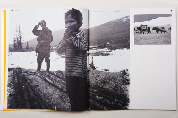
An open book shows two black and white photographs. The larger image features a child in a striped jumper standing in a snowy landscape, with another person standing behind them.
Above

LBN: Art direction/design for The Play Ground Issue 1
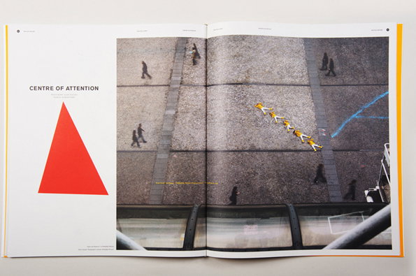
An open book shows a project titled “Centre of Attention”. A high-angle photograph captures several people in yellow outfits lying in a diagonal line across a grey paved square.
Above

LBN: Art direction/design for The Play Ground Issue 1
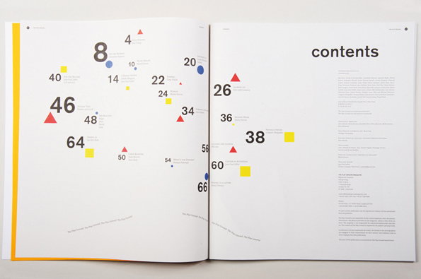
An open book shows a contents page with a minimalist, graphic layout. Page numbers are scattered across the spread, paired with small red triangles, blue circles and yellow squares.
Above

LBN: Art direction/design for The Play Ground Issue 1
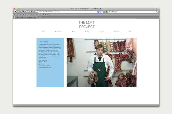
A screenshot of a website for “The Loft Project”. A person wearing a green apron stands in a butcher’s shop, surrounded by hanging cured meats.
Above

LBN: Identity, website, print materials and photography for The Loft Project, a private East London supper club
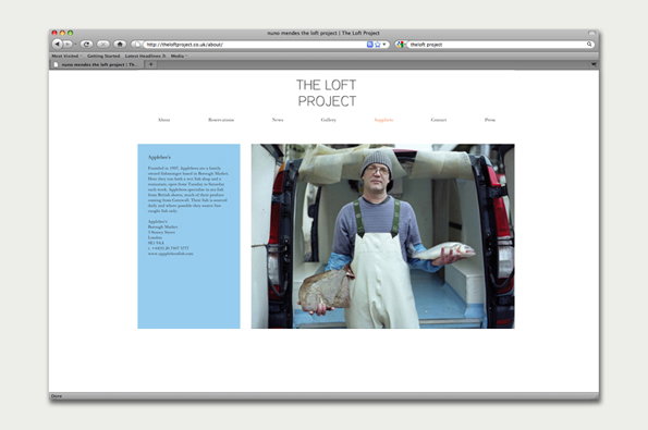
A screenshot of a website for “The Loft Project”. A person wearing a beanie and white waterproof overalls stands in the back of a van, holding two fish.
Above

LBN: Identity, website, print materials and photography for The Loft Project, a private East London supper club
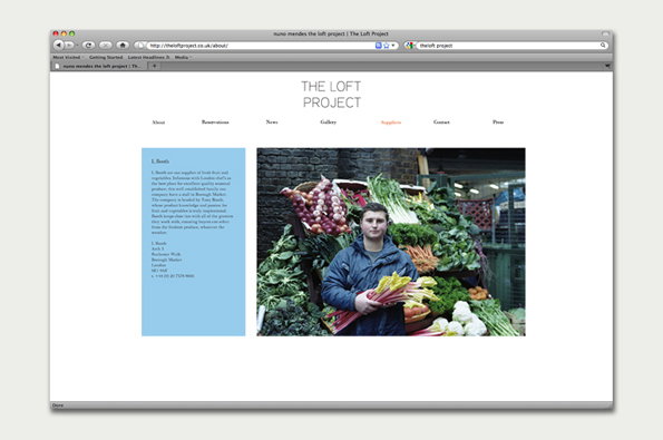
A screenshot of a website for “The Loft Project”. A photograph shows a person standing in front of a market stall piled high with fresh vegetables.
Above

LBN: Identity, website, print materials and photography for The Loft Project, a private East London supper club
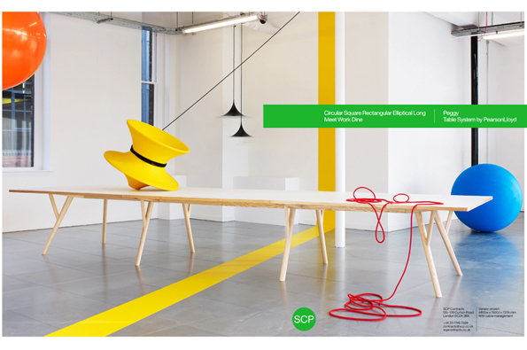
A long, light wood table stands in a white gallery space with a yellow stripe painted across the floor. A large yellow hat and a coil of red cable sit on the tabletop, while a blue sphere rests on the floor nearby.
Above

LBN: Advertising campaign and branding imagery for SCP Contracts
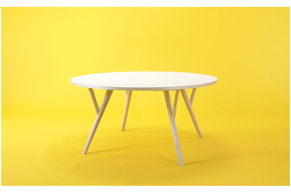
A round white table with light wood legs stands against a bright yellow background. The legs are angled and tapered, creating a minimalist silhouette.
Above

LBN: Advertising campaign and branding imagery for SCP Contracts
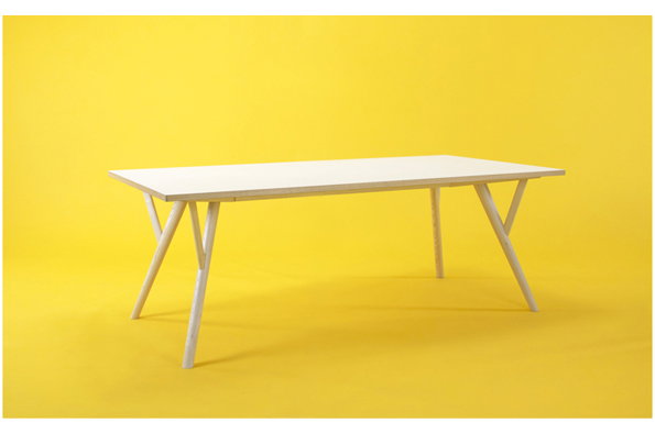
A light wood rectangular table with tapered legs stands against a bright yellow background. The legs are angled outwards, creating a minimalist, architectural silhouette.
Above

LBN: Advertising campaign and branding imagery for SCP Contracts
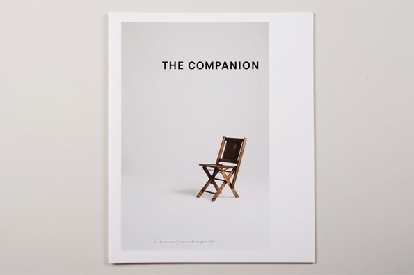
A poster featuring a single wooden folding chair centred against a plain white background. Bold text at the top reads “THE COMPANION”, with smaller text at the bottom mentioning a location in Birmingham.
Above

LBN: Art direction and design for The Companion, a one-off magazine about thinking in design
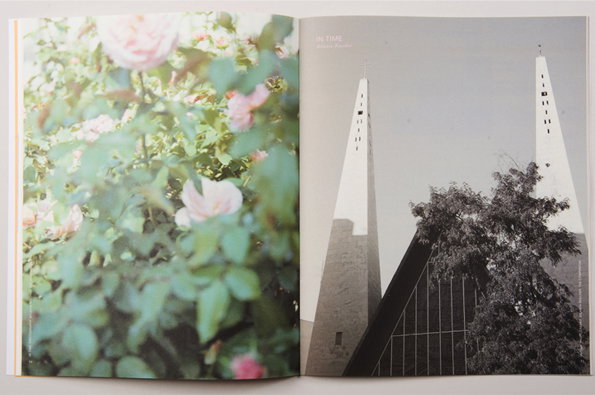
An open book shows two contrasting images. The left page is a soft-focus photograph of pink roses and green leaves, while the right page is a black and white photograph of two tall, slender spires rising above a building and a tree.
Above

LBN: Art direction and design for The Companion, a one-off magazine about thinking in design
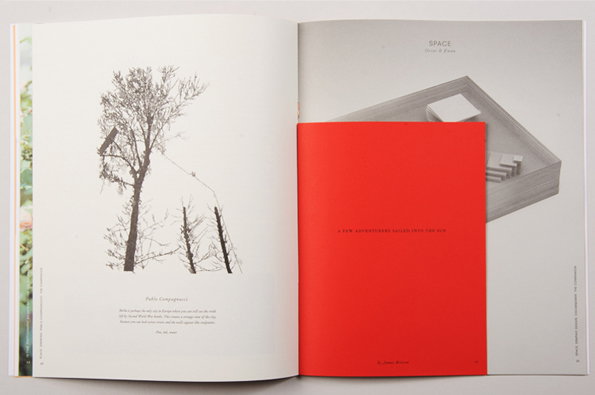
An open book shows a black and white illustration of bare trees on the left page. The right page features a photograph of a grey architectural model, partially covered by a bright red insert.
Above

LBN: Art direction and design for The Companion, a one-off magazine about thinking in design

Share Article

Further Info

About the Author

Rob Alderson

—

Rob Alderson is a freelance writer, editor and strategist. He was previously editor-in-chief of It’s Nice That and WePresent, and editor of Design Week. He publishes the newsletter Undo, which tries to make sense of how AI is changing design work, the design process and the design industry.

It's Nice That Newsletters

Fancy a bit of It's Nice That in your inbox? Sign up to our newsletters and we'll keep you in the loop with everything good going on in the creative world.