Lena Manger and Patryk Kulig balance timeless elegance with accessibility and precision
The Tokyo-based creative agency Bianco Bianco capture the alternative spirit of Japan’s capital in their magazine whilst overcoming language barriers with a visual overhaul that centers precision.
Lena Manger, a graphic designer, art director and writer who is based between Berlin and Tokyo, centers her work on emotion that “creates sparks.” Along with her long-term collaborator Patryk Kulig, the duo have worked for the past two years to create stunning design together – a visual identity for Bianco Bianco, a Tokyo creative studio, and for the studio’s “media collective & magazine” sabukaru.
Lena and Patryk have helped the bilingual studio carve an identity and magazine inspired by the forces “behind design” – art, literature, film and music. ““I’m interested in how a story, whether it’s something personal, imagined, or abstract, can be translated into visuals,” says Lena. “For me, it’s often less about depicting something literally and more about capturing the emotion, mood, or atmosphere behind it.”
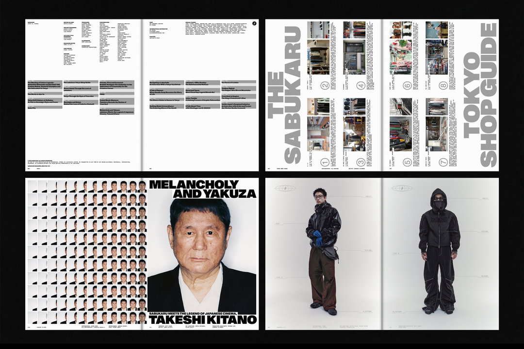
In sabukaru, Lena platforms those influences, as well as niche subcultures and creativity across borders. The first issue highlights Tokyo’s rich culture, particularly focusing on the legendary filmmaker Takeshi Kitano as the cover star, as well as featuring collaborators such as Thaiboy Digital, graphic designers Tim Lindacher and Mike Sunday, and producer/artist Palmistry. The magazine covers Tokyo’s underbelly as the main character: artsy films, trashy tattoos, boundary pushing DJs, latex and alternative fashion all printed with silver spot color – the magazine also features three variant covers, as well as a special edition created in collaboration with Stone Island.
Bianco Bianco’s own visual identity “acts as a blank canvas” – promoting a bilingual identity system that reflects clarity and “timeless elegance” whilst allowing the agency’s work to be completely accessible. Lena and Patryk have capitalised upon that thoroughly with a recent visual overhaul that not only features a new website and stationary, but also includes aluminum business card holders produced by Seoul-based design studio Niceworkshop. “Given that business cards hold a special significance in Japanese work culture, we approached this element of the identity with particular care, ensuring it feels both meaningful and memorable,” says Lena.
Lena’s redesign is simple, contemporary and precise, using elegant wordmarks and graphics to squash language barriers. “Design played a central role, with typography, layout, and material choices reflecting the platform’s eclectic, playful, and cross-cultural approach,” shares Lena. “While keeping the broader system in mind, we wanted each story to feel special and unique, making it fun for the reader to keep exploring.” In their one-two punch of a debut magazine and new visual identity, the enduring style and attitude of Tokyo is on full display – and proves that this creative duo is one to keep an eye on.
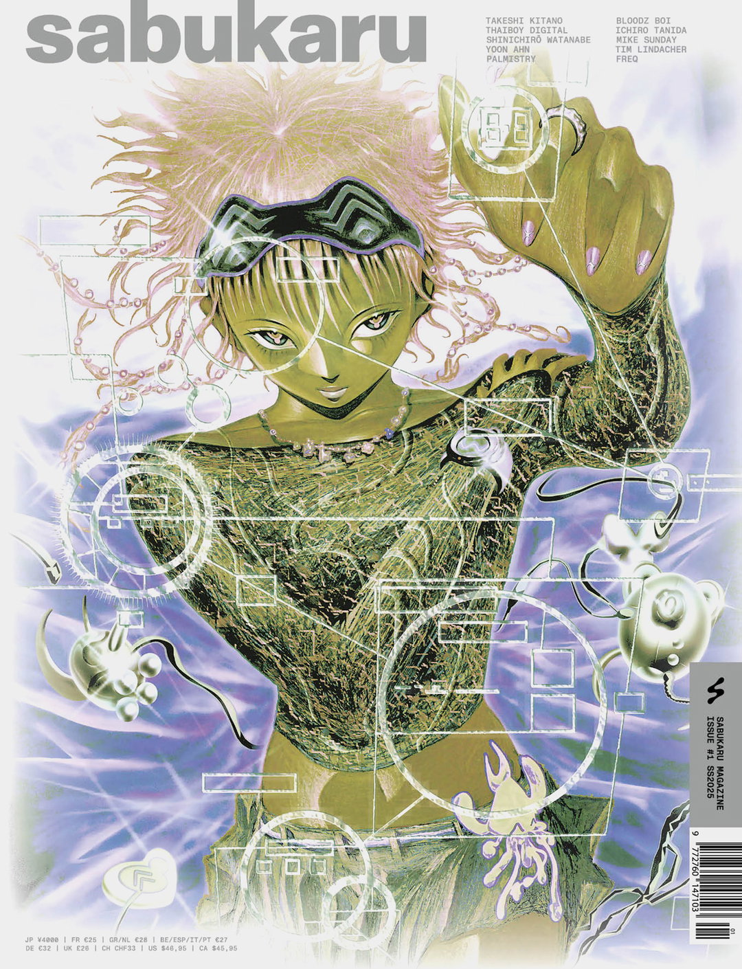
Patryk Kulig & Lena Manger: sabukaru Magazine Issue #1 for sabukaru (Copyright © Patryk Kulig & Lena Manger, 2025)
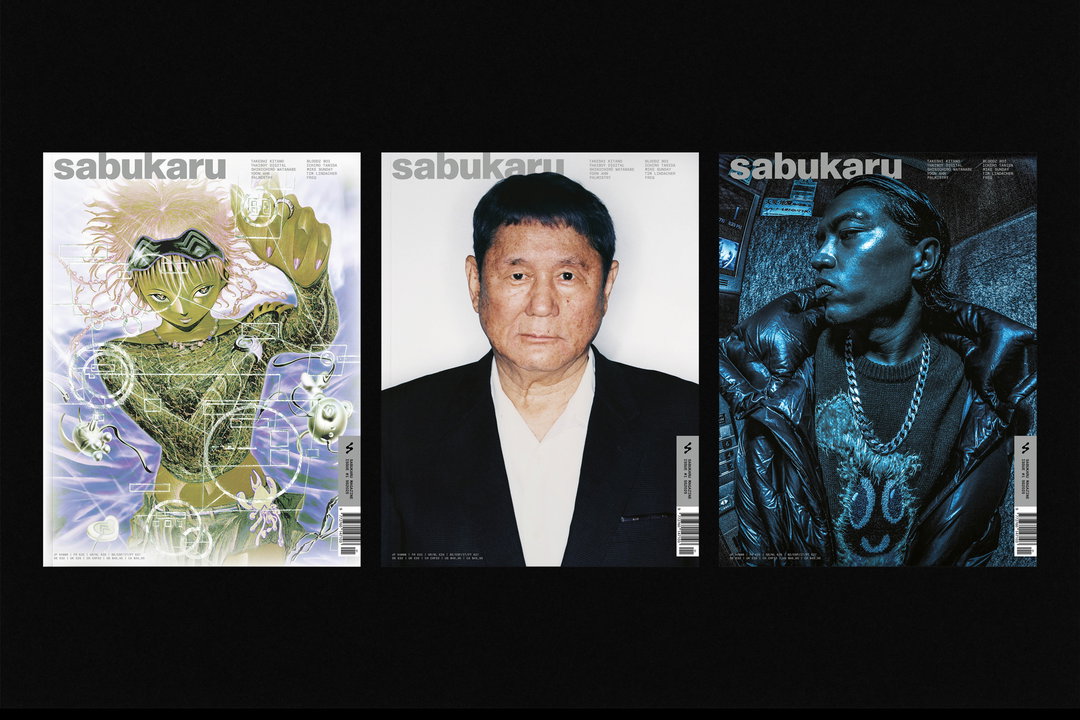
Patryk Kulig & Lena Manger: sabukaru Magazine Issue #1 for sabukaru (Copyright © Patryk Kulig & Lena Manger, 2025)
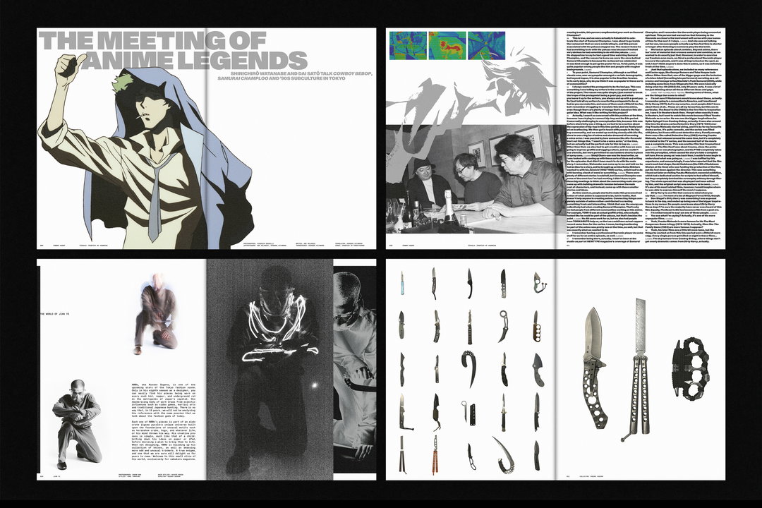
Patryk Kulig & Lena Manger: sabukaru Magazine Issue #1 for sabukaru (Copyright © Patryk Kulig & Lena Manger, 2025)
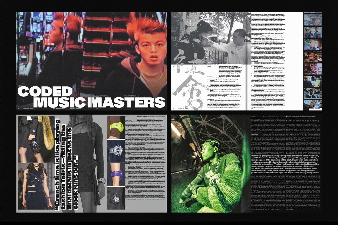
Patryk Kulig & Lena Manger: sabukaru Magazine Issue #1 for sabukaru (Copyright © Patryk Kulig & Lena Manger, 2025)
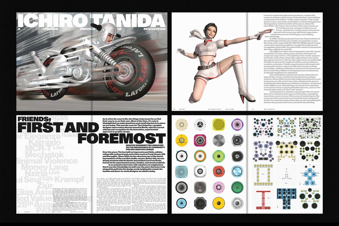
Patryk Kulig & Lena Manger: sabukaru Magazine Issue #1 for sabukaru (Copyright © Patryk Kulig & Lena Manger, 2025)
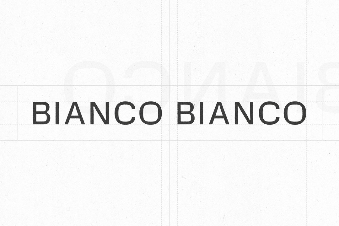
Patryk Kulig & Lena Manger: Visual Identity for Bianco Bianco (Copyright © Patryk Kulig & Lena Manger, 2025)
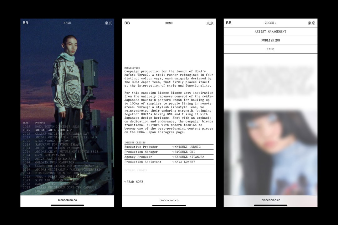
Patryk Kulig & Lena Manger: Visual Identity for Bianco Bianco (Copyright © Patryk Kulig & Lena Manger, 2025)
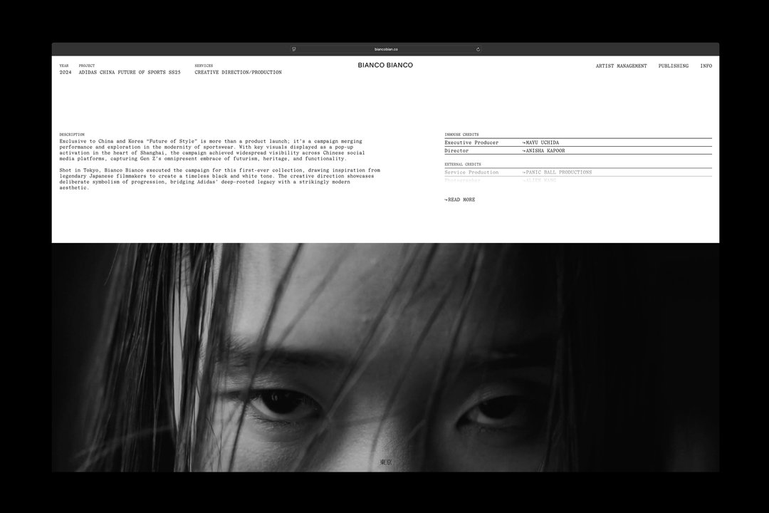
Patryk Kulig & Lena Manger: Visual Identity for Bianco Bianco (Copyright © Patryk Kulig & Lena Manger, 2025)
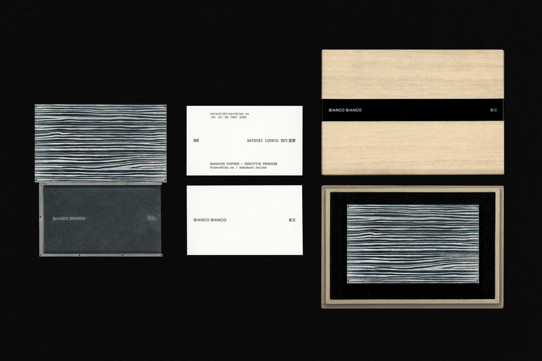
Patryk Kulig & Lena Manger: Visual Identity for Bianco Bianco (Copyright © Patryk Kulig & Lena Manger, 2025)
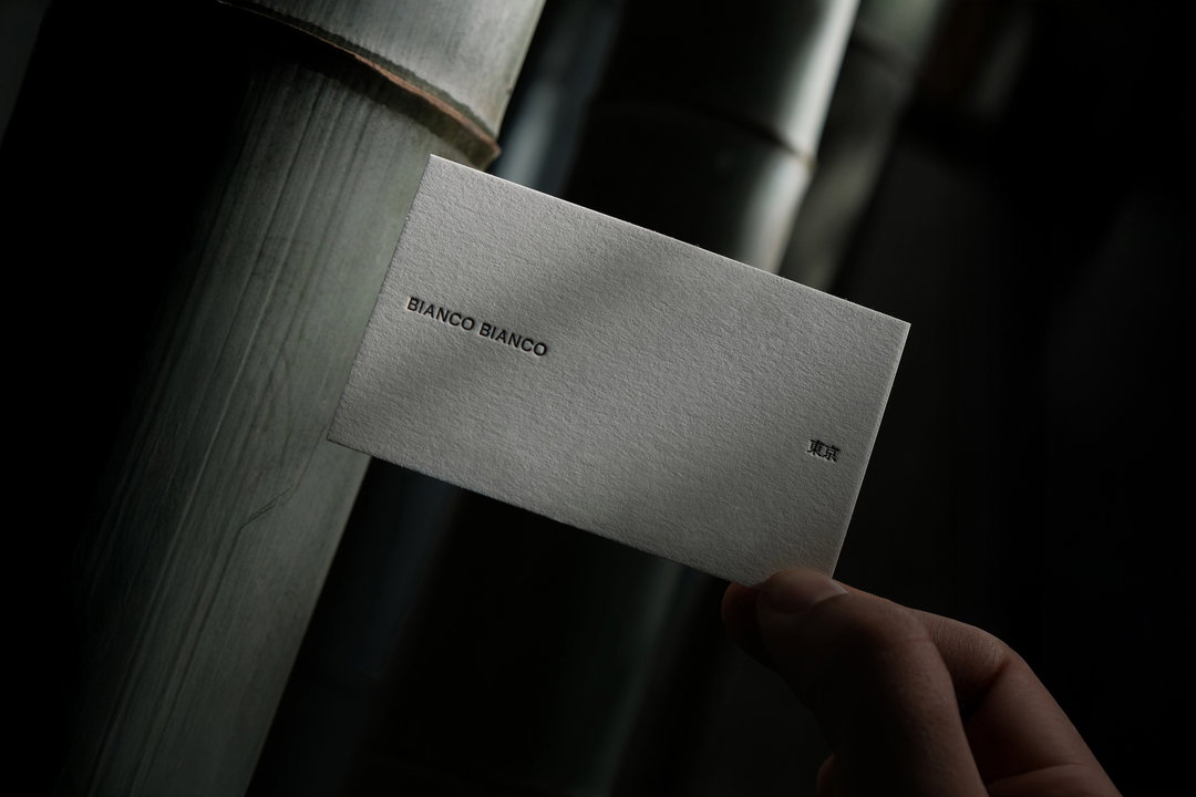
Patryk Kulig & Lena Manger: Visual Identity for Bianco Bianco (Copyright © Patryk Kulig & Lena Manger, 2025)
Hero Header
Patryk Kulig & Lena Manger: sabukaru Magazine Issue #1 for sabukaru (Copyright © Patryk Kulig & Lena Manger, 2025)
Share Article
About the Author
—
Paul M (He/Him) is a Junior Writer at It’s Nice That since May 2025. He has a strong interest in graphic design, digital kitsch, multimedia painting, collage, nostalgia, analogue technology and all matters of strange stuff. [email protected]
To submit your work to be featured on the site, see our Submissions Guide.