Launch Recite Me assistive technology
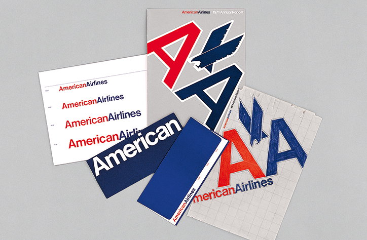
A collection of American Airlines branding materials and reports from 1971. The items feature the airline’s red and blue colour palette and a bold, stylised “AA” logo.

Graphic identity lovers rejoice: “an unprecedented catalogue of modern trademarks” is here

—
Date
6 October 2015

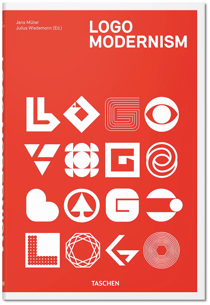
Judging from the recent brouhaha over the NASA graphic standards manual, there’s no stemming the creative community’s lust for logos of yesteryear. Thanks to Taschen, we reckon that appetite will be satiated at least temporarily in the form of its blockbuster new book Logo Modernism. The hefty red and white tome bills itself as “an unprecedented catalogue of modern trademarks." And that it is, documenting at length modernist graphic design through a series of logo marks, word marks and graphic identity systems.

There are more than 6,000 trademarks shown all in all, lovingly curated by Jens Müller and drawn from the years 1940 – 1980. The graphics are arranged by design into three sections – Geometric, Effect, and Typographic – making the book’s structure as sensible and functional as the designs it sets out to document. With work by the likes of Paul Rand, Yusaku Kamekura, and Anton Stankowsk and projects including the iconic designs for the 1968 Mexico Olympic Games, it’s a beautiful distillation of modernist ideals rendered in their most superbly crafted way.
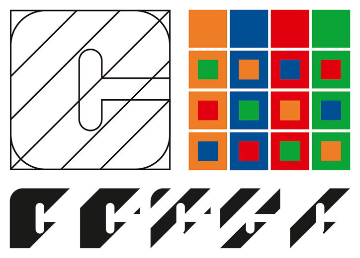
A graphic design sheet showing various iterations of a logo. It includes a large line-drawn “C” with diagonal stripes, a grid of colourful squares, and five black typographic variations of the letter “C”.
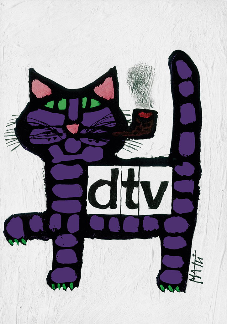
An illustration of a purple cat with green paws and pink ears, smoking a pipe. A white rectangular block across its torso reads “dtv” in lowercase black letters.
The red cover of a book titled “Logo Modernism”. Below the title, a grid of 16 white geometric logos is arranged in four rows. The publisher “Taschen” is printed at the bottom.
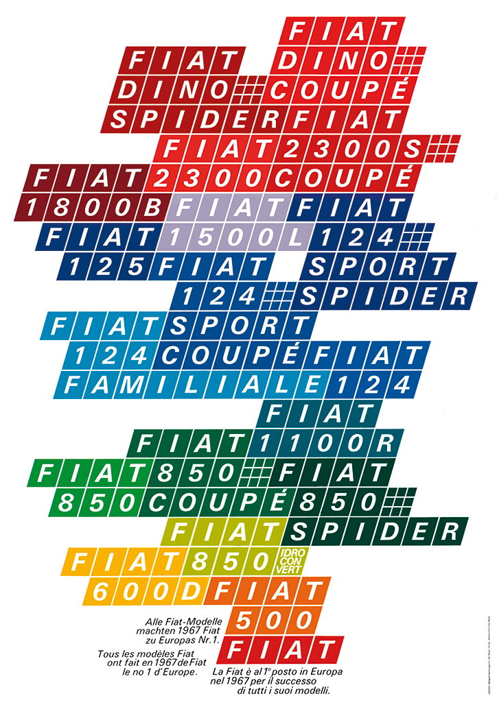
A typographic poster featuring a stack of colourful blocks in red, blue, green and yellow. The blocks contain the names of various Fiat car models, including “Fiat Dino”, “Fiat 124 Spider” and “Fiat 500”.
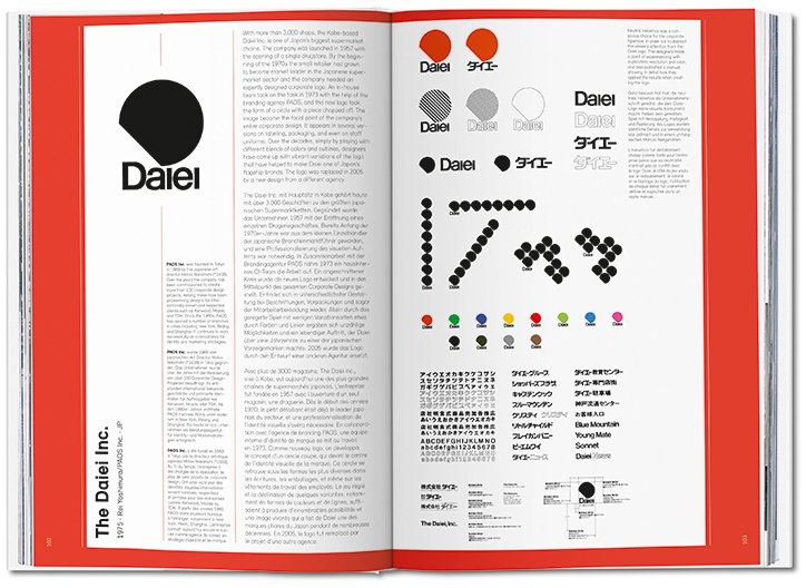
An open book displays a design case study for the Daiei brand. The pages feature the logo, a black circle with a white cutout, alongside various typographic iterations and a grid of colourful dots.
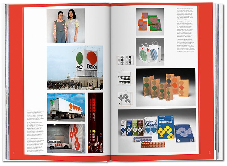
An open book showing a collection of branding materials for the Japanese supermarket Daiei. The pages feature a mix of photographs and graphics, including staff uniforms, a storefront with a large logo, a delivery truck, and various packaged goods.
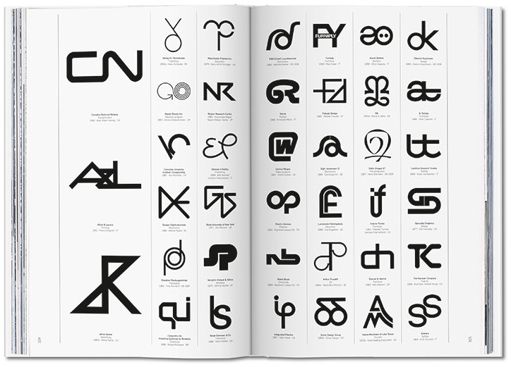
An open book displays a grid of minimalist black logos on white pages. Each symbol is accompanied by small blocks of text identifying the brand and designer.
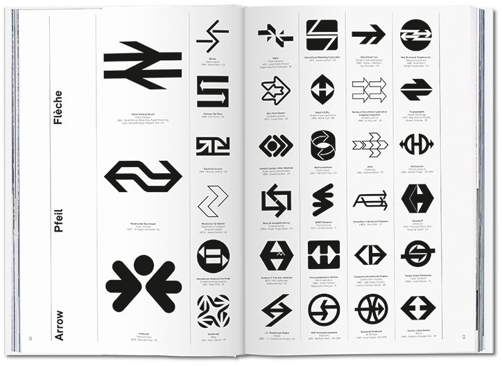
An open book displays a grid of black and white graphic logos based on arrows. The pages are titled “Flèche”, “Pfeil” and “Arrow” in the left margin.
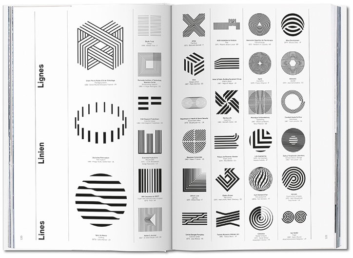
An open book displays a grid of black and white geometric logos and symbols. Vertical text on the left page reads “Lignes”, “Linien” and “Lines”.
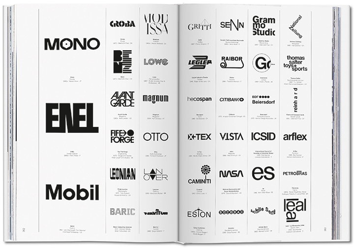
An open book displays a grid of black and white logos on white pages. Recognisable wordmarks include “Mono”, “Enel”, “Mobil”, “Citibank” and “Nasa”.

Share Article

Further Info

About the Author

Emily Gosling

—

Emily joined It’s Nice That as Online Editor in the summer of 2014 after four years at Design Week. She is particularly interested in graphic design, branding and music. After working It's Nice That as both Online Editor and Deputy Editor, Emily left the company in 2016.
It's Nice That Newsletters

Fancy a bit of It's Nice That in your inbox? Sign up to our newsletters and we'll keep you in the loop with everything good going on in the creative world.