Launch Recite Me assistive technology
A medical infographic from the “South Carolina Medical Association” showing various prosthetic body parts. Numbered examples include “crystal eyes”, “silicone ear”, “silicone hand”, “orthopedic foot” and a “silicone nose”.

For Loren Garciot, designers are graphic translators of thought

—
Date
30 July 2018

When Loren Garciot was young she wanted to be the president of her home country, Spain. That ambition changed when she started to wonder who designed the logo on cans of Coke. Could you, she asked herself, make money from doing that? She soon discovered you could, and her passion for graphic design took flight.

Concepts have always acted as points of inspiration for Loren; she believes designers are “graphic translators of thought,” people who turn philosophy into image. That idea chimes with British veteran Ken Garland’s notion that, “the role of the designer is to be a communicator, to take in information and translate it into an easy to understand visual language”.

For Loren, design is about problem-solving. “I try to justify each step I take in every project”, she tells us. “Sometimes I get results that I like aesthetically, but which are hard to defend in meaning. So whenever that happens, I have to give it a lot of thought until it has some coherence, at least to me”. Loren recognises the responsibility that graphic designers carry with them. If they are the translators of thought, then they should make sure those are not harmful to humankind.

Now an art director at the Malpaso publishing house, she describes her style as varied; this is because every project given to her is unique, so she responds differently to each one. Loren prefers to work with customers, “they give you more freedom”, she comments. “Not like brands where you have to follow their look in a rigorous way”.

Each project starts with an empty slate. “I try to get all the information that I can on a specific matter”, Loren explains. “The more knowledge I have on the subject, the better I will understand the customer. I become an expert on every topic”. For her, it is essential that the customer gets involved in the creative process, so they can understand “the concept, defend their identity and know the enthusiasm that went behind every task”.

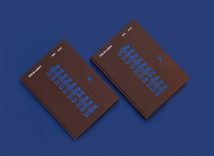
For her MA, she designed the publication Tribu y Tabú, a book written by self-created psychoanalyst Edip de Ludovic, aimed at criticising societal prejudices towards people with mental health issues. As Loren comments, “this criticism is expressed graphically from the first page to the last”. On the front cover “tribe” is repeated uniformly to represent “the norms imposed by society”, camouflaged within that is “taboo”. Flyleaves inside are “covered in blue velvet — an allusion to the couch where Ludovic analysed the protagonists of his work”. For Loren, behind every design decision, there is a reason; a reason that is then beautifully and coherently translated.
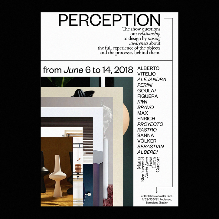
A typographic poster for an exhibition titled “PERCEPTION”. The text explains that the show questions our relationship to design, listing dates from 6 to 14 June 2018 and a series of artist names. A collage of architectural fragments and a white sculptural object sits beside the text, with the event location listed as Ox in Barcelona.
Above

Loren Garciot

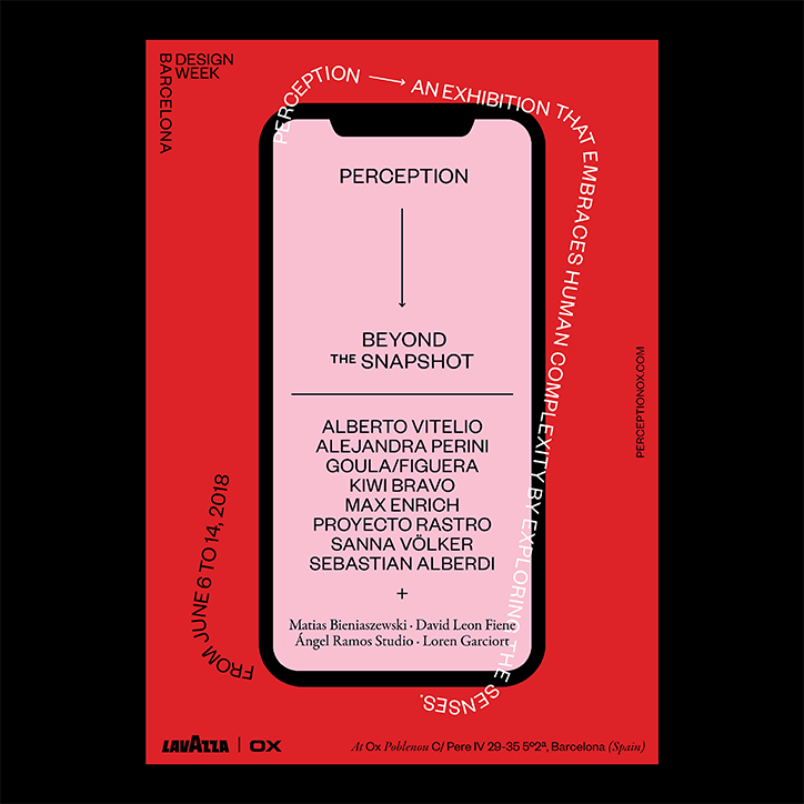
A red poster for a Barcelona Design Week exhibition titled “Perception”. A central smartphone graphic displays the text “Perception” and “Beyond the Snapshot”, followed by a list of participating artists. Curved text around the phone reads “Perception — an exhibition that embraces human complexity by exploring the senses”.
Above

Loren Garciot

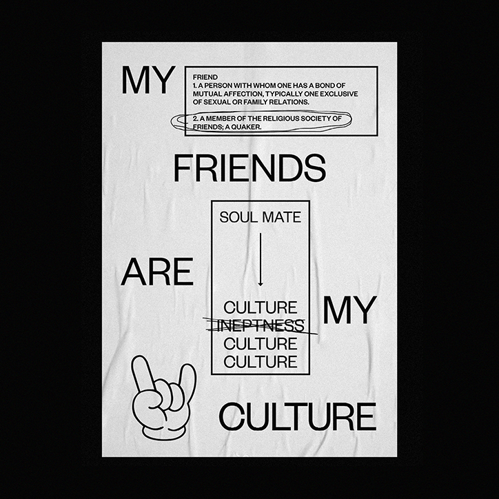
A black and white typographic poster reads “My friends are my culture”. A dictionary definition of “friend” is placed at the top, while a hand-drawn “rock on” gesture sits at the bottom.
Above

Loren Garciot

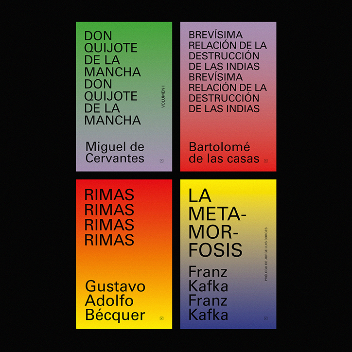
Four book covers arranged in a grid against a black background, each featuring a vibrant colour gradient. The titles include “Don Quijote de la Mancha”, “Brevísima relación de la destrucción de las Indias”, “Rimas” and “La Metamorfosis”.
Above

Loren Garciot

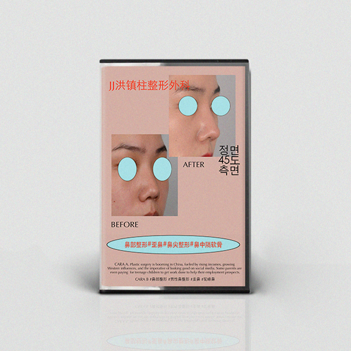
A small cassette tape case features a before and after comparison of a nose job. The person’s eyes are covered by light blue circles, with the words “BEFORE” and “AFTER” printed below the images.
Above

Loren Garciot

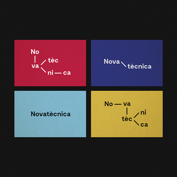
Four coloured squares in red, blue, light blue and yellow, each containing the word “Novatècnica”. The word is presented in different typographic arrangements, with some versions breaking the letters apart and connecting them with thin lines.
Above

Loren Garciot

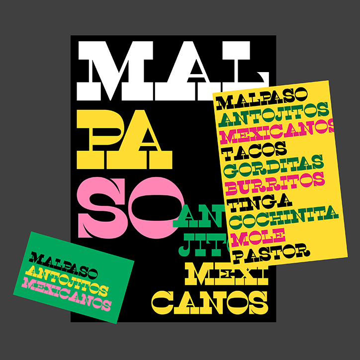
A graphic design layout featuring bold, colourful typography on a black background. Large, fragmented letters spell “Malpaso Antojitos Mexicanos”, accompanied by a yellow list of dishes including “Tacos”, “Burritos” and “Mole”.
Above

Loren Garciot

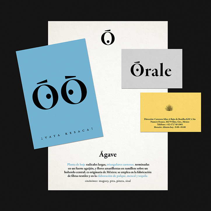
A brand identity showcase featuring a light blue card, a white letterhead, and two business cards. The designs use a bold, serif typeface and a circular logo with a line above it, appearing on a card that reads “¡Vaya resaca!”.
Above

Loren Garciot

Two brown books lie diagonally on a deep blue background. The covers feature blue text including the name “Edip de Ludovic” and a repeating vertical list of the word “tribu”.
Above

Loren Garciot

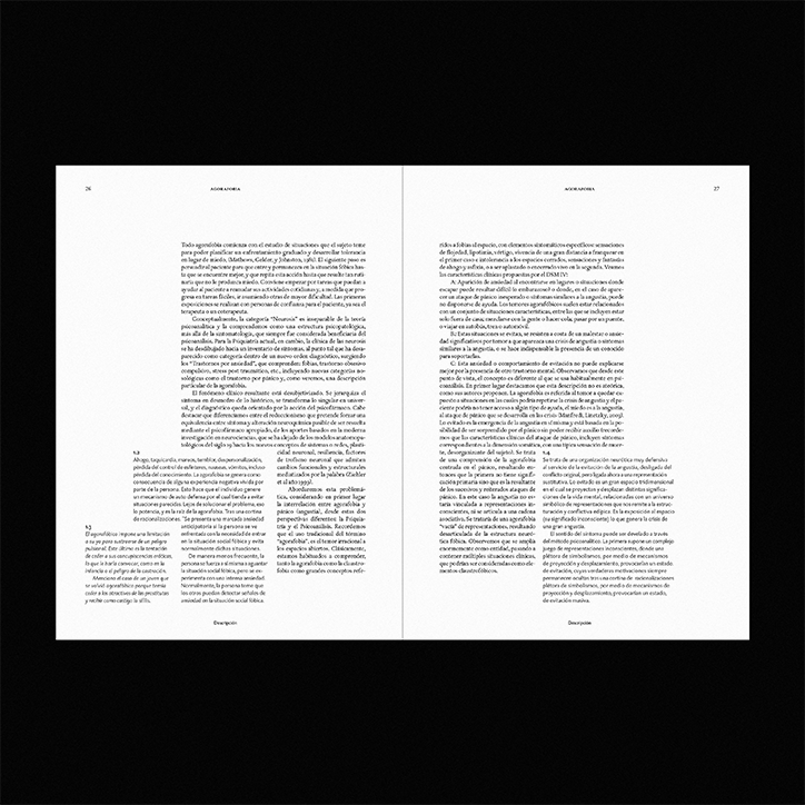
Two pages of a printed book featuring dense columns of Spanish text. The pages are numbered “26” and “27” at the top corners, with the header “Arquitectura” appearing on both.
Above

Loren Garciot

Share Article

It's Nice That Newsletters

Fancy a bit of It's Nice That in your inbox? Sign up to our newsletters and we'll keep you in the loop with everything good going on in the creative world.