




Loris Pernoux designs moveable and colour-coded identity for university library
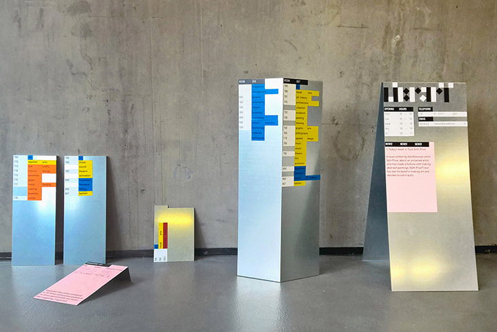
French designer Loris Pernoux studied at the Gerrit Rietveld Academie and while in his final year, he was asked by the institution to design a temporary identity for its library. The challenge for Loris was the fact that the academy is currently in transition, where a new building is currently being constructed. During this time the library needs to be organised and easily moveable, while still being useable for visitors.
Loris has “reset” the library’s visual identity to “be in tune with that particular context”. The designer began the project by speaking with the staff of the library and the interior architect, which allowed him to “understand how the library is organised and what the staff needs during this special period”.
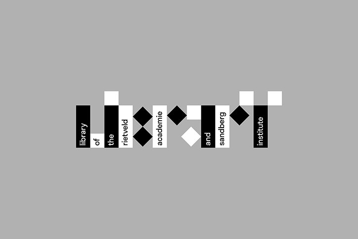
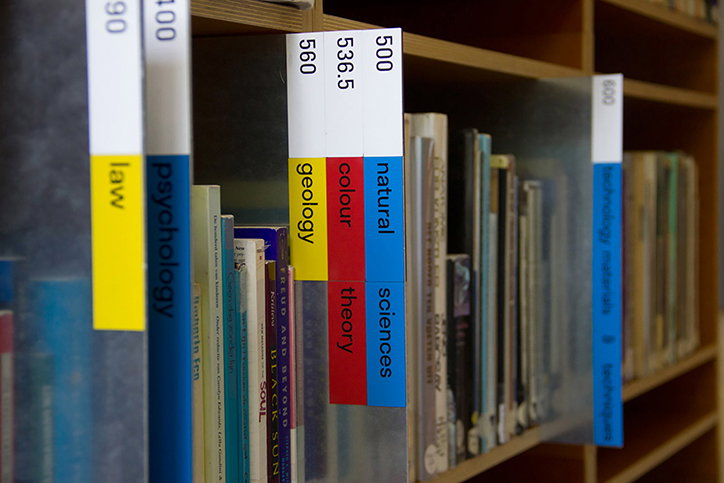
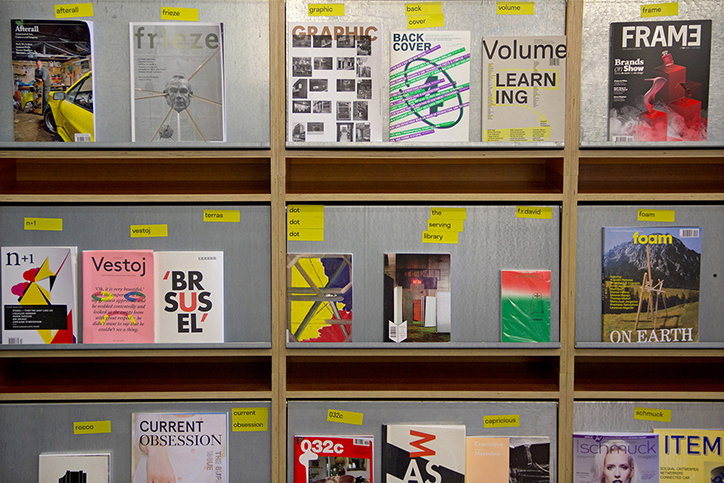
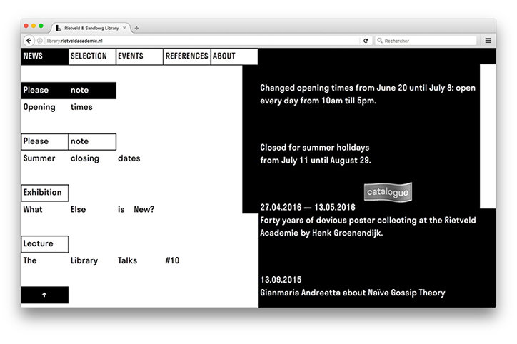
“I have worked on a grid and a visual system that is based on a square and a rectangle, which were extracted from the basic idea of an ‘L’ for ‘Library’,” explains Loris. “The word length defines the square/rectangle shapes where the words are contained. Different sets of spaces appear between each other creating different rhythms.”
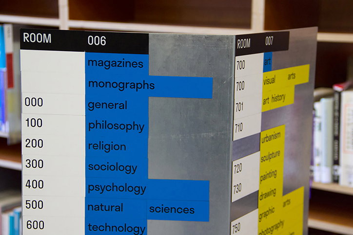
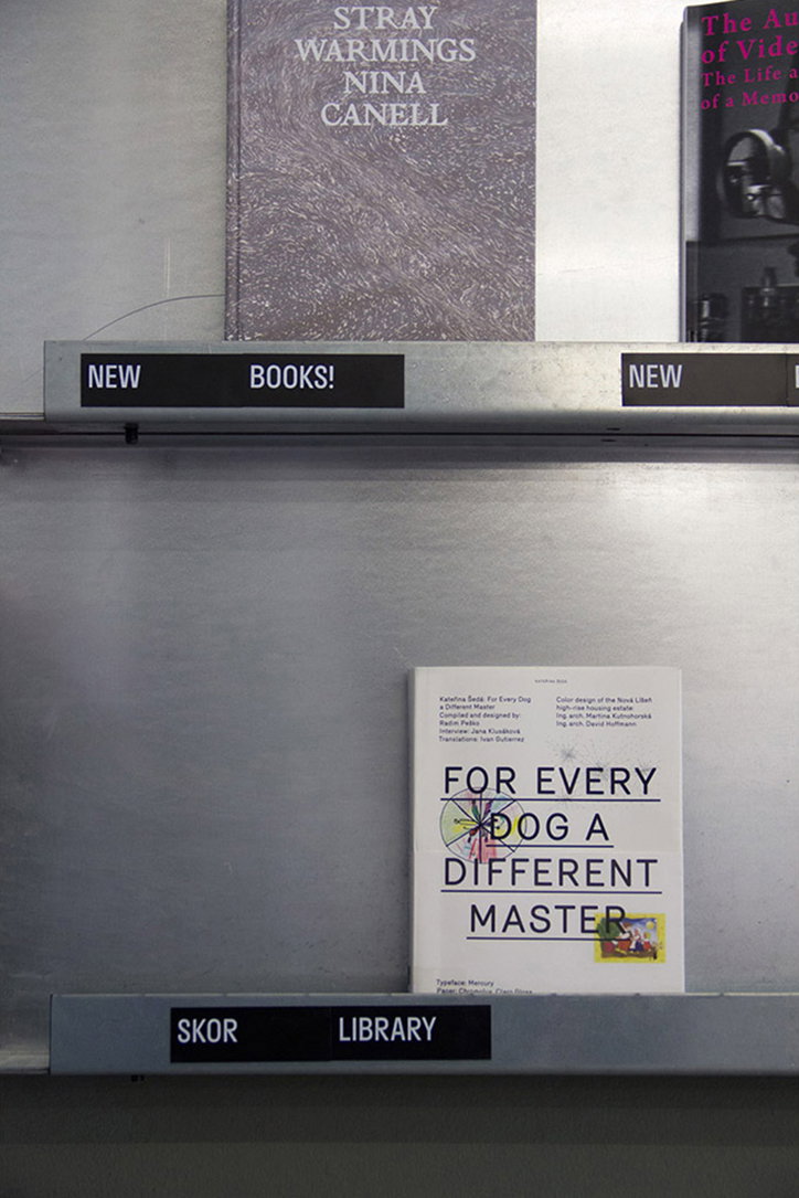
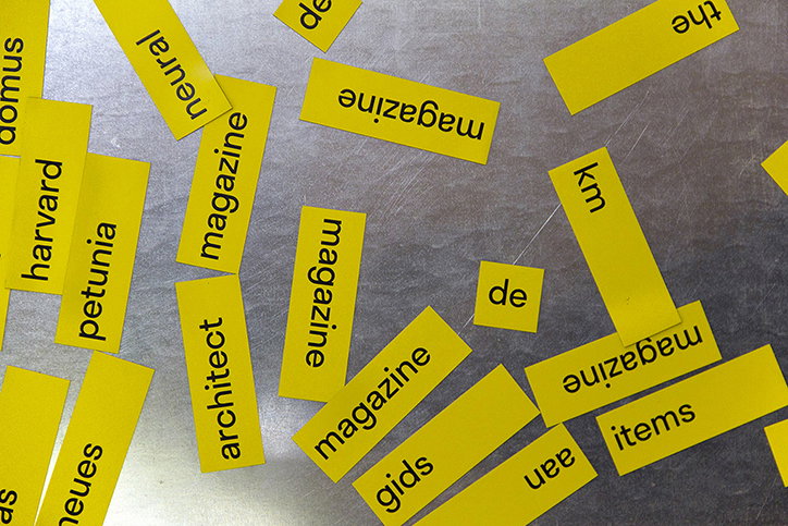
The interchangeable identity is kept simple and communicative through Loris’ use of the Stratos typeface, which responds specifically to the height and width of the grid system. “There is no typographical hierarchy in the system. The type set is identical on each support, leading the visitor to pay more attention to the reading the information.
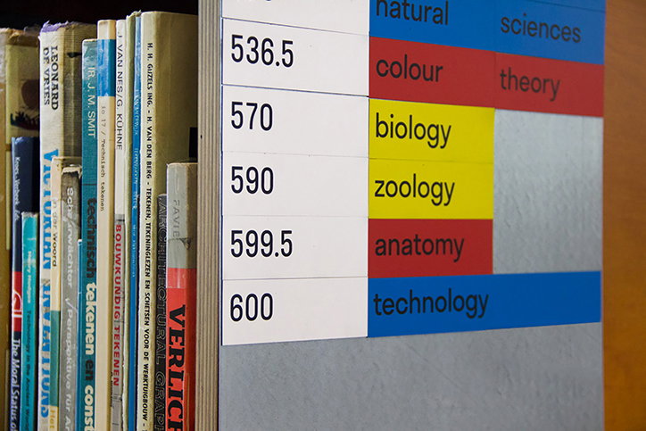
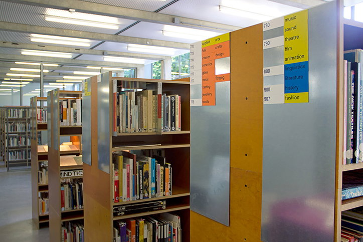
Each word and sign is printed on a magnet. “These magnetic words allow a completely free and autonomous change of the information set by the library’s staff,” says Loris. “The magnets are placed on compound metal plates, which I’ve had made-to-measure to fit the existing library furniture.”
The system has a mix and match aesthetic on first glance but the design has been carefully considered and colour coded. Each sign has a crisp tone that corresponds to the different book categories offered by the library. “Black and white are the colours used to represent general library information. The main book categories use a blue colour, red for subcategories and then the lighter colours delineate more precise topics,” explains Loris. “Visitors can then follow a colour path through the library. It’s made it a playful and moveable design, for a temporarily nomadic space.”
Loris Pernoux: Gerrit Rietveld Academie
Loris Pernoux: Gerrit Rietveld Academie
Loris Pernoux: Gerrit Rietveld Academie
Loris Pernoux: Gerrit Rietveld Academie
Loris Pernoux: Gerrit Rietveld Academie
Loris Pernoux: Gerrit Rietveld Academie
Loris Pernoux: Gerrit Rietveld Academie
Loris Pernoux: Gerrit Rietveld Academie
Loris Pernoux: Gerrit Rietveld Academie
Share Article
Further Info
About the Author
—
Rebecca Fulleylove is a freelance writer and editor specialising in art, design and culture. She is also senior writer at Creative Review, having previously worked at Elephant, Google Arts & Culture, and It’s Nice That.


