




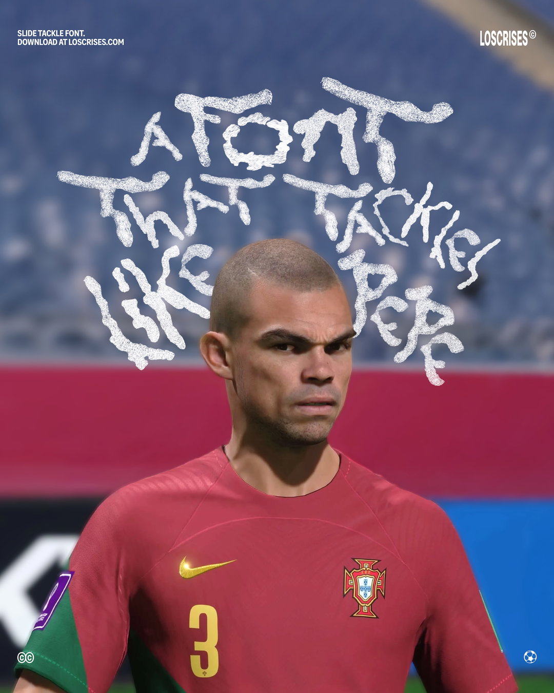
Slide Tackle Font from Los Crises follows in the footsteps of red card kings
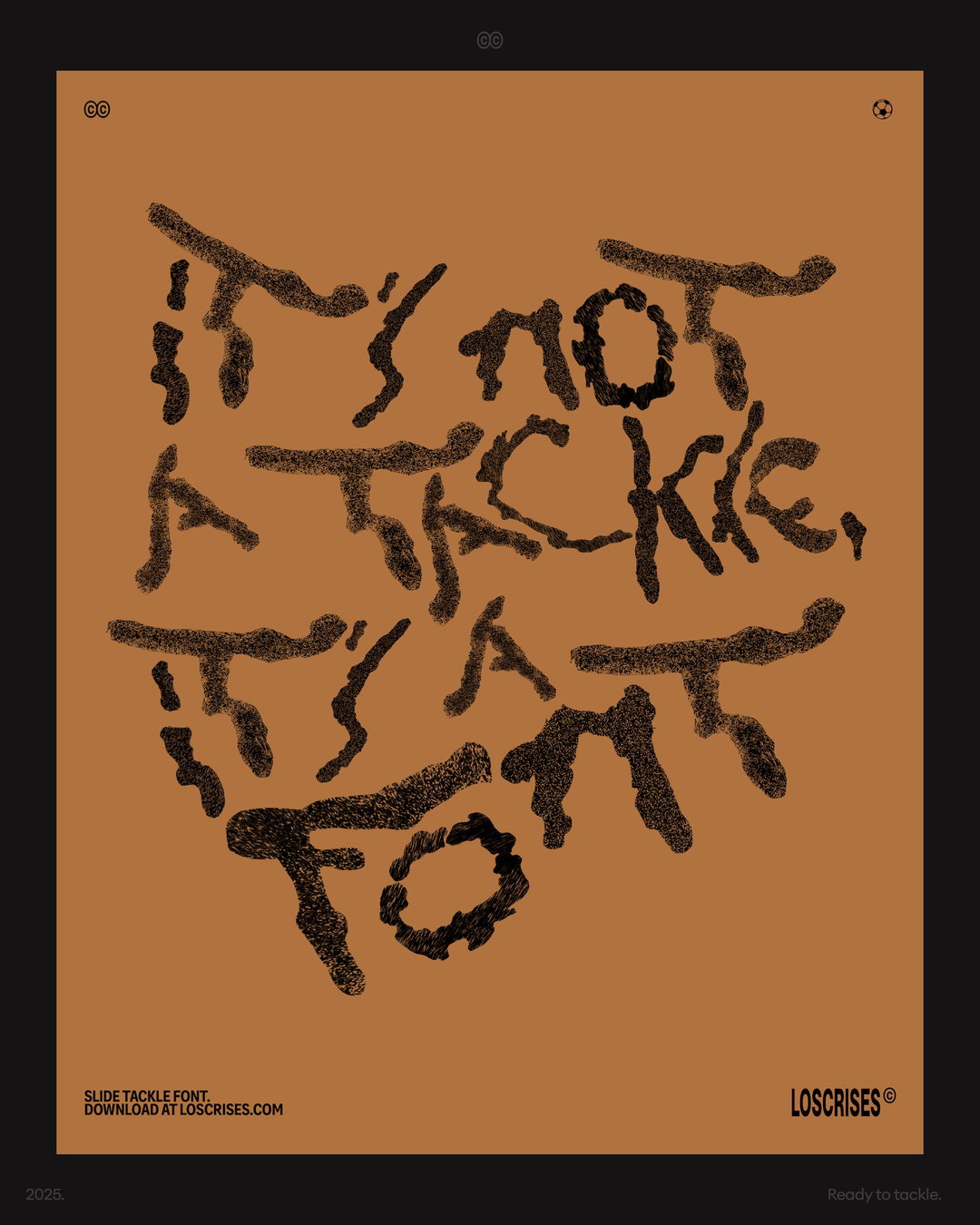
A font made on the Fifa pitch, this typeface turns one of the most high-risk, high-reward techniques in the game into something you can read.
Like a lot of the best design projects, the idea for creative duo Los Crises’ Slide Tackle Font was completely incidental. One evening copywriter Cristian Burgos and art director Christian Hurtado (the Colombian creative duo behind its making) were chatting over a game of Fifa and spotted odd marks across their virtual field, the remanence of players paths on the pitch “and we thought: hey, those weird shapes could be something – what if we made a typeface out of them?”, says Cristian.
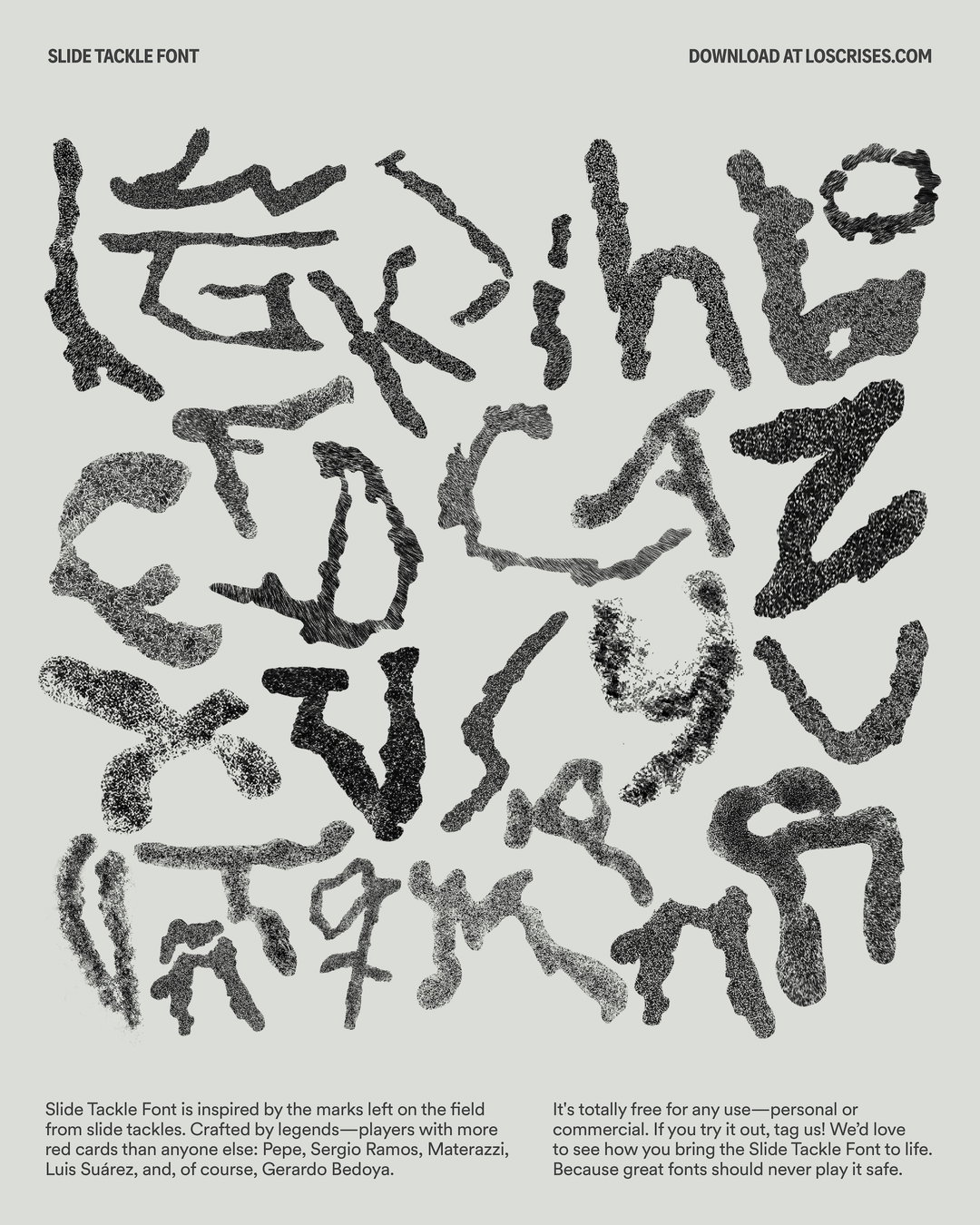
Following this lightbulb moment, the pair spent nights playing and pausing the game to capture interesting screenshots of slide tackle marks on the pitch. In some cases they chose match players they thought would have the most success at the designing these abstract, squiggly letterforms: “We went with football’s most notorious slide tacklers – Pepe, Ramos, Materazzi, Suárez and Bedoya, the red card king” says, Christian. “We wanted each letter to feel unique, so we had to get pretty inventive (and commit a lot of virtual fouls) to get the shapes right.”
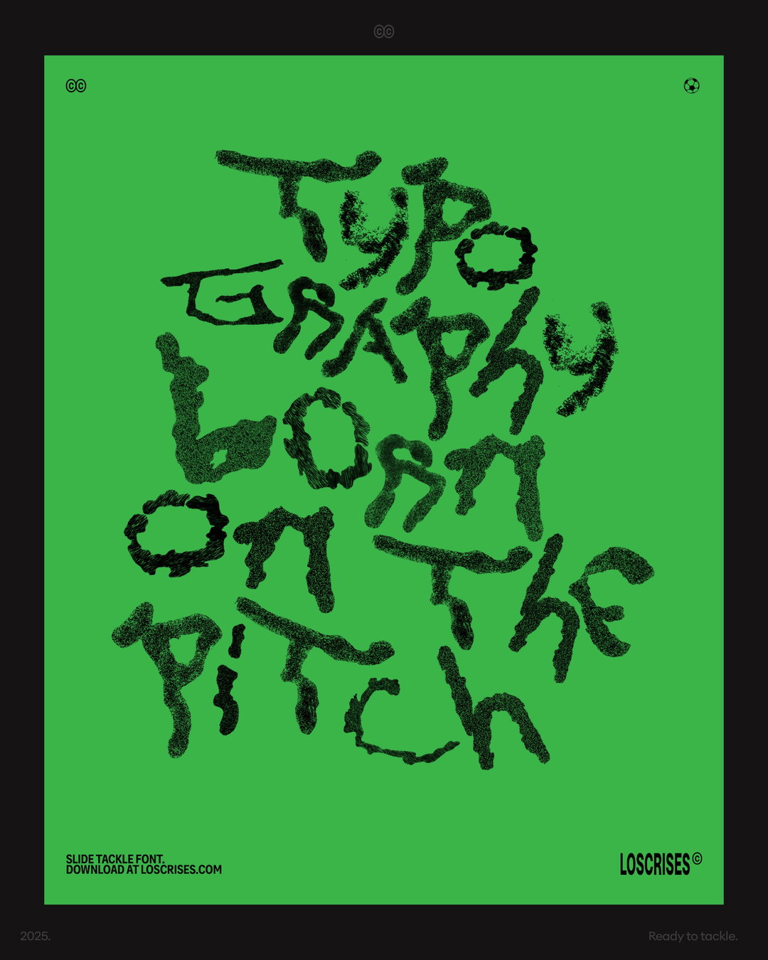
Los Crises (Cristian Burgos, Christhian Hurtado): Slide Tackle Font (Copyright © Los Crises, 2025)
The hardest part for the pair was turning these somewhat accidental marks into something that actually reads as an alphabet. “The process was messy in the best way,” shares Cristian. “We’d bring those images into Illustrator and challenge ourselves to shape each unique scuff into part of a letterset.” There was, inevitably, a lot of trial and error in this technique and a lot of the slide tackle shapes got benched in the final line-up, with swaps for more legible A’s or more dynamic C’s. “We wanted the final set to keep that sense of energy and randomness you get from real tackles – not something too polished,” says Christian.
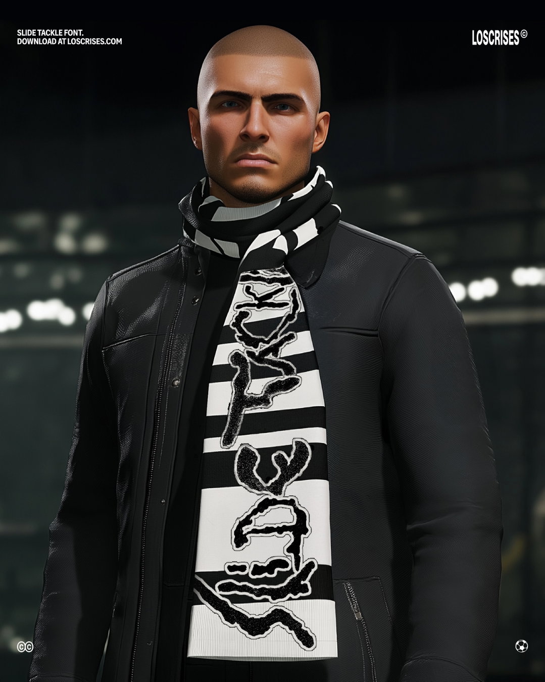
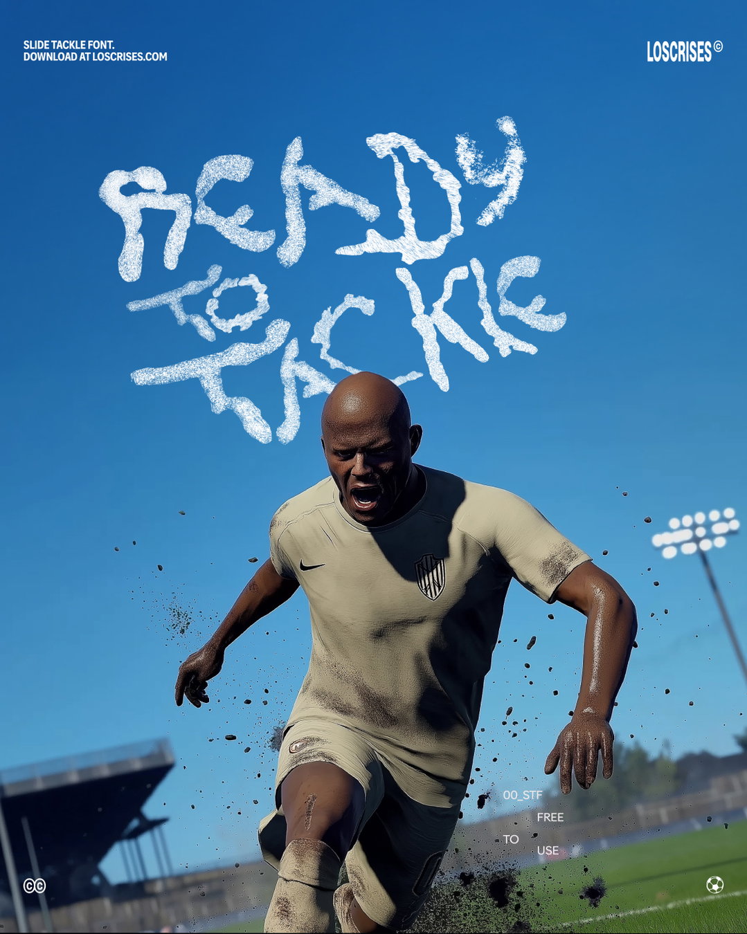
Since the development of a full letterset with all the final tweaks, and a fully fledged campaign for the typeface inside the game – with wiggly words printed across team kits and merch – the pair have released the project as a completely open source font, with football fans and designers alike from around the world snapping it up for their projects. “It never gets old seeing something you made pop up somewhere unexpected”, the Cristian shares, “each share feels like a tiny win.”
The Colombia and Mexico-based design duo have been in advertising for over a decade, “always learning, always curious, and still a bit amazed every time someone recognises our work”, Cristian says. For them, it’s important that personal projects that happen on the side like these remain free and accessible to all “because, let’s face it, the best things in life usually are”, says Christian. “We just wanted people to download it instantly, no hoops. We believe that creative growth comes from sharing, not gatekeeping. Good things tend to find their way back to you when you put them out there with no strings attached,” he continues.
When speaking to what the pair will get up to next, Christian ends: “We’ll probably still be playing FC (and still getting red cards), and we’re always daydreaming about weird new side projects. We don’t have a big master plan, we just the hope that if we keep having fun, good things will keep coming.”
If you want to download Los Crises Slide Tackle font, you can do so via their website.
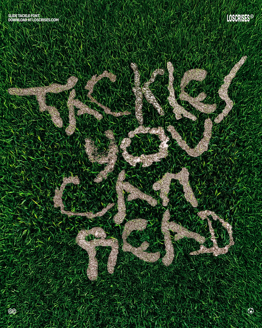
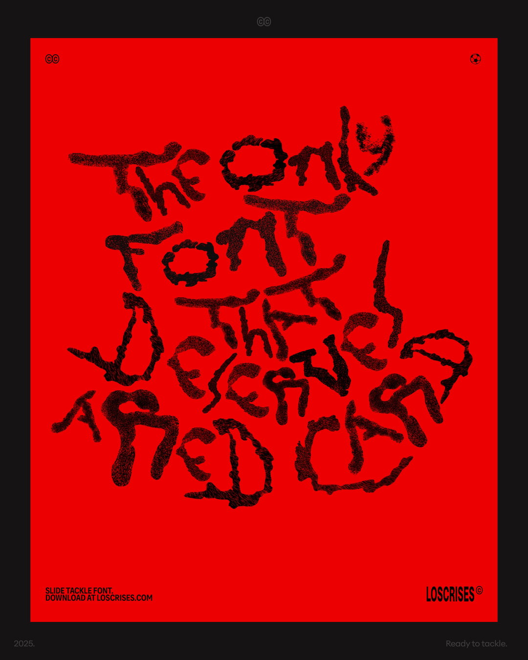
GalleryLos Crises (Cristian Burgos, Christhian Hurtado): Slide Tackle Font (Copyright © Los Crises, 2025)
Hero Header
Los Crises (Cristian Burgos, Christhian Hurtado): Slide Tackle Font (Copyright © Los Crises, 2025)
Share Article
Further Info
About the Author
—
Ellis Tree (she/her) is a staff writer at It’s Nice That. She joined as a junior writer in April 2024 after graduating from Kingston School of Art with a degree in Graphic Design. Across her research, writing and visual work she has a particular interest in printmaking, self-publishing and expanded approaches to photography. ert@itsnicethat.com
To submit your work to be featured on the site, see our Submissions Guide.




