Launch Recite Me assistive technology
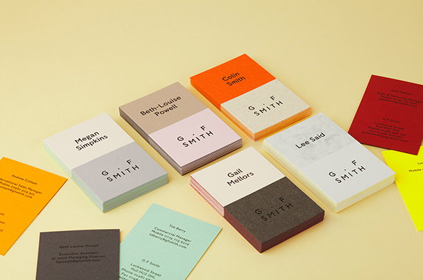
Stacks of business cards in various colours are arranged on a pale yellow surface. Each card features a two-tone design with a name on one side and the “G. F. Smith” logo on the other.

Graphic Design: G . F Smith unveil wide-ranging rebrand overseen by Made Thought

—
Date
22 April 2014

In an age defined by digital, us print proponents are fond of harking on about the beauty, tactility and ultimately irreplaceable wonders of paper. But for a hugely-respected paper company like G . F Smith that argument is one they have to try and win on a very real, daily basis.

Today sees the latest salvo in this all-important battle with the launch of two new marks and a range of printed and digital collateral overseen by London-based studio Made Thought. The overarching idea was to "better reflect the legacy, stature and future ambitions of the company.” and the challenge for Made Thought was to combine the values first put in place by founder George Frederick Smith when he formed the company way back in 1885 with its restlessly innovative contemporary role in the creative industries.

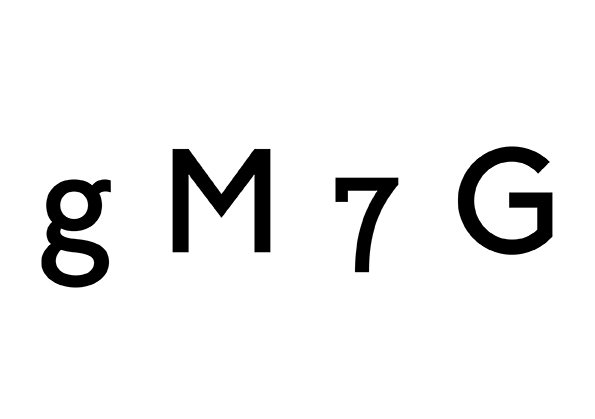
So the new Humanist Sans typeface is designed to reflect both machine printing and calligraphy while the newly-introduced curators symbol points to the current generation’s responsibilities in the context of nearly 130 years of G . F Smith.
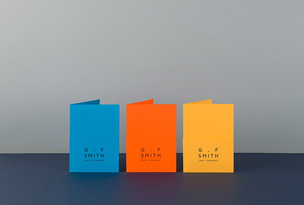
Three folded cards in blue, orange and yellow stand side by side against a grey background. Each card features the “G. F. Smith” logo and the words “1885 onwards” in small white text.
Above

Made Thought: G . F Smith rebrand

Black typographic characters on a white background read “g M 7 G”.
Above

Made Thought: G . F Smith rebrand

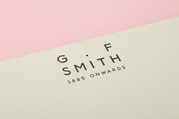
A close-up of a cream-coloured piece of paper featuring the G. F. Smith logo. The black text reads “G. F. SMITH” with “1885 ONWARDS” written below.
Above

Made Thought: G . F Smith rebrand

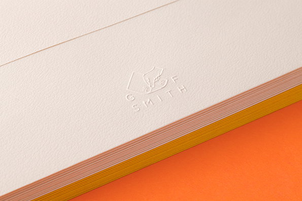
A close-up of a textured white card with a blind embossed logo. The logo features a stylised graphic above the words “G F SMITH”.
Above

Made Thought: G . F Smith rebrand

Ben Parker, creative partner of Made Thought, says: “The brand had a huge visual cache but we felt this was not enough and we could better accentuate the unique and highly covetable brand story that existed beneath the surface. We had the feeling that customers and clients knew of the company but did not know ‘who’ they were.

“To some extent, the design process has been simply about ‘joining up the dots’ and exploiting what already exists, in bucketloads, within the company. Most importantly, we have wanted to reflect a personal, human dimension to a remarkable brand that still proudly carries its founder’s name nearly 130 years later. The new brandmark firmly links the company back to the start — George Frederick Smith — and imparts a genuine sense of honesty, trust and integrity. It adds a human ’touch’ to a business that is all about paper and an already intrinsically beautiful and covetable product that is all about sensation and tactility.”

Along with the stunning new stationery and the impressive brand identity update, Made Thought has also revamped the company’s websites, bringing together the digital and physical sides of the business.
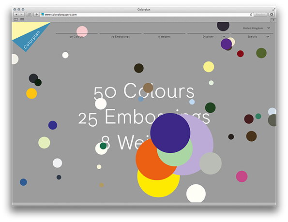
A screenshot of the Colorplan website featuring a grey background scattered with colourful circles of various sizes. Large white text in the centre reads “50 Colours”, “25 Embossings” and “8 Weights”.
Above

Made Thought: G . F Smith rebrand – Colorplan website
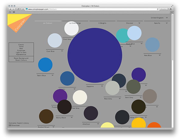
A screenshot of a website for Colorplan papers, showing a grey interface with a collection of coloured circles. A large, deep blue circle labelled “Sapphire” dominates the centre, surrounded by smaller circles in various shades of blue, grey, purple and brown.
Above

Made Thought: G . F Smith rebrand – Colorplan website
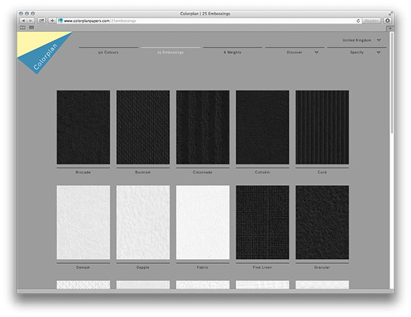
A screenshot of the Colorplan website showing a grid of paper texture samples. Each sample is labelled with a name, including “Brocade”, “Buckram”, “Colonnade”, “Coltskin” and “Cord”.
Above

Made Thought: G . F Smith rebrand – Colorplan website
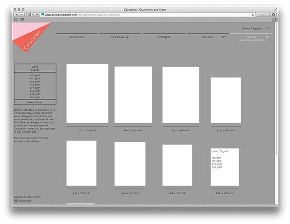
A screenshot of the Colorplan website showing a “Quantities and Sizes” page. White rectangular paper samples of various dimensions are arranged in a grid against a grey background.
Above

Made Thought: G . F Smith rebrand – Colorplan website
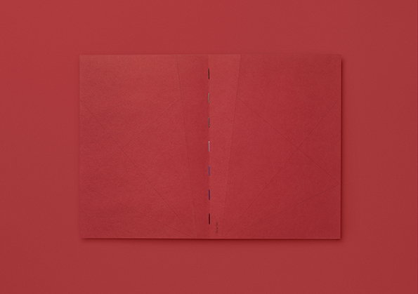
An open red book lies flat against a matching red background. The pages feature a subtle, textured pattern of intersecting diagonal lines.
Above

Made Thought: G . F Smith rebrand – Tear Notebook
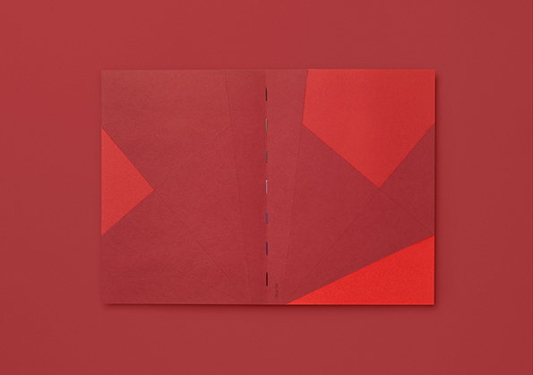
An open book featuring an abstract composition of red and burgundy geometric shapes. The pages are laid flat against a matching red background.
Above

Made Thought: G . F Smith rebrand – Tear Notebook
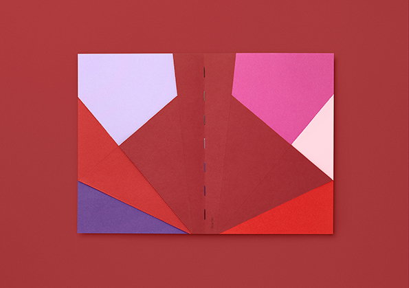
An open book featuring a bold, geometric collage of colourful paper shapes. Large angular forms in purple, red, pink and pale lilac overlap against a deep red background.
Above

Made Thought: G . F Smith rebrand – Tear Notebook
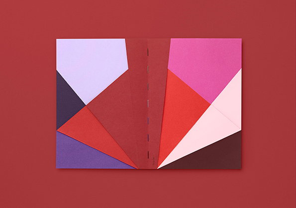
An open booklet featuring a bold, geometric collage of colourful shapes. The abstract composition uses sharp angles in shades of purple, red, pink and cream against a deep red background.
Above

Made Thought: G . F Smith rebrand – Tear Notebook
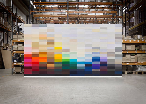
A large rectangular canvas featuring a grid of coloured squares stands in a warehouse. The colours transition from bright reds and yellows on the left to cool blues and greys on the right.
Above

Made Thought: G . F Smith rebrand – Collection Wall
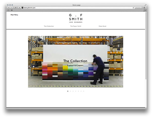
A screenshot of the G. F. Smith website homepage. A central image shows a person in a warehouse standing before a large display of coloured paper samples under the heading “The Collection”.
Above

Made Thought: G . F Smith rebrand – Collection website
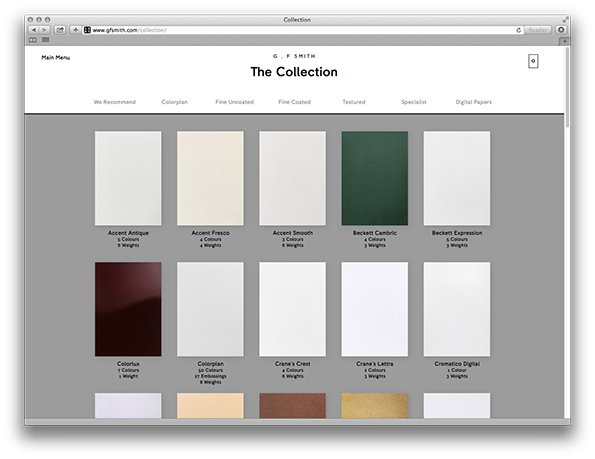
A screenshot of the G F Smith website showing “The Collection” page. A grid of paper samples in various shades of white, cream, green and burgundy is displayed with their names and specifications listed below.
Above

Made Thought: G . F Smith rebrand – Collection website
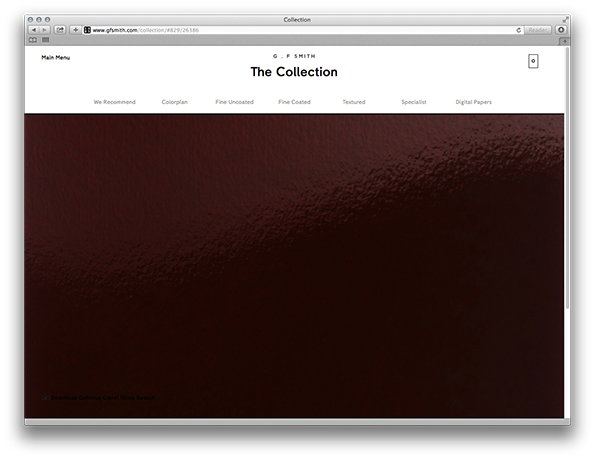
A screenshot of the G. F. Smith website showing “The Collection” page. A large, textured deep red image fills the lower half of the screen below a white navigation menu.
Above

Made Thought: G . F Smith rebrand – Collection website
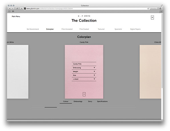
A screenshot of the G. F. Smith website showing “The Collection” page. A pink paper sample labelled “Candy Pink” is centred on a grey background with dropdown menus for embossing, weight and size.
Above

Made Thought: G . F Smith rebrand – Collection website
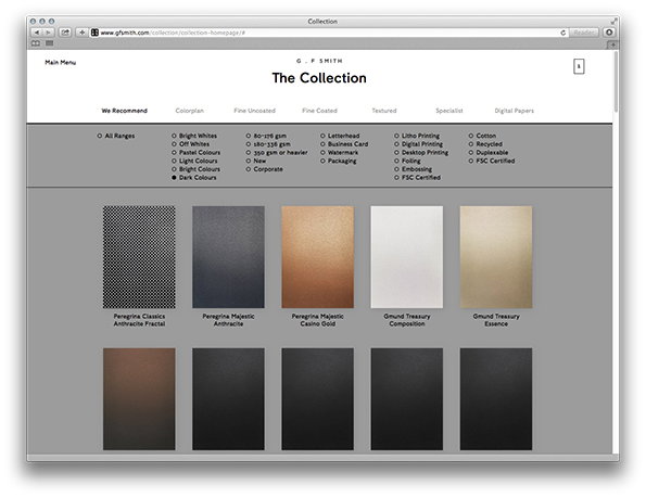
A screenshot of the G. F. Smith website showing “The Collection” page. A grid of paper samples in various colours and textures is displayed below a series of filter options.
Above

Made Thought: G . F Smith rebrand – Collection website
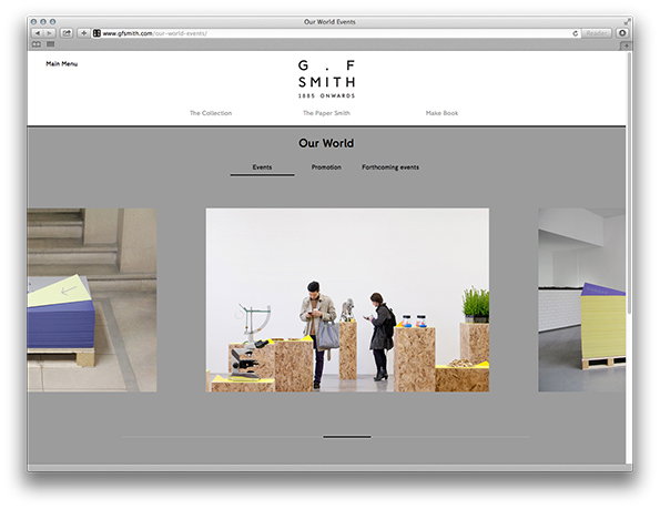
A screenshot of the G. F. Smith website page titled “Our World”. Two people stand in a white gallery space, looking at objects displayed on wooden plinths.
Above

Made Thought: G . F Smith rebrand – Collection website

Share Article

About the Author

Rob Alderson

—

Rob Alderson is a freelance writer, editor and strategist. He was previously editor-in-chief of It’s Nice That and WePresent, and editor of Design Week. He publishes the newsletter Undo, which tries to make sense of how AI is changing design work, the design process and the design industry.


It's Nice That Newsletters

Fancy a bit of It's Nice That in your inbox? Sign up to our newsletters and we'll keep you in the loop with everything good going on in the creative world.