ManVsMachine rebrand Film4 with stunning new idents
- Date
- 3 September 2014
- Words
- James Cartwright
- Tags
Share
Film4 has been one of the UK’s foremost production companies since its inception in 1982, responsible for titles like Trainspotting, Paris, Texas, Hunger and This Is England among many others. They’re also the UK’s number one film channel, screening films for free since 2010. But we’ve always just liked them for their weird TV spots. When they launched their free service four years ago they had Lucy Liu, Ewan McGregor, Gael Garcia Bernal and Judi Dench dressed up in all manner of strange outfits making fools of themselves. Now they’ve grown up a bit and have a new look to show off, but the ads are no less enjoyable.
Today they announced a fresh new identity produced by London-based studio ManVsMachine and overseen by Channel 4’s own 4Creative, that sees a complete overhaul of their OSP and idents for something entirely more cinematic.
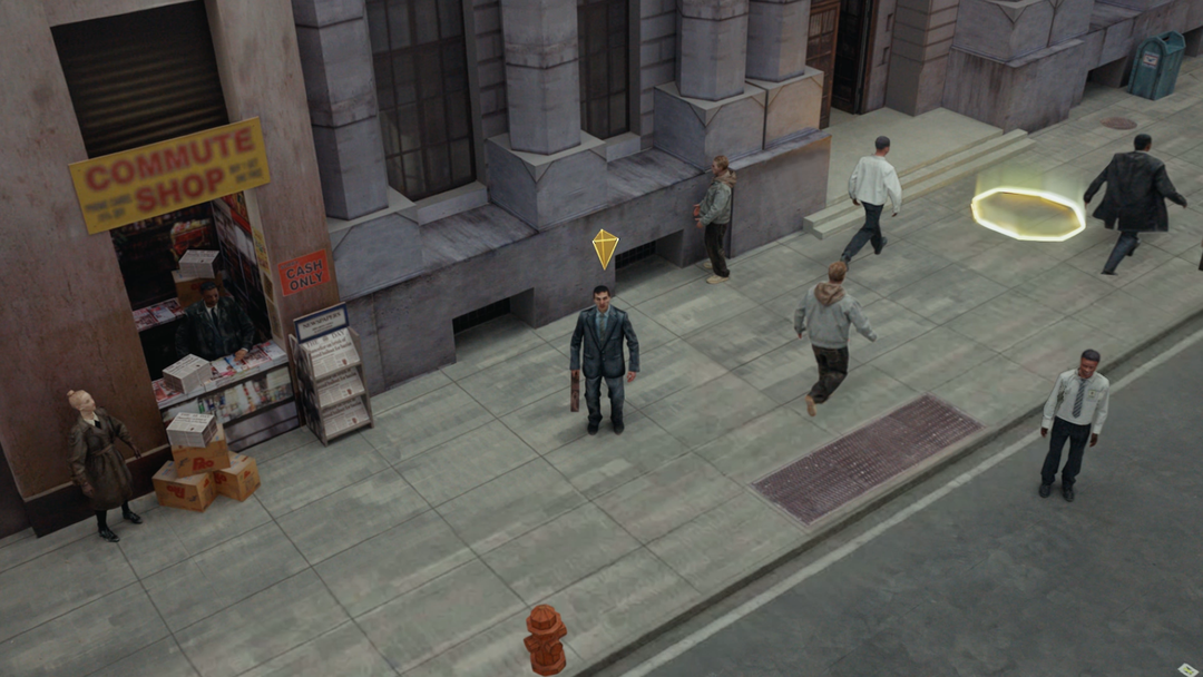
The 16 new shorts were shot in five locations across the UK and US, including a gas station, Brighton hotel, and an eerie forest. Each has a variety of endings, from all-out dramatic explosions to subtle changes in ambiance and soundtrack. They’re also littered with cinematic references, from slight nods to props used in classic, to wholesale re-use of famous characters and sets.
All of them were shot in-camera, utilising a device that stacks frames upon frames to give the effect of a moving film strip or individual animated frames.
Aside from the idents, ManVsMachine have also been hard at work reimagining the way Film4 looks in-between movies, creating a system that references cinematic poster design and type treatments to lend a movie-theatre atmosphere to the channel.
ManVsMachine creative director Mike Alderson explains below…

ManVsMachine: Film4 Identity

ManVsMachine: Film4 Identity

ManVsMachine: Film4 Identity

ManVsMachine: Film4 Identity

ManVsMachine: Film4 Identity
You say you’re looking to create a film channel rather than a TV channel. What was your approach to doing that?
It became our mantra, if there was ever a tricky decision we would refer to the film side of our brains rather than TV. Even down to the typography; we were keen it was bold and confident in just two colours, you rarely get this on a TV identity.
How much were you working within an existing framework of C4 branding? (For example the logo falling into place)
It wasn’t a conscious thing, we focused on making Film4 as strong as it could be as a stand-alone identity, but we obviously know the heritage of the main brand so there are a few nods in there to keep it in the family.
What’s the split between live action and digital in the idents?
As with our 4seven idents before, although people assumed a lot of CG is used it’s actually 80 percent live-action and the film-strip effect is achieved using edit techniques rather than heavy visual effects. Then it was made to look effortless and seamless in post by our talented friends at Analog. Particular kudos goes to those guys in the “gravity shift” parts of the corridor idents. All objects are simulated in CG.
How many films have you referenced?
Literally hundreds. We don’t want to name them as it’ll be good for people to discover them over time.
The branding feels ready pared-back but also epic. Was that in the brief or something you guys came up with?
The graphic “on screen presentation” elements are designed to give the film titles all the glory they deserve. Our design means that they all get an equal billing, as the size is determined by screen space rather than amount of characters. Simple, but these are the details that excite us most.
How do you design for content that’s so flexible and varied? What frameworks have you come up with to deal with it?
In the idents we were very keen to evoke moods rather than genres. Genres suck. So we start every ident in an ambiguous world (filmic establishing shots) and the various endings are what take the viewer into different moods. We want different people to take different things from them.
Is this kind of a dream project for a team who must be movie geeks?
It is. It’s definitely been one of the most fulfilling projects we’ve done, and that’s all thanks to Channel4/4creative being the best client/collaborator you could wish for. Dan Chase, head of on-air for Film4 was instrumental. He kept his watchful eye on us, but never stopped us from doing our thing.

ManVsMachine: Film4 Identity

ManVsMachine: Film4 Identity

ManVsMachine: Film4 Identity

ManVsMachine: Film4 Identity
Share Article
Further Info
About the Author
—
James started out as an intern in 2011 and came back in summer of 2012 to work online and latterly as Print Editor, before leaving in May 2015.