




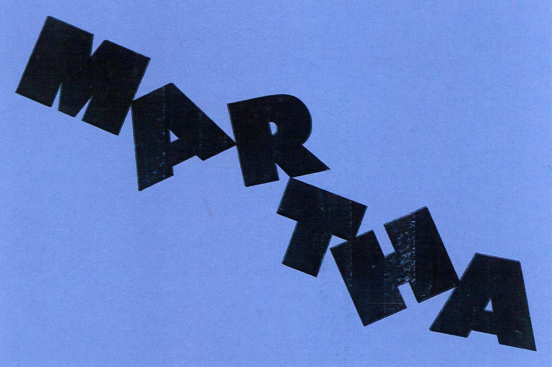
Founded on friendship, Martha is the Montreal design studio that approaches branding with a human touch
Launched last year, the studio has been busy using its keen eye for typography to build a diverse set of visual identities across all corners of the industry.
Martha is the creative brainchild of designers Guillaume Lavallée and Ariane Leblanc: a studio practice that merges the pairs contrasting creative backgrounds and perspectives. Whilst Guillaume is a self taught graphic designer with a decade of experience in the development of dynamic identities for brands, Ariane followed her BA in graphic design at Central Saint Martins with a stint in the fashion industry, working at Vivienne Westwood. Having both worked for a range of successful studios and agencies over their careers and even founding one their own (Guillame founded the design studio Demande Spéciale back in 2017, which he led for five years), the duo recently embarked on this new adventure in January of 2024.
Since then, Martha has expanded into a growing team and seen two different office spaces in Montreal already. Emerging from Guillame and Ariane’s collaboration are dynamic brand identities for the likes of Notion, AI comapny Ada, fashion brand Sheertex and non-profits like Greenpeace Canada. “Our work spans across industries: food, AI, culture, architecture and beyond. What connects it all is a human sensibility, a desire to make creative work that feels alive,” shares Ariane.
The duo’s beautifully art directed work carefully considers its use of type and aims for optimum impact, something that was foreshadowed by the studio’s type-focused soft launch over on Instagram last year. Even their visual identity for the studio itself showcases a logo in the shape of a wonderful staircase of letterforms that you can find with a scroll to the bottom of their website homepage.
Whilst beautiful type is certainly a focus and a talent of the studio, so is the way its work connects to viewers. Martha’s two founders has kept the fact that the studio was founded on friendship as a core aspect to all of their work so far: “We believe all design is relational,” Guillaume concludes. “To us, relational is defined in a few ways: how the design relates to people, and the world, but more importantly the relationships behind the work.”
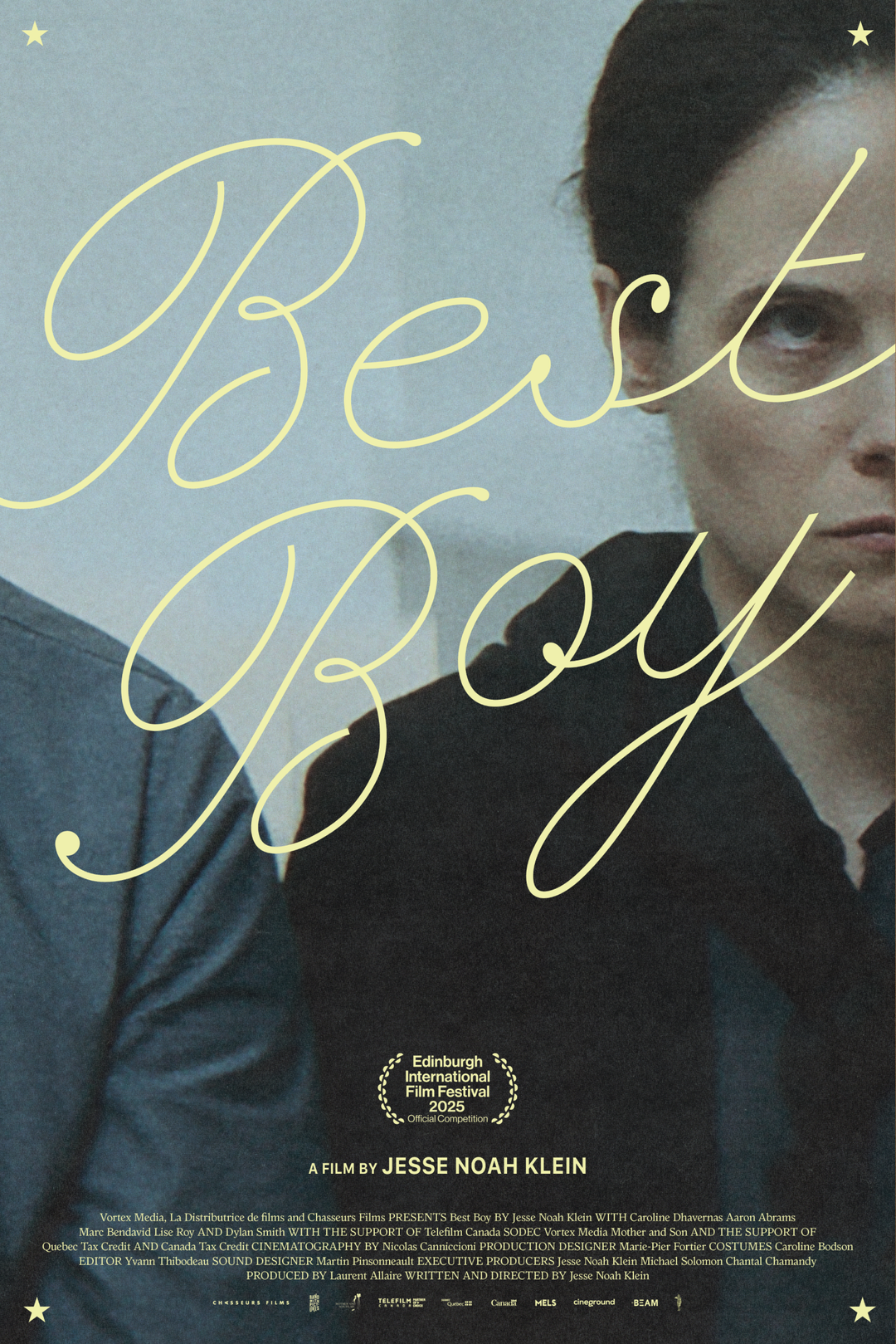
Martha: Best Boy by Jesse Noah Klein movie poster (Copyright © Martha, 2024)
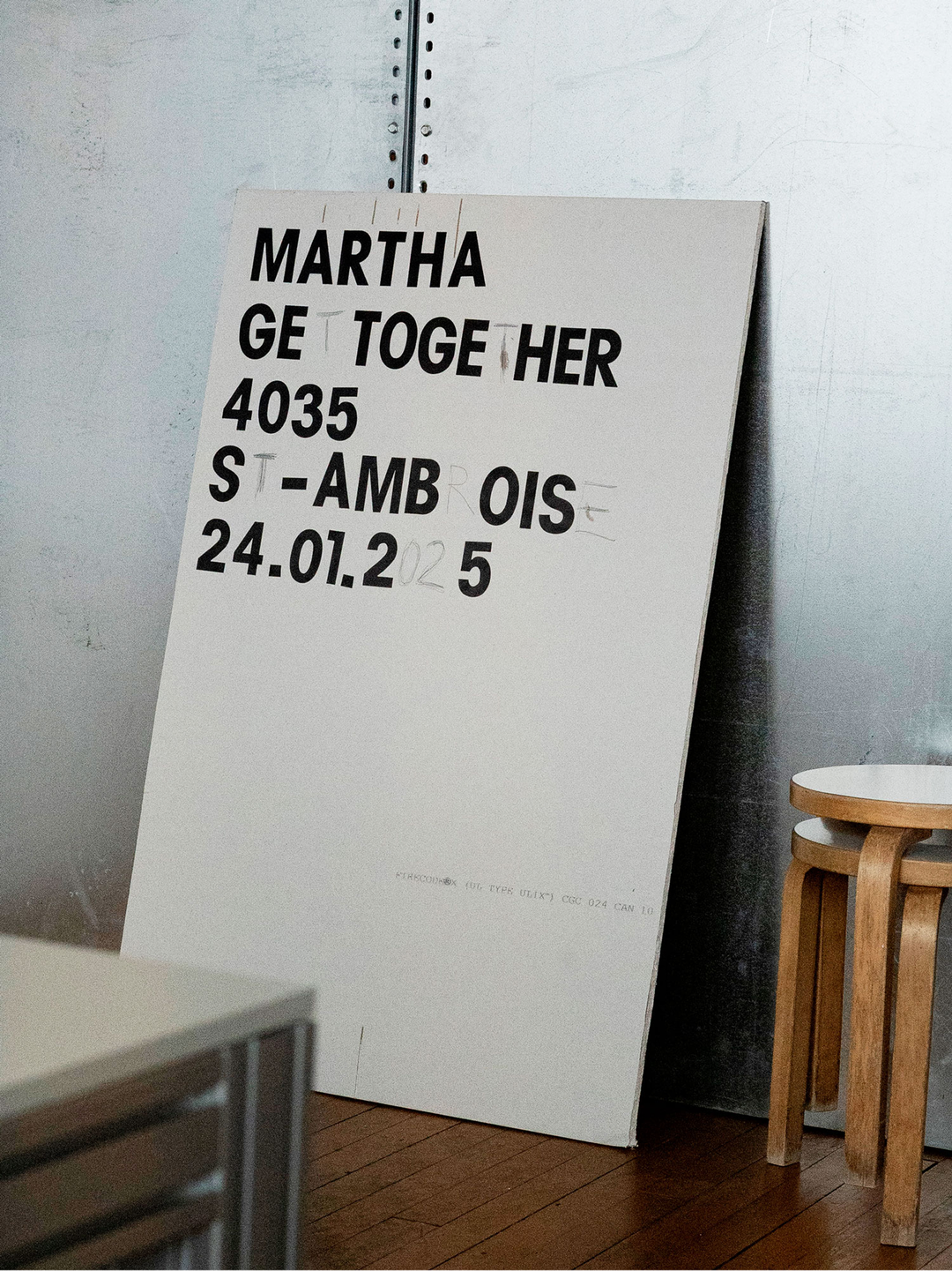
Martha: Martha Get Together (Copyright © Martha, 2025)
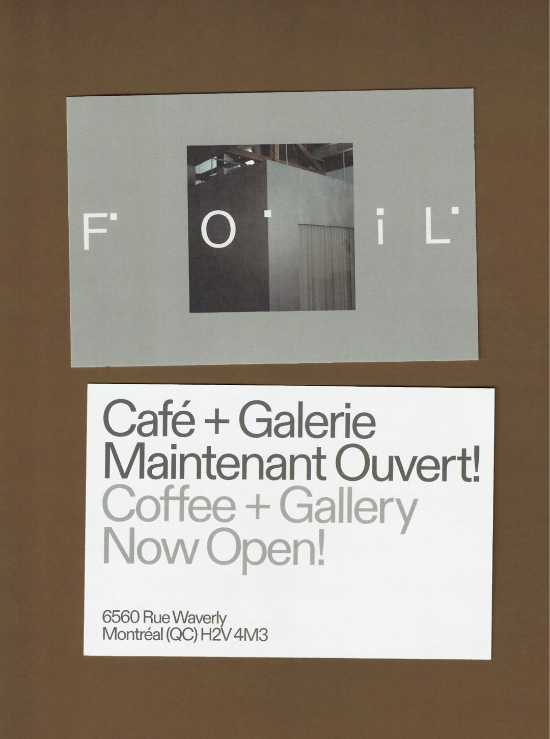
Martha: Foil Gallery brand identity (Copyright © Martha, 2024)
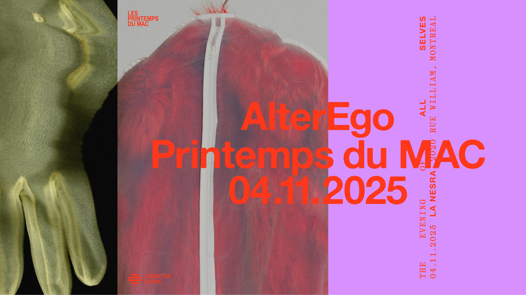
Martha: Printemps du MAC website (Copyright © Martha, 2025)
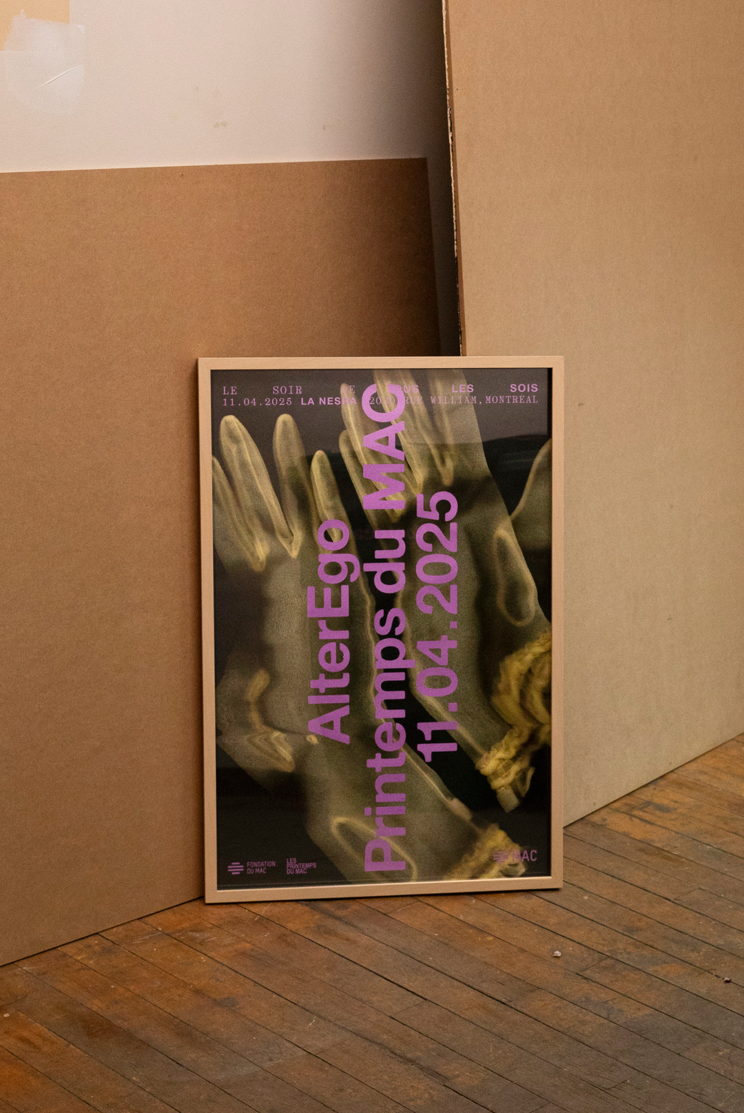
Martha: Printemps du MAC poster (Copyright © Martha, 2025)
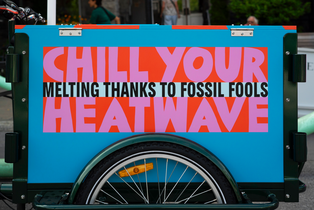
Martha: Greenpeace activation (Copyright © Martha, 2024)
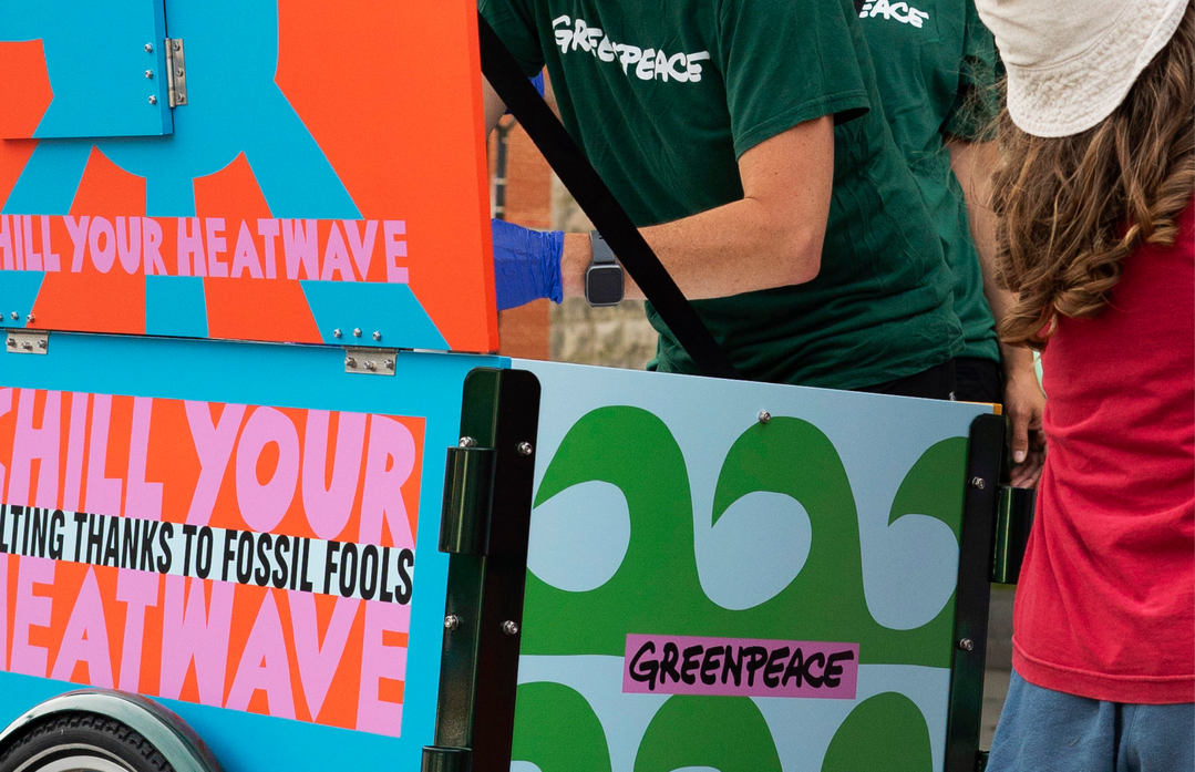
Martha: Greenpeace activation (Copyright © Martha, 2024)
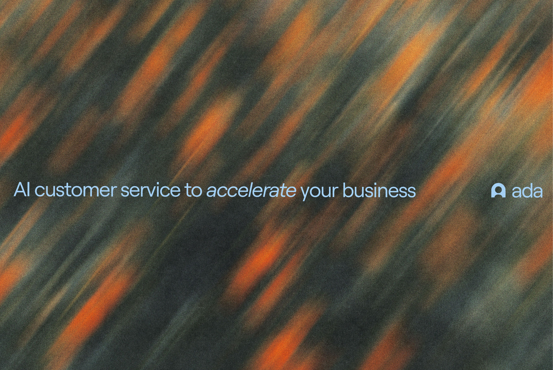
Martha: Ada rebrand (Copyright © Martha, 2024)
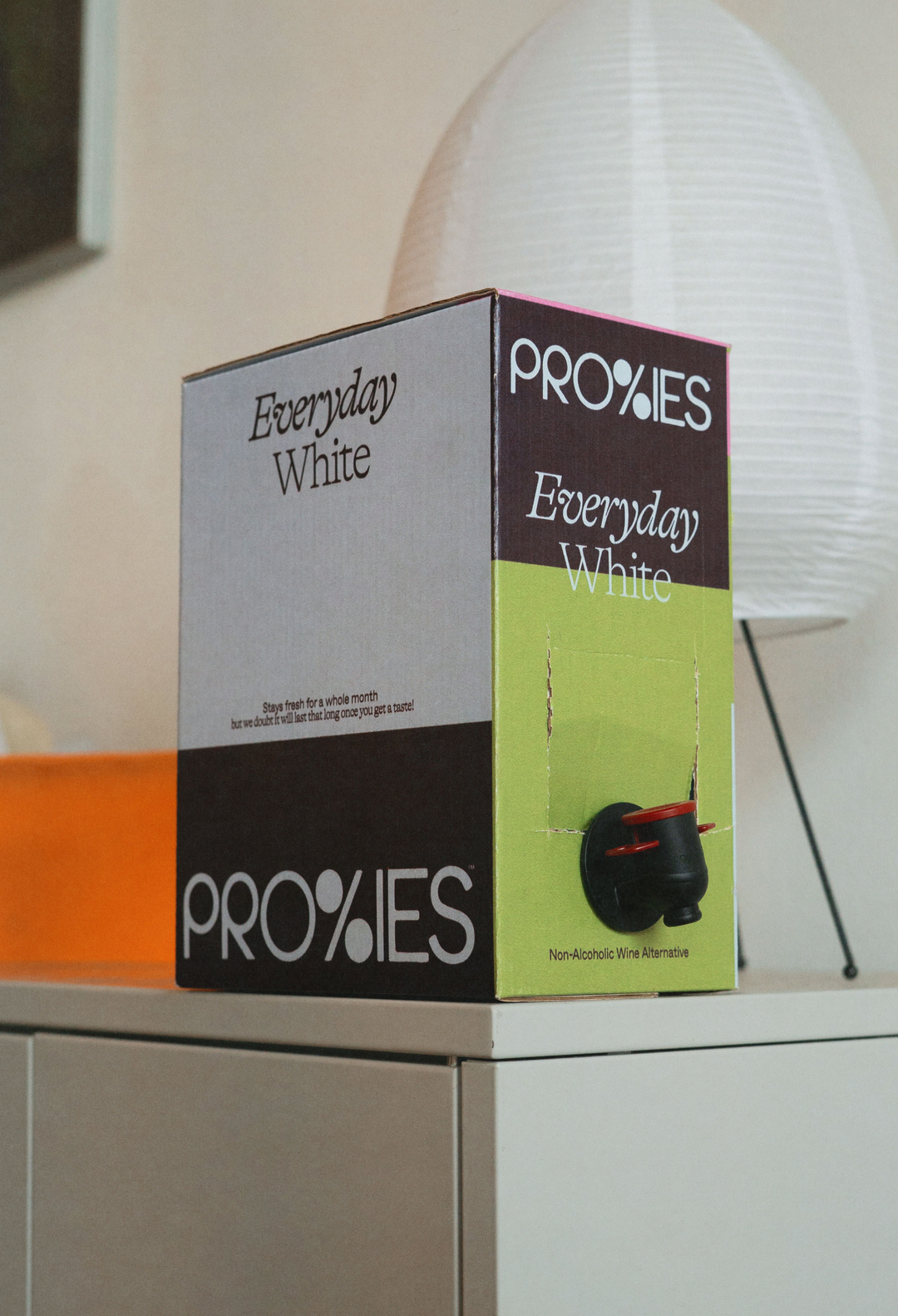
Martha: Proxies boxed non-alc. wine design (Copyright © Martha, 2025)
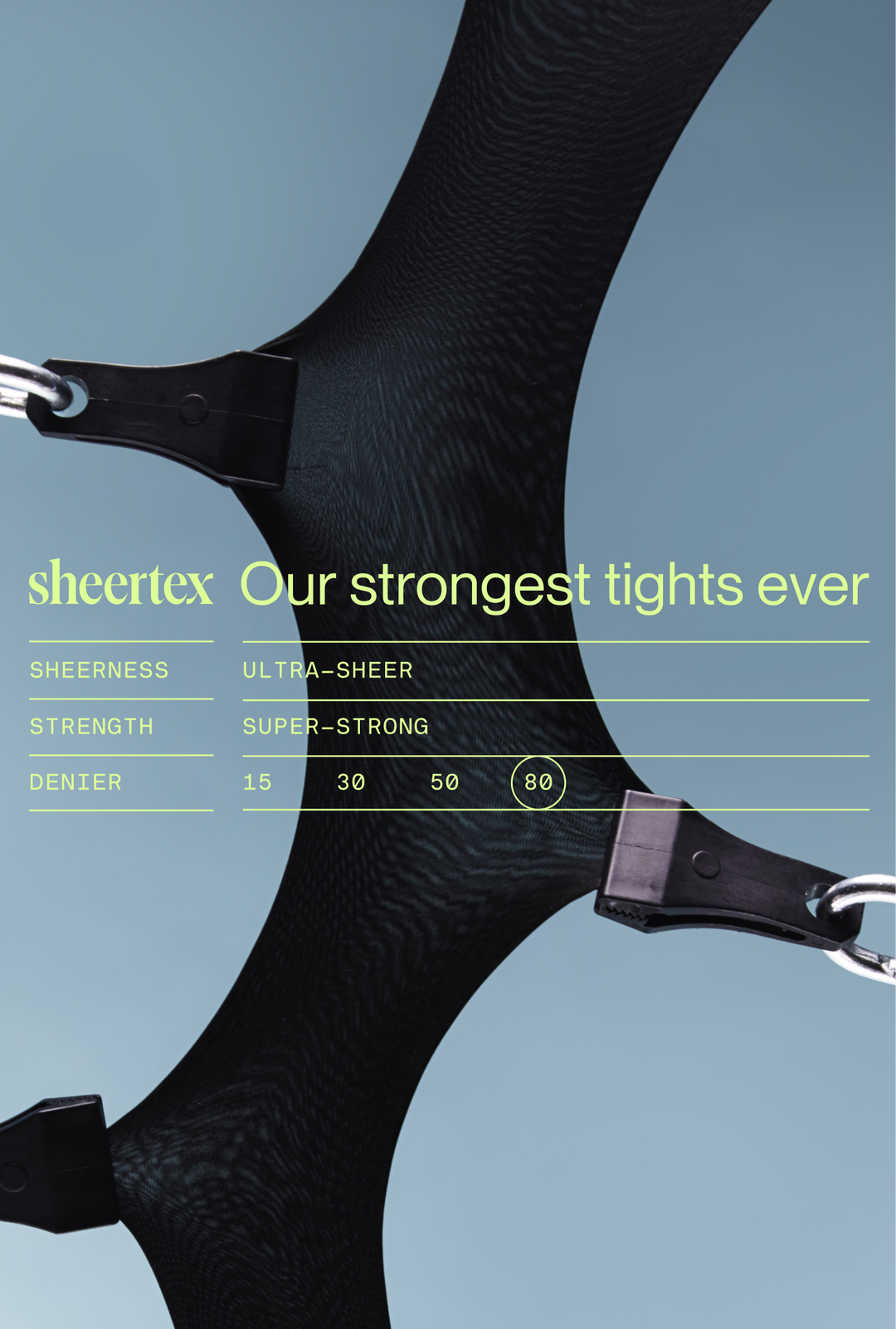
Martha: Sheertex brand refresh (Copyright © Martha, 2024)
Hero Header
Martha: Martha postcard (Copyright © Martha, 2025)
Share Article
Further Info
About the Author
—
Ellis Tree (she/her) is a staff writer at It’s Nice That. She joined as a junior writer in April 2024 after graduating from Kingston School of Art with a degree in Graphic Design. Across her research, writing and visual work she has a particular interest in printmaking, self-publishing and expanded approaches to photography. ert@itsnicethat.com
To submit your work to be featured on the site, see our Submissions Guide.


