“Do anything except what’s right in front of you”: Matt Dorfman on designing book covers
The New York Times Book Review art director speaks about reading every manuscript he designs for, embracing bad ideas, and why collage remains one of his go-to tools for making audiences find new things in familiar subjects.
New York-based designer Matt Dorfman has been the art director at The New York Times Book Review for over a decade, so he has a thing or two to say about book design. “A good book cover is more interested in its subject than it is about its audience,” he tells us. And when it comes to the experience of writing a book, he imagines it to be a challenging one. “Anyone who commits to writing one benefits from being equal parts obsessive and critical of its subject, characters and their own authorial intent.” He adds, “All of the covers that I notice by chance speak to some aspect of the author’s extremely personal, extremely idiosyncratic fixations which they poured into their book.” While it’s often advised not to judge a book by its cover, Matt believes that when a cover reflects the writing honestly, it can help draw in an audience.
Matt’s job affords him what he describes as “the honour and anxiety” of bringing on board creatives. Who, in particular, you may ask? “Anyone I’ve ever been marginally envious of to produce art for the section,” he says. Meanwhile, Matt also keeps up his own design and art consultancy, working on projects that he can “foresee myself caring about past midnight when I should definitely be asleep”. He adds, “my wife and daughter have been routinely supportive of this.”
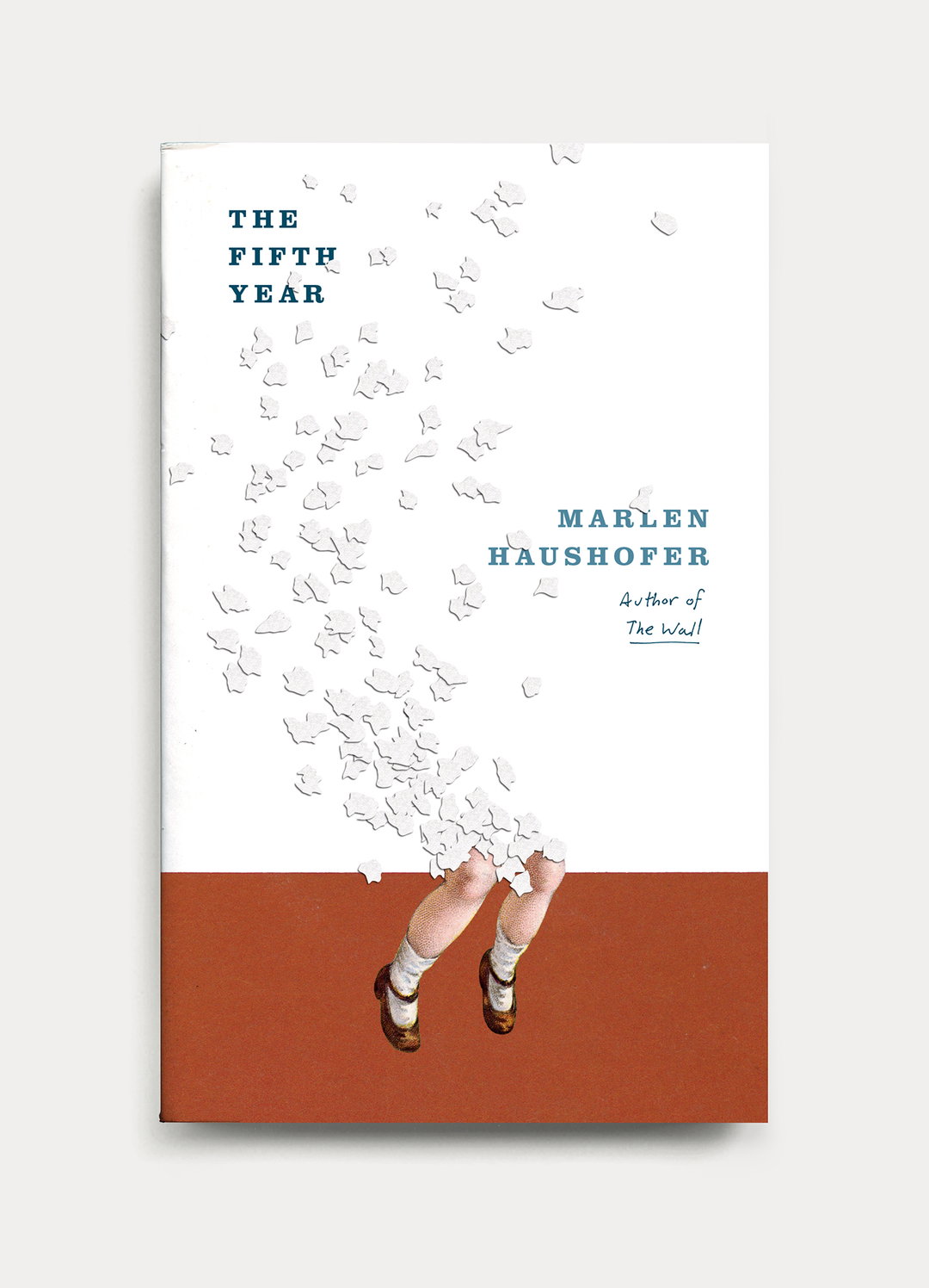
Matt Dorfman: The Fifth Year (Copyright © Matt Dorfman, 2026)
Matt Dorfman: The Wall (Copyright © Matt Dorfman, 2026)
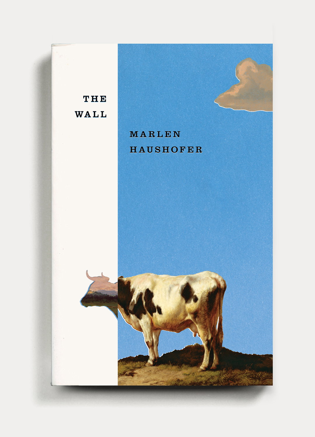
Matt Dorfman: The Wall (Copyright © Matt Dorfman, 2026)
These busy days and late nights begin with, as Matt puts it, “churning out a generous amount of trash”. Much to his frustration he will be “working through what often feels like a landfill-sized hill of boring ideas”. Despite taking up quite a bit of time, it’s a necessity, as among this trash will be a shred of an idea worth expanding upon. “Usually it’s a minor detail from an earlier comp made in haste and far afield from anything that book is actually about,” he says, “but it typically has a quality of brokenness or something unfinished that just looks interesting.” From here, he’ll identify something true to the book’s message and mission – something he’s very much across, having read every book he’s designed. “If I don’t read the book, I can’t be interested in the subject, and if I can’t be interested in the subject, the cover definitely won’t be.”
A recurring medium that Matt returns to for his book covers is collage, often an appropriate style due to the distinctive relationship between images, forms and letters that collage can visually afford. “Collage has become one of my shorthands for pairing themes and ideas together that aren’t so readily represented in nature or culture.” If the latter is well focused, then the ideas behind the cover can be quickly and effectively iterated upon. “That’s invaluable for a guy like me who is trying to maximize as many minutes as they can experimenting and making mistakes on purpose.” Beyond that, collage is an accessible form in which an audience can clearly see the divergence between things. “Historically, collage has been an effective blunt-force tool for taking two (or more) very different things,” Matt explains, “and gives readers a visual prompt to re-evaluate anything that might be overly familiar.”
Whichever approach Matt takes, there can often be pushback, which certainly comes with the territory when one’s considering trying to push cover design – an ancient pastime – into genuinely novel, original directions. “In which case, the hour is often late and my confidence is a little rickety, so a different, though familiar Plan B is put into effect, in which I tell myself: ‘you can do anything except what’s right in front of you. Don’t do that.’”
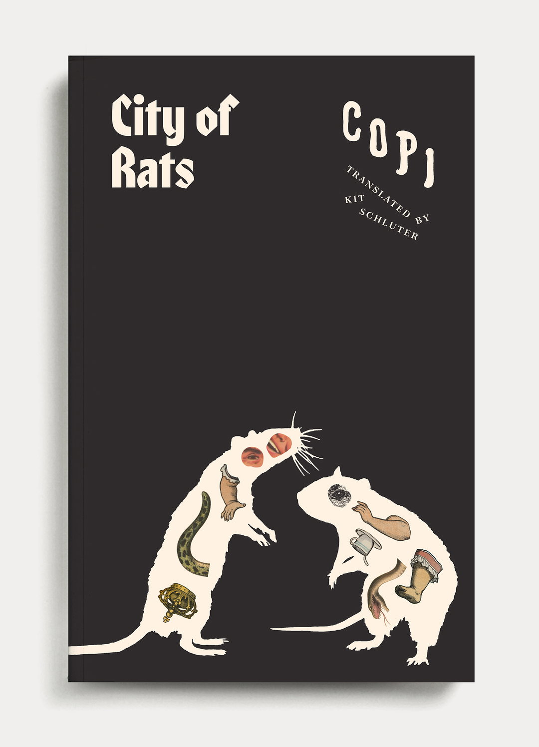
Matt Dorfman: City of Rats (Copyright © Matt Dorfman, 2026)
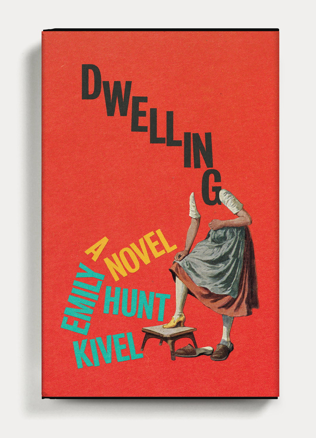
Matt Dorfman: Dwelling (Copyright © Matt Dorfman, 2026)
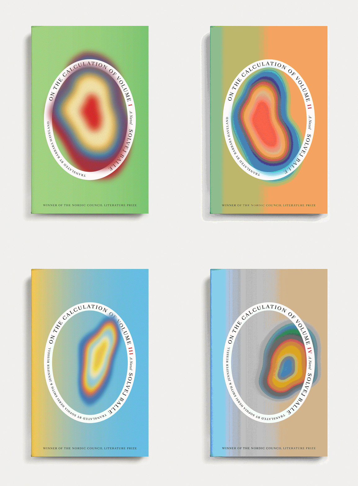
Matt Dorfman: On the Calculation of Volume I–IV (Copyright © Matt Dorfman, 2026)
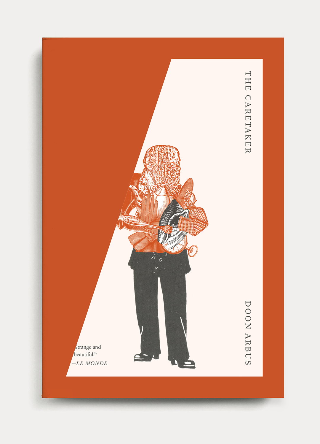
Matt Dorfman: The Caretaker (Copyright © Matt Dorfman, 2026)
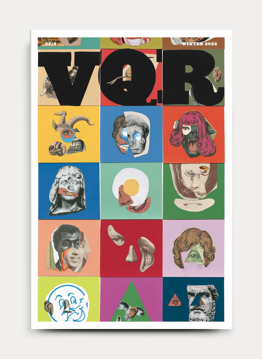
Matt Dorfman: VQR (Copyright © Matt Dorfman, 2026)
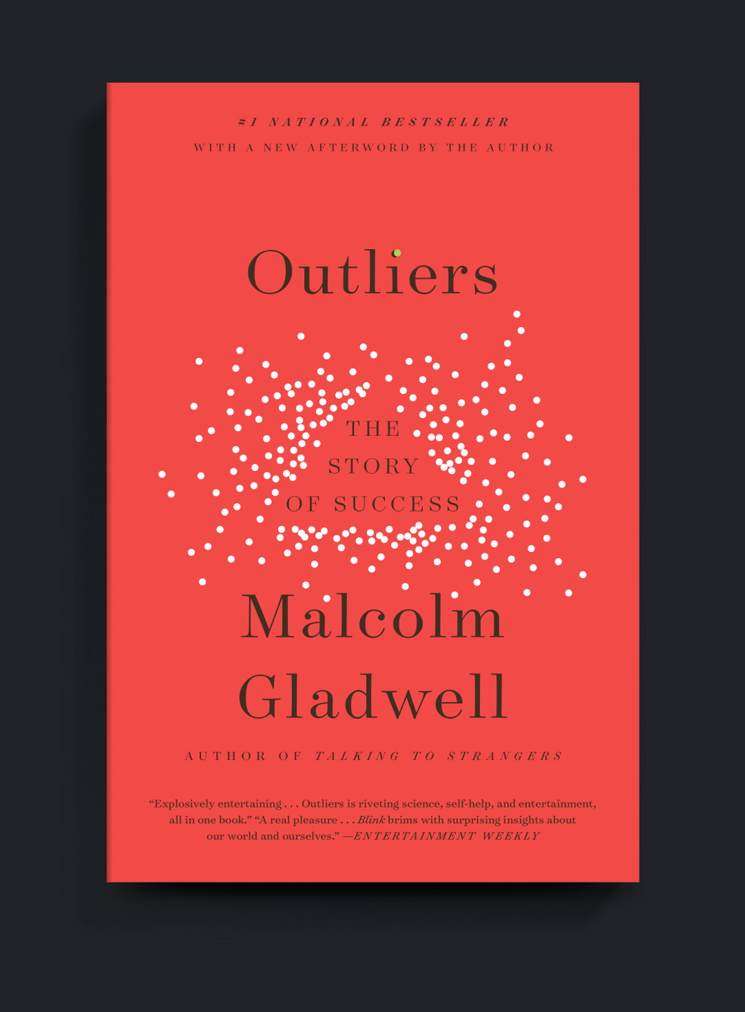
Matt Dorfman: Outliers (Copyright © Matt Dorfman, 2026)
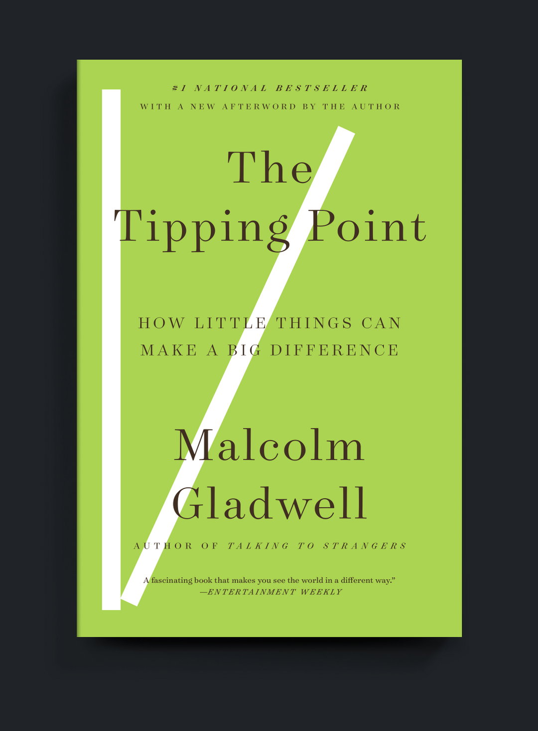
Matt Dorfman: The Tipping Point (Copyright © Matt Dorfman, 2026)
Matt Dorfman: What the Dog Saw (Copyright © Matt Dorfman, 2026)
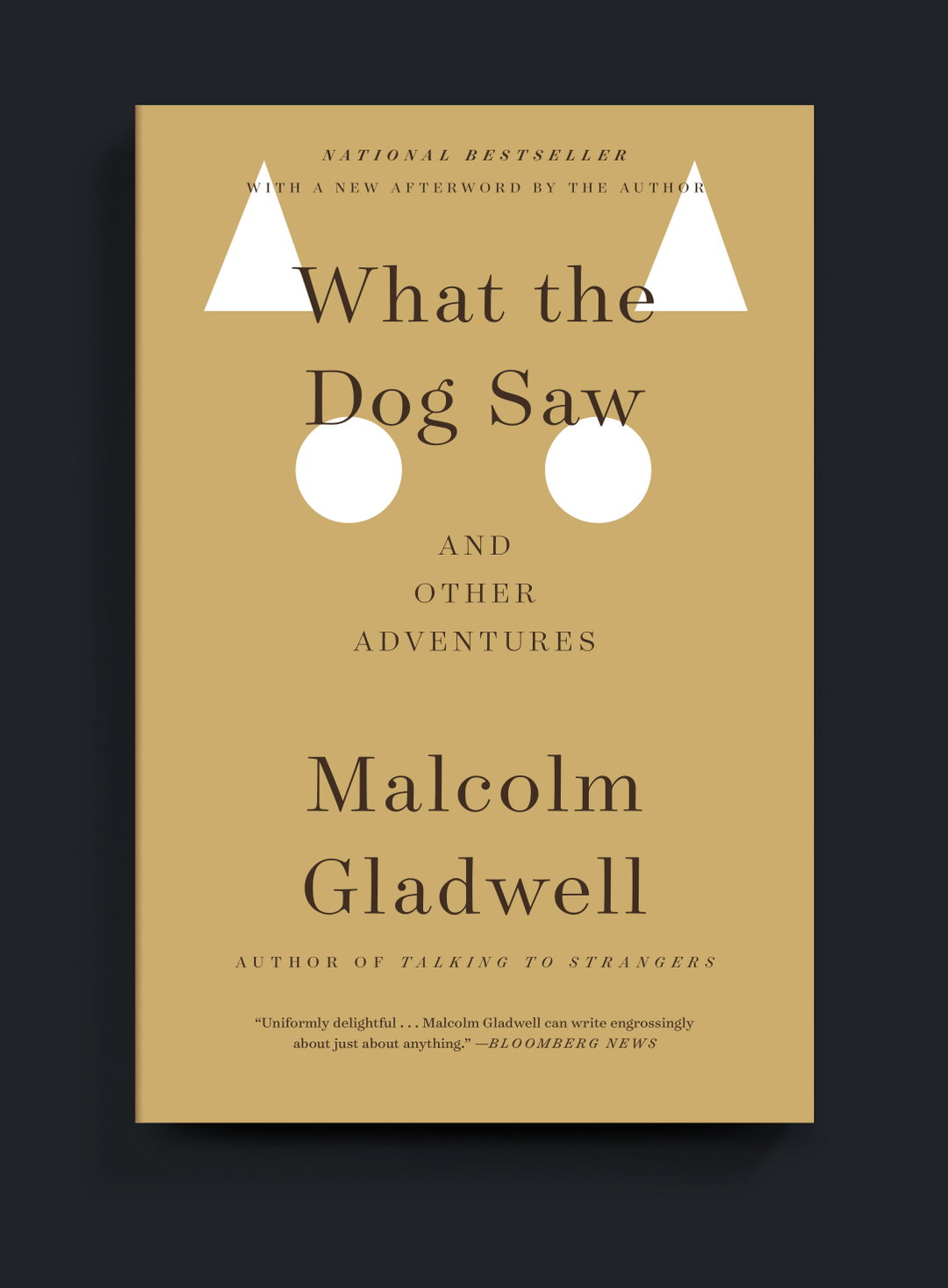
Matt Dorfman: What the Dog Saw (Copyright © Matt Dorfman, 2026)
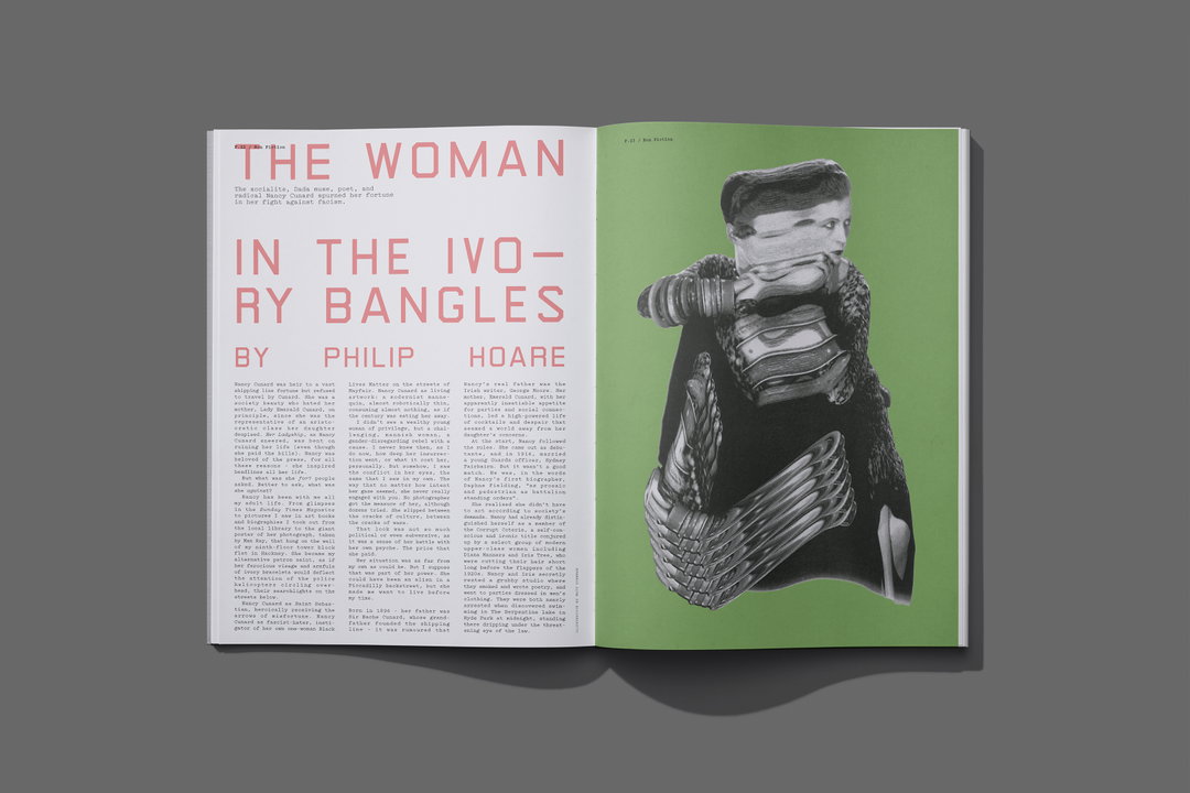
Inque Issue Three: Illustrations by Matt Dorfman, design by Matt Willey (Copyright © Matt Willey, 2026)
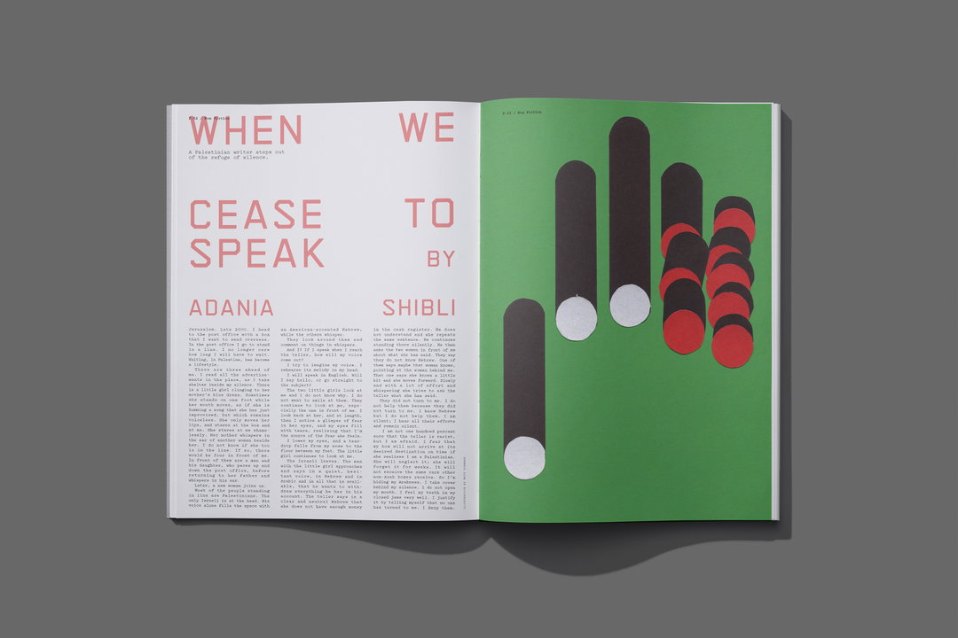
Inque Issue Three: Illustrations by Matt Dorfman, design by Matt Willey (Copyright © Matt Willey, 2026)

Matt Dorfman: New York Times Book Review (Copyright © Matt Dorfman, 2026)
Hero Header
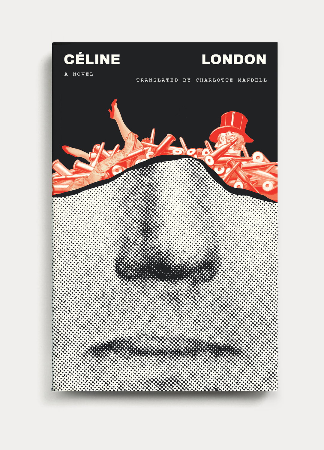
Matt Dorfman: Céline London (Copyright © Matt Dorfman, 2026)
Share Article
Further Info
About the Author
—
Hailing from the West Midlands, and having originally joined It’s Nice That as an editorial assistant in March 2020, Harry is a freelance writer and designer – running his own independent practice, as well as being one-half of the Studio Ground Floor.