



Launch Recite Me assistive technology
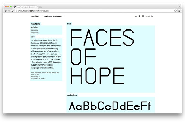
A screenshot of a website showcasing a typeface called “adjuster”. Large, angular black text on a light blue background reads “FACES OF HOPE”.

Create your own typefaces with cool online tool Metaflop

—
Date
18 February 2015

I’d forgotten that I once described typography as “the least sexy design discipline” until I discovered that not only did I say it, but that Sarah Hyndman has recorded it for posterity in her excellent Type Tasting book that we featured on the site yesterday. Anyway I may have to reassess this glib pronouncement after spending some time on Metaflop, “an easy to use web application for modulating your own fonts.” Designed and developed by Swiss designers Marco Müller and Alexis Reigel, it’s a delightfully simple tool that allows you to customise fonts using a series of sliders that alter different characteristics such as cap height, aperture and contrast.

“This enables you to focus on the visual output – adjusting the parameters of the typeface to your own taste,” the developers say. “All the repetitive tasks are automated in the background.” The results can be downloaded as a web font package (for free!) and there’s also a library of pre-made metafonts if you’re lacking inspiration. No doubt Serious Design Journalists will decry the dumbing down of the typographer’s craft, but there’s something super-exciting about democratising type in this way, and no-one’s seriously suggesting that it’s going to make talented type designers obsolete.

“We are aware that it is difficult to produce subtle and refined typographical fonts (in the classical meaning),” Marco and Alexis admit. “Nevertheless we believe there is a undeniable quality in parametric font design and we try to bring it closer to the world of the designers.”
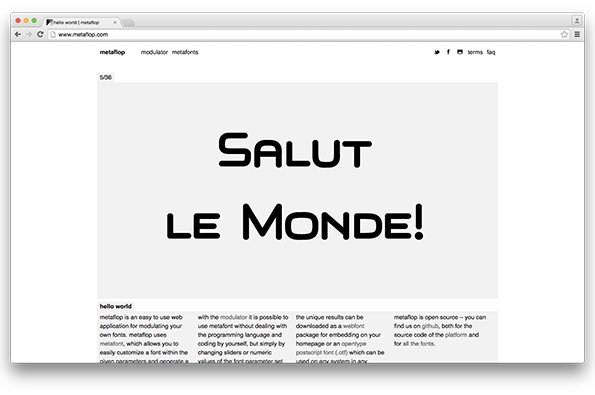
A screenshot of the Metaflop website showing a font modulator tool. Large, bold black text in the centre reads “SALUT LE MONDE!”.
Above

Marco Müller and Alexis Reigel: Metaflop
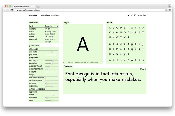
A screenshot of a font design tool called “modulator” on a web browser. A large capital “A” is displayed in a central preview window, surrounded by a character chart and a sidebar of technical sliders. Below the preview, a sample of text reads “Font design is in fact lots of fun, especially when you make mistakes.”
Above

Marco Müller and Alexis Reigel: Metaflop
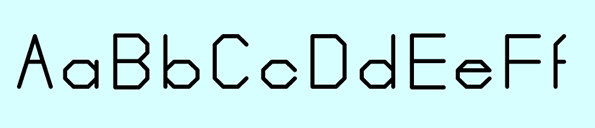
A sample of a geometric typeface showing uppercase and lowercase letters from “A” to “F”. The black characters are set against a pale blue background.
Above

Marco Müller and Alexis Reigel: Metaflop
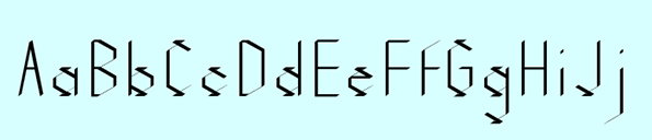
A specimen of a geometric typeface showing uppercase and lowercase letters from “A” to “J”. The characters feature sharp angles and thin, precise lines against a pale blue background.
Above

Marco Müller and Alexis Reigel: Metaflop
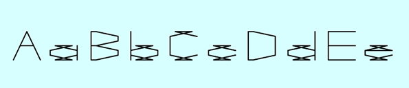
An illustration of a custom typeface showing uppercase and lowercase letters from “A” to “E”. The characters are constructed from thin black lines in a geometric, architectural style against a light blue background.
Above

Marco Müller and Alexis Reigel: Metaflop
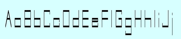
A set of uppercase and lowercase letters from A to J in a geometric, minimalist typeface. The characters are composed of thin black lines on a pale blue background.
Above

Marco Müller and Alexis Reigel: Metaflop
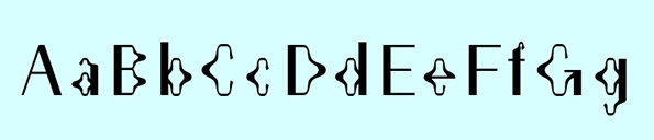
An illustration of a typeface showing uppercase and lowercase letters from A to G. Each letter is paired with a distorted, fluid version of itself.
Above

Marco Müller and Alexis Reigel: Metaflop
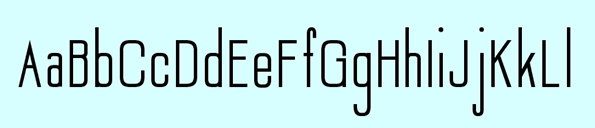
A specimen of a condensed sans-serif typeface showing uppercase and lowercase letters from “A” to “L”. The black characters are set against a pale blue background.
Above

Marco Müller and Alexis Reigel: Metaflop
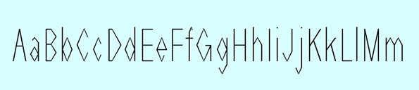
A specimen of a geometric typeface showing uppercase and lowercase letters from “A” to “M”. The characters are composed of thin black lines on a pale blue background.
Above

Marco Müller and Alexis Reigel: Metaflop
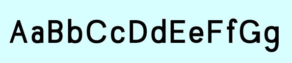
Black uppercase and lowercase letters from “A” to “G” are arranged in a row. They are set against a pale blue background.
Above

Marco Müller and Alexis Reigel: Metaflop
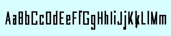
A black alphabet set in a bold, blocky typeface against a pale blue background. The letters are shown in both upper and lower case from “A” to “M”.
Above

Marco Müller and Alexis Reigel: Metaflop
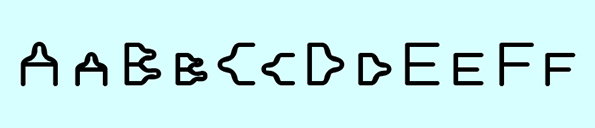
An illustration of a custom alphabet in black outlines on a pale blue background. The letters “A” through “F” are shown in uppercase and lowercase, featuring rounded, organic shapes.
Above

Marco Müller and Alexis Reigel: Metaflop
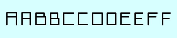
A sequence of letters in a blocky, geometric typeface reads “AABBCCDEEFF”. The black characters are set against a pale blue background.
Above

Marco Müller and Alexis Reigel: Metaflop
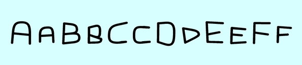
Hand-drawn black letters on a pale blue background. The letters read “AABBCCDDEEFF”.
Above

Marco Müller and Alexis Reigel: Metaflop

Share Article

Further Info

About the Author

Rob Alderson

—

Rob Alderson is a freelance writer, editor and strategist. He was previously editor-in-chief of It’s Nice That and WePresent, and editor of Design Week. He publishes the newsletter Undo, which tries to make sense of how AI is changing design work, the design process and the design industry.


It's Nice That Newsletters

Fancy a bit of It's Nice That in your inbox? Sign up to our newsletters and we'll keep you in the loop with everything good going on in the creative world.
