Launch Recite Me assistive technology
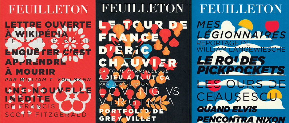
Three typographic posters in red, black and blue, each headed with the word “Feuilleton”. The layouts feature bold, overlapping text and abstract floral or cloud shapes, listing various articles and authors.

More great, slick graphic design work from Mike Lemanski

—
Date
23 January 2015

It’s little surprise that Mike Lemanski’s graphic design work has been something of an It’s Nice That favourite, and since we last posted about him in 2013 he’s not let his style slip. Mike’s site boasts some beautiful, mature designs for Feuilleton magazine, which takes articles from various international publications such as The New York Times, translates them into French and publishes issues every quarter.

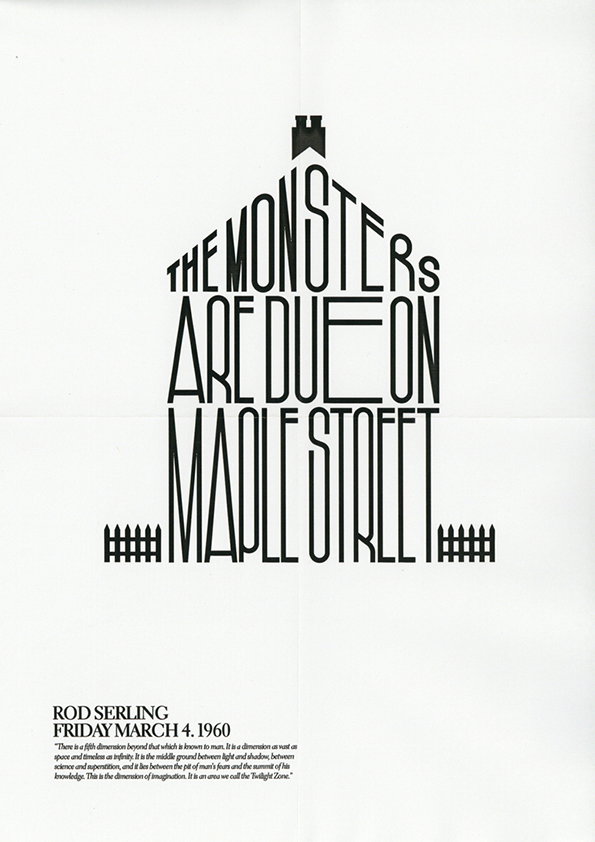
The four covers Mike designed stem from a brief to include text on the cover for the first time. “I put forward the idea of hiding the titles of the issue’s articles within an illustration which would be a graphic representation of the season in which the issue was published, starting in autumn through to summer,” he explains. As well as work for Feuilleton, Mike’s also been commissioned to work for clients including Creative Review magazine, Lacoste and Intel, but on the side he’s been indulging in his mission to create a poster for every episode of the original series of The Twilight Zone, two of which you can see below.
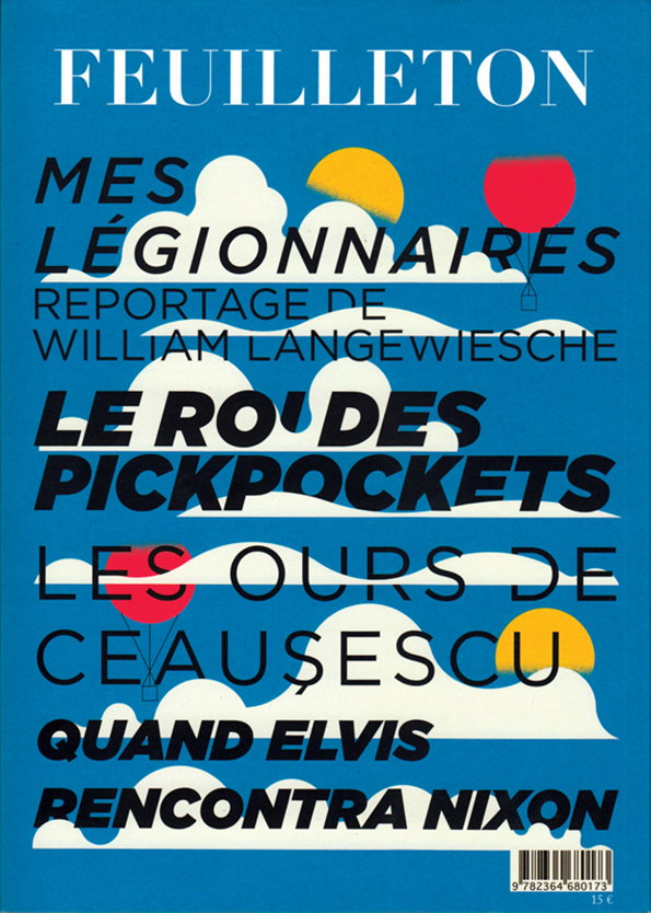
A blue book cover featuring bold, multi-coloured typography layered over white clouds. The title at the top reads “FEUILLETON”, followed by several headlines including “MES LÉGIONNAIRES” and “QUAND ELVIS RENCONTRA NIXON”.
Above

Mike Lemanski: Feuilleton magazine cover
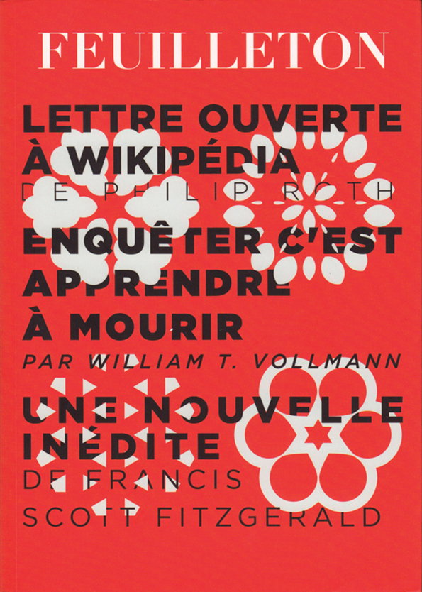
A red poster featuring bold black and white typography and white floral shapes. The text includes “Feuilleton” at the top, followed by titles and names including “Philip Roth”, “William T. Vollmann” and “Francis Scott Fitzgerald”.
Above

Mike Lemanski: Feuilleton magazine cover
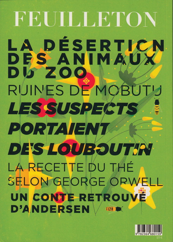
A green book cover featuring bold, black and red typography over a stylised illustration of yellow flowers and insects. The main text reads “Feuilleton” at the top, followed by headlines including “La désertion des animaux du zoo” and “Les suspects portaient des Louboutin”.
Above

Mike Lemanski: Feuilleton magazine cover
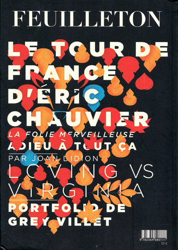
A book cover with a black background and bold white and orange typography. The title “Feuilleton” sits at the top, above a list of titles including “Le Tour de France d’Eric Chauvier” and “Loving vs Virginia”. Stylised orange and red leaves are layered over the text.
Above

Mike Lemanski: Feuilleton magazine cover
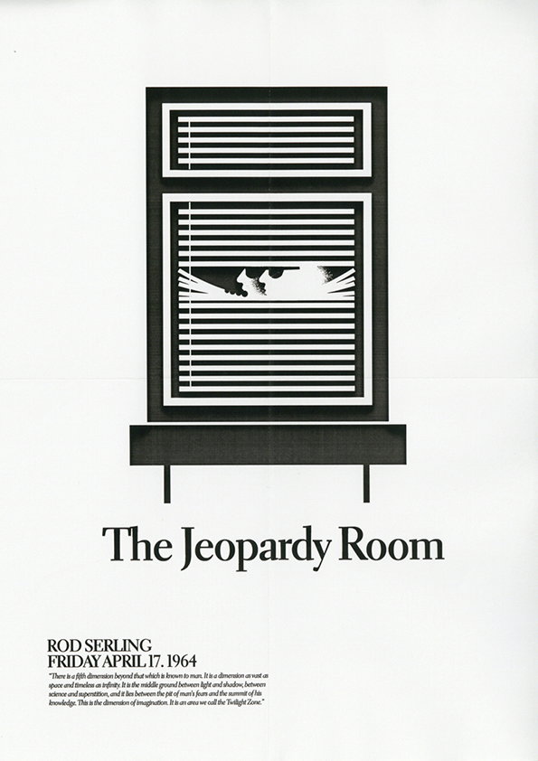
A black and white graphic poster for “The Jeopardy Room”. A stylized window with closed blinds reveals a silhouette of a person’s face peering through a gap. Below the image, text reads “Rod Serling” and “Friday April 17, 1964”. A small block of text at the bottom describes the “Twilight Zone”.
Above

Mike Lemanski: The Jeopardy Room

A black and white typographic poster reads “The Monsters Are Due on Maple Street”. The letters are arranged to form the silhouette of a house with a chimney and a fence. Below, text reads “Rod Serling Friday March 4, 1960” followed by a short introductory paragraph about the Twilight Zone.
Above

Mike Lemanski: The Monsters Are Due on Maple Street

Share Article

About the Author

Emily Gosling

—

Emily joined It’s Nice That as Online Editor in the summer of 2014 after four years at Design Week. She is particularly interested in graphic design, branding and music. After working It's Nice That as both Online Editor and Deputy Editor, Emily left the company in 2016.


It's Nice That Newsletters

Fancy a bit of It's Nice That in your inbox? Sign up to our newsletters and we'll keep you in the loop with everything good going on in the creative world.