




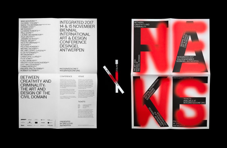
Is it real, or is it not? Mirror Mirror's identity for Integrated 2017
“With a brief about creativity and criminality, a graphical direction referencing spray paint and street-art was initially exactly what we didn’t want do to,” explains Antwerp-based design studio Mirror Mirror, “but we kept returning to it, thinking to ourselves: ‘It’s a cliche not to use a cliche’.” This year, the multi-disciplinary studio was tasked with creating the visual identity for Integrated 2017 and its answer was a series of faux-in-situ visuals and a “post-real” poster campaign.
Integrated, now in its sixth edition, is a biennial international art and design conference organised by St Lucas School of Arts Antwerp which is always highly defined by a concept or manifesto. This year, that concept was Between Creativity and Criminality: The Art and Design of the Civil Domain. In essence, the invited speakers (including Lucienne Roberts, Metahaven and Nadya Tolokonnikova of Pussy Riot among many others) were asked to explore the ambiguous third space between market and state where “innovative design ideas are often cultivated in a grey zone between legality and illegality.”
Mirror Mirror explains how: “Citizen initiatives, for instance, occupy an increasingly significant place in society. These are movements that emerge because an authority has (still) not developed a policy for them or because a market has (still) not seen the point of them and is therefore waiting.” These types of movements often find themselves said grey zone and so the questions of “what aesthetic does it generate and what positions do designers, artists and architects occupy in this?”; and “how does this civil domain get designed and shaped?” were the central questions of the 2017 conference.
Upon brief, Mirror Mirror began to explore the idea of whether the public space still offers an inviting canvas for communication and whether this space is still primarily physical. “We challenged the idea of the poster,” it explains – a communication tool which is historically inherently linked to the public space. The studio states that: “Posters have become wallpaper in the urban landscape while people walk by, staring at their phones. With no real budget for distribution through an outdoor media network, we came up with a meta-concept of a ‘post-real’ poster campaign.”
This consisted of a series of posters featuring short, provoking statements and topical juxtapositions of black block lettering and red spray painted wording over and/or under those letters. The posters were then mocked up in-situ and spread on social media, blogs and via PR communication. “Before we knew it, the studio was hit up with questions like: ‘Where can we find the posters?’ and ‘What do you mean they’re not real?’”
The identity embodies the ambiguity of the conference’s theme by playing on the “is it real, is it not?” By choosing to only spread the posters online and almost trick an audience into thinking the campaign existed out in the real world, Mirror Mirror takes a step towards defining a new virtual public space where meaningful and powerful protest and revolt can take place. As well as the “post-real” campaign, the studio also developed (with Matthias Deckx) a particularly good website, a brochure, programme booklet, stage design, motion video for speaker announcements, tickets, bracelets and merchandise. “And yes, there were also actual printed posters available at the conference as a ‘I’ve been there and got the poster’ desirable,” the studio jokes.
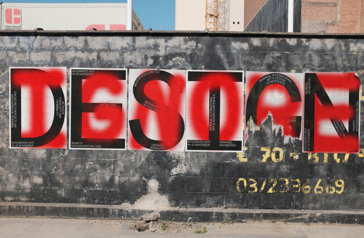
Concept, design and communication by Mirror Mirror. Conference photography by Tijs Vervecken.
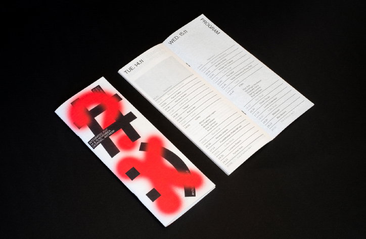
Concept, design and communication by Mirror Mirror. Conference photography by Tijs Vervecken.
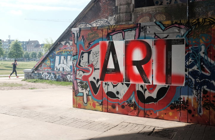
Concept, design and communication by Mirror Mirror. Conference photography by Tijs Vervecken.
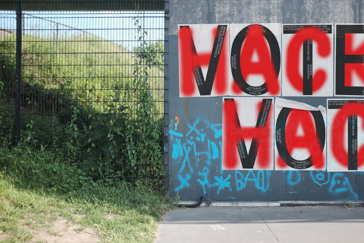
Concept, design and communication by Mirror Mirror. Conference photography by Tijs Vervecken.
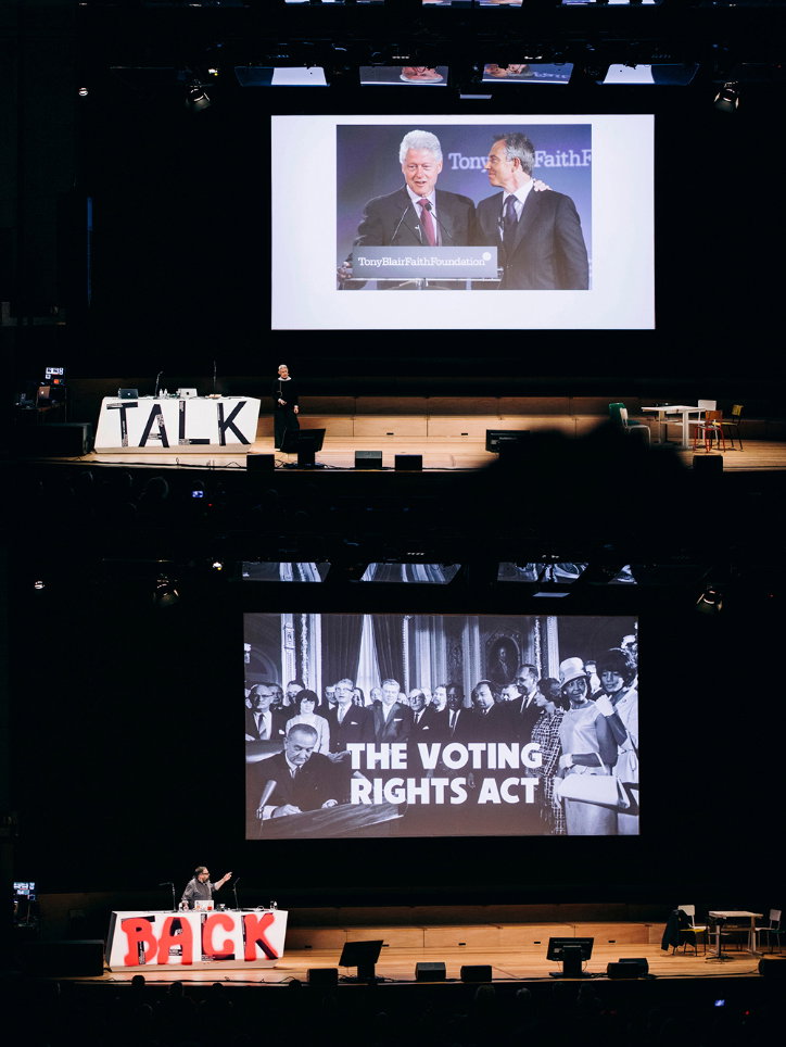
Concept, design and communication by Mirror Mirror. Conference photography by Tijs Vervecken.
Concept, design and communication by Mirror Mirror. Conference photography by Tijs Vervecken.
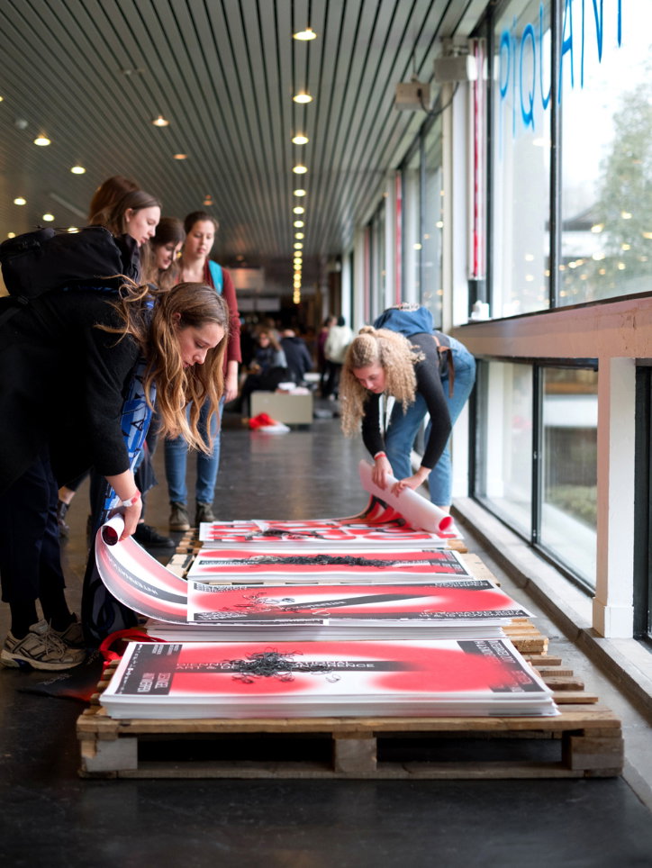
Concept, design and communication by Mirror Mirror. Conference photography by Tijs Vervecken.
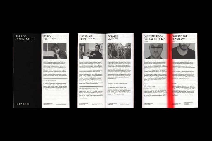
Concept, design and communication by Mirror Mirror. Conference photography by Tijs Vervecken.
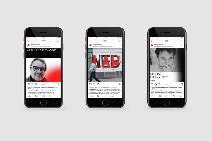
Concept, design and communication by Mirror Mirror. Conference photography by Tijs Vervecken.
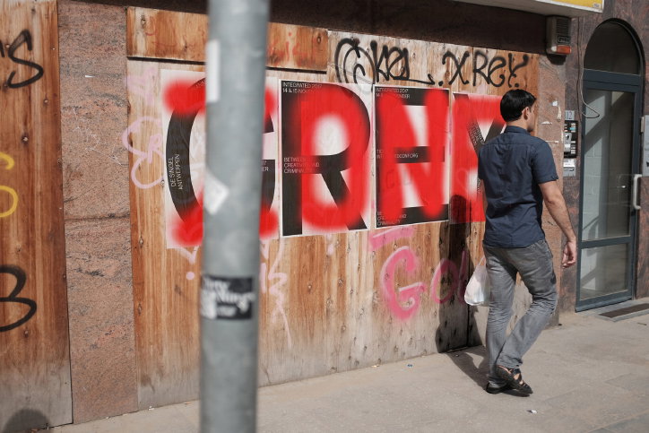
Concept, design and communication by Mirror Mirror. Conference photography by Tijs Vervecken.
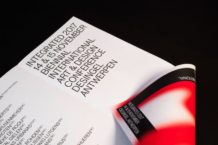
Concept, design and communication by Mirror Mirror. Conference photography by Tijs Vervecken.
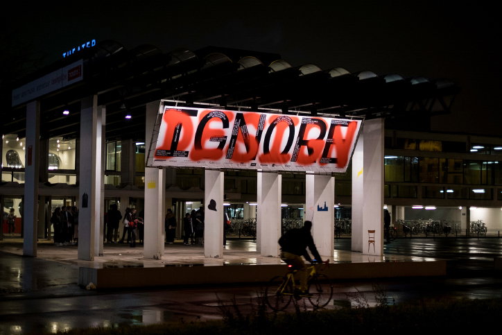
Concept, design and communication by Mirror Mirror. Conference photography by Tijs Vervecken.
Share Article
Further Info
About the Author
—
Ruby is Senior Creative at It's Nice That, overseeing our visual output across platforms and projects. Before that, she was associate editor on the editorial team, after joining in September 2017 following graduation from Central Saint Martins.

