




Morgane Vantorre is a typographer who believes in “the power of graphic design in our society”
The French designer is currently working towards a master’s in type design at École Estienne in Paris and cites nature and the typography of her city as influences on her practice.
Share
For French type design student, Morgane Vantorre, it’s the key role graphic design plays in everyone’s lives which draws her to the medium. “Graphic design has the ability to give values to our thoughts through images, that represents a lot for me,” she tells It’s Nice That. “I think it’s, in a way, a kind of art which conditions our way of thinking. That is why a graphic designer has an enormous responsibility: they transmit messages and anchor them in our brains.”
Morgane describes herself as a “madly passionate and very curious” student and she is currently studying towards a master’s in type design at École Estienne in Paris, where she started in September. “I have never felt so fulfilled in my studies,” she adds. Typography, specifically, is a subject she chose for “its ambivalence: it both speaks to our mind and intellect because its shapes materialise ideas but it also stimulates also our emotions through its visual characteristics.”
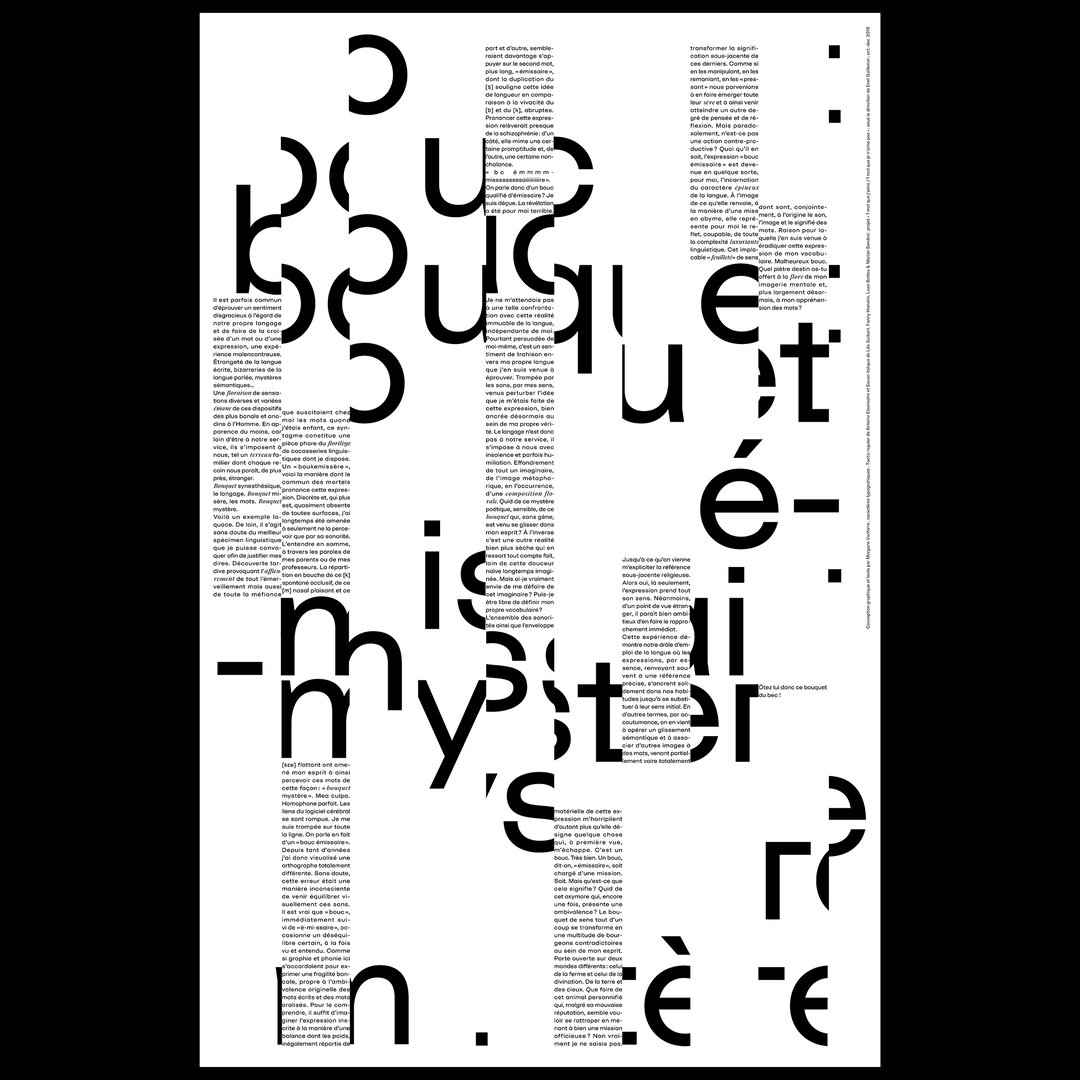
When working on a project, Morgane always starts by immersing herself in the topic, defining its concepts. “I think a lot through images or shapes but also through words. I need to understand the essence of the topic in order to be conscientious,” she says. This sees her placing emphasis on research but also on the theory behind design, and she spends a lot of her time writing essays to support her work. “In our career which dominated by visual practices, getting an intellectual step back is important,” Morgane adds.
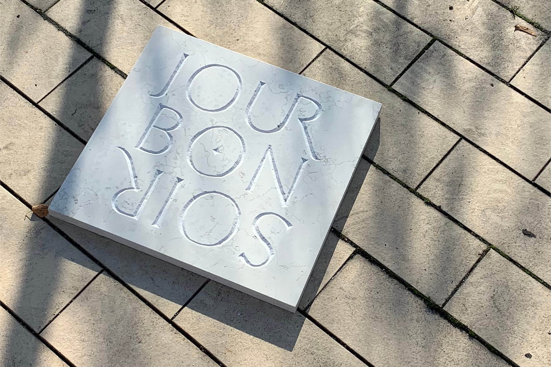
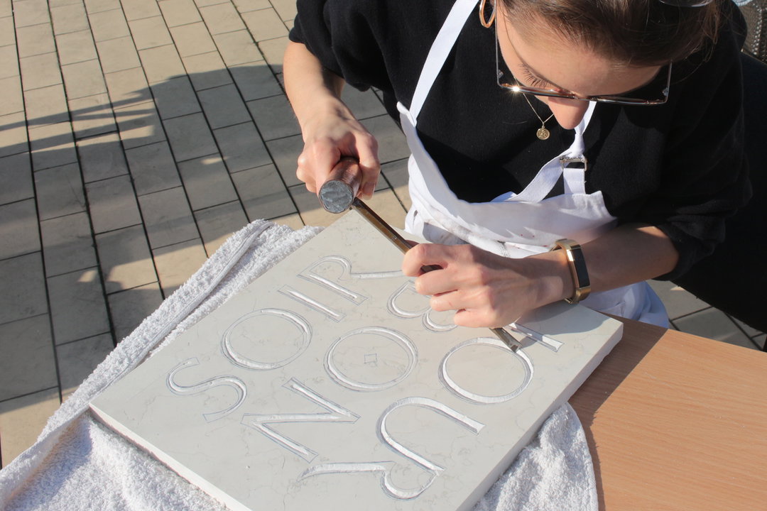
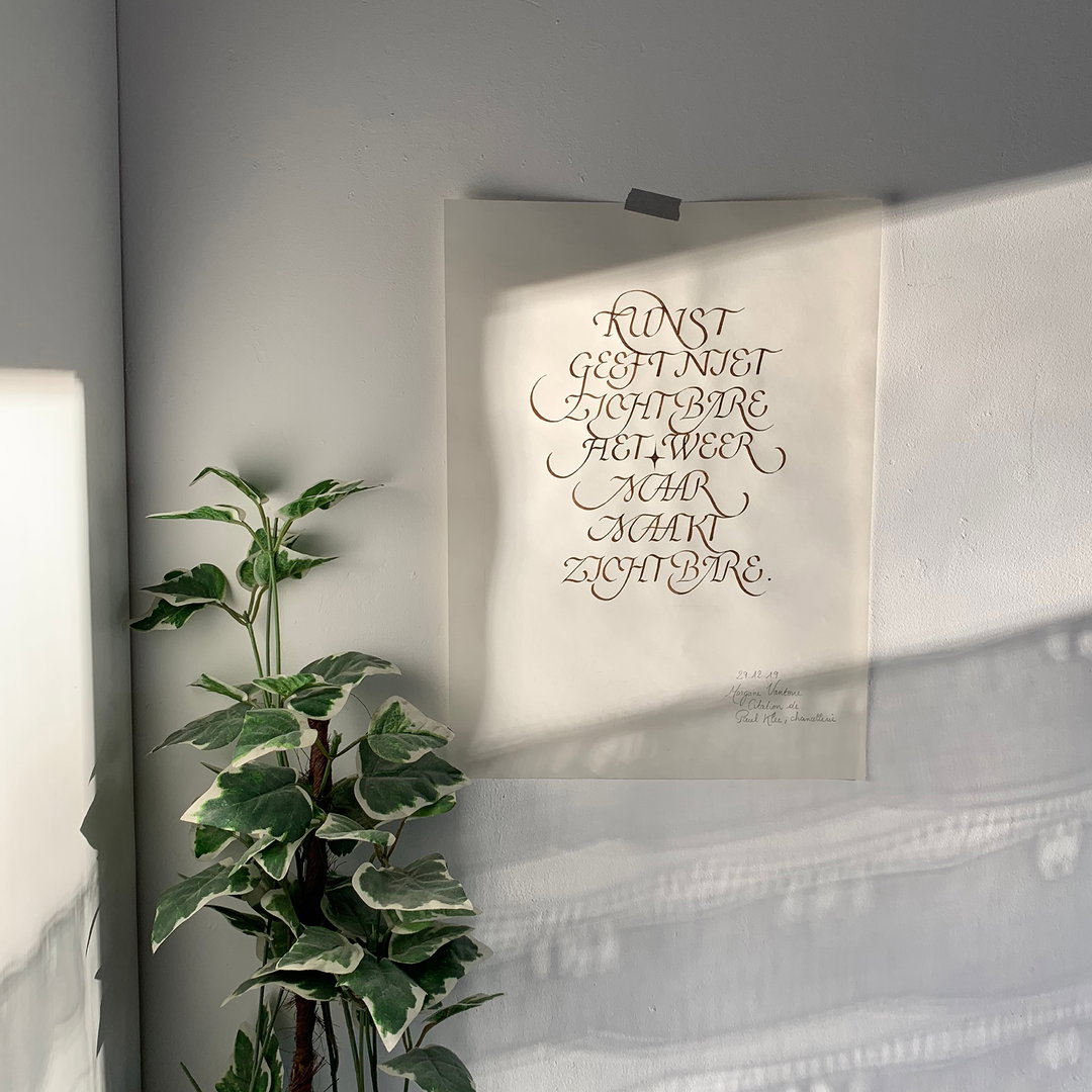
With such importance placed on research and process, it therefore makes sense when Morgane tells us she finds it difficult to describe her style. “I like to feel free to create without aesthetic boundaries,” she explains. “Nevertheless, with hindsight, my work is obviously influenced by all physical and numerical shapes/forms around me.” Firstly, she attributes nature as a great source of inspiration, mimicking shadows and light within her own typefaces, but also her typographic surrounding in Paris, such as shop signs and exhibitions.
Morgane Vantorre
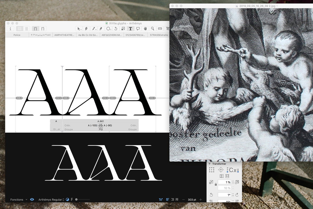
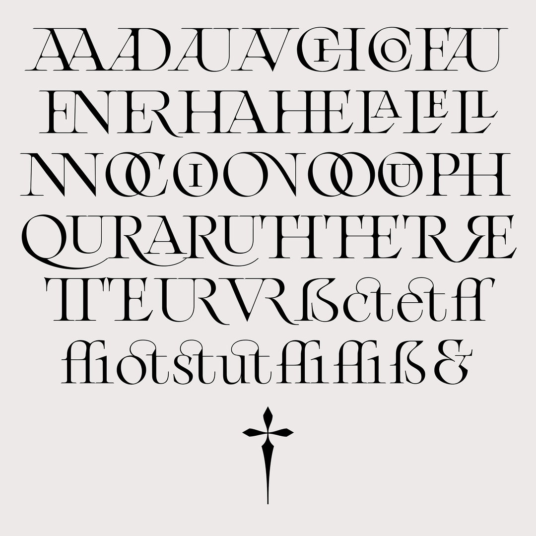
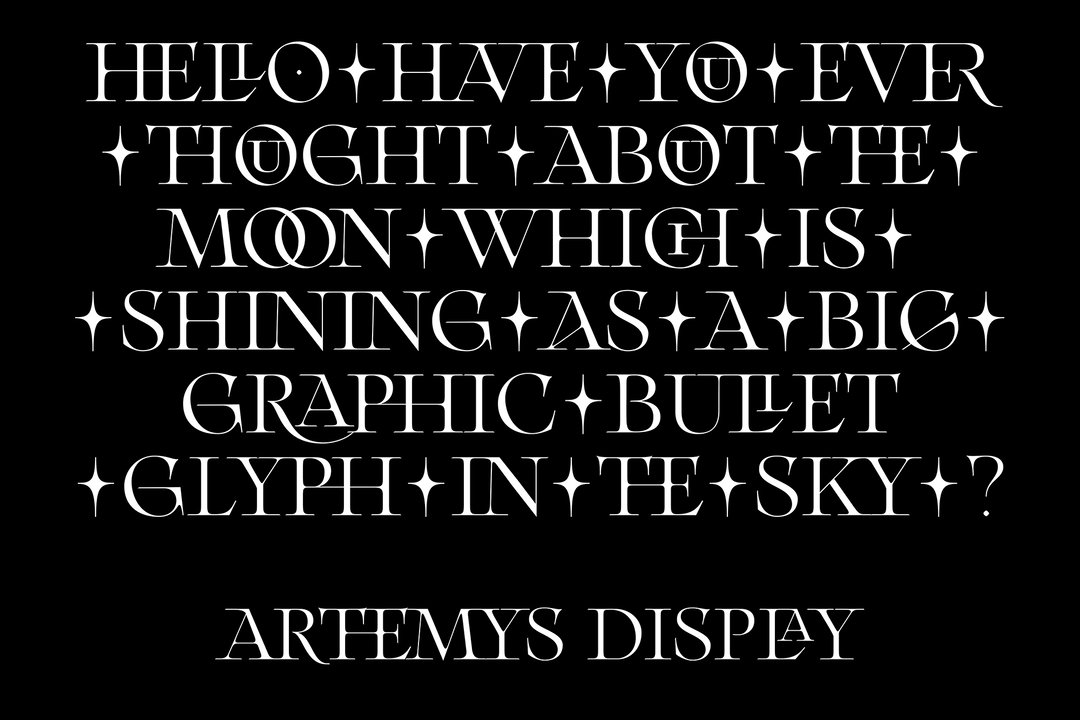
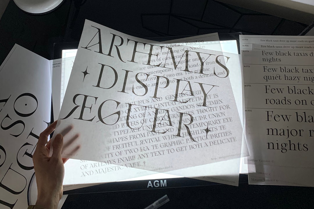
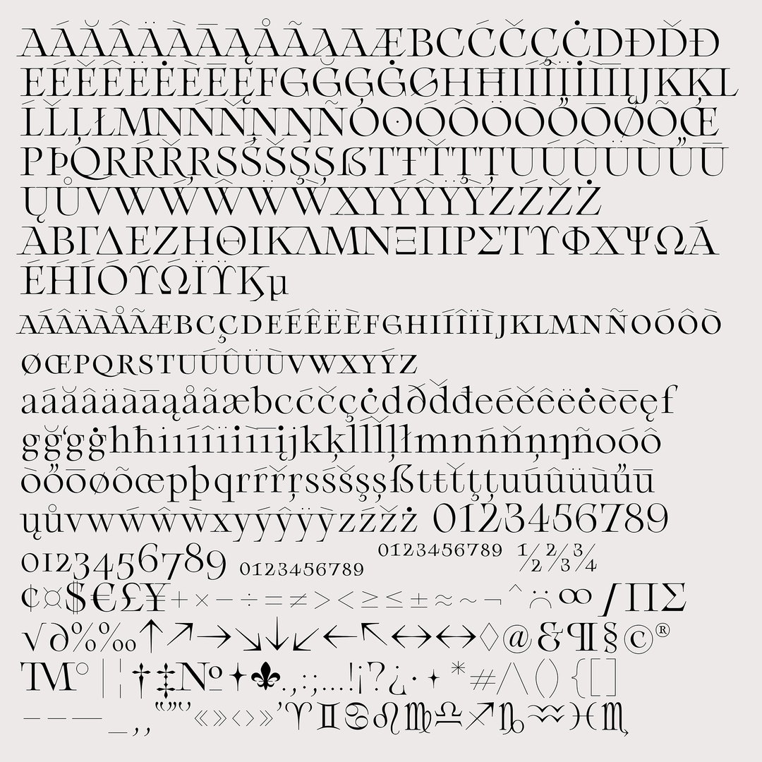
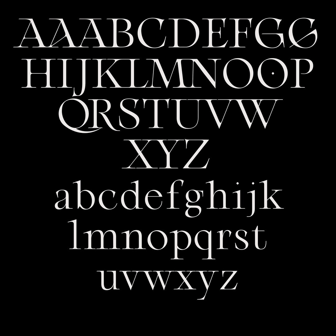
Currently, Morgane is working on a whole serif family based on 18th Century French aesthetics. Called Arthemys Display, the typeface represents a bringing together of shapes from past with a contemporary twist; “a kind of fruitful revival which highlights the sensitivity of two eras,” Morgane explains. “The graphic particularities of Arthemys (especially its ligatures and alternates) enable any text to have both a delicate and majestic value,” she continues. Still underway, Morgane says Arthemys is “progressing” and she’ll be working on the italics, a bold version and also a variable next.
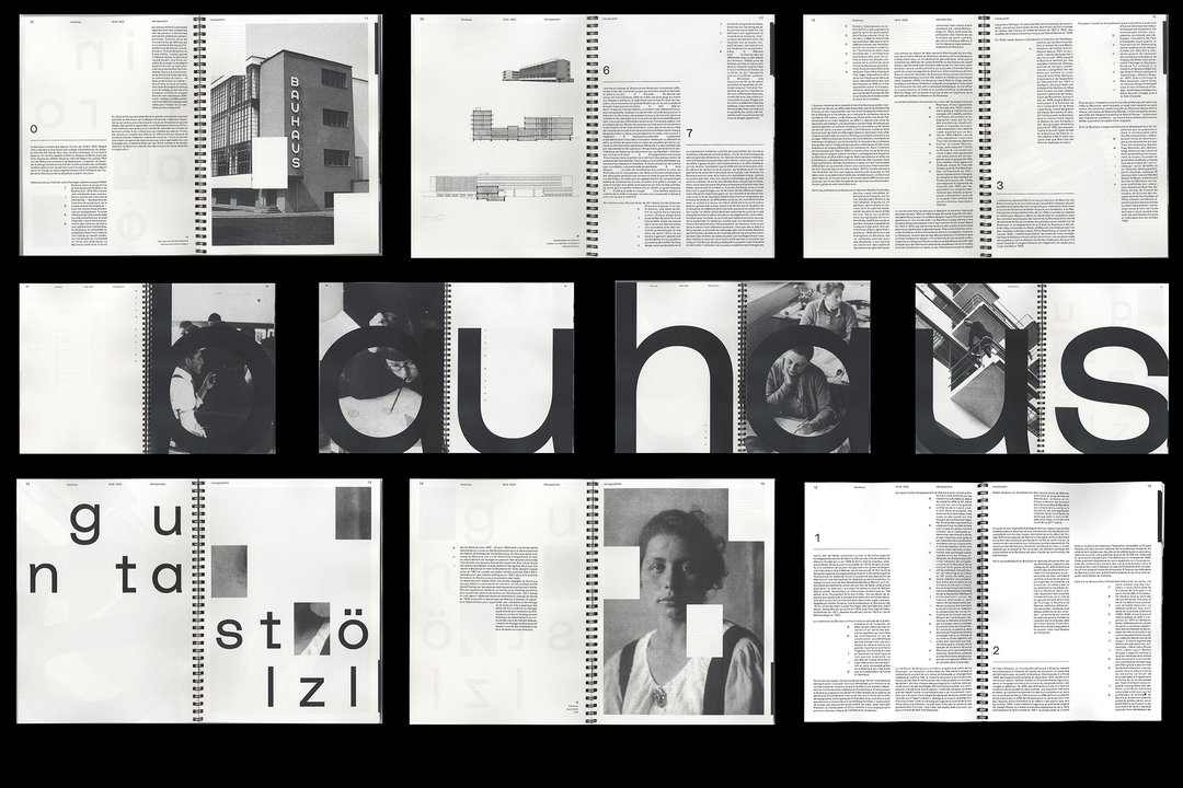
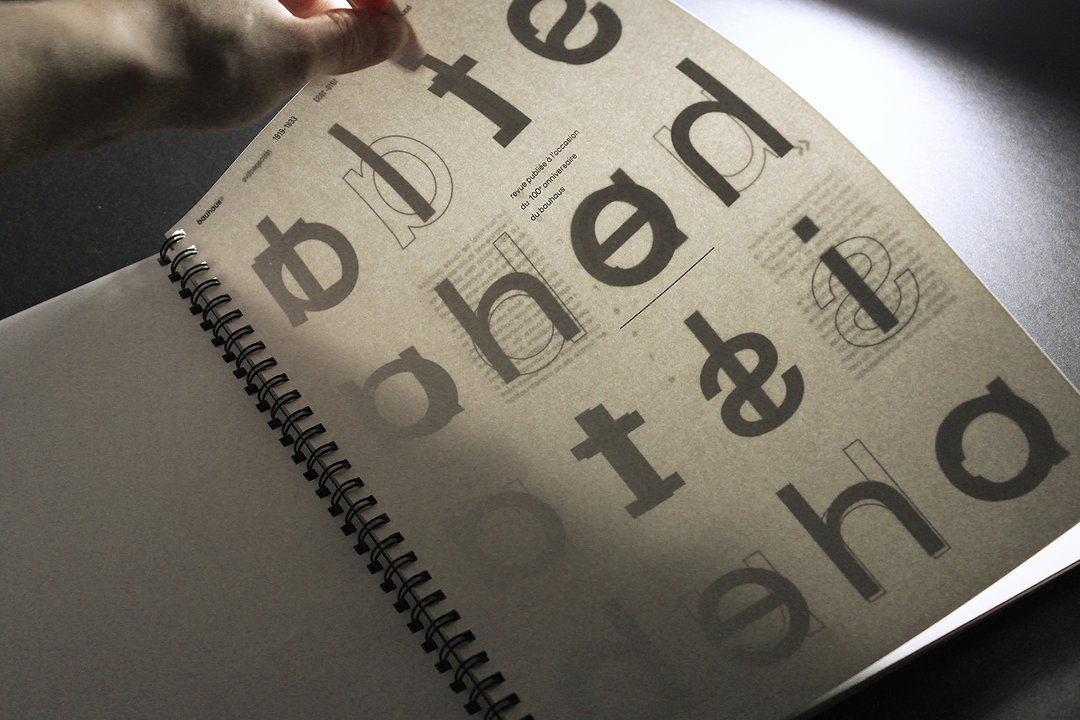
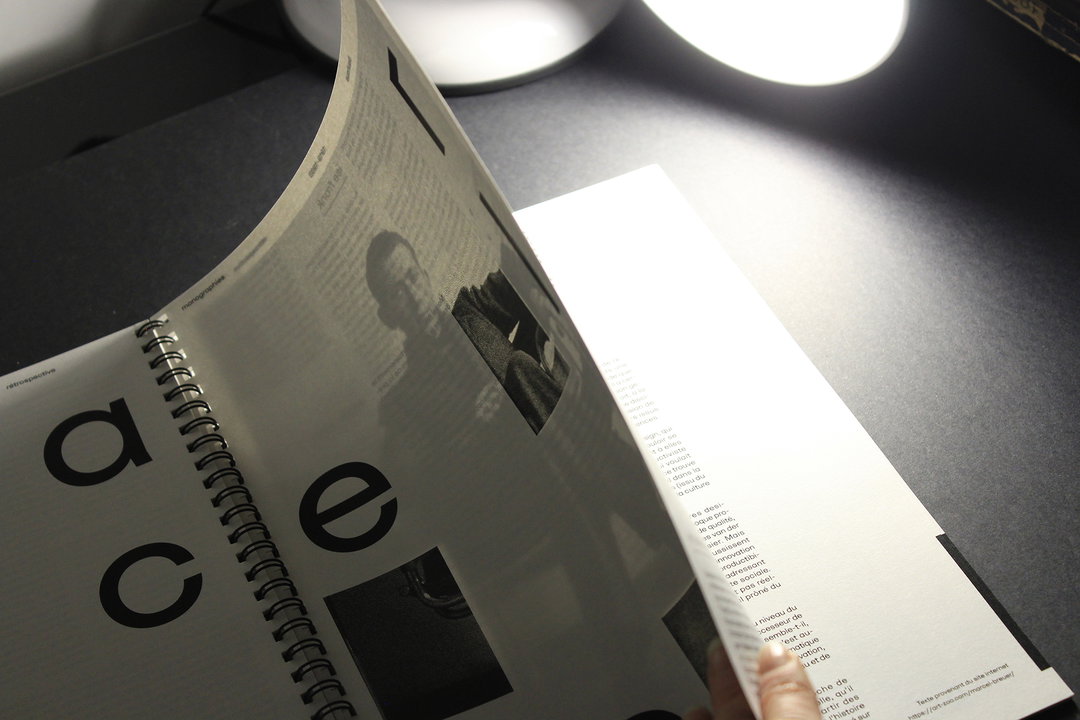
Another project saw Morgane marking the 100-year anniversary of the Bauhaus through a publication bringing together three monographs – of Gunta Stölzl, Mies Van der Rohe and Marcel Breuer. “My editorial concept is based on a constraining grid (inspired by Bauhaus architecture) which influences text’s layout,” she tells us. Morgane also played with transparency to create a game between the letters and images. “I really like to play with the subtlety of materiality,” she say. “It makes all the difference on a project.”
Clearly, Morgane is an ardent typographer who’s only just getting going. And with nearly a whole master’s degree stretching ahead of her, it seems the designer’s thorough and research-led approach is only going to get stronger. “My dream is to become a type and graphic designer with a multidisciplinary approach,” she concludes, looking beyond her studies. “I would like to be free to make typefaces but also create books, identities etc… Moreover, I want to keep up my writing practice. I am convinced by the power of graphic design in our society, by the effects it produces and how it contributes to a structuring of the unconscious.”
GalleryMorgane Vantorre
Share Article
Further Info
About the Author
—
Ruby is Senior Creative at It's Nice That, overseeing our visual output across platforms and projects. Before that, she was associate editor on the editorial team, after joining in September 2017 following graduation from Central Saint Martins.
