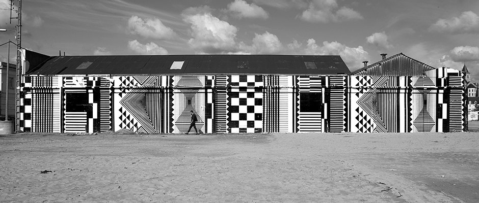
Graphic Design: French studio Murmure's amazing geometric festival identity
I’ve only just come across French creative agency Murmure and looking through its work can’t quite believe it’s taken so long. They have a bold visual vernacular which they apply with ambition and flair across everything from printed matter to bags, websites to walls. Nowhere is this better expressed than in Murmure’s work for the Nördik Impakt festival held in Caen (where Murmure is part based along with Paris).
Built around striking geometric patterns and a bespoke, music inspired typeface, the identity is stylish and recognisable, so much so in fact that its motifs can be applied to huge walls with little or no information about the festival. When visuals can be left to speak for themselves in this way you know you’re dealing with very strong, special graphic design work.
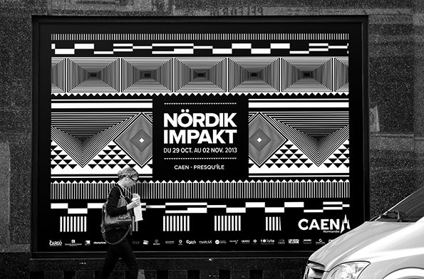
Murmure: Nördik Impakt identity
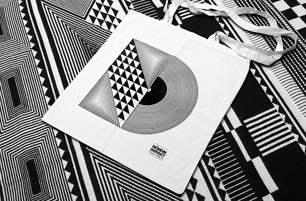
Murmure: Nördik Impakt identity
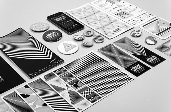
Murmure: Nördik Impakt identity
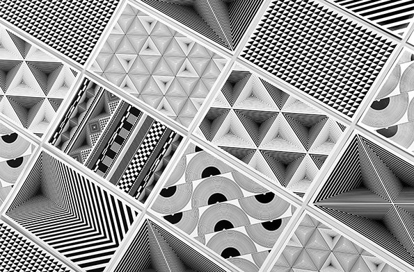
Murmure: Nördik Impakt identity
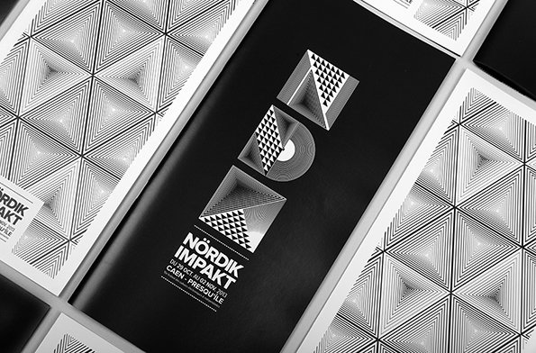
Murmure: Nördik Impakt identity
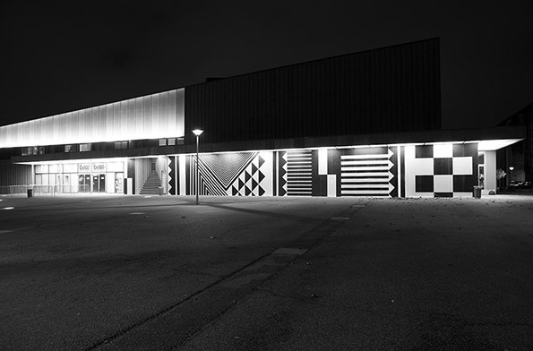
Murmure: Nördik Impakt identity
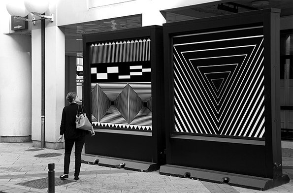
Murmure: Nördik Impakt identity
Share Article
Further Info
About the Author
—
Rob Alderson is a freelance writer, editor and strategist. He was previously editor-in-chief of It’s Nice That and WePresent, and editor of Design Week. He publishes the newsletter Undo, which tries to make sense of how AI is changing design work, the design process and the design industry.