




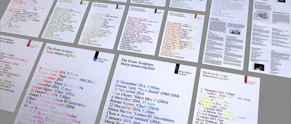
An exhibition identity with 10,000 different iterations
A lot of designers talk about the thrill of seeing their work out in public – that cliche of having created something that your nan might see at the bus stop. Music’s identity for The Event Sculpture exhibition not only ticks that box, but manages to do so in 10,000 different ways. The campaign looks to reflect the nature of the exhibition itself, which is comprised of a series of momentary events. Each is unique and each and no two people will experience the events in the same way, and so the campaign uses unique pieces of print created using generative technology. The project was led by Music’s associate creative director Orla McGrath.
“For the brochure, a listed schedule of events acts as a stencil,” Music explains. “Seen through the stencil is a random image, sourced from the internet using the search term ‘time, encounter, place’. Mail merge technology was used to place the 10,000 randomly sourced images on the individual brochure covers.
“We took no control over the outcome – something which mirrored the relationship between the experience and participation of the artist and their audience.” The flyposters for the series take this concept even further, and are posted over waste flyposters found in storage at the printers. As such, each is totally unique, meaning that the simple, typographic approach is a hell of a lot more complex than it seems.
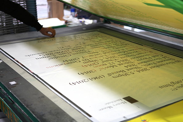
Music: Henry Moore show campaign
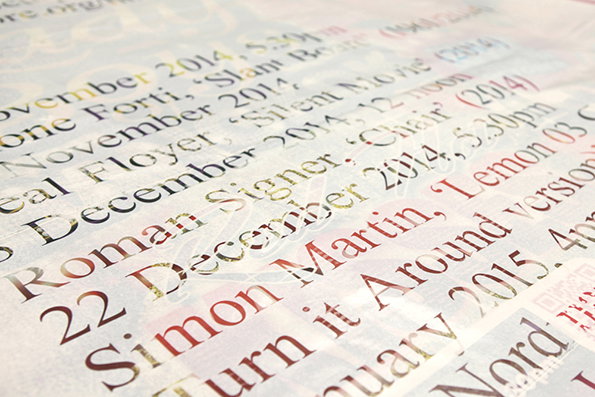
Music: Henry Moore show campaign
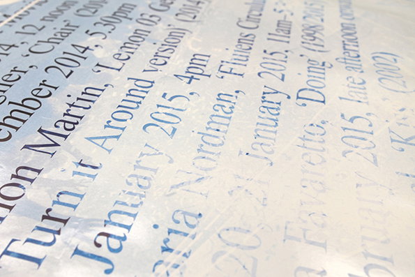
Music: Henry Moore show campaign
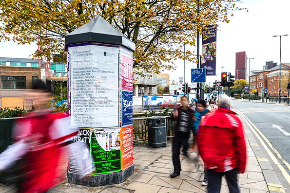
Music: Henry Moore show campaign
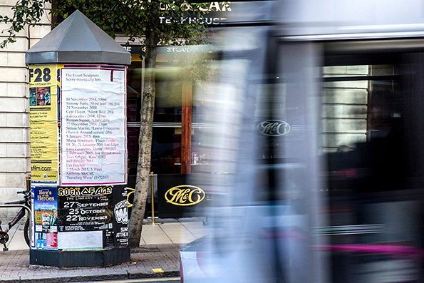
Music: Henry Moore show campaign
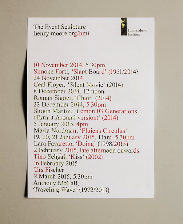
Music: Henry Moore show campaign
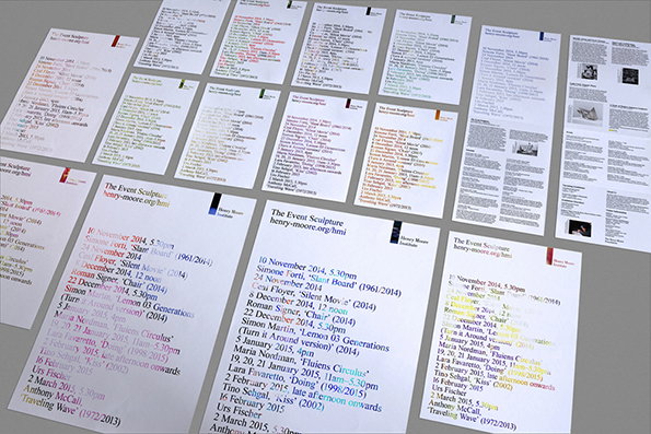
Music: Henry Moore show campaign
Share Article
Further Info
About the Author
—
Emily joined It’s Nice That as Online Editor in the summer of 2014 after four years at Design Week. She is particularly interested in graphic design, branding and music. After working It's Nice That as both Online Editor and Deputy Editor, Emily left the company in 2016.



