Nansen magazine emphasises the shared experiences of migrants
Fridtjof Nansen was a Norwegian explorer and humanitarian whose life-long project involved orchestrating relief for refugees after the First World War. For example, he created what became known as the Nansen Passport, a document that allowed stateless refugees safe passage into other countries. Nansen was awarded the Nobel Peace Prize in 1922 for such philanthropic endeavours. Almost a century on, and his name has been taken up by Nansen magazine, a publication about migrants and their shared experiences like learning a new language or trying to build up a network.
Each issue focuses on one migrant in order to delve “deep into their personal experiences, and also the history of their community and the context in which they have migrated,” Nansen’s publisher and editor Vanessa Ellingham tells us. “Our aim is to connect and celebrate migrants of all kinds, with the idea that focusing on just one migrant at a time allows us to build a strong connection between reader and subject.”
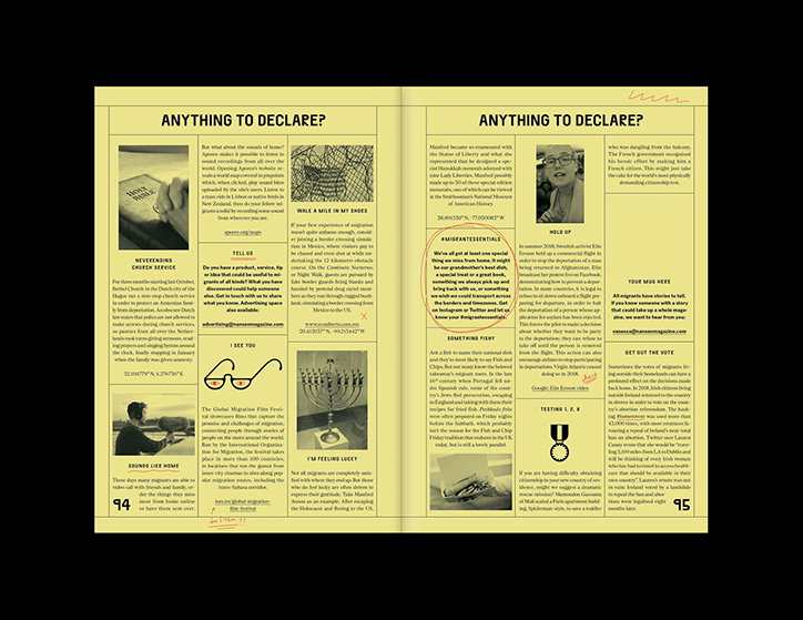
Nansen’s first issue, for example, focused on Aydin Akin, a Turkish man who moved to Germany 50 years ago. Infuriated by the hostile rhetoric deployed by mainstream media to describe the recent influx of refugees into Europe, Nansen wanted to highlight that mass-migration is an age-old phenomenon. To give just one example, over a million Turks, including Aydin, moved to West Germany during the 1960s to help fill the country’s labour shortage. “The word ‘unprecedented’ is consistently being used to describe the arrival of refugees in the present day,” Vanessa says, yet migration is a fundamental part of humanity’s existence – and has been for centuries.
Nansen: Issue Two.
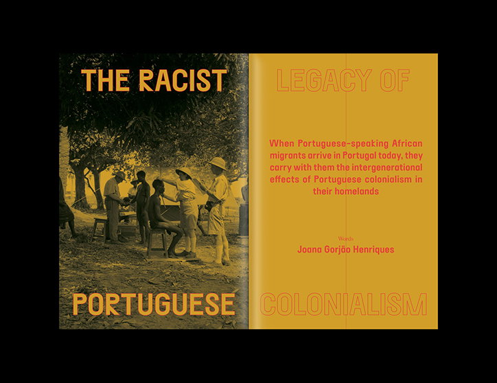
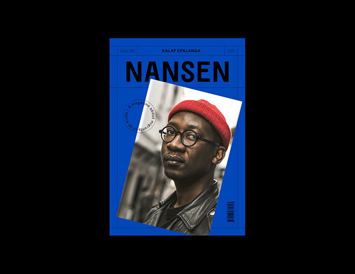
Nansen’s second issue is dedicated to Lisbon-based author and musician Kalaf Epalanga whose writing centres around his experiences as a black man living in Europe and about the legacy of Portuguese colonialism both in his home country, Angola, and in Portugal. Recognising and understanding the country’s colonial past – and indeed any imperial power’s colonial past – is integral to combatting and, eventually, overcoming its racist legacy. “We were keen to involve as many collaborators that were local to Lisbon and specific to the Afro-Portuguese community as possible in order to make sure members of that community got the chance to tell their own stories,” Vanessa says. “Kalaf sent us multiple contributor suggestions that ranged from very experienced journalists, to academics, to a record label manager, to a promising young photographer that he wanted to celebrate and give an opportunity to.”
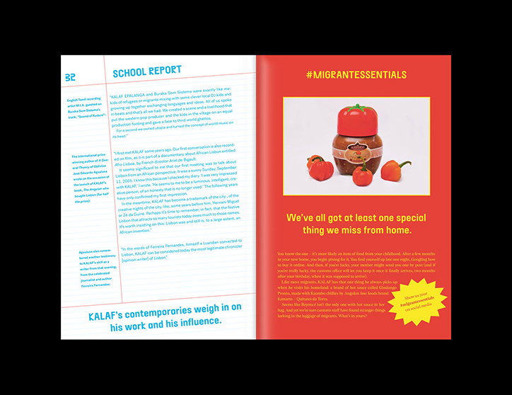
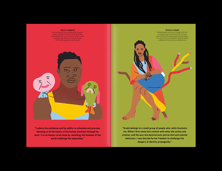
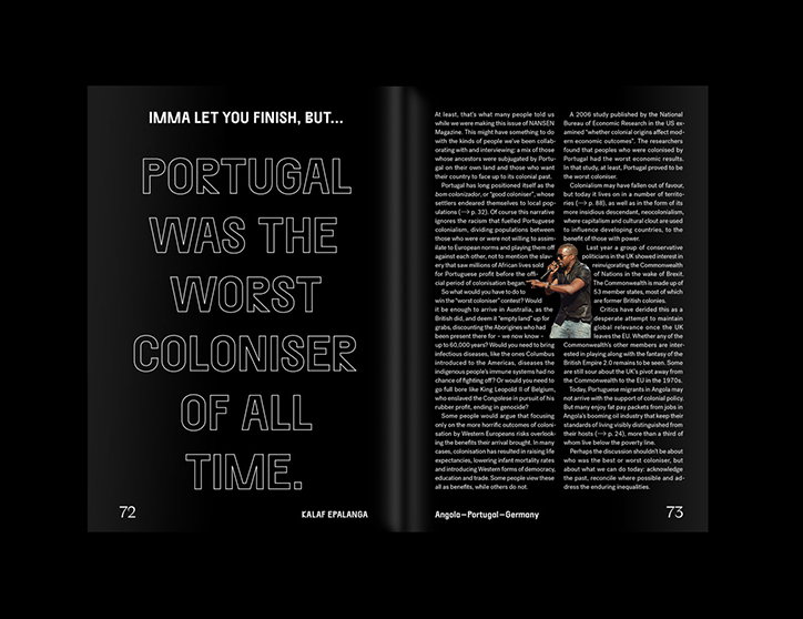
The magazine’s concept is mirrored in Nansen’s design, which marries universality with specificity and individuality. It is first and foremost inspired by the passport format, which is “the perfect combination of universal and yet personal in one same object,” according to art director Eva Gonçalves. “Our overall concept relies on the creation of a frame, an ‘infrastructure’ that is stable and robust and yet allows the flexibility needed for enough change to happen within its limits. So we committed to certain constrictions – a grid, type sizes, the use of two main body typefaces that give us enough flexibility to create the different layouts, one illustrated section, two fixed layout templates – whilst going relatively wild with colours, headline typeface and original layouts.” The main transformations between issues one and two are a change in the headline typeface that is also reflected on the masthead. The second issue is also more experimental and playful, with bold colour palettes and deconstructed headlines that break free form the grid.
When asked about their favourite part of Nansen’s second issue, both Vanessa and Eva reference the value of working with a wide range of contributors. “A highlight was definitely working with a team of collaborators who are representative of the community we are focusing on and whose perspectives and personal experiences address the complex issues we discuss in our magazine,” says Eva. Vanessa agrees and adds: “In this issue we’ve got Joacine Katar Moreira, a black feminist academic and activist, writing about the Portuguese language as a bridge between Portugal and its former colonies. The rapper Telma Tvon writes about her experience as a member of the Afro-Portuguese community and offers a really evocative picture of that life. The much-celebrated journalist Joana Gorjão Henriques provides us with a really useful history of Portuguese colonialism. So many of these contributors will be new to our readers, and that’s really important to us – that our readers get to know a community from the inside, and that our magazine is a place where those voices can reach new audiences.”
Nansen: Issue Two.
Nansen: Issue Two.
Nansen: Issue Two.
Nansen: Issue Two.
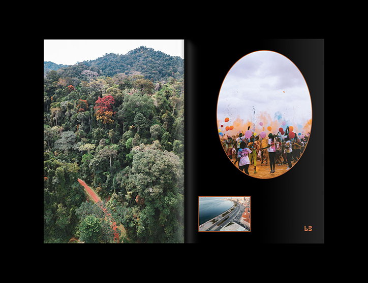
Nansen: Issue Two.
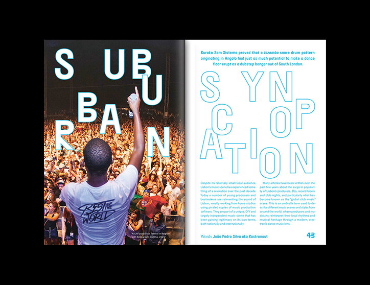
Nansen: Issue Two.
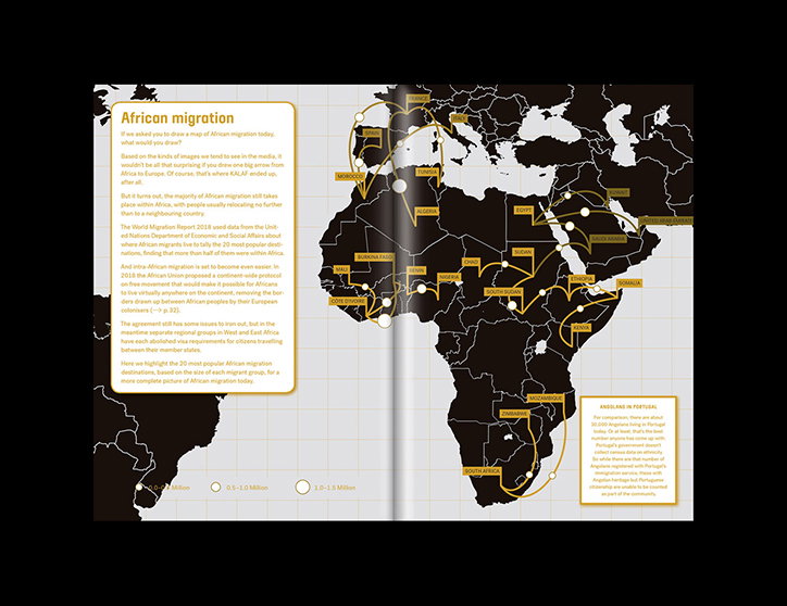
Nansen: Issue Two.
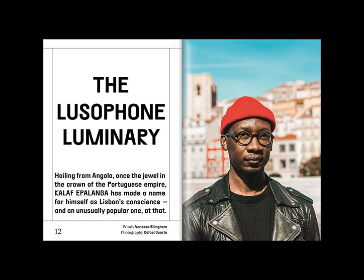
Nansen: Issue Two.
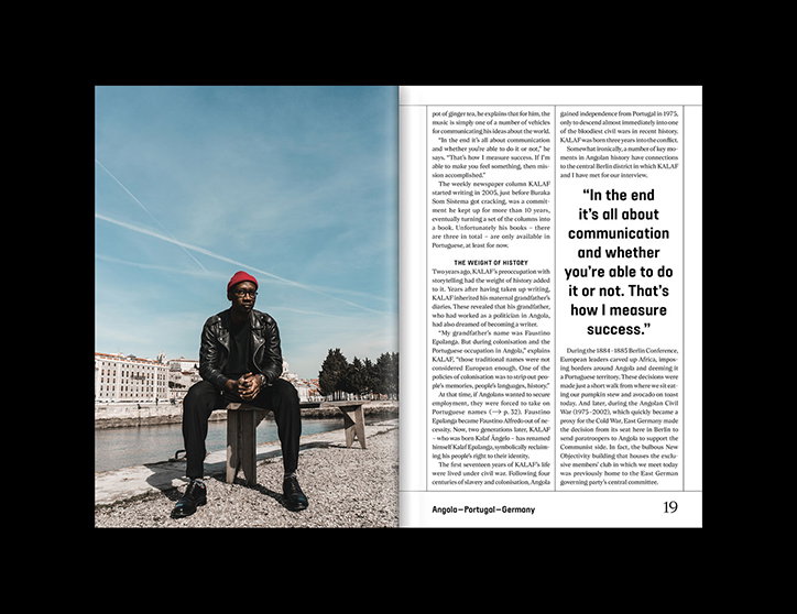
Nansen: Issue Two.
Share Article
Further Info
About the Author
—
Daphne has worked for us for a few years now as a freelance writer. She covers everything from photography and graphic design to the ways in which artists are using AI.