




First look at the new MySpace, and it won't be what you expect
- Date
- 25 September 2012
- Words
- Rob Alderson
Share
I feel a bit sorry for Myspace, which fell from grace so spectacularly it became a social media punchline of the early 2000s, a nostalgic staging post on route to the Facebook-Twitter axis of everywhere. But yesterday something extraordinary happened – MySpace released a teaser video showing off its new look and, whisper it, it looks pretty darn impressive.
The clean, crisp, stripped-back approach is a world away from the eyeball-battering of the existing site and design types have been queuing up to admit that it looks really rather good.
Of course the problems with Myspace run deeper than aesthetics and it will take much more than a swanky redesign to reverse its decade of decline. But it could be the opening salvo in winning back some of its lost credibility and its design team deserves a great deal of credit for creating something that has raised so many eyebrows (in a good way).
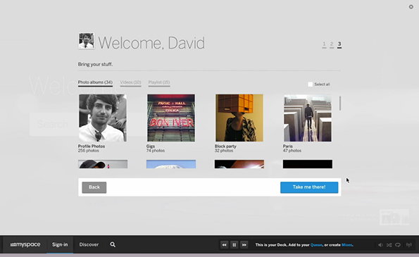
New Myspace (video still)
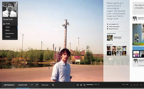
New Myspace (video still)
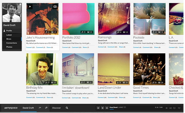
New Myspace (video still)
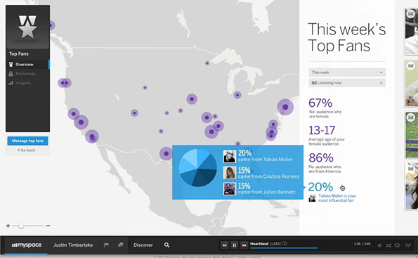
New Myspace (video still)
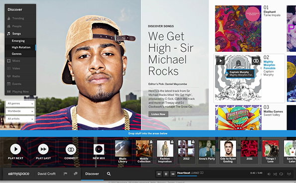
New Myspace (video still)
Share Article
Further Info
About the Author
—
Rob Alderson is a freelance writer, editor and strategist. He was previously editor-in-chief of It’s Nice That and WePresent, and editor of Design Week. He publishes the newsletter Undo, which tries to make sense of how AI is changing design work, the design process and the design industry.
