Launch Recite Me assistive technology
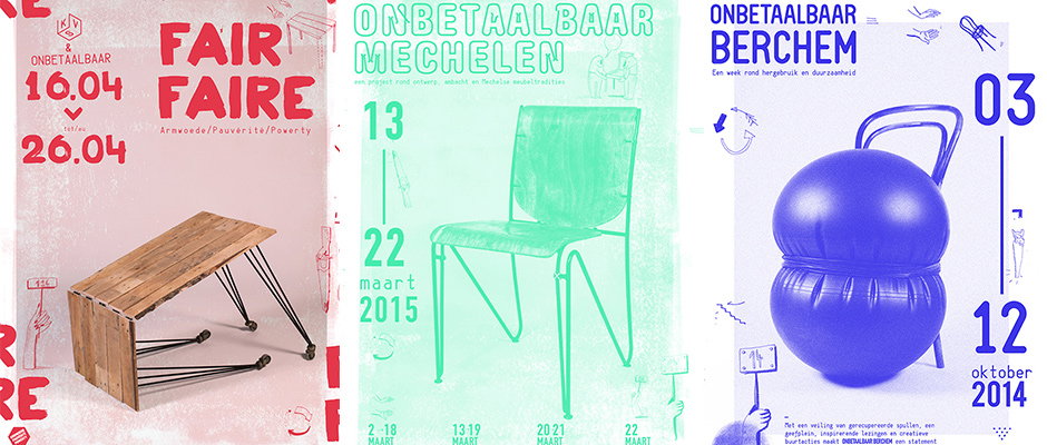
Three posters for design events. The first is red and white, featuring a wooden table and the text “Fair Faire”. The second is mint green, showing a chair and the text “Onbetaalbaar Mechelen”. The third is blue and white, featuring a blue weight and the text “Onbetaalbaar Berchem”.

Nice Nick Mattan graphics for furniture design collective Onbetaalbaar

—
Date
14 May 2015

Dutch furniture design collective Onbetaalbaar found a rare gem in Belgium-based designer Nick Mattan. Describing itself as a “research project born out of love for objects,” Onbetaalbaar (which translates as “priceless”) is both a workshop and a kind of think-tank “where furniture makers, upholsterers, writers, philosophers, product designers, restorers and graphic designers” can get together to work on a variety of projects – and with a brief that broad, it can be hard to find a designer with the right solutions. Nick has been working on the graphic identity of the collective for some time now, creating posters for various exhibitions and events, applying a consistent, relatable but still open-ended aesthetic to both digital and printed ephemera.
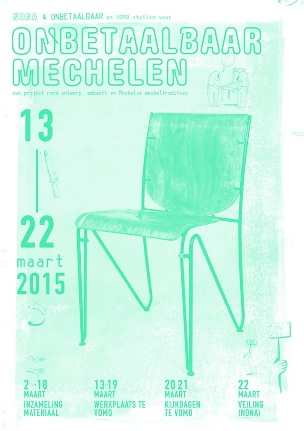
A mint green poster featuring a simple wooden chair with metal legs. Bold text at the top reads “ONBETAALBAAR MECHELEN”, with the dates “13 22 maart 2015” listed on the left. Smaller text at the bottom outlines a schedule of material collection, workshops, and an auction.
Above

Nick Mattan: Onbetaalbaar Posters

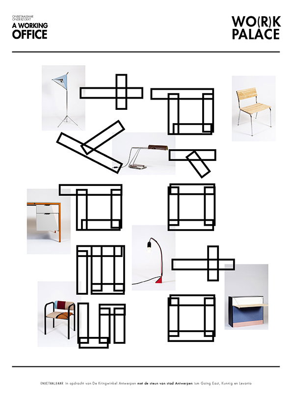
A graphic layout titled “A Working Office” and “Wo(r)k Palace”. It features a grid of minimalist furniture photographs interspersed with bold, black geometric line drawings.
Above

Nick Mattan: Onbetaalbaar Posters

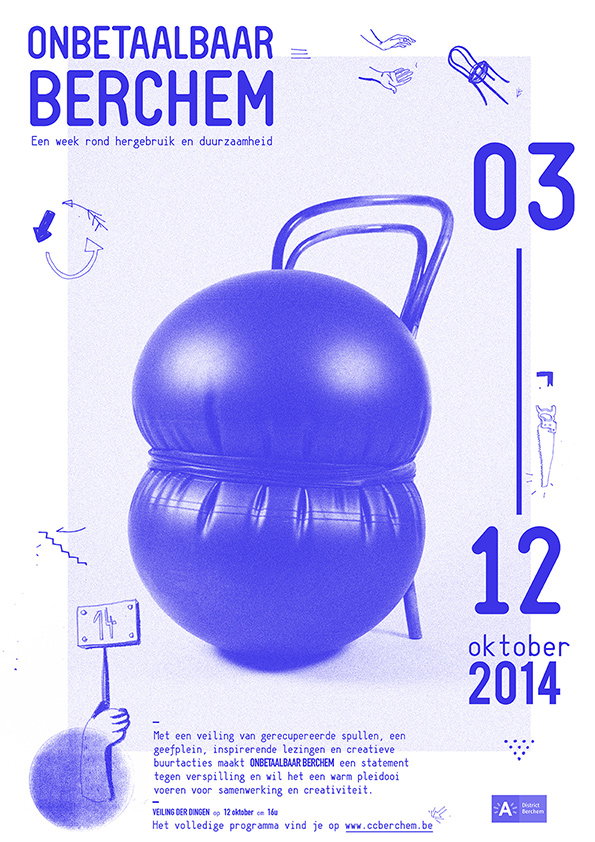
A blue poster featuring a 3D render of two stacked, glossy blue spheres with a handle. Bold text at the top reads “ONBETAALBAAR BERCHEM”, with a subtitle about reuse and sustainability. The dates “03” and “12 oktober 2014” appear on the right. Small line drawings and a block of Dutch text are scattered around the central object.
Above

Nick Mattan: Onbetaalbaar Posters

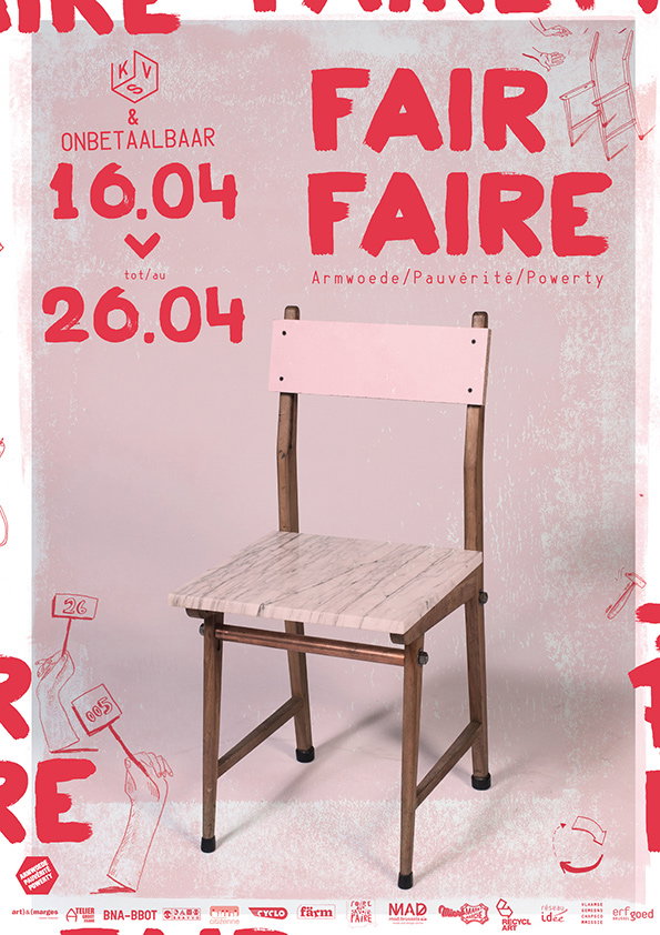
A wooden chair with a pale pink backrest stands in front of a red and white poster. The poster features the words “FAIR FAIRE” and the terms “Armwoede/Pauvreté/Powerty”.
Above

Nick Mattan: Onbetaalbaar Posters

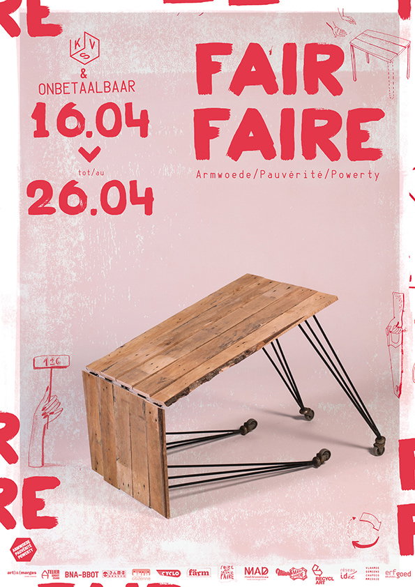
A wooden table made from reclaimed planks stands against a pale pink background. Bold red text reads “FAIR FAIRE” and “Armwoede/Pauvreté/Powerty”, with the dates “16.04” to “26.04”.
Above

Nick Mattan: Onbetaalbaar Posters

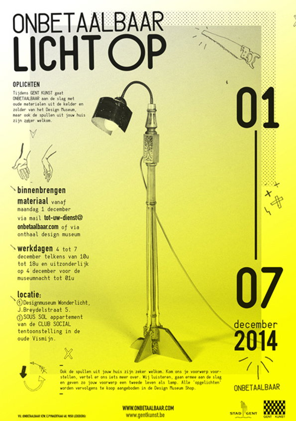
A yellow typographic poster reads “ONBETAALBAAR LICHT OP” in bold black letters. A photograph of a vintage floor lamp stands in the centre, surrounded by Dutch text and the dates “01” and “07 december 2014”.
Above

Nick Mattan: Onbetaalbaar Posters

Share Article

About the Author

Maisie Skidmore

—

Maisie joined It’s Nice That fresh out of university in the summer of 2013 as an intern before joining full time as an Assistant Editor. Maisie left It’s Nice That in July 2015.


It's Nice That Newsletters

Fancy a bit of It's Nice That in your inbox? Sign up to our newsletters and we'll keep you in the loop with everything good going on in the creative world.