A Ntsal identity uses the nonlinear timeline of films to inspire its expressive and compressive motion
The Cairo-based studio gives the film festival’s 18th edition a custom typeface and a shifting visual language that echoes the way events interlink across a narrative.
In cinema, a narrative always moves forward in time, but rarely in a straight line. The timeline can chop and change, pull back or jump forward. This idea of narrative structure, and how design could play with it, became the starting point for Cairo-based studio Ntsal as they developed an identity for the 18th edition of the Panorama of the European Film.
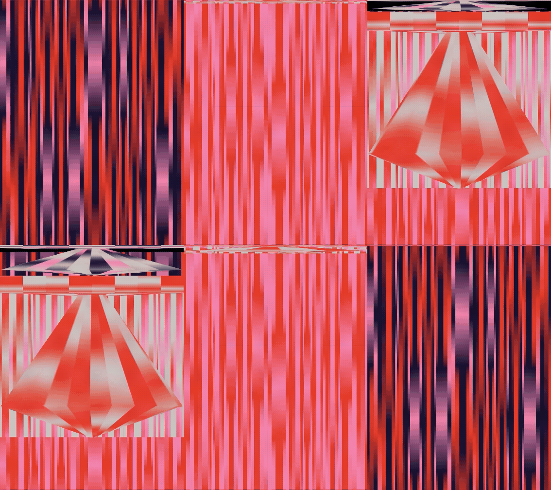
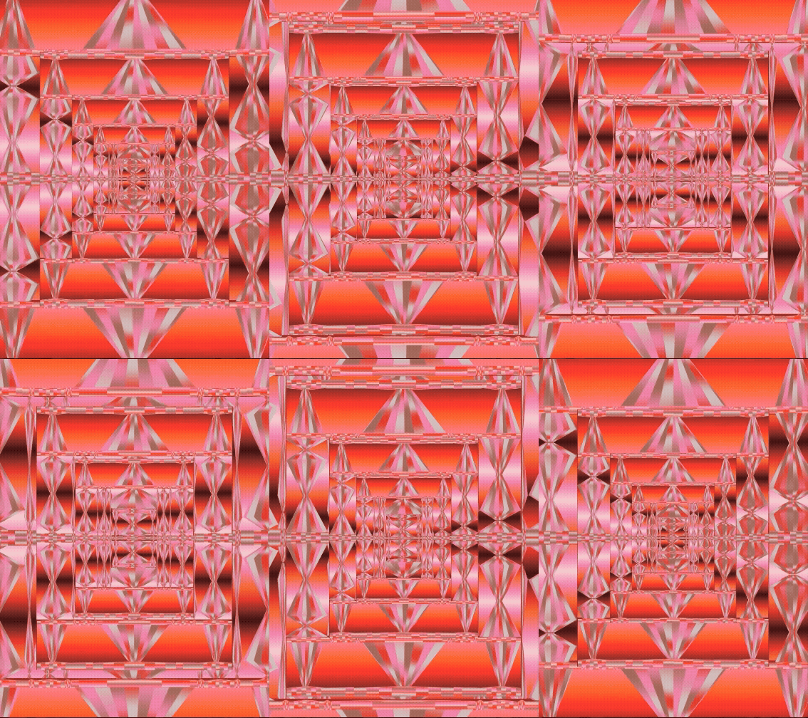
The team began with thinking about “the inherent linearity of film”, says Nardine Shenouda, partner and design director at Ntsal. As designers with an interest in motion design, they were also drawn to the tools used in filmmaking, which led to exploring “time as something that could be expanded and compressed”. From that, they developed the identity’s kaleidoscopic, shifting graphic patterns, resembling a timeline stretching, contracting and shifting across the composition.
“It also suggests the interlinking of events throughout the festival,” Nardine adds. Ntsal started with the poster, then continued to expand and play with the resulting forms throughout the identity. “There was this flexibility with interacting with these shapes and the plethora of exciting forms that could emerge resulting from the simple acts of compression and expansion.”
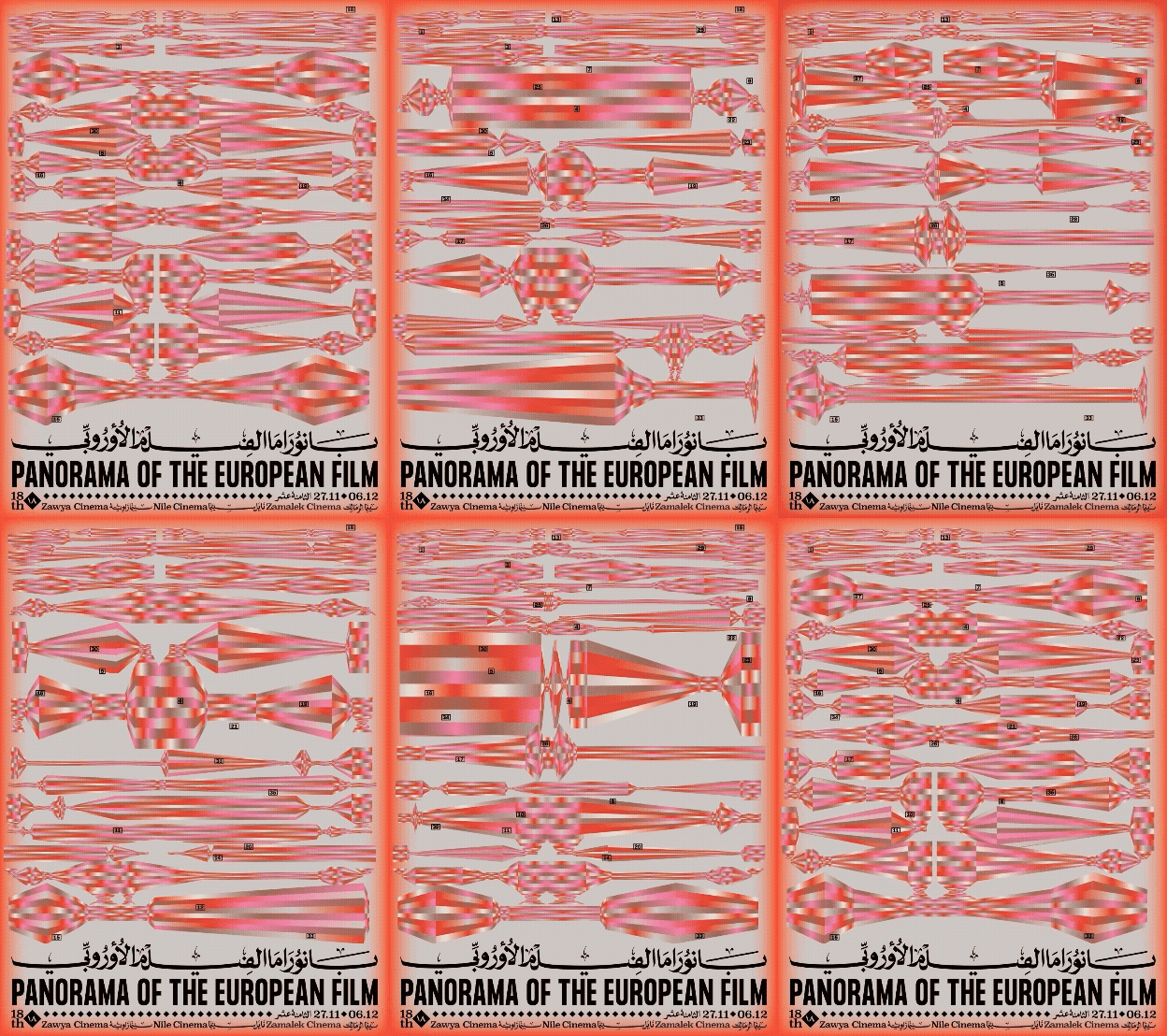
Ntsal Cairo: Panorama of the European Film (Copyright © Ntsal Cairo, 2025)
Much of Ntsal’s design practice centres around typography as a way to nod to certain cultural traditions. For this project, they created a custom headline typeface that draws references from the calligraphy traditionally used in Arabic newspapers, and for credits on vintage posters. “They contain a form of rawness that can only be captured through the manual labour that heavily inspired these pieces of work,” Nardine explains. NT Panorama Naskh is a homage to the freehand typography that preceded the modern digital typesetting. “These forms are quite unconventional particularly in the way they rely heavily on the baseline, setting them apart from more classical approaches to Arabic calligraphy and typography,” they explain.
For the physical experience at the fair itself, the team considered how visitors interacted with printed materials in previous editions, how they physically moved between different screenings and location throughout the day. They carried that idea of moving through time into the film schedule, creating an “interactive checklist” that lets viewers map their own path through the festival, as well as a small keepsake for them to treasure long after the credits roll.
GalleryNtsal Cairo: Panorama of the European Film (Copyright © Ntsal Cairo, 2025)




Hero Header
Ntsal Cairo: Panorama of the European Film (Copyright © Ntsal Cairo, 2025)
Share Article
Further Info
About the Author
—
Marigold Warner is a British-Japanese writer and editor based in Tokyo. She covers art and culture, and is particularly interested in Japanese photography and design.