




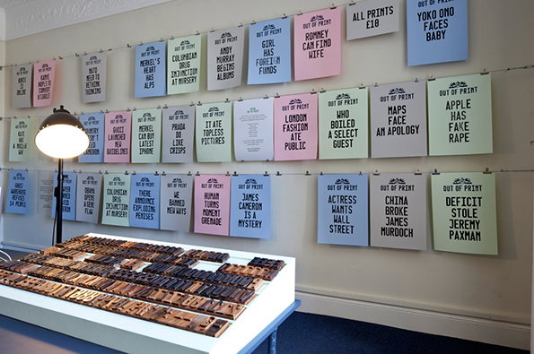
LDF 2012: Out of Print explores information overload with lovely results
Issues around digital and print media, information overload and our changing habits of consumption tend to be mired in fairly dry academic debates, so it’s nice to see a project exploring them in a more creative way.
Out of Print was a collaboration between James Cuddy, Roma Levin, Danilo Di Cuia and Goldsmiths BA Design students during last week’s London Design Festival. Using an application which conflated and confused trending news stories, they created hybrid-headlines which were then printed on a custom-made letterpress.
They said: "With the growth of digital media we are faced with unprecedented levels of data. We now find ourselves at a saturation point. By attempting to consume ever more, we end up understanding less. In this context, we find news and media redefined to fit our shortened
attention spans. How do we make sense of all the information we consume and not get lost in the process?
“Both the print process and the software can produce unexpected results. The distortions and juxtapositions in language create headlines that are profound and confusing in equal measure; not unlike our evolving relationship with digital media.”
The resulting prints are really nice-looking objects as well as being an interesting contribution to the on-going attempts to make sense of this information evolution.
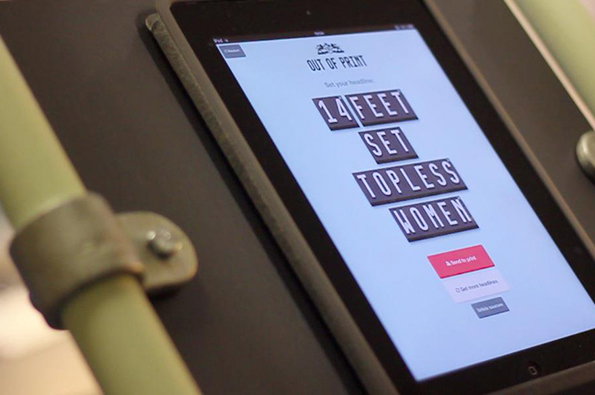
Out of Print installation shots (the headline generator)
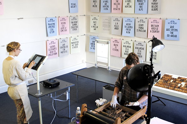
Out of Print installation shots
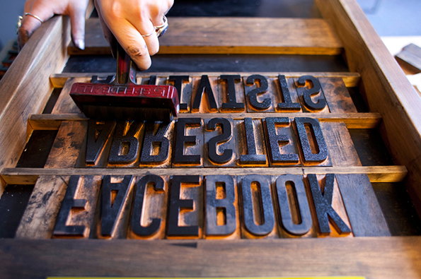
Out of Print installation shots
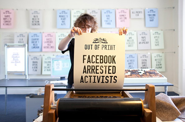
Out of Print installation shots
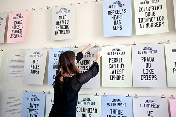
Out of Print installation shots
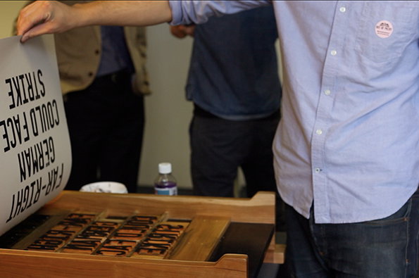
Out of Print installation shots
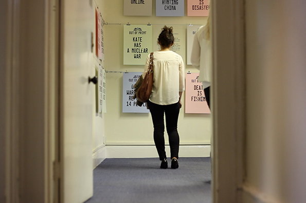
Out of Print installation shots
Share Article
Further Info
About the Author
—
Rob Alderson is a freelance writer, editor and strategist. He was previously editor-in-chief of It’s Nice That and WePresent, and editor of Design Week. He publishes the newsletter Undo, which tries to make sense of how AI is changing design work, the design process and the design industry.
