Patrick Fry unearths our new favourite design gem: bricks!
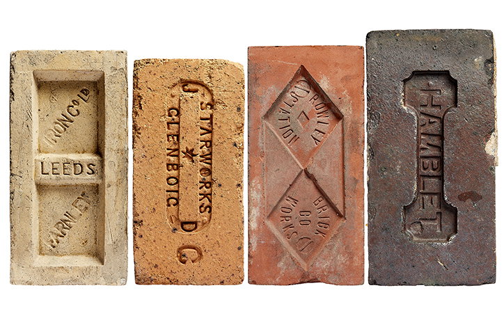
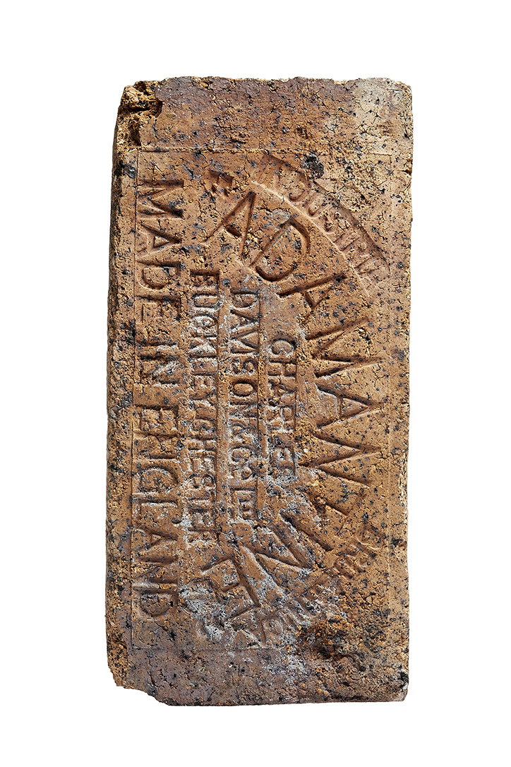
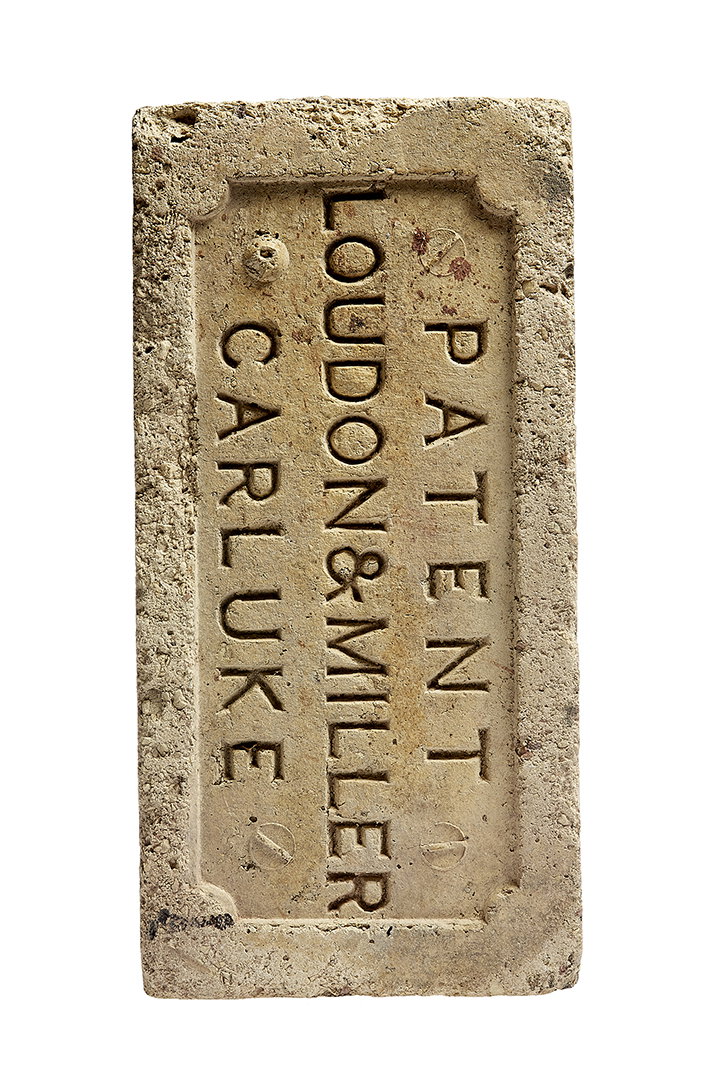
Patrick Fry has a design orientated fascination with bricks. Yes, bricks! Maybe this is a commonly known brick fact, but all bricks feature a makers mark stamped on top. Despite the fact that you’re probably surrounded by a stack of bricks right now, we never see them as the marks become hidden once laid on top of each other, just as bricks are supposed to.
For Patrick, this hidden typographic mark links to his own obsession with “design that isn’t necessarily created by designers but rather engineers, craftsmen and the like,” he tells It’s Nice That. “It’s design for utility that often has a strange, imperfect quality that really appeals; it holds an honest story. This ‘outside design’ exists apart from our historical understanding of graphic design, it’s raw and unrecognised.” And in turn, makes bricks one of those fascinating elements of design that are ubiquitous, and that we couldn’t really live without.
And so Patrick decided to start looking for a collection to present, considering his personal fascination aligns very nicely with his publishing house, CentreCentre, which creates limited edition books from unexpected collections, falling nicely within its remit “of celebrating the mundane”.
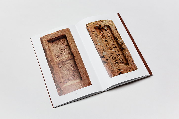
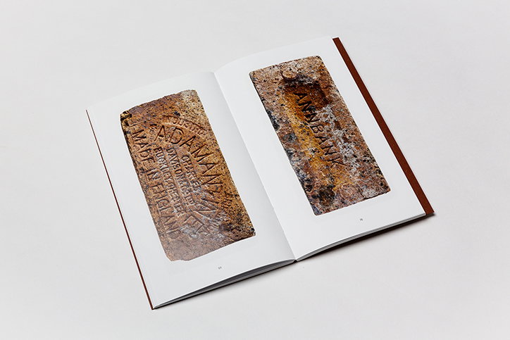
Patrick found a collection of bricks to document through the personal collection of an architect, Jason Harris of T-Space Architects, who “came into the possession of the majority of the bricks recently and was excited by the idea of encapsulating the heavy, cumbersome collection into something more portable.” From here, Patrick then organised the collection together “in terms of richness of colour” in a publication format.
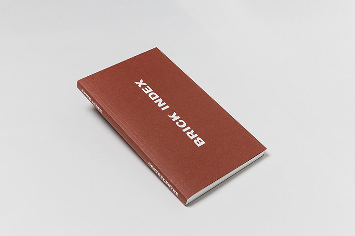
Although it gives the book a pleasing colour combination to flick through, it “isn’t purely an aesthetic decision” its creator points out: “it actually displays them geographically too, as bricks are coloured by the natural clay available in the area they are made,” he explains. Consequently, as well as unearthing a graphic design gem, the book teaches the reader elements of geology, helping to understand the UK’s industrial history at a visual level. The publication, aptly titled Brick Index also features an index stating the time, place and maker of every brick included, an introduction by brick historian David Kitching, an essay, Brick Haikus by Professor Rick Poynor and photography by Inge Clemente.
“But of course, the Brick Index primarily revels in the sheer beauty of the bricks,” concludes Patrick, deciding to concentrate on their “unique textures” by printing the photographs at actual size, “and in a vivid LED UV print", he says. Overall presenting "an ordinary material as something extraordinary.”
Patrick Fry: Brick Index
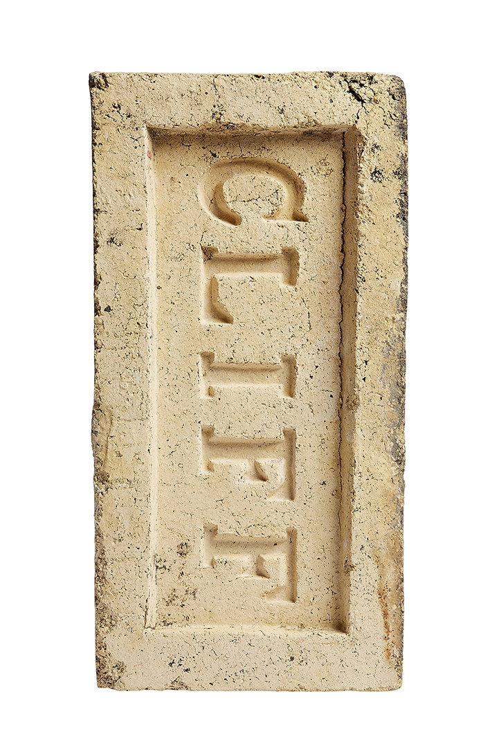
Patrick Fry: Brick Index
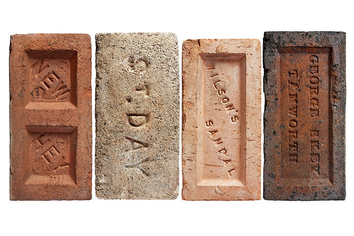
Patrick Fry: Brick Index
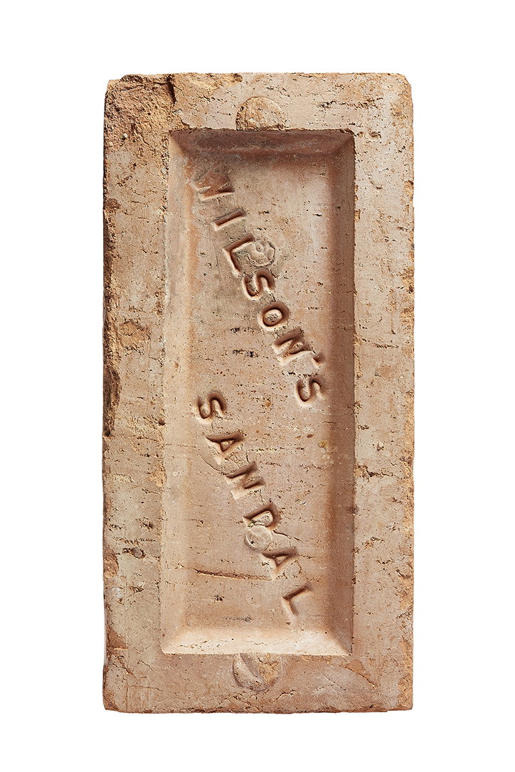
Patrick Fry: Brick Index
Patrick Fry: Brick Index
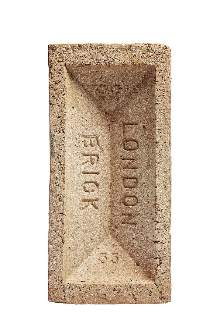
Patrick Fry: Brick Index
Patrick Fry: Brick Index
Patrick Fry: Brick Index
Patrick Fry: Brick Index
Patrick Fry: Brick Index
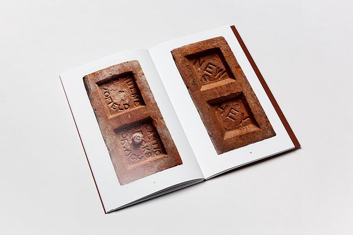
Patrick Fry: Brick Index
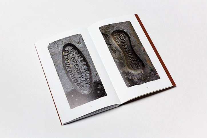
Patrick Fry: Brick Index
Share Article
Further Info
About the Author
—
Lucy (she/her) was part of the It’s Nice That team from 2016–2025, first joining as a staff writer after graduating from Chelsea College of Art with a degree in Graphic Design Communication, eventually becoming a senior editor on our editorial team, and most recently at Insights, a research-driven department with It’s Nice That.