




Type designer Pauline Le Pape on learning to trust her own design decisions
The Amsterdam-based designer talks us through three recent projects including a custom typeface for Nike, a digital triptych for Typojianchi and her newest font style, Till Melted.
Pauline Le Pape describes her venture into type design as “a multiplication of coincidences.” For one, it suited her personality, more of an observer than anything else. She likes tasks that require meditation and patience, something that all type designers are adept in, and on the other hand, she was drawn to the social connotations that typography can carry.
“Even if you have no design education,” explains the designer, “even if you’re not aware of it, everyone can read or feel the meaning of type as we are surrounded by it all the time on a daily basis.” Though she still struggles to tell her family what she does for a living, Pauline has faith in the fact that “we all have an instinct for typography”, something she draws out in her observation-based practice.
It’s been absolutely yonks since we first wrote about Pauline Le Pape and her wonderful graphic design and type design practice. A whopping five years to be exact. Back then, Pauline was still in her first year of her master’s degree studying type design in Estienne, Paris. Whereas now, the designer has gone from strength to strength, creating some typographic belters as seen in this year’s International Womxn’s Day identity, not to mention Actual Source’s Shoplifters 8: New Type Design and the Japanese design mag Quotation.
Pauline Le Pape: Nike
After graduating, Pauline moved to Amsterdam where she was confronted with the realities of the design industry. “It’s been an awakening on different levels,” she tells It’s Nice That, “and for me, one of the most interesting aspects of the industry is the social impact.” Coming from a modest social background herself, it took the designer a long time to realise, in her words, that “it was my responsibility to claim my role as an artist/designer.” Eager not to be living in a state of precariousness, she learned to listen, be patient, and how to fail, gaining more and more experience with every job. Ultimately, with time, Pauline learnt the most important lesson in her career thus far, to trust her own decisions.
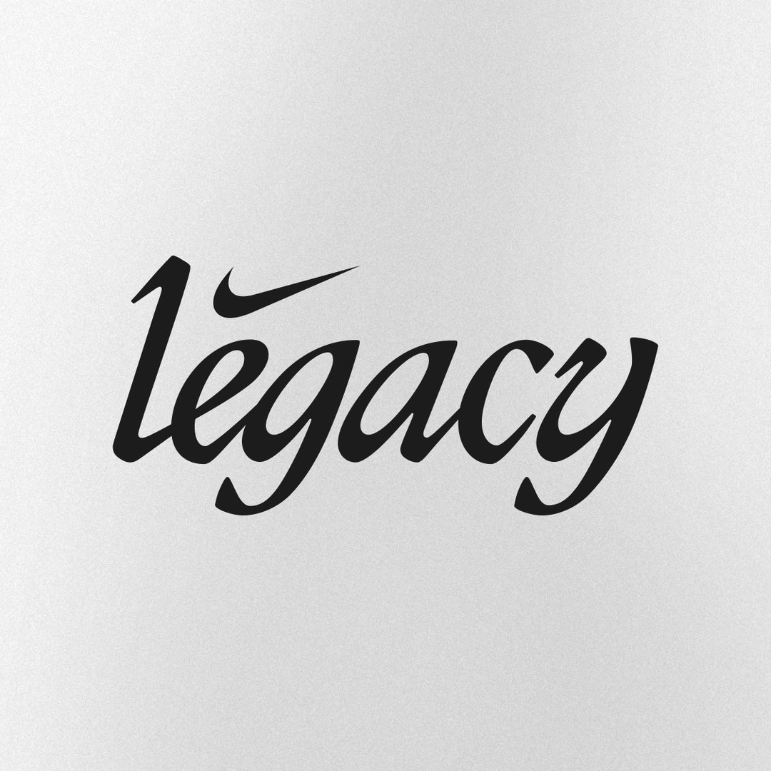
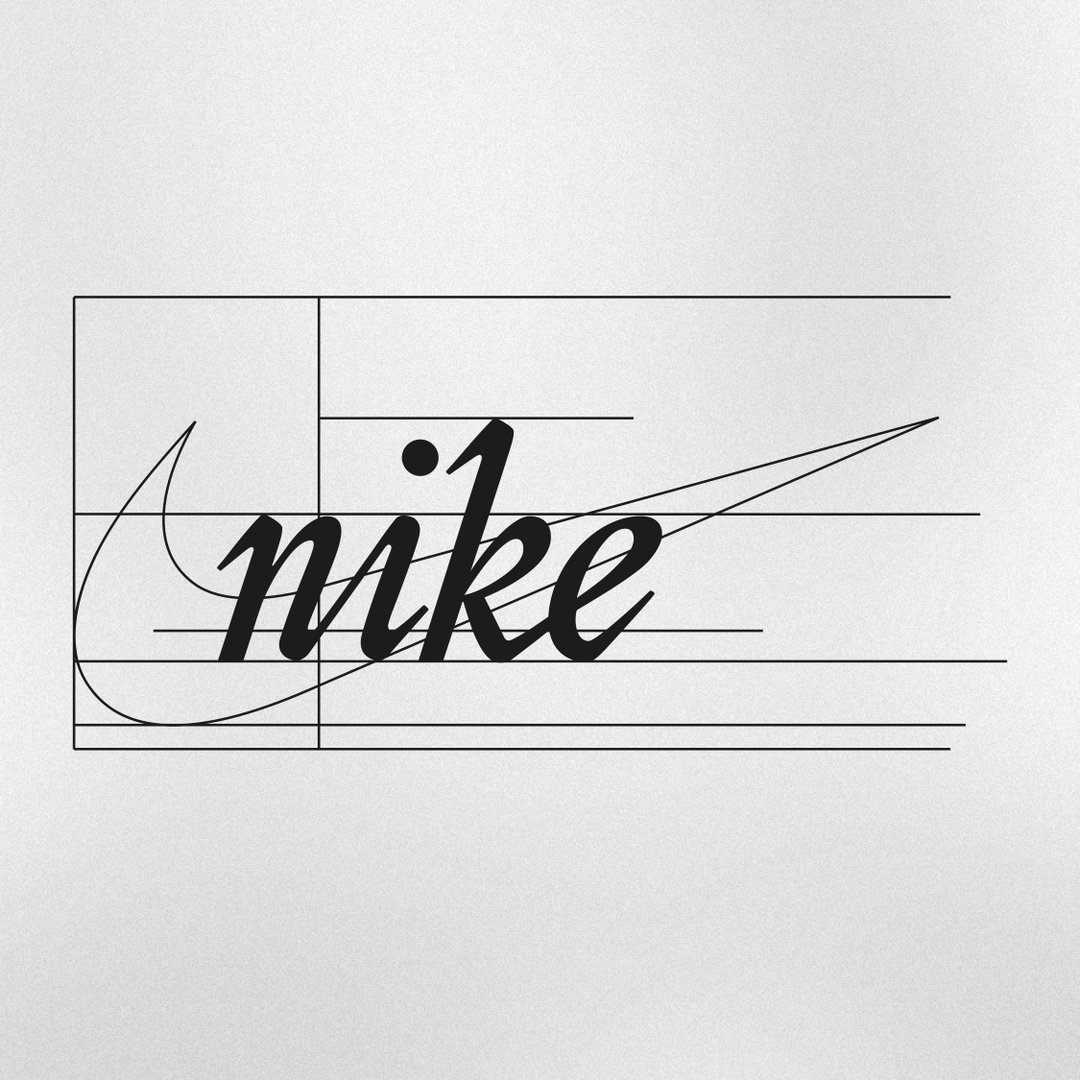
“I learned to cohabit with my securities as a designer,” she continues, “and I feel that I’m finally finding my own balance, even though I take nothing for granted.” It’s a confidence demonstrated in her latest projects, the most recent of which is a custom lettering project for Nike Los Angeles. Commissioned by Something Special Studios, Pauline was tasked with designing the typeface to accompany the initiative which inspires women through sport and movement, Pauline enacted a revival project of sorts to create a bold and empowering lettering to match the initiative.
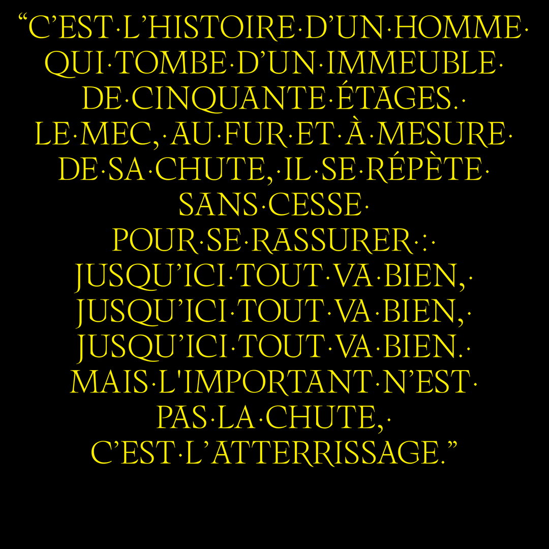
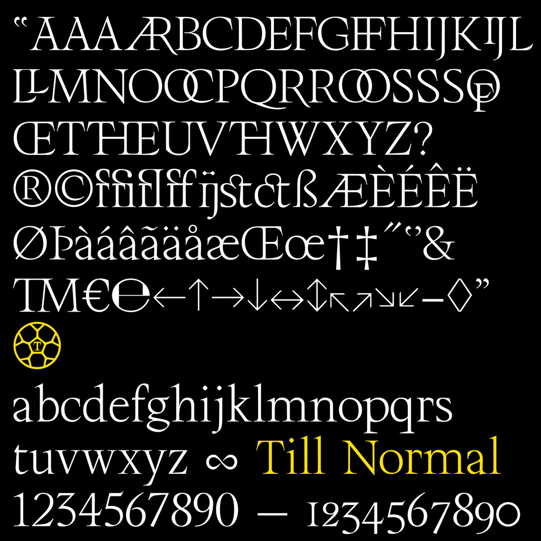
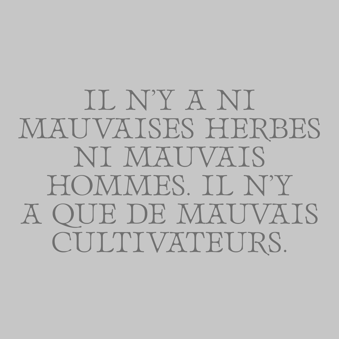
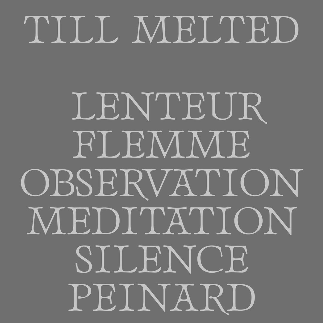
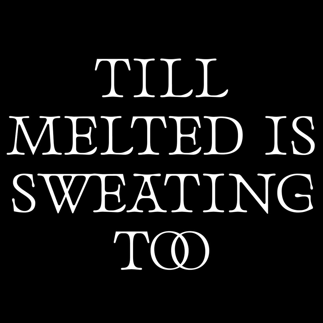
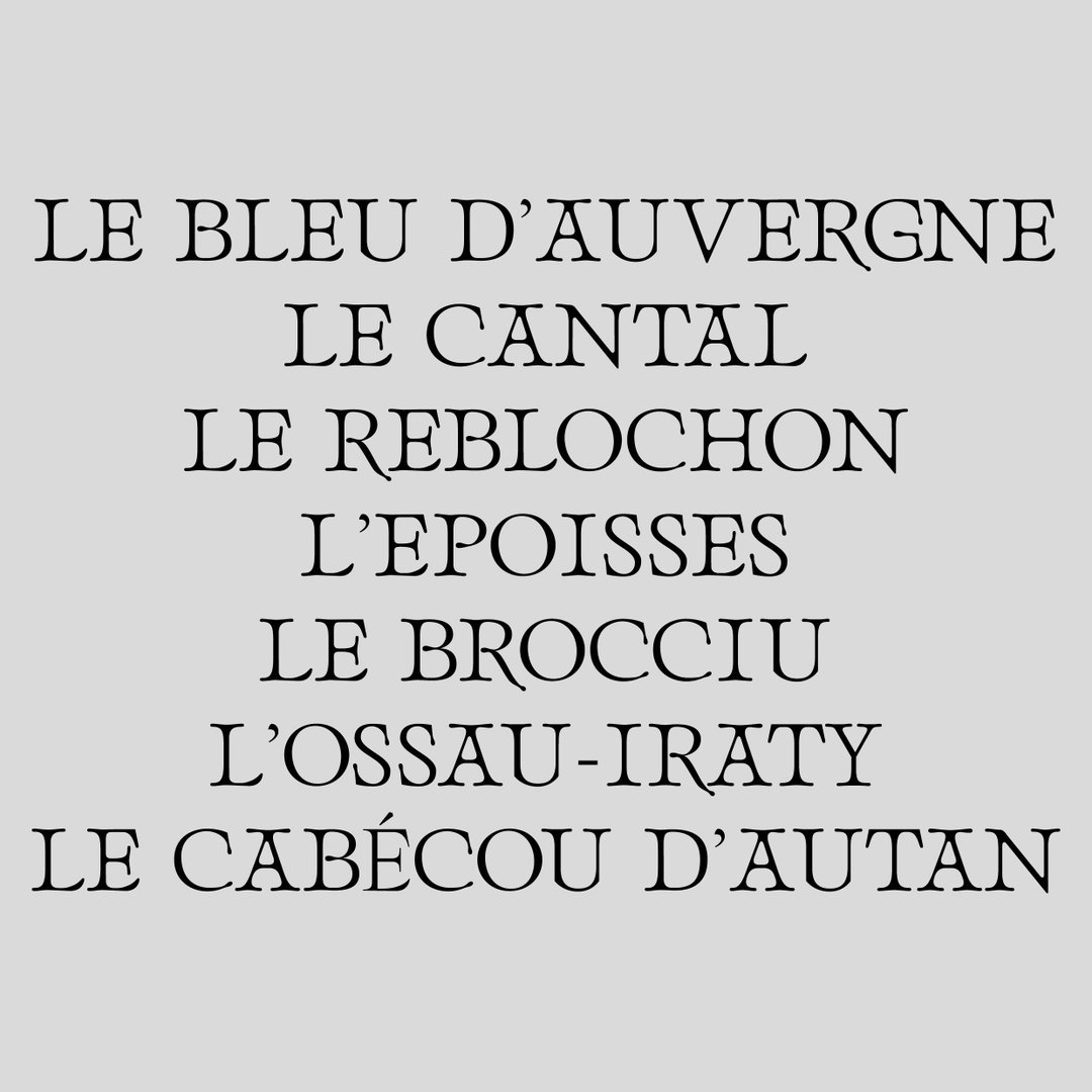
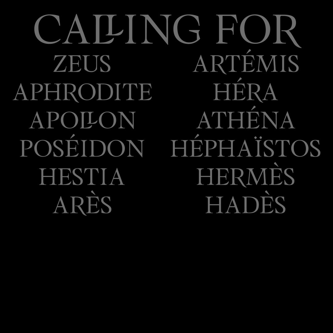
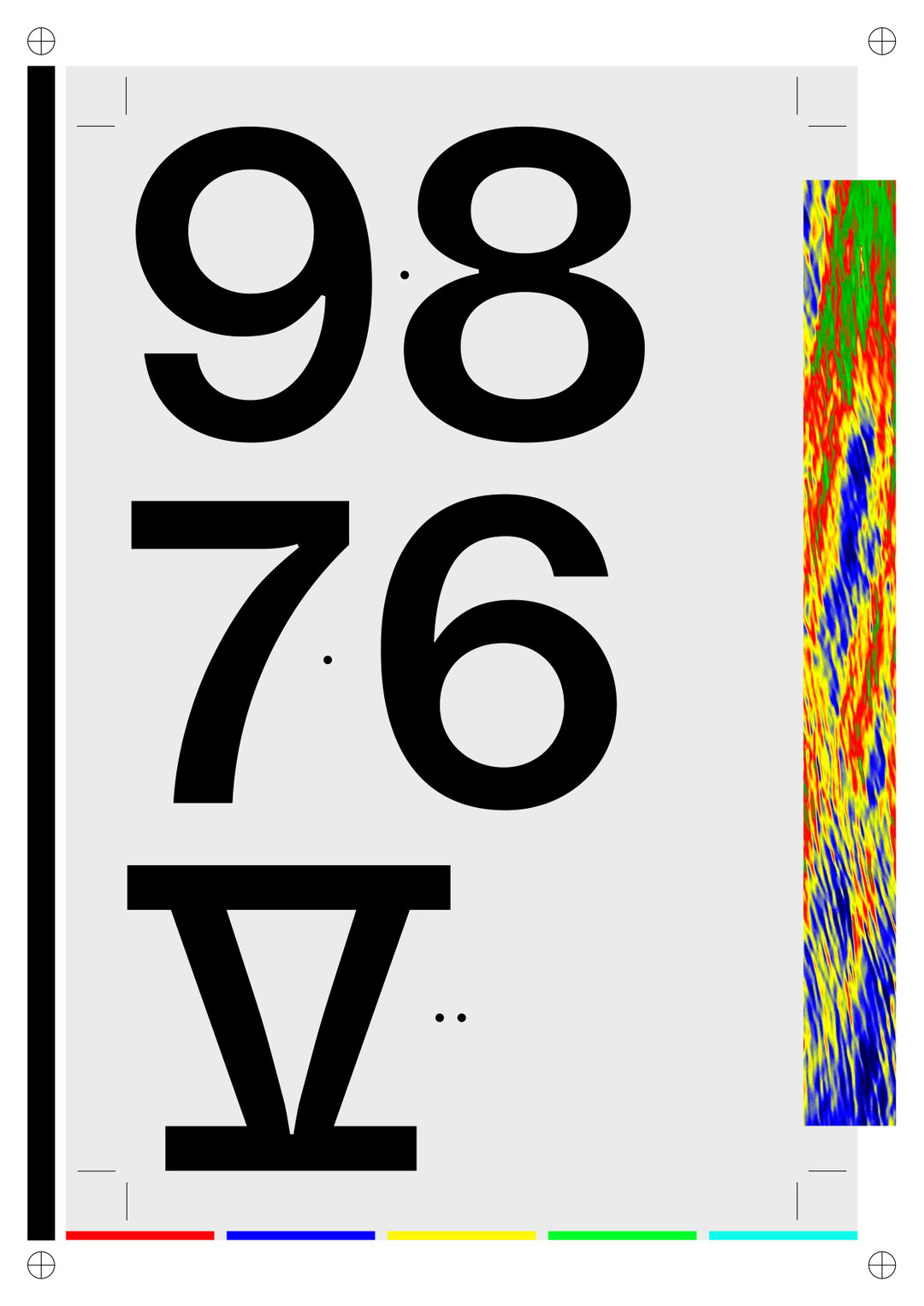
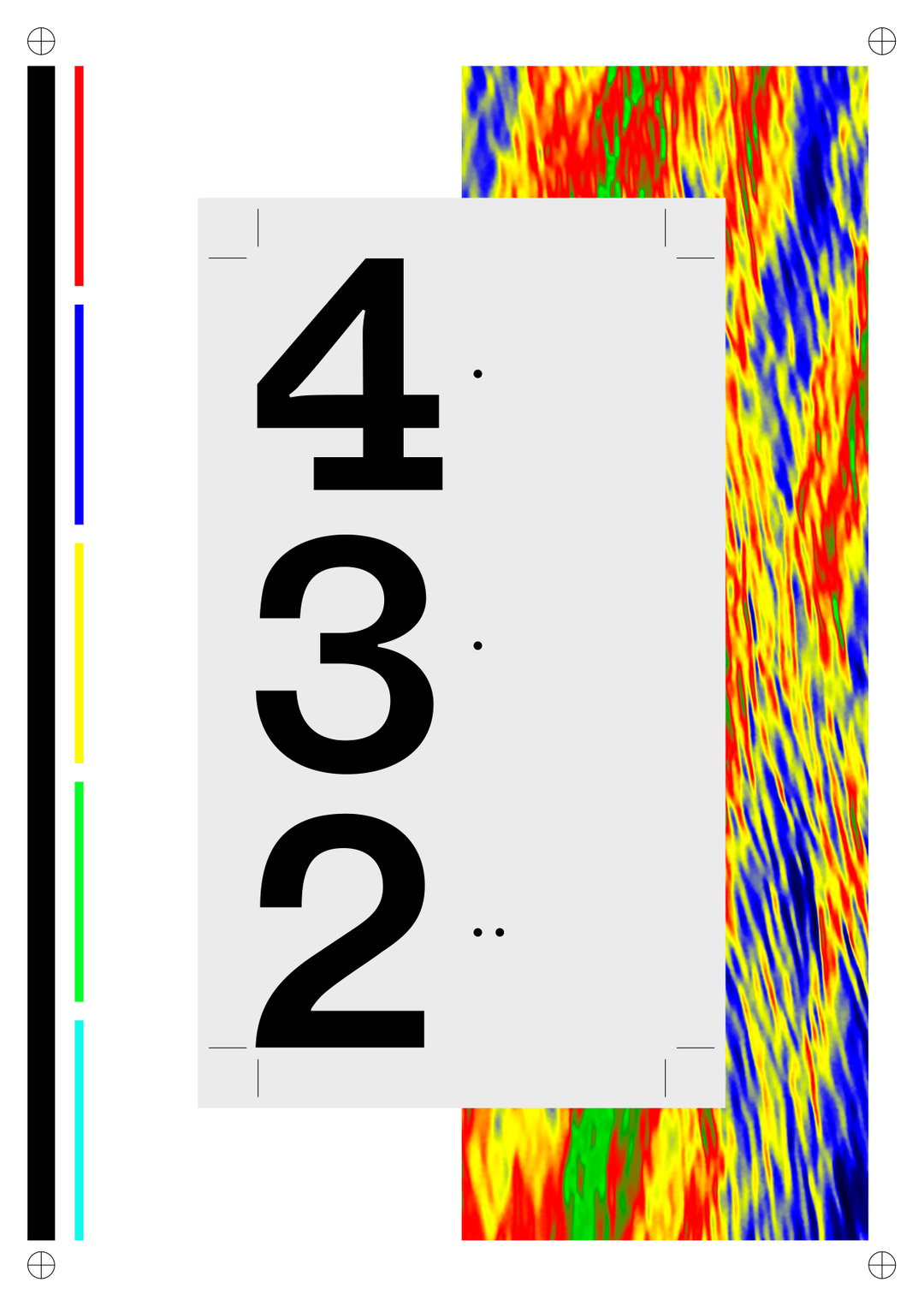
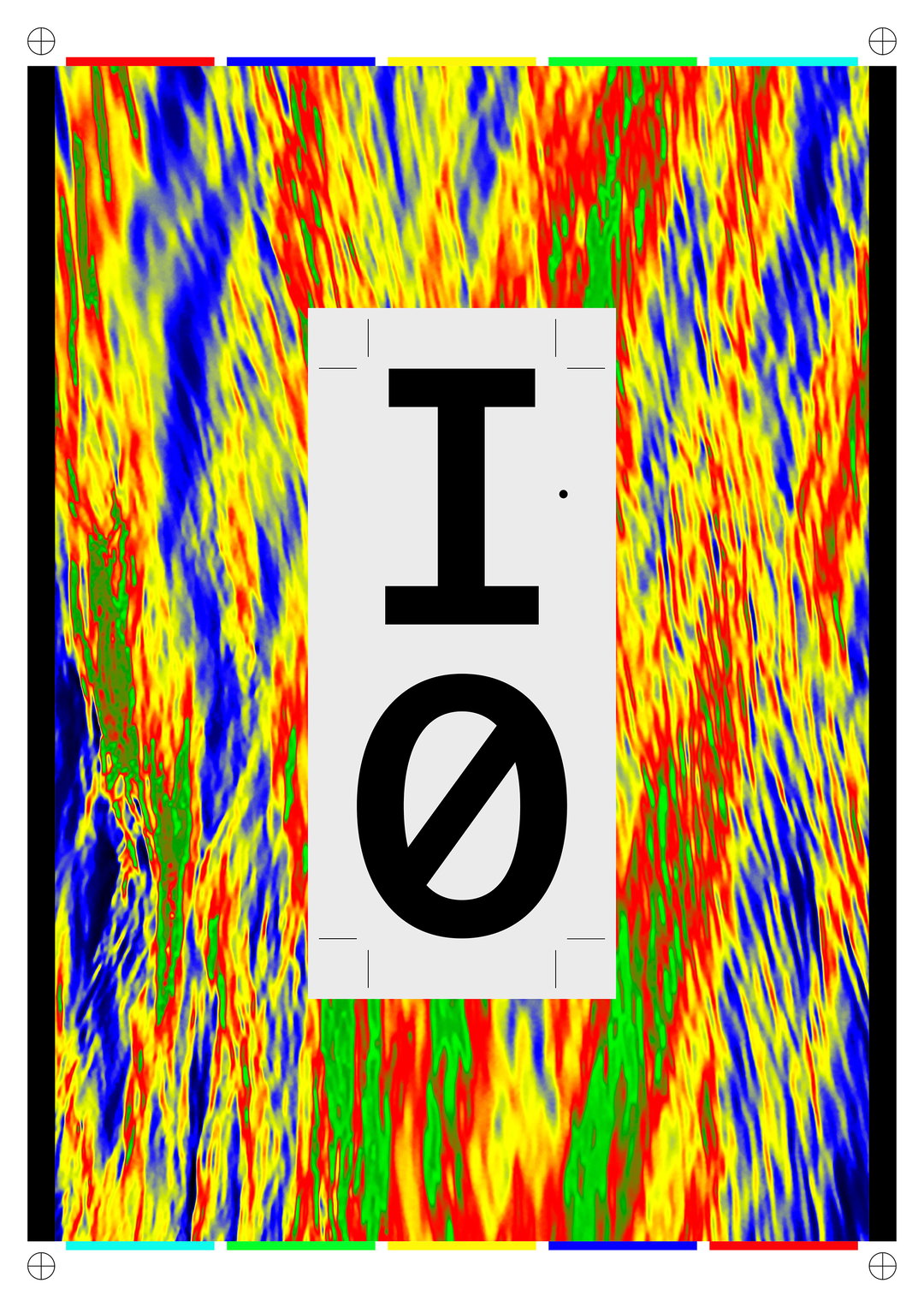
In other work, Pauline is continuously working on her latest typeface, Till. The newest member of the family is Till Melted, an alternative quirk to the dynamic serif that she hopes to launch later this year. “I wanted to break down one of the fundamental aspects of this typeface,” says Pauline of this latest style, “it’s acute sharpness.” Elsewhere, she created a digital triptych for last year’s Typojianchi Biennale. As part of the Clocks exhibition curated by Sera Yong, Pauline explored the ecological disasters that today’s younger generations will face. Playing on the themes of time and urgency to enact action, Pauline wanted to create something that would appeal to our common senses, as well as our visual ones. “At the end of the countdown,” she finally goes on to say, “hopefully comes a revolution.”
GalleryPauline Le Pape
Till
Till
Till
Till
Till
Till
Till
Till
Till
Typojianchi
Typojianchi
Typojianchi
Hero Header
Pauline Le Pape
Share Article
About the Author
—
Jynann joined It’s Nice That as an editorial assistant in August 2018 after graduating from The Glasgow School of Art’s Communication Design degree. In March 2019 she became a staff writer and in June 2021, she was made associate editor. She went freelance in 2022.


