Pentagram’s Paypal rebrand features a new motion language that mimics payment gestures
With the aim to emulate the simplicity of the online payment system, the new brand identity by Andrea Trabucco-Campos and team features new motion elements celebrating everyday user actions like “tapping, flipping and swiping”.
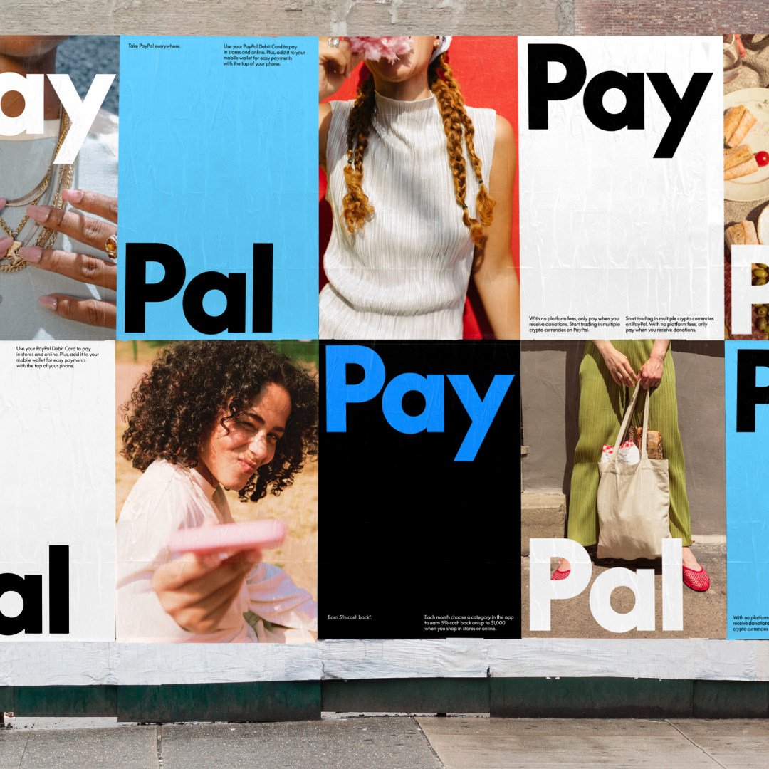
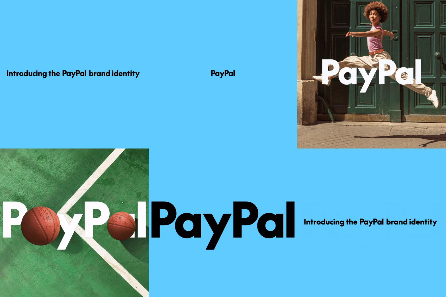
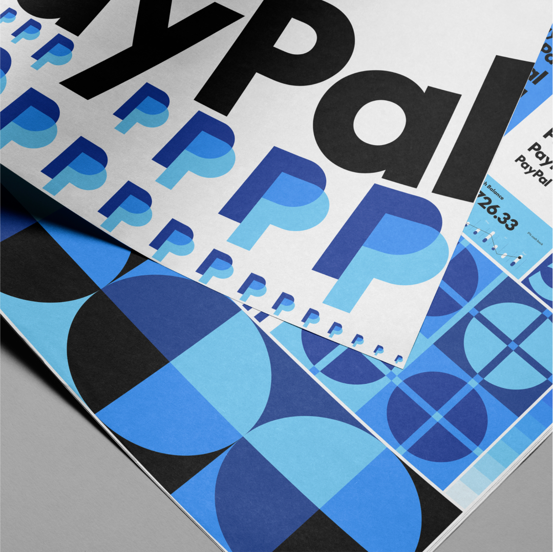
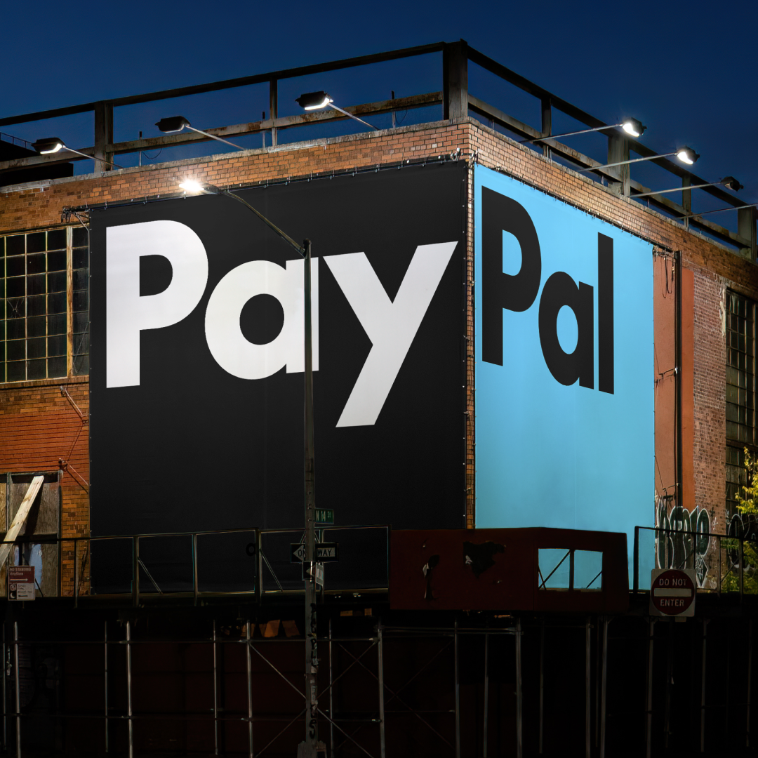
Now over 25 years old, financial tech company Paypal has announced a brand refresh, led by Pentagram partner Andrea Trabucco-Campos. With the help of the design agency, the brand has evolved with the aim for a “simpler, cleaner, more modern and more optimistic look”. The logo has been redrawn for a slightly sharper more contemporary cut, with a new wordmark set in PayPal’s new custom typeface, Paypal Pro. The colour palette has also seen an edit, where excess colours have been cut from the brand’s oeuvre for a focus on contrasting its traditional blues as an accent across platforms with neutral black-and-white backgrounds for the new “timeless typography”.
In contrast to the pared-down palette, Paypal has gone all-out on a colour-saturated photo series to highlight “the points of accessibility of the platform”, putting people at the face of the brand with the goal of making Paypal understandable and usable for “everyone, everywhere”. The playful photographic approach was directed by Pentagram to display “moments that felt real, spontaneous and authentic”, in a bid for the platform to have a more personal look and feel. This vibrant set of visuals, paired with new the simplicity of the logo and typographic elements, sets apart this shift in the brand’s appearance.
Pentagram: Paypal (Copyright © Pentagram, 2024)
The new typeface, Paypal Pro is a “customised version of LL supreme, a contemporary drawing of Futura by Lineto Type Foundry. A typeface which according to Andrea Trabucco-Campos and his team at Pentagram, has “timeless universal forms that allow the focus to stay on the message”. So Paypal Pro takes directly from Futura, with its straight lines and circular curves becoming a new brand signature. Pentagram is now working closely with the type foundry to develop a follow-up to the typeface: Paypal Pro Text — designed to perform best on small screen sizes where legibility is the focus.
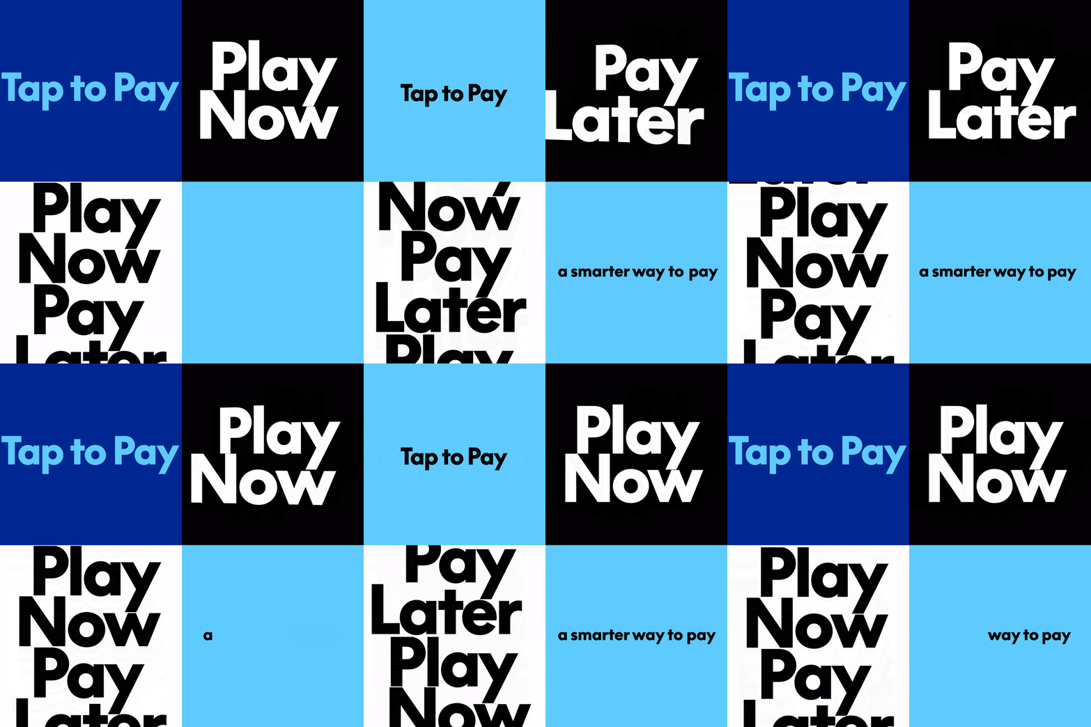
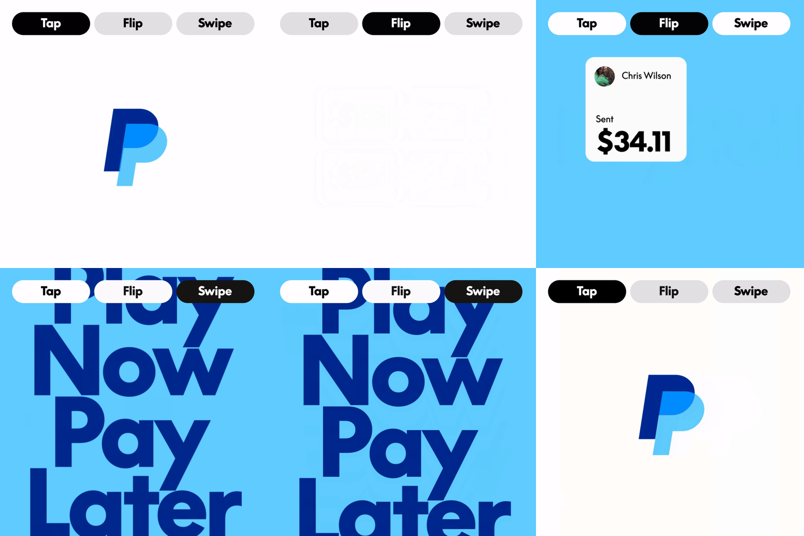
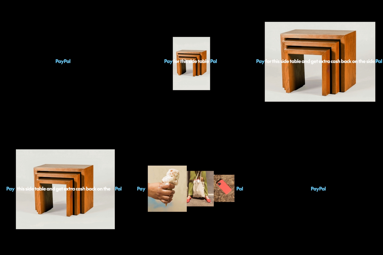
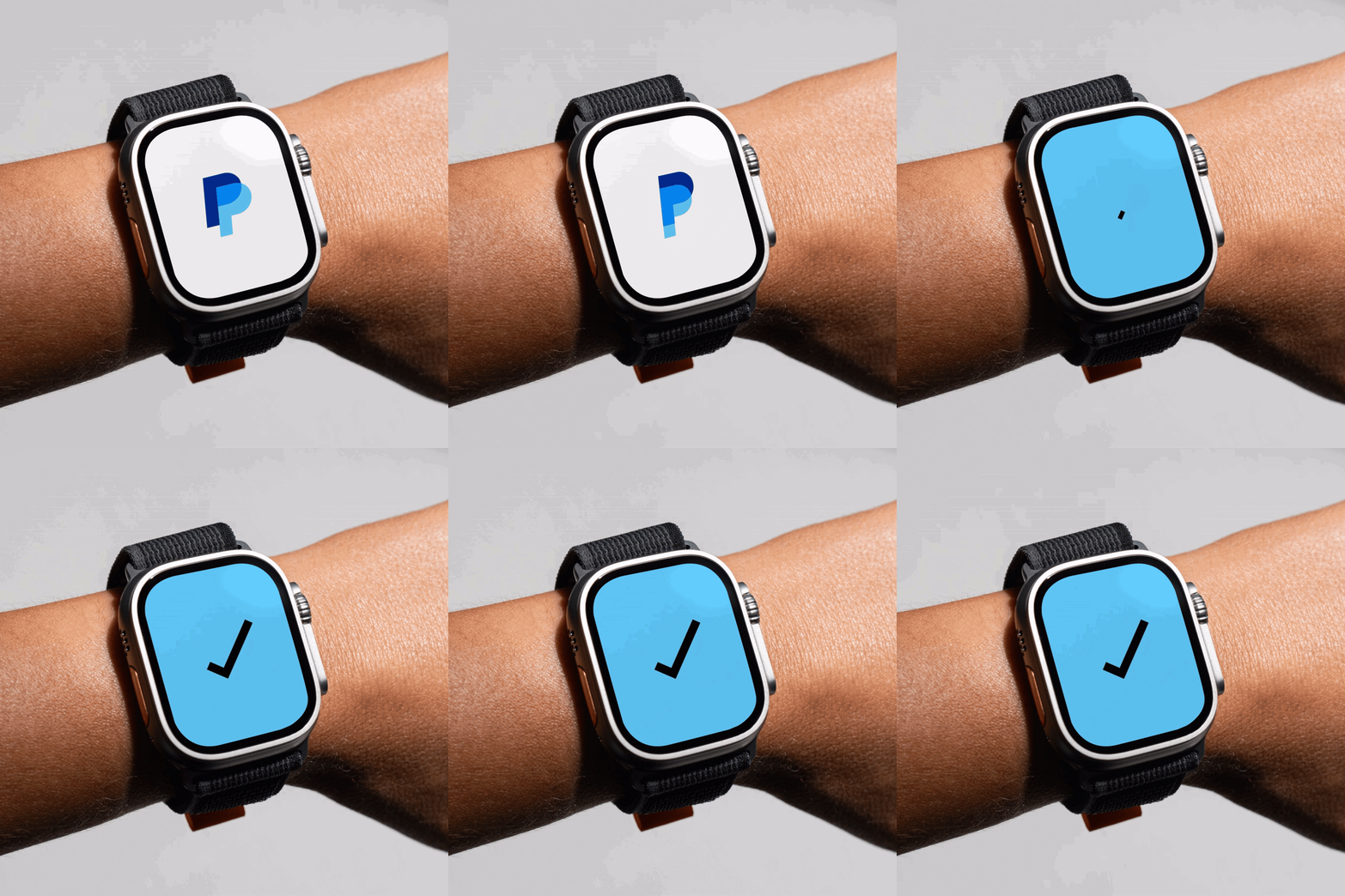
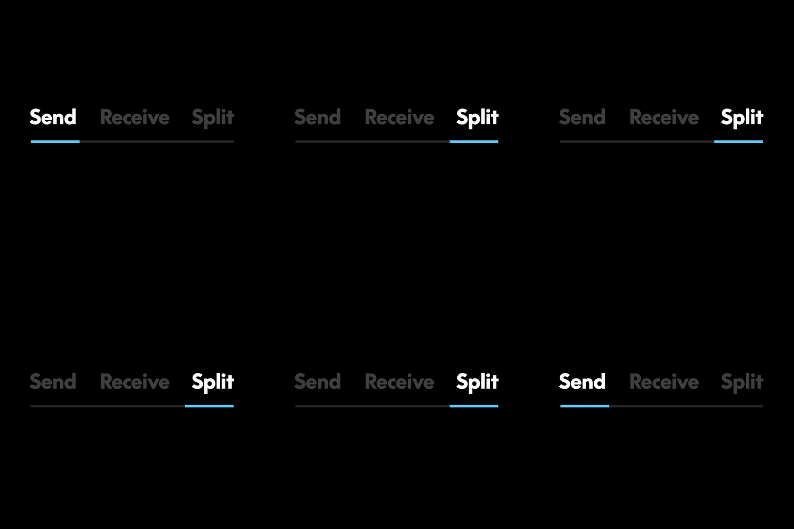
Something all the more current for the brand was the use of a new motion language that Pentagram has introduced, to bring attention to PayPal’s ease of use as a platform. These motion elements in the design system draw on “everyday transnational gestures and behaviours of making payments both digital and physical,” according to Pentagram. The animations move the new wordmark and typography with gestures that emulate things like “tapping, clicking and swiping” in order to bring “the movement of the product experience to the identity itself”.
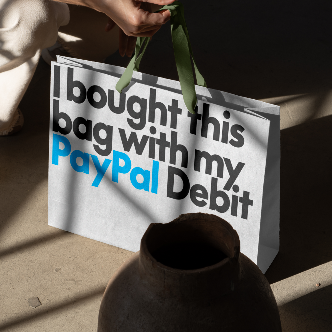
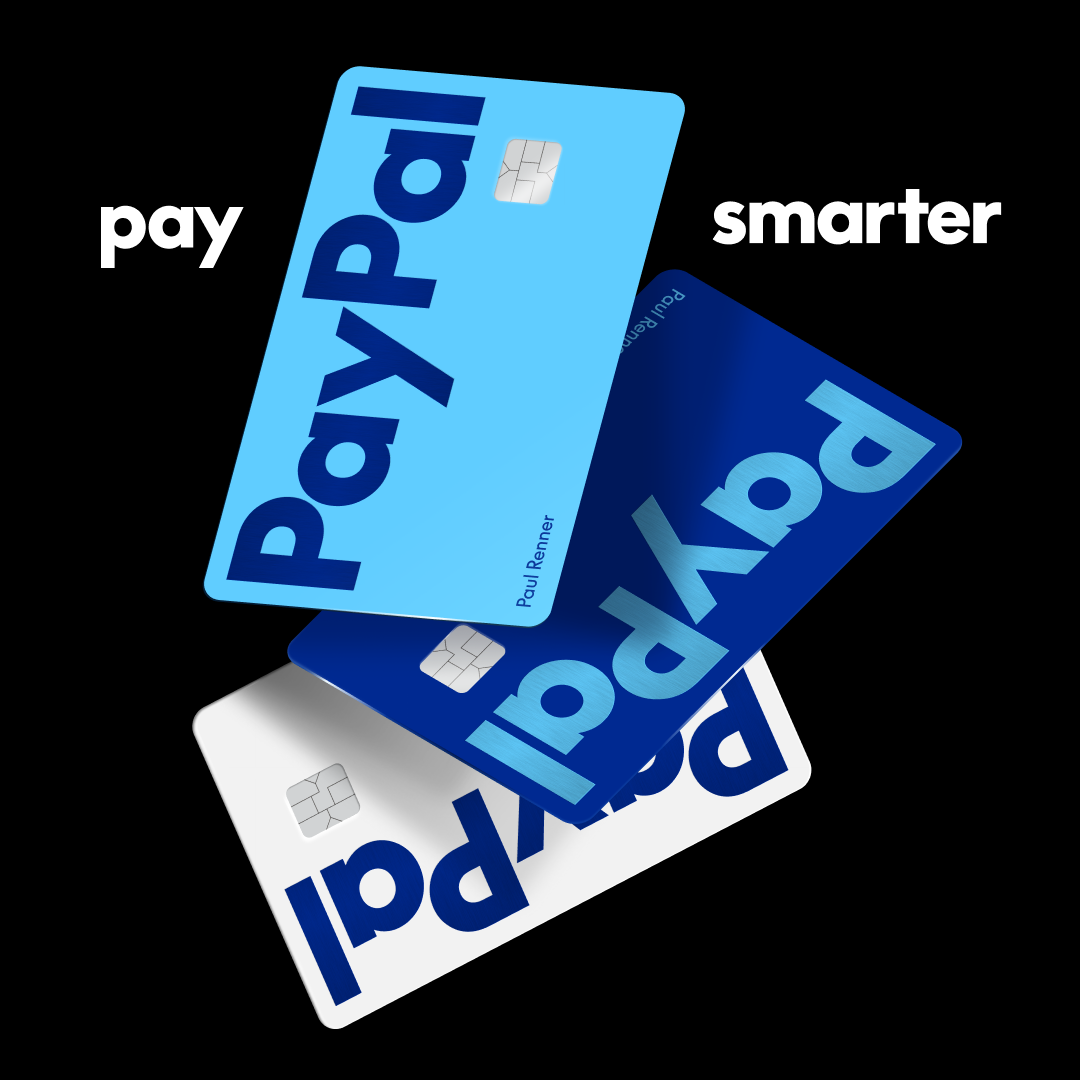
Paypal’s refresh also marks the launch of a host of new expressions and applications for the brand, including the new PayPal debit card, bringing Paypal’s design presence into in-person experiences. Looking to extend its reach, the brand identity was deliberately crafted by Pentagram to have a kind of “flexibility that welcomes new brand partnerships and collaborations” in future.
GalleryPentagram: Paypal (Copyright © Pentagram, 2024)

Hero Header
Pentagram: Paypal (Copyright © Pentagram, 2024)
Share Article
Further Info
About the Author
—
Ellis Tree (she/her) is a staff writer at It’s Nice That. She joined as a junior writer in April 2024 after graduating from Kingston School of Art with a degree in Graphic Design. Across her research, writing and visual work she has a particular interest in printmaking, self-publishing and expanded approaches to photography. [email protected]
To submit your work to be featured on the site, see our Submissions Guide.