Launch Recite Me assistive technology
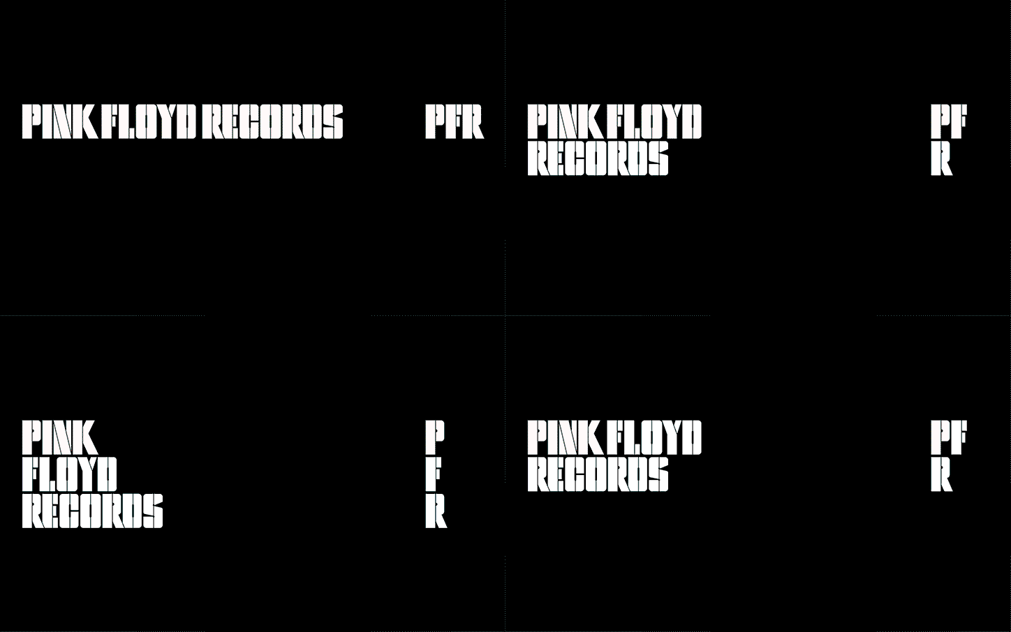
An animation in which white text on a black background shifts its layout. The words “Pink Floyd Records” and the initials “PFR” rearrange themselves into different stacked configurations.

Harry Pearce and Pentagram create a new identity for Pink Floyd’s record label

—
Date
17 March 2017

Pentagram has created a new identity for Pink Floyd Records. The project saw the team, led by partner Harry Pearce, take the original lettering from the Animals album and extend it into an entire alphabet. The first boxset, comprising a mighty 27-discs covering the early years of 1965 – 1972, from the band’s famous Bedford van.

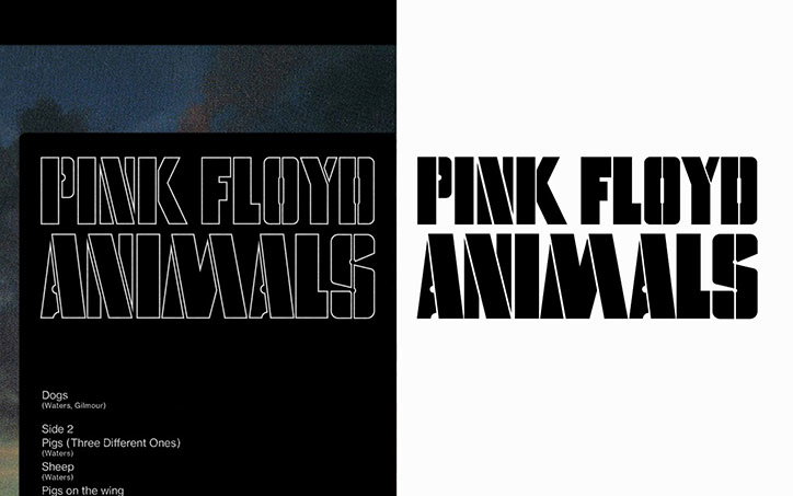
“Pink Floyd’s impact on music is immeasurable, and is only seconded by their impact of visual culture. Famed by their relationship with the design collective Hipgnosis, their LP covers are part of the cultural consciousness, creating moments of shared experience for millions of people around the world,” says Pentagram. “Harry worked closely with Aubrey Powell of Hipgnosis to create the visual identity for the label. Taking inspiration from the original lettering on 1977’s Animals record cover, Harry and team build a complete alphabet based on the album’s stencilled lettering in both outline and solid form. This lettering has been used to make a unique mark and headline font for the band and business.”

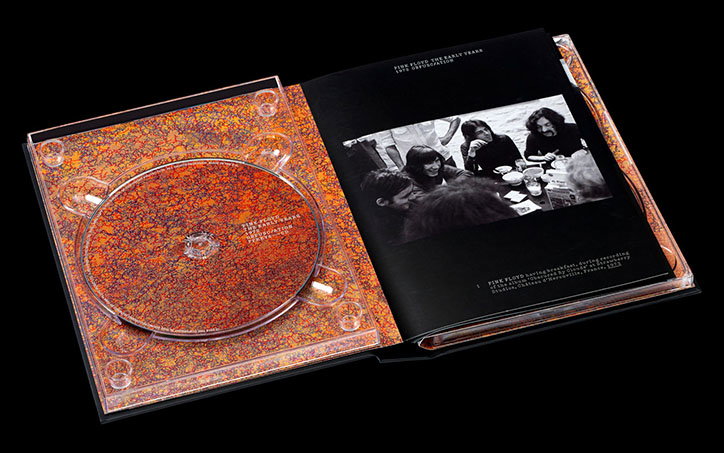
Inside the box set, which features preciously unreleased material including the band’s first recording, original artworks by John Whitely have been used on the CD booklet covers. “The box sets follow a simple one column grid and uses typewriter-esque typography to create an archival aesthetic, which is built upon through the careful arrangement of historical photographs of the band,” says Pentagram. “Harry has also written for the ‘outro’ of the upcoming book by Thames & Hudson, which will be titled Vinyl. Album. Cover. Art: The Complete Hipgnosis Catalogue to be published in April.”
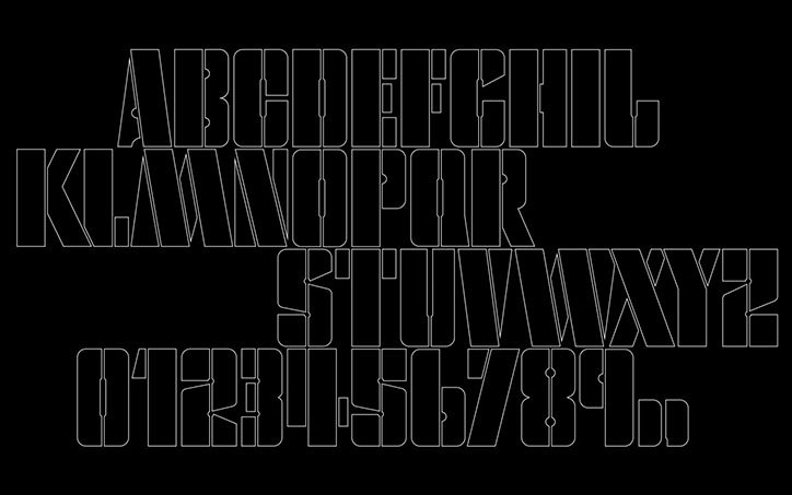
A white outline typeface on a black background. The image shows the full alphabet and numbers from 0 to 9 in a bold, geometric style.
An open CD digipak featuring a disc and booklet against a black background. The disc and its casing are covered in a dense, orange and red speckled pattern. The opposite page shows a black and white photograph of Pink Floyd having breakfast, with the text “Pink Floyd: The Early Years” above.
An animation of a technical diagram in which teal and grey geometric shapes build from left to right. The shapes are marked with labels including “X” and “Y” along a baseline.
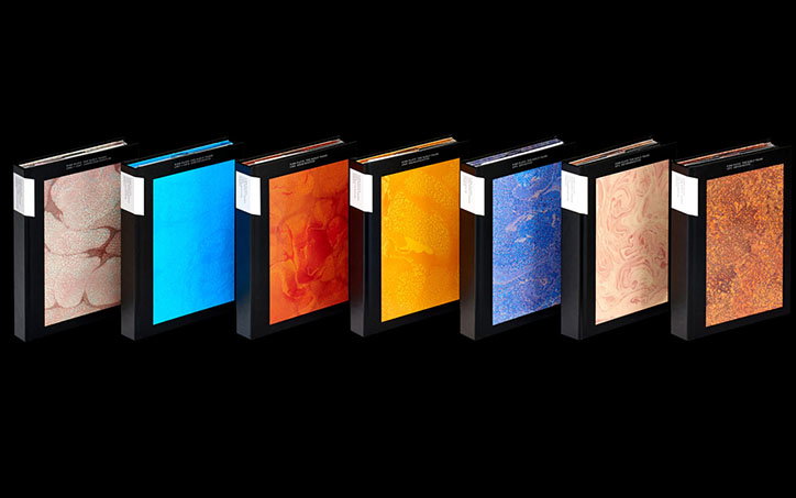
Seven hardcover books stand side by side against a black background. Each cover features a different marbled pattern in colours including pink, blue, red, yellow and orange.
Above

Each set features an original artwork by John Whiteley, in a distinct psychedelic oil on paper style.
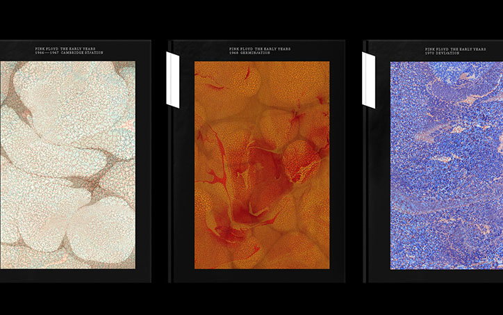
Three black book covers from the series “Pink Floyd: The Early Years”. Each features a different abstract, organic pattern in white, orange, or blue.
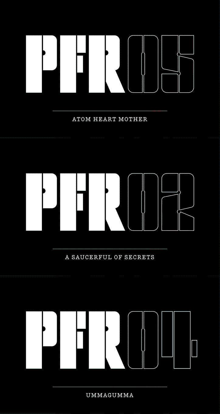
An animation in which bold white text on a black background changes. The letters “PFR” remain static while the following numbers and the captions below them cycle through “05” and “Atom Heart Mother”, “02” and “A Saucerful of Secrets”, and “04” and “Ummagumma”.
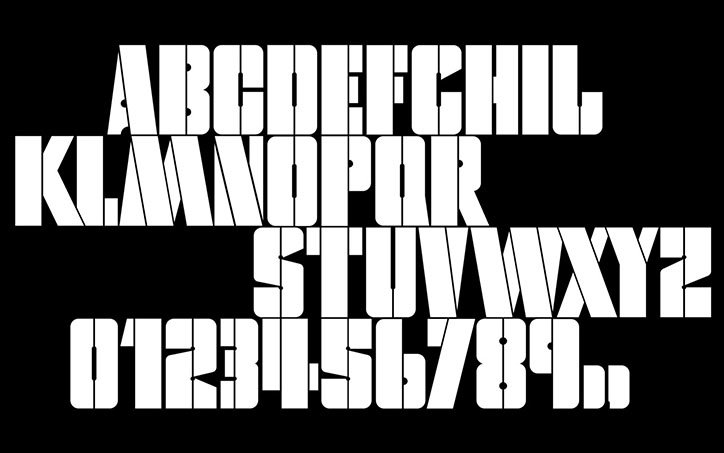
A bold, white sans-serif typeface displayed against a black background. The image shows the full alphabet and numbers from 0 to 9, each character split by a thin vertical line.
Above
Left

The full alphabet used in the Pink Floyd Record’s identity.
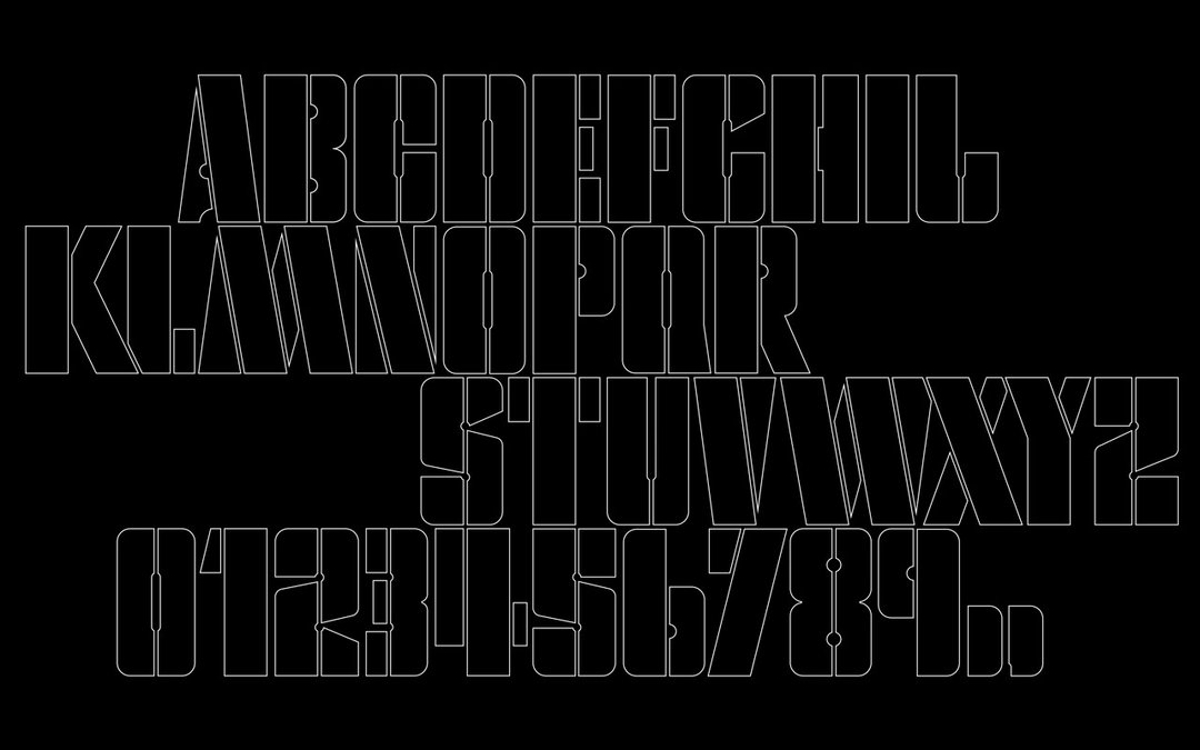
A white outline typeface on a black background. The image displays the alphabet and numbers from 0 to 9 in a tall, geometric style.
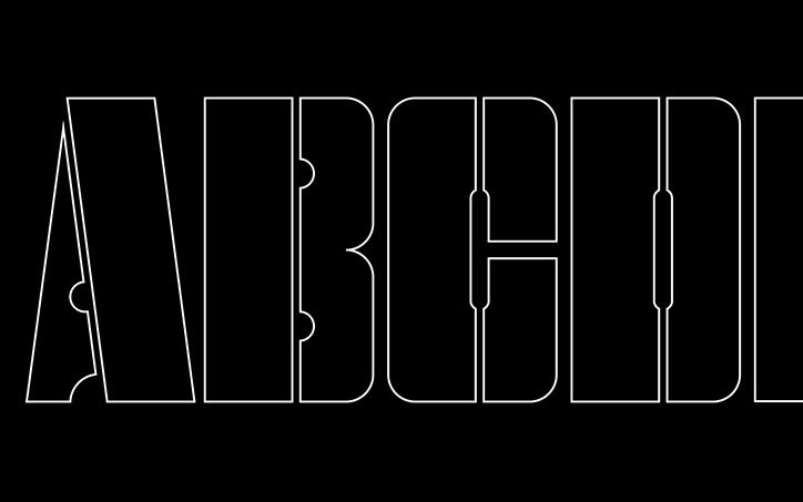
A graphic of the letters “ABCD” in a bold, white outlined typeface against a black background. The letters are tall and compressed with a modern, architectural style.
Above
Left

The new alphabet was created in both solid and outline versions.
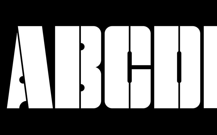
Bold white letters “ABCD” are set against a black background. The characters are sliced by thin vertical lines, creating a fragmented, geometric effect.
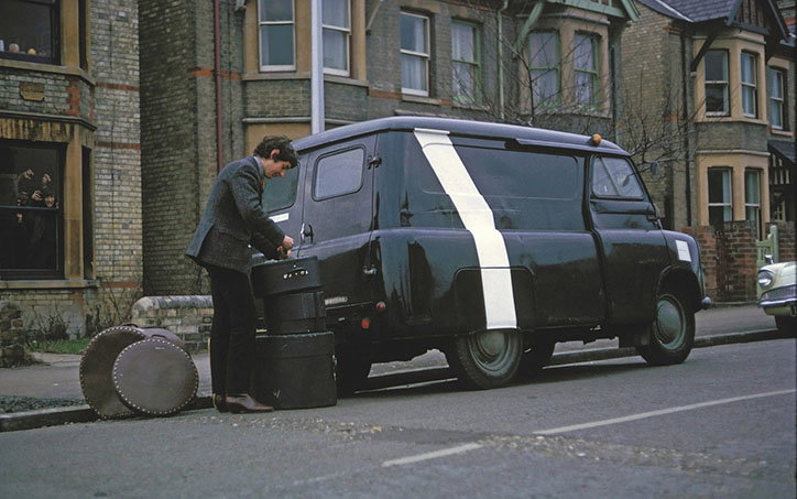
A person in a dark suit loads large, black circular equipment cases into the back of a black van. The van features a bold white diagonal stripe across its side and is parked on a residential street.
Above

Nick Mason with Pink Floyd’s famous Bedford van in 1965 (photo courtesy of the Pink Floyd Archive).
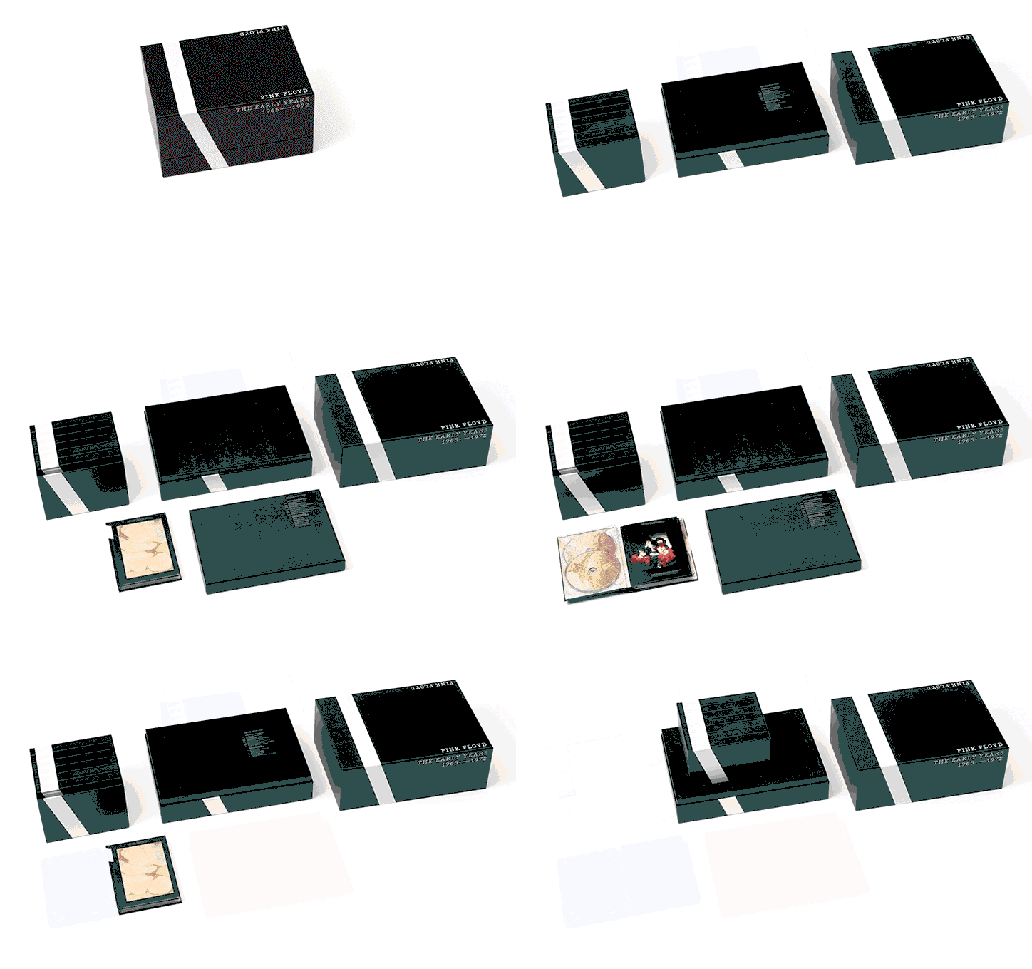
An animation in which a black box set for Pink Floyd, titled “The Early Years 1965–1972”, unfolds against a white background. The packaging opens to reveal CDs, a booklet and other inserts before closing again.
Above

The Bedford van influenced the design of the ‘The Early Years 1965-1972’ boxset.
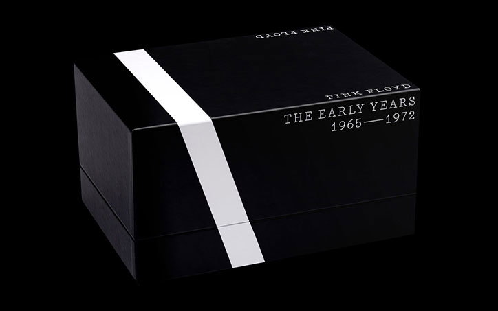
A black box set for Pink Floyd, featuring a single thick white stripe running diagonally across the left side. Text on the front reads “Pink Floyd” above “The Early Years 1965–1972”.
Above

The Early Years 1965-1972’ boxset is designed in an archival style
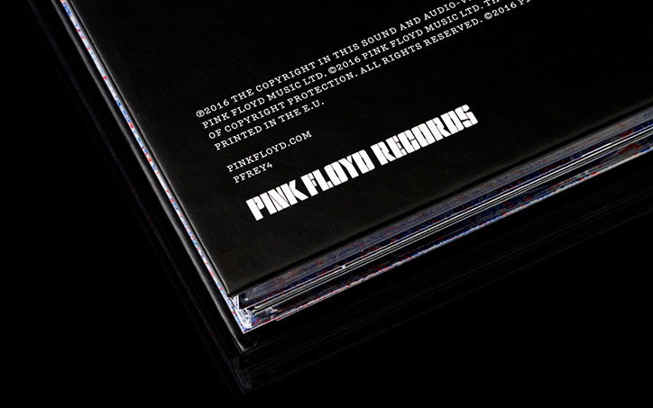
A close-up of a black record sleeve. White text reads “Pink Floyd Records” and “pinkfloyd.com”, with copyright information and “Printed in the E.U.” above.
Above

The archival aesthetic of ‘The Early Years 1965-1972’ is carried through the entire boxset, from cover to credits.

An animation in which a white, tapered shape on a red background fills with a list of Pink Floyd songs and dates. The text grows from the top down, including titles such as “Arnold Layne”, “Money” and “Another Brick in the Wall (Part II)”.
A side-by-side comparison of a record sleeve and its logo. On the left, a black cover features the text “Pink Floyd Animals” in an outlined font, with a tracklist including “Dogs” and “Sheep” below. On the right, the same text appears in a solid black, bold typeface against a white background.
Above

The iconic typography on Pink Floyd’s Animals forms the basis of the typeface used in Pink Floyd Record’s identity.
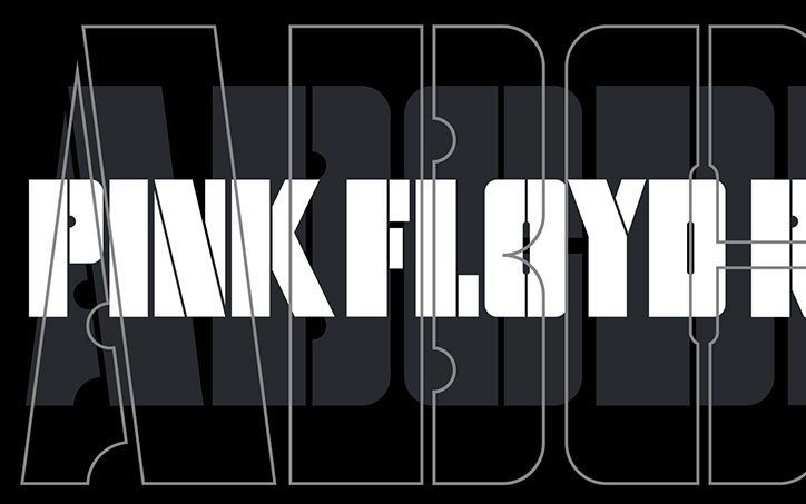
A graphic featuring the words “PINK FLOYD” in bold, white, condensed lettering. The text is laid over a dark background with large, grey, outlined typographic shapes.
Above

Pentagram created three cuts of the typeface for use at small, medium and display sizes.
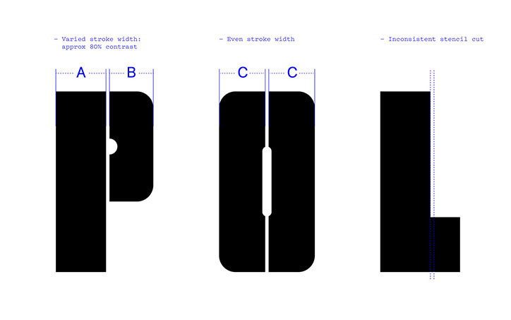
A typographic study of the letters “P”, “O” and “L” in a heavy black stencil font. Blue technical annotations above the letters describe “varied stroke width”, “even stroke width” and “inconsistent stencil cut”.
Above

Pentagram established a set of rules to extend the Animals’ typography to include an entire alphabet.

Share Article

Further Info

About the Author

Owen Pritchard

—

Owen joined It’s Nice That as Editor in November of 2015 leading and overseeing all editorial content across online, print and the events programme, before leaving in early 2018.


It's Nice That Newsletters

Fancy a bit of It's Nice That in your inbox? Sign up to our newsletters and we'll keep you in the loop with everything good going on in the creative world.