Launch Recite Me assistive technology
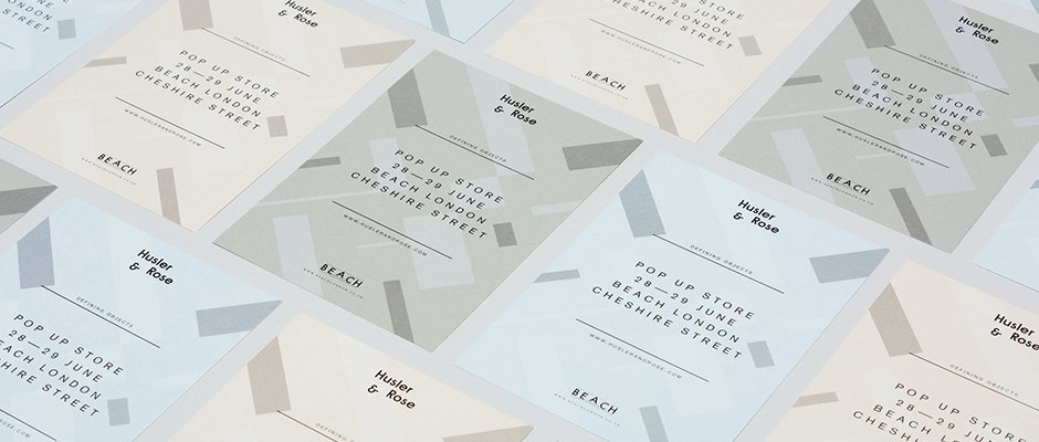
A grid of minimalist flyers for a “Pop Up Store” by Husler & Rose. The design features a pale green and grey colour palette with text detailing the event on 28–29 June at “Beach London, Cheshire Street”.

Splendid new identity work for online shop Husler & Rose by POST–

—
Date
28 April 2015

London studio POST– has built an admirable reputation for clean, considered design work for clients across the world. Perusing their portfolio recently we came across this pleasing work for Husler & Rose, an online boutique that sells furniture, homeware and other bits and pieces. Too often we see identities for these kinds of shops that tick off cliched checklists ripped from Instagram mood boards but I feel the POST– team has navigated these pitfalls with skill and style. Inspired by “Herbert Bayer’s Bauhaus posters and the old jazz record sleeve designs of Duke Ellington,” the designers have developed a relevant look and feel that works across both print and digital collateral and breathes a little life into a couple of quite standard conventions.
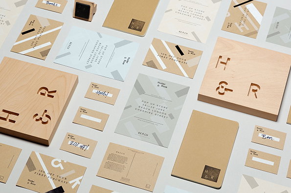
A collection of branding materials for “Hustler & Rose” laid out on a light grey surface. The set includes light wood blocks with the letters “H & R” carved into them, alongside various cards and stationery in beige, white and pale blue.
Above

POST– Husler & Rose

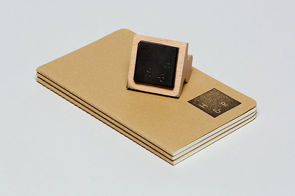
A wooden rubber stamp rests on a stack of brown kraft paper notebooks. The stamp has left a black ink mark on the top cover reading “H & R”.
Above

POST– Husler & Rose

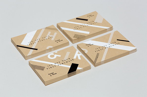
Four stacks of brown kraft paper cards are arranged on a plain grey surface. Each card features a white and black geometric design with the text “10% OFF YOUR FIRST PURCHASE” and the brand name “Husler & Rose”.
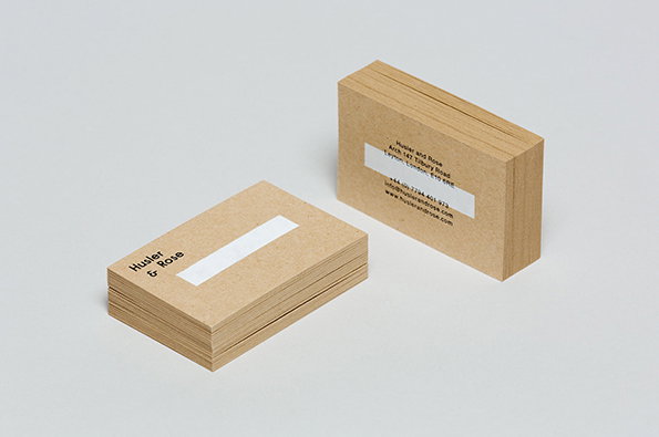
Two stacks of business cards printed on brown kraft paper. One stack shows the logo “Husler & Rose” next to a white rectangular block.
Above

POST– Husler & Rose

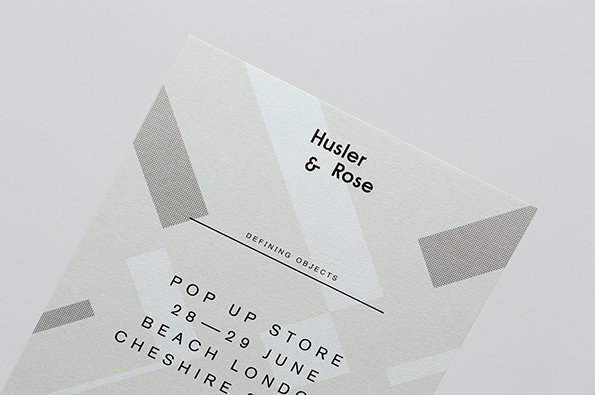
A white textured card for “Husler & Rose” featuring a minimalist layout with grey geometric shapes. Text below reads “DEFINING OBJECTS” and announces a “POP UP STORE” on “28 – 29 JUNE” in London.
Above

POST– Husler & Rose

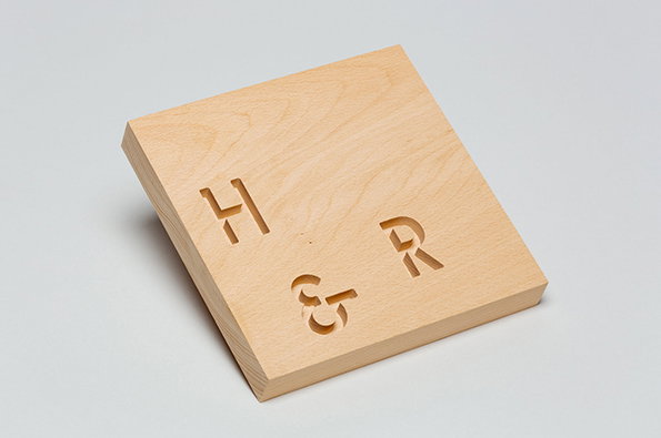
A square block of light-coloured wood with the letters “H”, “&” and “R” carved into the surface. The block is set at an angle against a plain grey background.
Above

POST– Husler & Rose

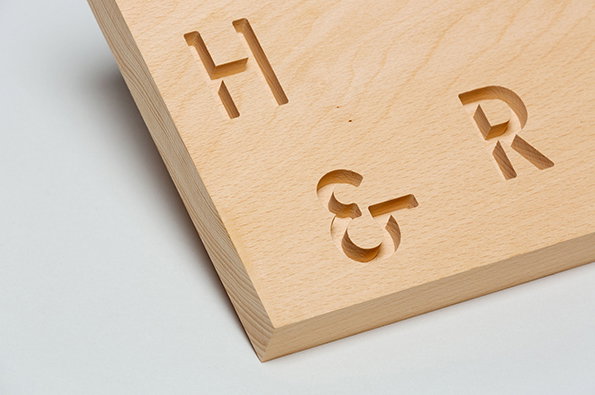
A close-up of a light-coloured wooden block with the characters “H & R” carved into the surface. The letters are spaced apart and cut deep into the grain.
Above

POST– Husler & Rose

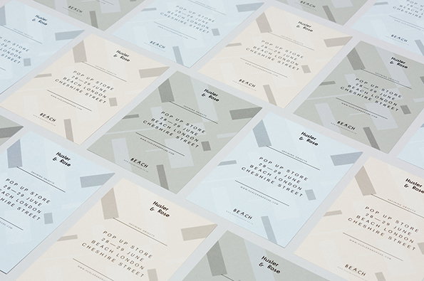
A collection of minimalist invitation cards scattered across a surface. The cards feature a neutral colour palette and read “Pop Up Store 28–29 June Beach London Cheshire Street”.
Above

POST– Husler & Rose

Share Article

About the Author

Rob Alderson

—

Rob Alderson is a freelance writer, editor and strategist. He was previously editor-in-chief of It’s Nice That and WePresent, and editor of Design Week. He publishes the newsletter Undo, which tries to make sense of how AI is changing design work, the design process and the design industry.


It's Nice That Newsletters

Fancy a bit of It's Nice That in your inbox? Sign up to our newsletters and we'll keep you in the loop with everything good going on in the creative world.